Reducing drop-off after QR code scans starts with understanding what happens in the few seconds between a user pointing a camera and deciding whether to continue. In QR code campaigns, drop-off means the percentage of people who scan but do not complete the next desired action, such as viewing a product page, submitting a form, downloading an app, redeeming an offer, or making a purchase. Conversion rate optimization, in this context, is the disciplined process of improving that post-scan journey so more scans turn into measurable outcomes. I have worked on QR programs for retail packaging, restaurant ordering, event check-in, direct mail, and field sales enablement, and the same pattern appears repeatedly: scan volume alone tells very little. The real performance story is told by scan-to-load rate, page engagement, form completion, cart starts, and completed conversions. This matters because QR codes compress attention into a tiny window. Users are often standing in a store aisle, walking past a poster, holding coffee in one hand, or dealing with poor mobile signal. If the landing experience is slow, mismatched, confusing, or intrusive, the opportunity disappears. A high-performing QR code strategy therefore combines analytics, message match, mobile UX, page speed, and rigorous testing. When these elements align, businesses can reduce abandonment, attribute offline media more accurately, and turn QR traffic into revenue instead of vanity metrics.
Diagnose where post-scan drop-off happens
The first step is not redesigning the page. It is building a clean measurement framework that shows exactly where users are leaving. At minimum, track scans, unique scanners, successful page loads, engaged sessions, primary CTA clicks, and final conversions. In Google Analytics 4, this usually means defining events for page_view, scroll, click, form_start, form_submit, add_to_cart, begin_checkout, and purchase, then segmenting sessions by QR campaign parameters such as source, medium, creative, placement, and date range. If you use a dynamic QR platform such as Bitly, QR Code Generator PRO, Uniqode, or Flowcode, compare scan logs with analytics sessions to identify a hidden failure point: scans that never become page loads because of weak connectivity, redirects, app-store detours, or broken parameters. I have seen campaigns reporting strong scan counts on packaging while mobile sessions lagged by 20 percent because the destination URL passed through multiple redirects before loading. Funnel diagnosis should also include technical conditions. Review page speed in PageSpeed Insights, real-user performance in Chrome UX Report where available, and mobile behavior in tools like Microsoft Clarity or Hotjar. Session recordings often reveal practical causes of abandonment: coupon fields hidden below the fold, sticky consent banners covering buttons, form keyboards obscuring inputs, or store locator maps failing on low bandwidth. A useful rule is to classify drop-off into three buckets: technical friction, message mismatch, and decision friction. Technical friction covers load times, redirects, errors, and device issues. Message mismatch occurs when the QR promise says “see the menu” and the destination opens a generic homepage. Decision friction appears when the page asks for too much effort too soon, such as account creation before showing price, or a long lead form before explaining value.
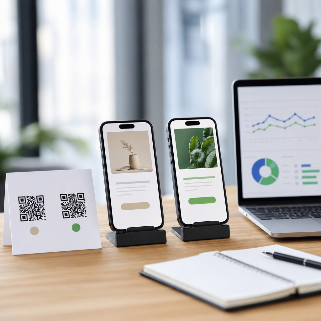
Align the scan promise with the landing experience
Most QR conversion problems begin before the scan. The user scans because the code implies a specific outcome, and drop-off rises when the destination fails to deliver that exact next step. If the printed CTA says “Get 15% off today,” the landing page should immediately repeat the offer, show eligibility, and present a single redemption path. If a table tent says “View lunch menu,” do not send traffic to a restaurant homepage with a pop-up newsletter gate and five navigation choices. Message match is the shortest route to trust because it confirms the user made the right move. In practice, strong message match includes identical offer language, consistent imagery, campaign-specific URLs, and a visible headline within the first viewport. I generally create dedicated landing pages for meaningful QR placements rather than reusing broad site pages. Packaging, storefront signage, direct mail, and out-of-home placements each produce different user intent. A QR code on medication instructions needs clarity and safety information first. A QR code on product packaging often needs how-to content, ingredients, warranty registration, or replenishment. A QR code in a sales brochure should continue the conversation already started by the copy around it. This is why dynamic destination management matters. You can preserve one printed QR code while adapting the landing page by geography, inventory status, campaign period, or device type, provided the final experience remains predictable. The more specific the promise and page are to one another, the lower the immediate bounce rate.
Improve mobile speed, clarity, and action paths
After message match, mobile usability has the biggest effect on scan conversion. QR traffic is overwhelmingly mobile, and mobile visitors are less patient than desktop users. Research from Google has long shown that conversion probability drops as page load time increases, and even a few extra seconds can suppress action on high-intent visits. For QR campaigns, aim for a lightweight landing page, visible core content above the fold, compressed images in next-gen formats, minimal script dependency, and as few redirects as possible. On commerce flows, I prefer one fast landing page over a chain of campaign page, category page, product page, and account gate. Reduce cognitive load by limiting navigation, using one dominant CTA, and writing clear microcopy around forms, pricing, fulfillment, and privacy. Avoid design habits that look polished in internal reviews but hurt real usage: autoplay video, oversized hero images, modal pop-ups on first load, and chat widgets that cover important controls. For lead generation, shorten forms ruthlessly. If all you need is email and ZIP code to qualify interest, do not ask for company size, phone number, and budget on the first step. For commerce, surface key objections early: shipping cost, return policy, delivery timing, and payment methods. Trust signals matter here because QR users often arrive cold. Show recognizable payment badges, review counts, security reassurance, and contact options near the conversion point. Accessibility also reduces abandonment. Use high-contrast buttons, readable font sizes, proper labels, and tap targets large enough for one-handed use. On restaurant and event flows, QR visitors often operate under time pressure. The best pages respond by making the first action obvious, not by presenting every possible action.
| Optimization area | Common cause of drop-off | Practical fix | Primary metric to watch |
|---|---|---|---|
| Destination routing | Code leads to homepage or irrelevant page | Create campaign-specific landing pages with matching headline and CTA | Bounce rate, engaged sessions |
| Page speed | Slow mobile load from redirects and heavy scripts | Reduce redirects, compress assets, defer nonessential scripts | Page load time, landing-page conversion rate |
| Form design | Too many fields or unclear value exchange | Use progressive profiling and explain benefit above form | Form start-to-submit rate |
| Offer clarity | User cannot tell what happens after click | State offer, terms, and next step in the first viewport | CTA click-through rate |
| Trust | Cold traffic hesitates to buy or submit data | Add reviews, policies, contact info, and secure payment cues | Checkout completion, lead conversion rate |
Use segmentation and testing to raise conversion rates
Once the obvious friction is removed, conversion rate optimization becomes a testing discipline. Do not evaluate QR traffic as one audience. Segment by placement, creative, audience context, device, operating system, geography, time of day, and whether the scan occurred in a high-intent environment such as packaging or a lower-intent environment such as street posters. In one retail campaign I worked on, the same QR code design performed very differently on shelf wobblers and shipping inserts because shoppers scanning in store wanted instant product proof, while existing customers scanning at home responded better to replenishment offers. That kind of difference only appears when campaign tagging is structured and consistent. Use UTMs or equivalent parameters that encode media source, asset type, placement, creative version, and offer. Then test one variable at a time with enough volume to make decisions. High-impact tests usually include headline clarity, CTA wording, offer framing, page length, social proof placement, form fields, and checkout steps. On QR pages, simple changes often beat dramatic redesigns. Replacing “Learn more” with “Get coupon” or “Start order” can materially increase clicks because the action becomes concrete. Moving the main CTA above a long explanatory block can improve completion for distracted users. If volume is limited, combine A/B testing with qualitative evidence from heatmaps, on-page surveys, and customer service feedback. Ask a narrow question such as “What stopped you from completing this today?” and patterns emerge quickly. Also watch for variant bias caused by device conditions. A design that performs well on newer iPhones may fail on older Android devices if scripts are heavy or layout shifts are severe. Testing should lead to documented operating principles, not isolated wins. Over time you build a playbook: how long a QR landing page should be for restaurant ordering, which trust cues matter most for direct mail insurance leads, and what CTA language works best for packaging scans.
Strengthen trust, continuity, and follow-up across the funnel
Many organizations treat the QR code as the campaign and the landing page as the endpoint. In reality, the page is only the midpoint of a larger funnel. Reducing drop-off requires continuity after the initial click. For ecommerce, save carts automatically where possible, support express payment methods such as Apple Pay and Google Pay, and send recovery messages when users consent. For lead generation, confirm form submission instantly, set expectations for response time, and route qualified leads quickly into CRM workflows such as HubSpot or Salesforce. Delayed follow-up destroys the value of high-intent scans. For content journeys, recommend the next best action rather than ending with a thank-you page. If someone scans a QR code on product packaging to watch setup instructions, offer registration, accessories, FAQs, and support within the same session. Trust also extends to the code itself. Users hesitate when branding is absent or the destination domain looks unfamiliar. Branded short links, clear surrounding copy, and visible privacy language reduce perceived risk. So does operational hygiene: SSL enabled, no interstitial spam, no forced app download unless genuinely necessary, and no asking for permissions before value is delivered. Offline context matters here too. A QR code in healthcare, finance, or public services needs stronger reassurance than a code on a cafe table because the stakes are higher. Compliance requirements may shape what can be tracked and how consent is handled, especially under GDPR and CCPA. Respecting those limits does not prevent optimization; it forces better design. When teams connect scan analytics, landing-page behavior, CRM outcomes, and downstream revenue, they can optimize for true business value rather than superficial engagement.
To reduce drop-off after QR code scans, focus on the full post-scan experience, not the code alone. Start by measuring each stage of the journey so you can see whether abandonment comes from technical failures, message mismatch, or decision friction. Then align the printed promise with a dedicated mobile landing page that loads fast, repeats the offer clearly, and makes the next action obvious. Simplify forms, surface trust signals, and remove anything that slows or distracts a user who is scanning in the real world. After that, segment traffic by context and test systematically. The highest gains usually come from clearer CTAs, stronger message match, fewer steps, and better mobile performance. Finally, connect the scan to the rest of the funnel by using CRM follow-up, checkout recovery, and relevant next actions. This page serves as the hub for conversion rate optimization within QR code analytics, tracking, and optimization because conversion improvement depends on every layer working together: tagging, attribution, UX, copy, speed, and lifecycle follow-up. If you want more value from existing QR traffic, audit one high-volume campaign today, identify the biggest post-scan friction point, and fix that first.
Frequently Asked Questions
What causes people to drop off after scanning a QR code?
Drop-off after a QR code scan usually happens because the post-scan experience does not meet the user’s immediate expectations. A person scans with intent, but that intent is often fragile and time-sensitive. If the destination page loads slowly, looks untrustworthy, is not mobile-friendly, asks for too much information too soon, or fails to clearly explain the next step, many users will leave within seconds. In practical terms, every extra second of delay, every confusing form field, and every mismatch between the QR code’s promise and the landing page content increases abandonment risk.
Another common cause is lack of continuity between the offline trigger and the digital destination. If a QR code appears on packaging, signage, direct mail, or an event display, the user expects a seamless transition. For example, a code promoting a discount should land on a page where that discount is immediately visible and easy to redeem. If instead the visitor reaches a generic homepage or has to search for the offer, confidence drops quickly. Reducing post-scan drop-off starts with aligning the message, minimizing friction, and making the very first screen answer three questions instantly: where am I, what do I get, and what should I do next?
How can I optimize the landing page to reduce drop-off after QR code scans?
The landing page is the most important part of the post-scan journey because it either converts momentum into action or wastes it. To reduce drop-off, start by designing for mobile first. Most QR scans happen on smartphones, so the page should load quickly, display cleanly on smaller screens, use readable text, and feature a clear call to action above the fold. The headline should match the QR code’s promise exactly, whether that promise is a product demonstration, app download, special offer, menu, registration page, or purchase path. Message match reassures users they arrived in the right place and encourages them to continue.
You should also reduce the amount of work required from the visitor. Keep forms short, remove unnecessary navigation, avoid intrusive pop-ups, and focus the page on a single primary goal. If the desired action is a purchase, make checkout simple. If the goal is a lead submission, ask only for essential information. If the objective is app installation, provide direct links and concise benefits. Trust signals matter as well, especially for users who are encountering your brand in a fast, low-attention environment. Add secure browsing indicators, recognizable branding, testimonials, ratings, or concise privacy reassurance where appropriate. The best landing pages after QR code scans are fast, relevant, credible, and effortless to use.
What metrics should I track to measure and improve post-scan conversion performance?
To improve drop-off after QR code scans, you need visibility into what happens after the scan, not just how many scans occur. Start with scan-to-visit rate, landing page bounce rate, time on page, click-through rate on the primary call to action, form completion rate, checkout completion rate, and overall conversion rate. These metrics help you identify where users are leaving the journey. For example, a strong scan volume but high bounce rate often points to landing page mismatch or slow load times, while a good page engagement rate but poor form completion may signal friction in the conversion step itself.
It is also useful to segment performance by campaign, location, device type, traffic source context, and QR code placement. A code scanned from retail packaging may behave differently from one used at a trade show or on a restaurant table tent. Dynamic QR codes can be especially helpful because they allow you to change destinations and monitor scan behavior without reprinting the code. If possible, set up event tracking for micro-conversions such as button taps, scroll depth, coupon reveals, video plays, add-to-cart actions, and app store clicks. These smaller signals reveal where attention is strong and where intent weakens. Strong optimization comes from combining top-level conversion data with detailed behavioral insights so you can test specific improvements with confidence.
How do speed, trust, and message match affect drop-off after a QR code scan?
These three factors have an outsized impact because they shape the user’s first impression in the critical seconds immediately after scanning. Speed matters because QR interactions are typically impulsive and context-driven. People scan while standing in a store aisle, walking through an event, opening a mailer, or looking at product packaging. They are not always willing to wait. If the page is heavy, redirects are excessive, or scripts delay rendering, users often abandon the experience before they even see the offer. Compressing images, reducing page bloat, limiting third-party code, and using fast hosting can materially improve conversion rates.
Trust and message match are equally important. A QR code asks users to cross from the physical world into a digital experience with very little context, so any sign of inconsistency can trigger hesitation. The page should clearly reflect the brand, design language, and offer referenced near the QR code. If users scanned to get a coupon, menu, product details, warranty registration, or exclusive content, that exact value should be visible immediately. Trust is reinforced by professional design, secure URLs, familiar branding, transparent privacy language, and a straightforward explanation of what happens next. When speed, trust, and message match are strong, users feel oriented and safe, which dramatically lowers the chance of drop-off.
What are the best practical strategies for reducing drop-off in a QR code campaign?
The most effective strategy is to treat the post-scan flow as a conversion funnel rather than a simple link. Begin by defining one clear goal for each QR code: purchase, signup, download, redemption, booking, product education, or another specific action. Then build a destination experience around that single purpose. Use a compelling and explicit call to action near the QR code itself so users know exactly what they will get by scanning. Once they land, remove distractions, shorten the path to completion, and make the next action obvious. The fewer decisions users must make, the lower your drop-off rate is likely to be.
From there, apply disciplined conversion rate optimization. Run A/B tests on headlines, page layouts, call-to-action text, form length, incentives, and page design. Personalize destinations when possible based on campaign context, geography, product type, or audience segment. Use dynamic QR codes so you can refine pages over time without replacing printed materials. Make sure the experience is accessible, mobile-optimized, and easy to complete one-handed. Finally, review real user behavior regularly through analytics, heatmaps, session recordings, and conversion data. Small improvements in load speed, clarity, and friction reduction can compound quickly. The strongest QR code campaigns win not because they get scans alone, but because they make the step after the scan feel immediate, useful, and effortless.