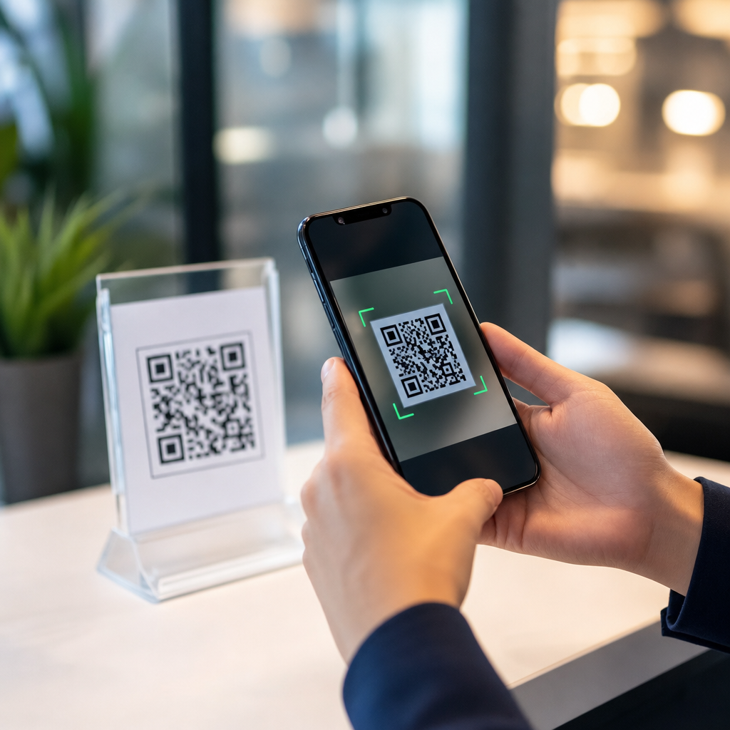
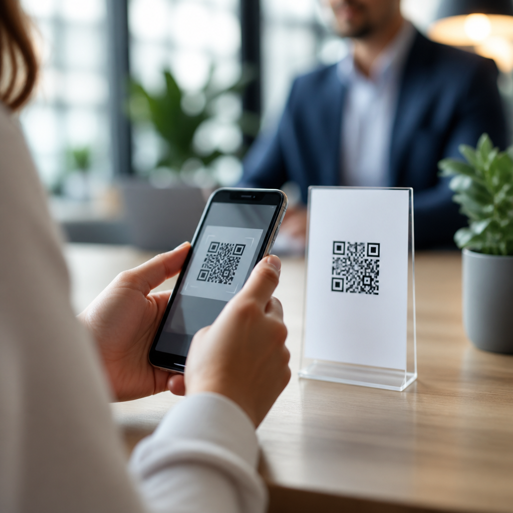
User experience and QR code trust signals shape whether people scan with confidence or hesitate at the point of decision. In the security, privacy, and compliance work I have done around campaigns, menus, labels, event badges, and payment flows, the pattern is consistent: the technical safety of a QR code matters, but the user’s perception of safety often determines adoption first. A trust signal is any visible or contextual cue that helps a person judge legitimacy, intent, and risk before and after scanning. User experience is the sum of those cues across design, placement, destination, disclosure, and follow-through. When these elements align, scan rates rise, complaints fall, and compliance becomes easier to maintain.
This topic matters because QR codes compress a lot of uncertainty into a tiny square. A user cannot read the destination with the naked eye, cannot infer data handling from the pattern, and often scans while distracted, mobile, or under time pressure. That makes trust and transparency central design requirements, not marketing extras. A restaurant guest deciding whether to open a digital menu, a patient checking in at a clinic, or a shopper validating a product all ask the same questions: Where will this take me? Why am I being asked to scan? Is this official? What data will be collected? Can I back out safely? Strong answers to those questions create measurable business value while reducing fraud exposure.
Trust signals for QR codes include branded domains, clear labels, recognizable logos, secure transport through HTTPS, concise privacy disclosures, predictable landing pages, and visible fallback options such as printed URLs or customer support numbers. Transparency means telling users what the scan does before they scan and what happens next after they arrive. It also means avoiding dark patterns, excessive permissions, and misleading redirects. As a hub topic, user trust and transparency connects to adjacent concerns such as tamper resistance, phishing prevention, consent management, accessibility, mobile performance, and records needed for legal review. If an organization treats QR codes as a full user journey rather than a graphic asset, it can turn a common point of friction into a reliable channel.
Why trust breaks down in QR experiences
Trust breaks down when the code asks for action before it earns belief. In field audits, I most often see five causes. First, the code appears in a suspicious context, such as an unbranded sticker placed over original signage. Second, the surrounding copy is vague, using lines like “Scan me” without naming the destination or benefit. Third, the linked page looks inconsistent with the brand, loads slowly, or redirects through multiple domains. Fourth, the experience requests sensitive information too early, such as login credentials, card details, or document uploads on the first screen. Fifth, there is no fallback path for users who prefer not to scan. Each of these failures increases cognitive load and makes a legitimate code resemble a phishing lure.
Attackers exploit exactly those weak points. QR phishing, often called quishing, replaces or imitates trusted codes to drive victims to credential harvesting pages, malware downloads, or fraudulent payment requests. The FBI and other agencies have repeatedly warned about malicious QR codes in public spaces and on invoices. Yet not every trust failure involves criminal activity. Some are operational. I have seen event teams print codes that resolve to generic URL shorteners, retail stores place codes in low-light windows where camera autofocus struggles, and healthcare practices route patients to mobile forms that omit privacy disclosures required by policy. None of those teams intended harm, but the result was the same: hesitation, abandonment, and service desk strain.
The practical lesson is that user trust cannot be bolted on after deployment. It must be designed into the entire QR interaction, from physical environment through confirmation screen. Organizations that map the journey step by step usually uncover basic gaps fast. For example, if a code initiates payment, users need to know the amount, merchant identity, and confirmation process before they authorize anything. If a code opens Wi-Fi access or app installation, users need stronger legitimacy cues because the perceived risk is higher. Matching the strength of the trust signal to the sensitivity of the action is one of the most important principles in this area.
Core trust signals users recognize before scanning
Before scanning, users evaluate visual and contextual clues in seconds. The strongest pre-scan trust signal is official placement. A code printed directly onto packaging, professionally integrated into signage, or embedded in tamper-evident materials inspires more confidence than a random sticker. Branding also matters. A known company name, logo, and campaign label near the code help users connect the scan to an expected experience. In stores, I advise teams to add a short human-readable destination line, such as “Opens nike.com size guide” or “View ingredient details at brandname.com,” because stating the destination lowers uncertainty immediately.
Instruction quality is another major factor. “Scan to pay invoice 1048 at acme.com/pay” is far better than “Scan now.” Specificity signals control. Time-bound context helps too: “Valid through September 30” or “Use at check-in desk only” tells the user the code belongs in a legitimate workflow. For regulated sectors, disclosures can be brief but precise. A clinic might say, “Scan to complete pre-visit forms securely on clinicname.com.” That sentence communicates purpose, destination ownership, and the expectation of personal data collection without overwhelming the user with legal text.
Trust also depends on physical integrity. Torn posters, crooked labels, and signs with multiple competing codes create suspicion. Staff behavior matters as much as graphics. When employees can explain what the code does and offer a non-scan alternative, people perceive the organization as accountable. That accountability is itself a trust signal. The table below summarizes the cues I have found most influential in production environments.
| Trust signal | What the user infers | Good implementation | Common failure |
|---|---|---|---|
| Branded placement | The code belongs to the organization | Printed within official packaging or signage | Loose sticker covering existing content |
| Named destination | The scan has a predictable outcome | “Opens brandname.com/warranty” | No explanation beyond “Scan me” |
| HTTPS landing page | Connection is encrypted | Browser shows secure site on first load | Redirect chain through unknown domains |
| Privacy disclosure | Data handling is acknowledged | Short notice before form submission | Collecting personal data with no notice |
| Fallback option | The user retains control | Short URL, phone number, or staffed help desk | Scan-only process for essential tasks |
Transparency after the scan: landing pages, consent, and disclosure
Once a user scans, the landing page must confirm that the trust they extended was justified. The first screen should repeat the brand identity, clearly state the purpose, and avoid surprise redirects. If the code opened a coupon, show the offer immediately. If it started registration, show the event or service name and the expected completion time. People use these cues to verify continuity between the physical object and the digital destination. A mismatch, even a small one like an unrecognized subdomain, can trigger abandonment.
Consent and disclosure should be proportionate to the task. For analytics-only scans, many organizations can rely on standard website notices, but if the flow collects personal, health, financial, or location data, more explicit notice is appropriate and often required by policy or law. A clean approach is layered transparency: a short plain-language explanation near the action button, with links to the full privacy notice, terms, and support. This respects user attention while preserving informed choice. In my experience, completion rates suffer less from honest disclosure than from hidden surprises discovered later.
Technical behavior also communicates trust. Fast load times, mobile-optimized forms, and limited permission requests tell users the organization is competent and considerate. Conversely, pop-ups asking for push notifications, camera access unrelated to the task, or app-download detours create alarm. Browser previews and native camera warnings vary by device, so teams should test iPhone and Android flows separately. A trustworthy QR experience minimizes redirects, maintains one recognizable domain family, and avoids collecting any data that is not necessary for the stated purpose.
Designing QR journeys that feel safe and usable
Safe design is usable design. QR interactions usually happen on mobile devices, often one-handed and in variable lighting, network, and attention conditions. That means the basics matter: sufficient code size, strong contrast, quiet zones around the symbol, and placement where the camera can focus without glare. ISO/IEC 18004 defines QR code symbology requirements, and while many campaign teams never read the standard, they benefit from following its practical implications. A code that is hard to scan already feels risky because users are forced to retry, move closer, or question authenticity.
Clarity should continue in the interface. Use page titles that match the physical context, prominent primary actions, and short forms with progressive disclosure. If identity verification or payment is necessary, say so early. If there is any cost, make it explicit before the user commits. Accessibility supports trust as well. High contrast text, readable font sizes, descriptive link labels, and compatibility with screen readers reduce exclusion and demonstrate care. I recommend treating the non-scanner path as a first-class experience rather than a reluctant backup. A printed short URL, NFC alternative, or staffed kiosk can preserve access for users with older phones, disability-related barriers, or justified caution.
Monitoring completes the design loop. Teams should review scan analytics alongside bounce rates, completion rates, support tickets, and fraud reports. A sudden drop in conversion from a specific physical location can indicate tampering, poor placement, or a broken redirect. Version control for destinations, approval workflows for edits, and periodic inspections of printed materials are not glamorous tasks, but they protect the trust earned at launch. The best programs treat QR trust signals as an operational discipline shared by marketing, security, legal, and customer experience teams.
Building a governance model for user trust and transparency
A hub page on user trust and transparency should connect policy to execution. Governance starts with ownership: someone must approve QR use cases, someone must manage domains and redirects, and someone must review privacy language and records retention. Without clear ownership, teams improvise. That is how temporary campaign codes become permanent customer channels with weak controls. I have had the most success with a lightweight intake process that asks seven questions before publication: What is the purpose? Where will the code appear? What domain will open? What data is collected? What notice is shown? What fallback exists? How will tampering and performance be monitored?
Those questions create a repeatable standard that scales across departments. Security teams can require HTTPS, domain allowlisting, and redirect restrictions. Privacy teams can specify when consent banners, collection notices, or data minimization reviews are needed. Brand teams can enforce visible naming and logo standards. Operations teams can define inspection intervals for high-risk locations such as public posters, parking meters, and payment desks. This is especially important for dynamic QR codes, which are useful because destinations can be updated without reprinting, but also increase governance risk because a trusted physical asset can later point somewhere new.
Training matters too. Frontline staff should know how to identify tampering, explain official scan destinations, and help users choose alternatives. Customers notice when employees answer confidently. Finally, document the inventory. A maintained register of active QR codes, owners, destinations, creation dates, and retirement dates makes audits possible and incident response faster. If your organization relies on QR codes for engagement, payments, support, or compliance tasks, strengthen the trust layer now: review every code from sign to screen, remove ambiguity, and make transparency visible at each step.
Frequently Asked Questions
What are QR code trust signals, and why do they matter so much for user experience?
QR code trust signals are the visual, contextual, and behavioral cues that help a person decide whether a code is legitimate before they scan it. In practice, these signals can include recognizable branding, a clear call to action, a short explanation of what happens after scanning, placement in a credible environment, tamper-evident printing, and a landing page that matches the promise made offline. They matter because most people do not evaluate QR codes through a technical lens first. They evaluate them through perception. If a code looks out of place, appears generic, lacks context, or sends users to an unexpected destination, hesitation rises immediately.
From a user experience perspective, trust is often the first conversion step. Even if a QR code is technically secure, poor presentation can suppress scans because users feel uncertain about intent, privacy, or safety. That is especially true in high-stakes use cases such as payments, healthcare, event access, product authentication, restaurant menus, and compliance-driven environments. A well-designed trust experience reduces cognitive friction by answering key questions before the user has to ask them: Who is behind this code? Why should I scan it? What will happen next? Is this safe on my device? The stronger and more consistent those answers are, the more likely people are to engage with confidence.
How can businesses make QR codes look more trustworthy before the scan happens?
Trust begins before a smartphone camera is ever opened. The best way to make a QR code feel trustworthy is to surround it with enough useful context that the user does not have to guess its purpose. That means labeling the code clearly, naming the destination or action, and stating the benefit in plain language. For example, “Scan to view the official menu,” “Scan to verify product authenticity,” or “Scan to pay on our secure checkout page” performs much better than a bare code with no explanation. The more specific the instruction, the lower the uncertainty.
Visual consistency also matters. A QR code should appear within established brand design rather than floating on a sign, label, badge, or package with no identifying markers. Recognizable logos, official colors, quality printing, and a professional layout all support legitimacy. Placement plays a major role as well. Users are more likely to trust codes displayed in controlled, expected locations than codes added with stickers, taped inserts, or inconsistent formatting. In environments where tampering is a risk, businesses should use materials and mounting methods that make unauthorized replacement obvious. Finally, trust should continue after the scan with a destination URL, domain, and landing page experience that aligns with what was promised offline. If the on-page experience feels mismatched, users quickly lose confidence, even if the pre-scan design was strong.
What information should be shown near a QR code to reduce hesitation and increase scan confidence?
The most effective QR code placements answer the user’s practical and emotional questions at the same time. At minimum, nearby text should explain what the scan does, who is providing it, and what the user can expect next. That might include the brand or organization name, the action being triggered, whether login or payment is involved, and whether any personal information will be collected. Even a brief line such as “Official event check-in for attendee badge activation” or “Secure payment link from Company Name” can dramatically improve confidence because it frames the interaction before the user evaluates risk on their own.
It is also helpful to set expectations about the destination. If the scan opens a website, app store listing, menu, form, video, or verification portal, say so directly. If a code initiates a sensitive process such as registration, account access, or payment, users benefit from reassurance about the official domain or secure processing method. In some contexts, a short privacy cue can make a meaningful difference, such as “No app download required,” “No account needed,” or “Your information is processed securely.” These signals reduce friction because they anticipate common objections. In short, the more relevant context you provide without cluttering the design, the easier it becomes for users to interpret the code as intentional, legitimate, and safe.
How do security, privacy, and compliance concerns affect trust in QR code campaigns and workflows?
They affect trust at every stage. Users may not use formal security terminology, but they are highly sensitive to anything that feels suspicious, invasive, or inconsistent. A QR code can raise concerns about phishing, malware, fraudulent payment redirection, data harvesting, or unauthorized tracking. In regulated or high-trust environments, those concerns expand to include privacy disclosures, consent, recordkeeping, brand accountability, and whether the workflow aligns with industry requirements. If a business ignores those dimensions, users often express that discomfort through avoidance rather than direct feedback. They simply do not scan.
From an operational standpoint, trust improves when organizations treat QR codes as part of a governed digital experience rather than as isolated graphics. That includes controlling where codes point, using official domains, monitoring redirects, validating campaign ownership, and ensuring that the destination pages are mobile-friendly, secure, and consistent with disclosed intent. Privacy and compliance cues matter because they support informed participation. If a scan leads to data collection, registration, authentication, or payment, users should not be surprised by what is requested. Clear disclosures, limited data collection, transparent permissions, and visible alignment between the physical prompt and the digital destination all reinforce legitimacy. In other words, good security and compliance practices do not just reduce technical risk; when they are made visible in the experience, they also strengthen user trust and increase adoption.
What are the most common mistakes that make users distrust QR codes, even when the destination is legitimate?
One of the biggest mistakes is providing no context at all. A standalone QR code with no explanation forces users to infer purpose and risk on their own, which increases hesitation. Another common problem is poor brand alignment. If the code appears on low-quality signage, in an unexpected location, or without recognizable visual identity, users may suspect it was placed there by a third party. Mismatch is another trust killer: if the code promises one thing but leads to a different page, requests unexpected information, or lands on a domain that does not look official, confidence drops fast. Even minor inconsistencies can create doubt in a moment where users are already making a rapid safety judgment.
There are also post-scan mistakes that damage trust retroactively. Slow-loading pages, intrusive pop-ups, confusing forms, forced app downloads, broken mobile layouts, and aggressive permission requests all make people feel that the initial scan may have been a mistake. In payment or identity-related flows, hidden fees, unclear next steps, or poor authentication cues are especially harmful. Another overlooked issue is failing to account for the physical environment. Codes placed where lighting is bad, signs are crowded, or tampering is easy can create both usability and legitimacy problems. The central lesson is simple: trust is not created by the QR code alone. It is created by the full chain of experience before the scan, during the scan, and after the scan. When any part of that chain feels ambiguous or inconsistent, users become more cautious, even if the final destination is technically valid.