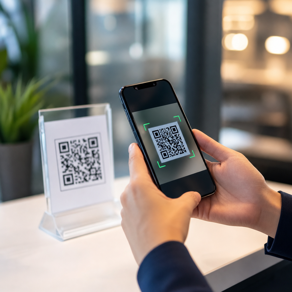

Should you explain what a QR code does before scanning? In most business, healthcare, education, and public-service settings, yes. A clear explanation improves user trust, reduces hesitation, lowers support requests, and helps people make an informed choice before they point a camera at a code. In my work reviewing QR journeys for retailers, clinics, event venues, and internal IT teams, the strongest programs never treat the scan as self-explanatory. They tell people what will happen next, why the code is there, what data may be collected, and whether scanning is optional.
A QR code is a machine-readable matrix barcode that usually opens a link, launches an app action, starts a download, fills in structured text, joins a network, or triggers a payment flow. The code itself is not the destination; it is a shortcut to an action. That distinction matters because users cannot inspect a QR code visually the way they can read a printed URL. Transparency, in this context, means giving enough context before the scan so the person understands the purpose, expected result, and any meaningful risk. User trust is the confidence that the scan will do what the organization claims, without hidden tracking, deceptive redirects, or unsafe content.
This question matters because QR codes sit at the intersection of convenience and uncertainty. Adoption is high, but so is caution. People have learned to be wary of phishing, fake parking codes, malicious sticker overlays, and payment fraud. Regulators and accessibility standards also push organizations toward clearer disclosure, consent, and informed participation. A sign that simply says “Scan me” asks for trust without earning it. A sign that says “Scan to view today’s menu on our website; no app required” is far more usable and credible. For any organization building a durable QR code strategy, explaining what a QR code does before scanning is not a cosmetic extra; it is the foundation of transparent design.
Why pre-scan explanation directly affects trust and scan rates
People decide whether to scan in seconds. In usability tests I have run, the first question is almost always practical: “What happens if I scan this?” If the answer is obvious and low risk, scans rise. If the purpose is vague, many users ignore the code entirely. This is especially true in locations where users feel time pressure, such as transit stations, checkout counters, hospitals, and conference entrances. Uncertainty creates friction, and friction lowers conversion.
Explaining the outcome before scanning works because it removes ambiguity. Users want to know the destination, value, and effort required. A short label like “Scan to download the warranty PDF” tells them the destination is a document, the value is product support, and the effort is minimal. Compare that with a bare code on packaging. The unlabeled version forces the user to guess whether the code is for registration, tracking, marketing, or troubleshooting. Good disclosure raises confidence because the stated purpose can be checked against the actual result after the scan.
Pre-scan explanation also helps manage expectations after the camera opens the link. If a restaurant says “Scan to open our mobile menu,” users expect a menu, not a pop-up asking them to create an account. If a museum placard says “Scan to hear a two-minute audio guide,” visitors expect quick audio playback, not a five-step consent banner and a large app download. Trust drops sharply when the post-scan experience exceeds the stated scope. Clear wording before the scan therefore acts as a promise that the landing page must keep.
There is a measurable operational benefit too. Teams that explain QR outcomes usually see fewer “Where does this go?” support questions and less abandoned traffic. In retail and service environments, that means fewer interruptions for staff. In internal workplace settings, it means fewer help desk tickets from employees confronted with unlabeled codes for Wi-Fi, device enrollment, or policy forms. Transparency saves time because users are not forced to test unknown actions.
What users need to know before they scan
The right explanation is concise, but it should cover the facts a reasonable person needs to decide. In practice, that usually means five elements: purpose, destination, data implications, whether the action is optional, and what to expect on the device. Purpose answers why the code exists. Destination states what opens, such as a webpage, PDF, payment page, app store listing, calendar event, or messaging channel. Data implications explain whether the organization may log analytics, location approximation, or form data. Optionality tells users if there is another way to complete the task. Device expectations clarify whether an app, login, camera permission, or internet connection is needed.
Plain language matters more than legal phrasing. “Scan to check in for your appointment” is better than “Scan for digital intake workflow initiation.” Specificity matters too. “Scan to pay your parking session on cityparking.example.gov” is stronger than “Scan to pay.” The more sensitive the action, the more detail users need. Payment, identity verification, document signing, medical forms, and account login all require stronger pre-scan context than a poster linking to a playlist.
For high-trust environments, include the brand or domain in the explanation. A line such as “Opens secure.northclinic.org to complete pre-visit forms” gives users a domain they can verify after the scan preview appears. Many modern phone cameras show a URL preview before opening; that preview becomes meaningful only if the user already knows what domain to expect. This simple technique is one of the strongest defenses against QR phishing because it trains people to compare claim and destination.
Accessibility belongs in the explanation strategy as well. Some users cannot scan easily due to vision, motor, or device limitations. If the QR code is necessary for access to information or service, provide a short URL, NFC alternative, staffed assistance, or printed instructions nearby. Transparency is not complete if the code explains the action but still excludes users who cannot perform it.
When explanation is essential, optional, or legally sensitive
Not every QR code needs the same level of explanation, but some contexts demand it. It is essential when the scan involves money, personal data, health information, identity, employment records, age-restricted content, or binding consent. In these cases, users should know not just the immediate action but the consequences. “Scan to submit insurance details for today’s visit” sets a different expectation than “Scan for clinic information.” Likewise, “Scan to sign your delivery confirmation” clearly signals a formal act, not a casual page visit.
Explanation is also essential in public spaces prone to tampering. Parking meters, utility payment kiosks, apartment lobbies, and event posters are common targets for sticker replacement scams. A trustworthy sign should state the official operator, expected domain, and support contact. For example, “Official city parking payment. Opens pay.townname.gov only. Support: 555-0100.” That wording gives the user three verification signals before any payment page opens.
In lower-risk settings, explanation may be shorter but still useful. A café menu, product video, or campus map can rely on a brief action statement. The standard should be simple: if a person would reasonably want to know what opens, say it. The burden is low, and the usability gain is high.
Legally sensitive situations require coordination with privacy, compliance, and counsel. Healthcare organizations may need to consider HIPAA-adjacent workflow design, even if the QR code itself is only a link. Schools need to think about student privacy and parental expectations. Employers should explain whether scanning a code for training, attendance, or device setup results in monitoring or record creation. The principle is consistent across sectors: if the scan starts a regulated or consequential process, disclose that plainly before the action begins.
How to design transparent QR prompts that people actually follow
The best QR prompt is short, specific, and visibly connected to the code. Put the explanation directly above or beside the code, not in fine print far away. Lead with the action and benefit: “Scan to see ingredient details and allergy information.” Then add the operational detail: “Opens our website; no app required.” If needed, add trust cues such as the domain, brand logo, and support channel. This structure mirrors how people evaluate risk: what is it, why should I do it, and can I verify it?
Placement and environment matter. On a crowded poster, a QR code competes with every other visual element. On product packaging, glare and curve can make scanning harder, so the label must work even when the code is partially obscured. In clinical settings, the explanation should be readable from standing distance and should not force patients to decode tiny legal text while stressed. I recommend treating the explanatory line as part of the functional interface, not as marketing copy.
Consistency across channels helps too. If your website says mobile ordering happens at order.brand.com, in-store QR materials should use the same language. If your security awareness training tells employees to verify domains before scanning, your internal codes should consistently display those domains. Trust is cumulative; each clear interaction makes the next one easier.
| Context | Weak prompt | Strong prompt |
|---|---|---|
| Restaurant | Scan me | Scan to view today’s menu on bistroexample.com. No app required. |
| Clinic | Patient QR | Scan to complete pre-visit forms at secure.northclinic.org. Approx. 3 minutes. |
| Parking meter | Pay here | Official city parking payment. Opens pay.townname.gov only. |
| Product box | Learn more | Scan to download the setup guide PDF and warranty terms. |
| Workplace IT | Onboard device | Scan to enroll your company phone in Microsoft Intune. Corporate login required. |
Avoid dark patterns. Do not imply the code performs one action and then route users into another, such as claiming “Scan for receipt” but landing on a lead-generation form. Do not hide account creation requirements, subscription terms, location collection, or payment steps. If those elements are part of the journey, state them. Transparency is not just polite; it is the practical basis for trust retention.
Security, privacy, and compliance implications of explaining QR behavior
Explaining what a QR code does before scanning is one of the simplest security controls available because it gives users a reference point. When the phone preview shows a different domain, asks for an unexpected download, or requests unusual permissions, the mismatch is immediately visible. Without a pre-scan explanation, users have no baseline for detecting deception. This matters because QR-based phishing, sometimes called quishing, relies on the user not knowing what should happen.
Privacy is closely tied to expectation setting. A QR code that opens a landing page with analytics is common and usually low risk, but a QR code that preloads a form requesting name, email, location, or health details changes the privacy profile. Users should know that before they scan. In many jurisdictions, notice and consent obligations depend on the type of data collected and the purpose of processing. Even where the law does not mandate a particular label format, concise disclosure reduces complaints and strengthens defensibility.
Compliance teams should map QR use cases to existing policies for notices, retention, acceptable use, records, and vendor management. If the code points to a third-party form builder, payment gateway, or app store, that is not a trivial implementation detail; it affects vendor disclosure and risk review. If scan analytics are tied to campaign attribution, be careful not to overstate anonymity. Device type, timestamp, referral parameters, and approximate location can still create a meaningful data trail. Honest language beats broad reassurance.
There is also a brand-security angle. When customers encounter an unlabeled QR code and something feels off, they often blame the brand even if the issue comes from tampering or a third-party redirect. Clear explanation, visible domains, anti-tamper checks, and monitored redirects reduce that exposure. Transparency before the scan and integrity after the scan are two halves of the same control system.
Building a hub strategy for user trust and transparency around QR codes
As a hub topic within QR code security, privacy, and compliance, user trust and transparency should connect policy, design, and measurement. Start with standards: require every public-facing QR code to state purpose, expected domain, and whether an app or login is required. For sensitive workflows, require a privacy notice link, support contact, and non-QR alternative. Add review gates so security, privacy, legal, accessibility, and brand teams can approve high-risk deployments before print or publication.
Then build supporting guidance for the specific questions teams repeatedly face. Examples include how to label payment codes, how to disclose analytics, how to present short URLs alongside QR codes, how to detect sticker tampering, and how to write pre-scan copy for healthcare, education, retail, and workplace uses. This hub should anchor those deeper articles because transparency is not a single tactic; it is the design principle that shapes all of them.
Measurement should go beyond raw scan volume. Track completion rate, bounce rate, support contacts, suspicious-activity reports, consent acceptance where relevant, and user feedback about clarity. In my experience, improving the explanatory copy often increases not just scans but qualified scans: fewer accidental opens, fewer abandonments, and better downstream completion. That is the real win. A transparent QR journey attracts users who understand the value and trust the process enough to continue.
Teams should also maintain a QR inventory. Record owner, purpose, destination URL, creation date, physical location, expiry, and review cadence. This inventory supports transparency because outdated or repurposed codes are a trust risk. A code originally deployed for event registration should not quietly redirect months later to a generic marketing page. Stable intent matters. Users remember when a code does what it promised, and they remember even more when it does not.
The answer is straightforward: in most cases, you should explain what a QR code does before scanning, and in sensitive contexts you absolutely must. A QR code is a shortcut to an action the user cannot see in advance, so trust depends on context. When you state the purpose, expected destination, data implications, and any special requirements, you reduce uncertainty and make the experience safer, clearer, and more accessible.
For organizations, the benefit is broader than etiquette. Transparent QR design improves conversion quality, helps users spot fraud, supports privacy and compliance goals, and protects brand credibility. It also creates a repeatable standard your teams can apply across posters, packaging, forms, payments, onboarding, and public signage. The strongest QR programs do not ask people to scan on faith. They give them a reason, a verification path, and a fair choice.
If you manage QR codes at scale, audit every live code this month. Add a plain-language explanation, show the expected domain, provide a non-QR alternative where needed, and review sensitive flows with security and privacy stakeholders. That one step will make your QR experience more trustworthy before the camera even opens.
Frequently Asked Questions
Should you explain what a QR code does before asking someone to scan it?
Yes, in most cases you should. A QR code may look simple, but the action behind it is not always obvious to the person holding the phone. They may wonder whether the code opens a website, starts a download, checks them in, collects personal information, launches payment, or redirects them somewhere unexpected. A short explanation removes that uncertainty. It tells people what to expect before they commit to the scan, which makes the interaction feel more transparent and trustworthy.
In practical terms, explaining the purpose of the code improves performance. People are more likely to scan when they know the outcome, especially in settings like healthcare, education, retail, government, events, and internal workplace communications. A clear line such as “Scan to view the menu,” “Scan to confirm your appointment,” or “Scan to download the safety guide” gives context immediately. That context reduces hesitation, lowers the chance of abandonment, and helps users make an informed choice instead of guessing. The best QR experiences never assume the scan is self-explanatory; they tell people what will happen next and why it is worth doing.
What should you tell people before they scan a QR code?
The most effective explanation covers three things: what the scan does, what the user gets, and whether there are any important conditions. Start with the action. For example, tell people whether the code opens a webpage, signs them in, starts a payment process, downloads a file, launches a form, or displays contact details. Then explain the benefit. Why should they scan? Maybe it saves time, gives them event tickets, shows instructions, unlocks a discount, or lets them access a patient intake form. Finally, include any relevant caution or expectation, such as whether internet access is required, whether they will be asked for personal details, or whether the code works only during a specific time window.
This does not need to be long. In many cases, one or two sentences are enough. For example: “Scan to view today’s class materials in your browser. No app download required.” Or: “Scan to pay your parking fee securely online.” That kind of wording is simple, direct, and reassuring. It reduces confusion and gives people a reason to engage. If the scan leads to something more sensitive, such as medical information, registration, or payment, the explanation should be even more explicit so users understand the purpose before they proceed.
Why does explaining a QR code improve trust and reduce support issues?
Because uncertainty creates friction. When people are not sure what a QR code does, many will pause, ignore it, or ask someone for help. Others may scan but then back out once they see an unexpected page or prompt. That hesitation is not a minor usability issue; it directly affects completion rates, user confidence, and the volume of support questions your team receives. A brief explanation acts as a form of guidance and consent. It tells users what to expect, which makes the experience feel deliberate rather than ambiguous.
From an operational perspective, this matters a lot. In customer-facing environments, vague QR placement often leads to repeated questions like “What is this for?” or “Is this safe?” In internal settings, employees may avoid scanning entirely if they think it could trigger a login problem, app install, or security risk. In healthcare and public-service contexts, lack of explanation can be even more damaging because users may already feel stressed, rushed, or cautious about sharing information. Clear instructions reduce these pain points. They help the right people complete the intended action faster and allow staff to spend less time clarifying basic next steps.
Are there any situations where you do not need to explain what a QR code does?
There are a few limited cases where the need for explanation is lower, but even then, some context usually helps. If the QR code appears in a highly familiar environment with a very obvious purpose, users may already understand the expected action. For example, a restaurant menu code placed on a table, a boarding pass code used by staff, or a conference badge code for check-in may feel self-evident to many people. Even in those examples, though, a small label such as “Scan for menu” or “Scan for session schedule” still improves clarity and accessibility.
The key question is not whether some people can guess the purpose. It is whether all intended users can understand it quickly and confidently. Audiences differ in age, technical comfort, language fluency, visual ability, and familiarity with QR code behavior. What feels obvious to one group may be unclear to another. That is why strong programs default to explanation rather than assumption. A few words of context rarely hurt performance, but a lack of context often does. If the scan leads to anything involving personal data, account access, transactions, or compliance-related content, explanation should be treated as essential, not optional.
What is the best way to present instructions next to a QR code?
The best approach is to pair the code with a short, visible instruction written in plain language. Place the explanation close enough to the code that users see it before scanning. Lead with a verb so the purpose is immediately clear: “Scan to register,” “Scan to watch the demo,” “Scan to report an issue,” or “Scan to access discharge instructions.” If helpful, add a second sentence that clarifies what happens next or what the user needs, such as “Opens in your browser,” “Takes less than two minutes,” or “You will be asked to enter your email.” This keeps expectations aligned and reduces confusion after the scan.
Good presentation also depends on readability and environment. Make sure the text is large enough to read at the likely scanning distance, and avoid burying the instruction in dense surrounding copy. In busy physical spaces like clinics, stores, campuses, or event venues, users often decide within seconds whether to engage. The instruction should therefore be scannable in both senses: easy to notice and easy to understand. If the audience may need reassurance, include trust signals such as a branded landing page reference, secure payment note, or privacy cue. The goal is simple: before a person points their camera at the code, they should know what the scan does, why it matters, and what to expect next.