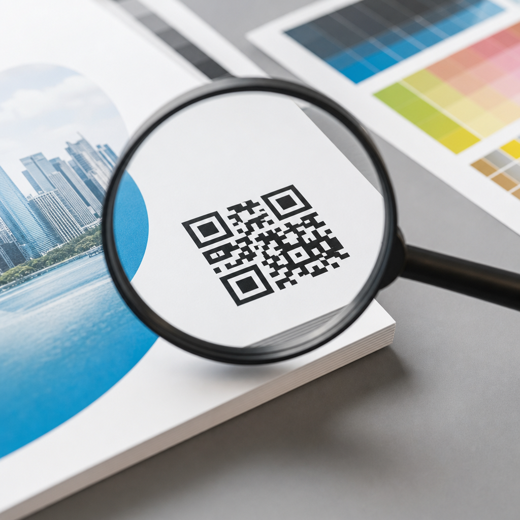
Resolution requirements for QR codes in print determine whether a scan works instantly or fails at the worst possible moment. In print, “resolution” means the amount of image detail available to reproduce the square modules that make up a QR code, while “print size” refers to the physical dimensions of the code on paper, packaging, signage, or labels. The closely related concept is scanning distance: the farther away a person stands, the larger the code must be. These terms matter because QR codes are not decorative graphics. They are machine-readable symbols with strict tolerance limits, and small production mistakes can make a code unreadable even when it looks sharp to the human eye.
I have prepared QR codes for brochures, retail packaging, direct mail, event signage, menus, and window decals, and the pattern is always the same: digital-first thinking causes print failures. A code that performs well on a phone screen can break when scaled, compressed, trapped into a busy layout, or printed on textured stock. Print introduces variables that screens do not, including ink spread, substrate absorbency, lighting conditions, viewing angle, and damage during handling. That is why resolution requirements for QR codes in print cannot be reduced to a single DPI number. Good results depend on the relationship between code version, module size, error correction level, contrast, and final use case.
This article serves as a hub for print vs digital design considerations within QR code design and branding. It explains what resolution actually means for QR production, how print workflows differ from digital display, what minimum sizes are practical, and how to choose formats, colors, and testing methods. If you are designing a business card, catalog, poster, product label, or storefront decal, the goal is simple: produce a branded QR code that remains reliably scannable after export, printing, finishing, and real-world use. That reliability protects campaign performance, customer trust, and the value of every printed piece.
Why print QR codes follow different rules than digital QR codes
Digital QR codes benefit from controlled rendering. On a screen, edges remain crisp, contrast is usually high, and the display does not absorb ink or distort fine detail. Print behaves differently. Offset printing can introduce dot gain, thermal printing can soften edges, inkjet output can feather on porous stock, and large-format printing may be viewed from several feet away. A QR code that looks mathematically correct on a monitor may lose module definition when reproduced physically. That loss affects the finder patterns in three corners, the alignment pattern in larger versions, the timing pattern, and the quiet zone that scanners rely on for detection.
The most important shift in mindset is this: printed QR code success depends more on module size than nominal image resolution. A 300 DPI bitmap can still fail if the modules are too small for the press and viewing conditions. Conversely, a vector QR code can scale cleanly, but it can still fail if the final printed modules are undersized or low contrast. In practice, I treat vector output as the default for commercial print because it preserves edge sharpness at any scale, then I validate the physical module size against the production method. For raster output, I usually avoid anything under 300 DPI at final size, and I prefer 600 DPI or higher for small labels and packaging where press variability is greater.
Digital layouts also tolerate animation, glow effects, gradients, and low-contrast color treatments better than print does. On paper, subtle branding decisions can erase scan reliability. The printed environment adds reflection from lamination, glare from overhead lights, wrinkles in folded mailers, and abrasion on shipped packaging. Those are not edge cases. They are standard production realities, which is why print QR codes must be designed with more margin for error than digital QR codes.
Core resolution requirements: module size, print size, and DPI
The cleanest way to set resolution requirements for QR codes in print is to start with module size. A QR code is a grid of square modules. Version 1 contains 21 by 21 modules, and each higher version adds four modules per side. As content increases, the grid becomes denser, which means each module gets smaller at the same printed size. That is why short URLs and dynamic QR codes are usually better for print: they reduce data density and allow larger modules.
A practical baseline for close-range print is a module size of at least 0.4 mm, with 0.5 mm to 0.8 mm providing safer performance across varied devices and printing methods. For tiny applications such as vial labels or compact cosmetic packaging, 0.3 mm can work under controlled conditions, but it leaves little tolerance. A common rule for overall size is a scanning distance ratio of about 10:1, meaning the QR code should be roughly one tenth of the expected scanning distance. If a poster is scanned from 100 cm away, a 10 cm code is a reasonable starting point. That rule is not absolute, but it is dependable for planning.
DPI still matters because raster images need enough pixels to render each module clearly. As a working benchmark, each module should have multiple printed dots or pixels across it. For standard commercial print, 300 DPI at final size is generally acceptable when the QR code is not extremely small and the data density is moderate. For high-density codes, small labels, or variable print conditions, 600 DPI is safer. Newspaper stock, corrugated packaging, and thermal labels may require larger modules rather than simply higher DPI because the substrate and print process become the limiting factors.
| Use case | Typical scan distance | Recommended code size | Preferred format | Notes |
|---|---|---|---|---|
| Business card | 15–30 cm | 20–25 mm | Vector or 600 DPI raster | Keep URL short and maintain high contrast |
| Product label | 10–25 cm | 15–25 mm | Vector preferred | Watch for curved surfaces and gloss |
| Brochure or flyer | 20–50 cm | 25–35 mm | Vector or 300 DPI raster | Allow generous quiet zone near folds |
| Poster | 50–150 cm | 50–120 mm | Vector | Design for off-angle scanning in public spaces |
| Storefront or event sign | 1–3 m | 100–300 mm | Vector | Account for glass reflections and lighting |
These numbers are starting points, not guarantees. The more styling you add, the more conservatively you should size the code. If a campaign is important, print a proof at actual size and test it with several phones before approving the run.
Print production factors that affect scannability
Print process has a direct effect on QR code readability. Offset presses can hold detail well, but uncoated paper may still spread ink and reduce module separation. Digital toner presses often produce crisp edges, though some devices create uneven density on dark fills. Flexographic printing on packaging can distort small squares, especially on film or corrugated materials. Thermal transfer and direct thermal printing are common for logistics labels, but they are sensitive to heat settings, ribbon quality, and printer calibration. When people ask for a universal minimum size, this production variability is why the answer must be conditional.
Substrate matters just as much as the press. Gloss coatings and laminates can reflect light into the camera, making detection harder. Textured paper can break up edges. Metallic films, transparent labels, and kraft materials reduce contrast or create inconsistent backgrounds. Curved containers introduce geometric distortion; a code wrapped around a narrow bottle can become difficult to scan even when technically large enough. In those cases, moving the code to a flatter panel is often more effective than increasing DPI alone.
Quiet zone is another frequent failure point. A QR code needs a clear margin around all four sides, typically at least four modules wide. Designers often invade that space with copy, borders, die lines, or background patterns. Scanners use the quiet zone to separate the symbol from surrounding content. When it is compromised, the code may fail intermittently, which is worse than failing consistently because the issue is harder to detect during review.
Finishing operations deserve attention too. Varnish, embossing, foil, folding, perforation, and shrink wrapping can all interfere with scanning. I have seen beautiful package designs fail because a matte varnish reduced contrast just enough, or because a fold line crossed the timing pattern. The safest approach is to reserve a flat, high-contrast area, keep the code away from seams and curves, and test after finishing, not just before press.
Designing branded QR codes for print without sacrificing performance
Branding a QR code for print is possible, but the print environment rewards restraint. The safest branded treatments are color changes that preserve strong luminance contrast, simple frame devices that stay outside the quiet zone, and landing-page branding rather than aggressive symbol modification. Dark code on a light background remains the most reliable approach. Black on white is ideal, but dark navy, charcoal, or deep brand colors usually work if the background stays very light and even. Reversed codes, where the modules are light on a dark field, can scan on modern phones, yet they are less dependable in print because reflections and ink density variations reduce edge clarity.
Logos in the center are often acceptable when error correction is set appropriately and the obstruction does not cover critical patterns. However, higher error correction increases density, which can force the modules smaller. That is the tradeoff many teams miss. If you add a logo, rounded modules, custom eyes, or decorative backgrounds, compensate by enlarging the printed code and simplifying the encoded data. Dynamic QR codes are especially useful here because they usually encode a shorter redirect URL rather than a long destination address, preserving design flexibility.
I recommend keeping cosmetic changes away from the finder patterns and testing on midrange Android devices as well as recent iPhones. Premium phones handle marginal codes better, but real audiences use a mix of camera quality, software, and lighting conditions. In print branding projects, reliability is the brand experience. A code that matches the palette but fails on older devices damages trust more than a plain code ever will.
Best practices for print vs digital design considerations across channels
Print vs digital design considerations come down to context of use. On digital screens, QR codes can be smaller because the device displays clean edges and viewers often scan from close range. File size matters more online, so PNG or SVG formats are common, and motion or hover treatments may be acceptable in supporting graphics. On print, file efficiency is secondary to physical performance. Vector PDF, EPS, or SVG placed correctly in the layout is usually best, especially for signage and packaging that may be resized during production.
Another difference is failure recovery. If a digital QR code underperforms, you can often replace the asset quickly. Printed materials are less forgiving. A mistake on 50,000 brochures or a nationwide packaging run becomes expensive immediately. That is why print should use approval gates that digital teams sometimes skip: preflight checks, output proofs, press checks for critical jobs, and post-finish scan testing. In my workflow, any printed QR code goes through four validation steps: verify destination, confirm final size, inspect quiet zone and contrast, then test from the expected user distance under realistic lighting.
Accessibility is also handled differently. On screen, you can support a QR code with clickable text, alt text, and surrounding interface cues. In print, you need plain-language instructions and a visible fallback URL when appropriate. A menu might say “Scan to view allergens,” while a trade show sign might add a short vanity URL for users who cannot scan from their angle. That small addition improves usability without cluttering the design.
Finally, campaign measurement shapes design choices. For print, dynamic QR codes enable destination changes and scan analytics without reprinting the symbol, which is invaluable for seasonal promotions, retail packaging, and event materials. But analytics only matter if the symbol scans consistently. Physical reliability comes first; measurement is the second layer.
Testing, troubleshooting, and quality control before printing at scale
Testing should happen at actual size, on the intended material whenever possible, and with multiple devices. On-screen previews are not meaningful substitutes for printed proofs. I test in bright office light, lower indoor light, and, for signage, near windows or outdoors. Distance matters, so I scan from the way a real user will approach the piece, not from a perfect angle at arm’s length. If a code is meant for a shelf talker, I test while standing. If it is on a mailer, I test while holding it naturally.
When a printed QR code fails, the cause usually falls into one of five categories: modules too small, insufficient contrast, compromised quiet zone, excessive styling, or physical distortion from production. The fix is correspondingly direct. Increase size, darken the code or lighten the background, restore the quiet zone, reduce custom elements, or relocate the code to a flatter and cleaner area. Re-encoding with a shorter URL also helps because it lowers symbol complexity. Tools such as Adobe Illustrator, InDesign preflight, printer proofing systems, and dedicated QR generators that export vector files all support better outcomes, but no software replaces physical testing.
For enterprise teams, I advise creating a simple print QR standard: approved formats, minimum sizes by use case, contrast rules, quiet-zone requirements, and a mandatory proof-and-scan checklist. That standard prevents repeated debate and lowers the risk of avoidable failures across packaging, retail, events, and direct mail.
Resolution requirements for QR codes in print are really about preserving scannability through the entire production chain. The critical variables are module size, final printed dimensions, contrast, quiet zone, substrate, and print method. DPI matters for raster files, but it is not the main decision point; physical module clarity is. Vector files, short encoded content, conservative branding, and proof testing give the best results across brochures, labels, posters, and signage. Digital design habits help, but print demands wider safety margins because paper, ink, coatings, curves, and lighting all introduce failure points.
If you manage QR code design and branding across channels, treat print as its own discipline rather than a simple export from screen-based artwork. Start with the scanning distance, choose a practical print size, preserve the quiet zone, keep contrast strong, and test the finished piece in real conditions. That approach protects campaign performance and makes every scan easier for customers. Use this page as your hub for print vs digital design considerations, then apply these standards consistently before your next production run.
Frequently Asked Questions
What does “resolution” mean for a printed QR code, and how is it different from print size?
In print, resolution refers to how much image detail is available to reproduce the tiny square modules that form the QR code. Those modules are the actual data pattern a phone or scanner must read, so their edges need to print cleanly and with enough contrast to remain distinct. Print size, by contrast, is the physical width and height of the finished QR code once it appears on paper, packaging, a poster, a product label, or any other printed surface. A code can be technically high resolution as a digital file but still fail in the real world if it is printed too small for the intended scanning distance. Likewise, a large printed code can still scan poorly if the file is low quality, blurry, compressed, or exported at insufficient detail.
The easiest way to think about it is this: resolution affects clarity, while print size affects usability at distance. Both must work together. A sharp vector QR code printed at an appropriate physical size usually performs best because vector artwork scales without losing edge definition. If a raster file such as PNG or JPEG is used, it needs enough pixel density for the final print dimensions so the modules do not soften or merge. For reliable scanning, what matters most is that every module is clearly reproduced, the quiet zone around the code is preserved, and the printed size matches how far away users will stand when they try to scan it.
What resolution should a QR code image be for print?
There is no single universal number that fits every situation, because the correct resolution depends on the final printed size and the complexity of the QR code itself. That said, standard print production guidance still applies: if you are using a raster image, 300 DPI at final print size is a strong minimum for most commercial printing. For very small labels, dense codes, or high-quality packaging where tiny modules must remain crisp, designers often aim higher to protect readability. If a QR code is scaled up from a low-resolution source, the module edges become soft or pixelated, which makes scanning less reliable even if the code looks acceptable at a glance.
The best practice is to use a vector format whenever possible, such as SVG, EPS, or PDF. Vector QR codes do not rely on fixed pixels, so they preserve sharp edges at nearly any output size. If your workflow requires raster artwork, export the code at the exact final dimensions or larger, never smaller, and avoid repeated resaving in lossy formats like JPEG. It is also important to remember that a “high-resolution” file alone does not guarantee success. If the code contains too much data, includes a logo that reduces clear module area, or is printed too small, even a 300 DPI asset may be difficult to scan. Resolution is necessary, but it is only one part of a scannable print QR code.
How large should a printed QR code be for different scanning distances?
As scanning distance increases, the QR code must also increase in physical size. This is one of the most important practical rules in print. A code on a business card or flyer may scan perfectly at a small size because the user holds it close to the phone. That same size would fail on a wall poster, window cling, trade show banner, or outdoor sign because people will try to scan from farther away. A commonly used rule of thumb is that the scanning distance should be no more than about ten times the width of the QR code. For example, if people are expected to scan from 20 inches away, a code around 2 inches wide is a sensible starting point. If they will scan from 10 feet away, the code needs to be substantially larger.
This rule is not absolute, but it is useful for planning. Real-world conditions such as phone camera quality, glare, motion, lighting, code density, and viewing angle all affect performance. A simple URL encoded into a low-density QR code can often scan from farther away than a dense code containing lots of characters. For close-use print pieces, many professionals treat around 0.8 x 0.8 inches as a practical minimum, while packaging and signage often require larger sizes for comfort and reliability. The smartest approach is to estimate realistic user behavior, choose a size based on expected distance, and then test printed samples in the actual environment rather than relying only on on-screen previews.
Can a QR code be too small or too detailed to print clearly?
Yes, and this is a very common cause of failed scans. Every QR code is made of modules, and as more data is stored, the code becomes denser by adding more modules. If that denser code is forced into a very small printed area, each individual module becomes tiny. At that point, normal printing limitations can interfere: ink spread, dot gain, substrate texture, low-quality office printers, flexographic variation, or slight registration issues may cause modules to fill in, blur together, or lose their crisp separation. Once those shapes stop being distinct, scanners struggle to decode the pattern quickly or at all.
This is why minimizing the amount of encoded data often improves print performance. A short URL usually produces a cleaner, less complex code than a long string of text or tracking parameters. It is also why preserving the quiet zone is essential. The blank margin around the QR code helps scanning software detect where the code begins and ends, and if that margin is reduced by nearby graphics, borders, or text, scan reliability drops. Adding logos, changing module shapes, or using decorative colors can also make a code harder to print and decode, especially at small sizes. If the application demands a compact code, simplify the content, print at high quality, and test the exact material, size, and finish before approving final production.
What are the best practices for making sure a printed QR code scans reliably?
The most dependable workflow starts with generating the QR code correctly, then preserving that quality through design, prepress, printing, and final testing. First, use a trustworthy QR code generator and keep the encoded content as short as practical to reduce module density. Whenever possible, place the code as vector artwork so it remains sharp at any size. Maintain strong contrast, ideally dark modules on a light background, and avoid busy textures, gradients, reflections, or transparent effects behind the code. Preserve the quiet zone on all sides, and resist the temptation to crowd the code with design elements that look attractive but interfere with detection.
Next, match the physical size to the real scanning distance. A code intended for hand-held scanning can be much smaller than one intended for in-store signage or public display. If raster artwork must be used, export at sufficient resolution for the final size, typically at least 300 DPI, and avoid low-quality compression. Also consider the print method and surface. Uncoated paper, corrugated packaging, metallic inks, glossy finishes, curved containers, and textured labels can all reduce scan performance. Finally, always test from printed proofs, not just digital mockups. Scan with multiple phones, under realistic lighting, and from the expected user distance and angle. The most important lesson is simple: successful print QR codes are not judged by how they look in a layout file, but by how quickly and consistently they scan in the real world.


