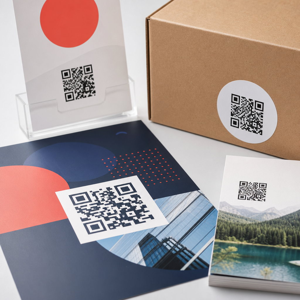
QR code design for flyers, posters, and packaging demands a different mindset than designing codes for screens, because ink, paper, distance, glare, curvature, and scanning context all change how reliably a code performs. In practice, the best printed QR code is not simply a branded square dropped into a layout; it is a scannable bridge between physical media and digital action, engineered around print production limits and real user behavior. That is why print vs digital design considerations matter so much within QR code design and branding. A code that scans perfectly in a design mockup may fail on a matte carton under store lighting, on a bus shelter poster viewed from several feet away, or on a folded flyer printed on an office copier. I have seen beautiful campaigns lose response because the code was too small, the contrast too low, or the landing page too heavy for mobile data. Good design prevents those avoidable failures.
For this topic, print design considerations refer to the physical variables that affect a QR code after it leaves the screen: substrate, print method, finishing, placement, viewing distance, and damage risk. Digital design considerations refer to how the same code appears in PDFs, social posts, email, in-app screens, and web pages, where pixel density, dark mode, responsive layout, and tap alternatives matter more than paper stock and bleed. The goal is not to treat print and digital as separate worlds, but to design a QR system that stays recognizable, branded, and functional across both. Flyers, posters, and packaging are the core use cases because they represent three very different scanning environments: hand-held, at-distance, and object-based. If you understand their constraints, you can build codes that look on-brand, scan fast, and support measurable campaign performance.
What changes when a QR code moves from screen to print
The most important difference is that print introduces irreversible production variables. On screen, a QR code is rendered from vector or high-resolution assets and viewed with clean contrast. In print, dot gain can thicken modules, registration shifts can blur edges, coatings can reflect light, and folds or seams can interrupt the quiet zone. A digital ad can be updated instantly if a code appears too small; ten thousand printed inserts cannot. That makes prepress discipline essential. I recommend starting with vector artwork, exporting press-ready PDFs, and checking the final code size in millimeters rather than pixels. For print, physical dimensions control scannability far more than a pixel measurement copied from a web design tool.
User context changes too. A person scanning a code from a desktop monitor is usually close to the screen and already online. A person scanning a poster may be walking past, using one hand, and standing in uneven light. Packaging adds another layer: the product may be curved, crinkled, refrigerated, or partially obscured by shelf tags. These realities affect design choices such as error correction level, minimum size, call-to-action wording, and placement. Error correction helps recover data when part of the code is damaged or stylized, but higher correction also increases density, which can make very small printed codes harder to scan. The tradeoff is real, and it should be made based on use case, not aesthetics alone.
Core sizing, contrast, and quiet zone rules for printed QR codes
For flyers, posters, and packaging, there are a few nonnegotiable rules. First, maintain a clear quiet zone around the code, typically four modules wide on all sides. This empty margin helps camera software detect the code boundary. Designers often break this rule by placing icons, borders, or copy too close to the edges. Second, preserve strong contrast. Dark code on a light background remains the safest option. Reverse codes, gradients, and low-contrast brand colors may work on premium phones in ideal conditions, but they reduce reliability across older devices and poor lighting. Third, size the code for expected scanning distance. A common rule of thumb is that the scanning distance should be about ten times the code width, though testing should always confirm the result.
In practical terms, a flyer held in the hand can often support a code around 20 to 25 millimeters square if contrast is high and the destination URL is not overly dense. A poster viewed from several feet away usually needs significantly more space, often 35 millimeters and up, with larger sizes for transit ads or storefront displays. Packaging varies by panel size and material, but I generally avoid going below 15 millimeters on consumer goods unless testing on actual production samples proves otherwise. Standards bodies and printer guidelines differ in specifics, yet they consistently support the same principle: size is not a branding afterthought. It is a functional requirement tied directly to scan success.
Designing QR codes for flyers: close-range scanning and quick conversion
Flyers are the most forgiving print format because the user can hold the piece close and adjust angle and lighting. Even so, flyer QR code design succeeds only when the code serves a clear action. “Scan to learn more” is weaker than “Scan for the menu,” “Scan to claim 15% off,” or “Scan to book today.” Strong call-to-action copy increases scan intent because it answers the immediate question: why should I bother. On flyers, the code should usually sit near the offer, event details, or response mechanism rather than isolated in a footer. Readers process physical layouts quickly, and proximity between message and code reduces friction.
Paper choice matters more than many teams expect. Uncoated stock can soften edges slightly, while glossy coatings can introduce glare under indoor lighting. Digital toner printing can also produce less precise edges than offset or high-quality inkjet. When I review flyer proofs, I always print a test at full size on the actual device or press class if possible, then scan it with multiple phones, including mid-range Android models. This catches issues that a crisp on-screen PDF hides. Flyers also benefit from dynamic QR codes, which allow destination updates without reprinting and enable analytics such as scans by date, device, and location. That flexibility is especially valuable for event promotions, restaurant handouts, local service campaigns, and real estate leave-behinds.
Designing QR codes for posters: distance, speed, and environmental friction
Poster QR codes fail most often because they are designed as if viewers will stand still directly in front of them. Real behavior is different. People scan posters while moving through stations, sidewalks, lobbies, campuses, and retail aisles. The code must be visible from a distance, easy to interpret instantly, and paired with a landing page that loads fast on mobile. If the poster promotes an app download, event registration, or limited-time offer, every extra second of delay reduces completion. A short, benefit-led prompt near the code works better than decorative captions. “Scan to reserve your seat” consistently outperforms generic phrasing because it states both the action and the value.
Placement is critical. Avoid low corners near floor grime, high positions that force awkward arm angles, and folds or frame edges that cut into the quiet zone. Outdoor posters face additional constraints: sunlight, weather, scratches, and viewing through glass. Matte laminates are often safer than glossy ones for scan reliability. For large-format print, file preparation matters too. Vector QR assets should remain vector through export so module edges stay sharp at any scale. Rasterized codes can blur during enlargement or compression. If the poster uses brand colors, confirm luminance contrast, not just hue difference. Two colors can look distinct to the designer and still scan poorly if their brightness values are too close for camera detection.
Designing QR codes for packaging: durability, curvature, and long lifecycle use
Packaging is the most complex printed QR environment because the code must survive manufacturing, shipping, shelving, and use in the customer’s hands. A package QR code may support product authentication, instructions, recipes, warranty registration, recycling guidance, loyalty enrollment, or traceability. Unlike a flyer or poster, packaging often remains in circulation for months, which makes destination management and URL permanence more important. I strongly prefer dynamic codes routed through a managed domain so campaigns can be updated, redirects maintained, and broken links avoided. A printed package with a dead landing page damages trust faster than almost any other QR failure.
Material and form factor shape the design. Flexible pouches wrinkle, bottles curve, cartons scuff, and metallic films reflect light aggressively. Place the code on the flattest practical panel, away from seams, tear notches, expiry stamps, and mandatory regulatory copy. If the package uses varnish or foil, keep the QR area matte and high contrast. Serialization or variable data printing introduces another consideration: every unique code must still respect the same quiet zone and print quality thresholds. Consumer packaged goods teams often test scannability at line speed during production, but they should also test after abrasion, refrigeration, and transport. A code that scans at the press check can still fail after the package enters the real distribution chain.
Print vs digital design considerations across formats
The hub question is not whether print or digital is better, but how QR code design changes when one code appears in both places. The table below summarizes the main differences that affect flyers, posters, and packaging.
| Factor | Print considerations | Digital considerations |
|---|---|---|
| Size | Measured in millimeters; tied to viewing distance and print accuracy | Measured in pixels or responsive dimensions; tied to screen size and zoom |
| Contrast | Affected by ink, substrate, coatings, and ambient light | Affected by display brightness, dark mode, and compression |
| Placement | Must avoid folds, seams, trim, glare, and awkward scan angles | Must avoid overlays, cropping, and competing tap targets |
| Editing | Hard or impossible after production | Easy to update quickly |
| User context | Often mobile, in motion, and affected by environment | Often close-range and already connected |
| Testing | Requires physical proofs and real-world scans | Requires device, browser, and app testing |
These differences drive strategy. For digital placements such as PDFs, presentation slides, product pages, or social graphics, you can often use smaller codes because users can zoom or move closer. You can also pair the code with a clickable link, which creates a fallback path. In print, there is no tap alternative, so the QR itself carries more responsibility. Print also needs extra attention to accessibility in context. If a poster is placed where wheelchair users cannot approach closely, or a code is too high for comfortable scanning, the design excludes people. Accessibility is not separate from performance; it improves it.
Branding, customization, and when styling hurts performance
Branded QR codes can absolutely work in print, but only when customization respects scanner tolerance. Safe branding usually includes a logo placed within available error correction limits, rounded modules that maintain clear geometry, and brand colors that still preserve strong luminance contrast. Riskier moves include transparent backgrounds over busy photography, heavy gradients, artistic frames that invade the quiet zone, and logos oversized enough to disrupt finder patterns. Many QR generators make these treatments look effortless, but production reality is stricter. Tools such as Adobe Illustrator, Figma plugins, QR Code Generator platforms, and enterprise campaign systems can produce attractive assets, yet none replace real-world scan testing.
A useful principle is that the brand should frame the code, not fight it. Use surrounding layout, copy, color fields, and supporting icons to express identity. Let the code itself remain functionally conservative unless repeated testing proves otherwise. This is especially important on packaging, where damage risk is high, and on posters, where scanning angles are less controlled. I have found that modest customization delivers the best balance: a centered logo, subtle color adaptation, and a clear call to action nearby. That approach protects scan rate while still making the code feel intentional and on-brand.
Testing, analytics, and governance for a scalable QR system
The strongest QR programs treat every printed code as part of an operational system, not a one-off graphic. Testing should cover device variety, low-light performance, glare, off-axis scanning, and live destination behavior. Use both iPhone and Android phones, because camera apps and decoding tolerance vary. Test from realistic distances, not just at arm’s length in the studio. For packaging, test production samples, not only prototypes. For posters, test after installation. For flyers, test folded and handled copies. The best teams also document pass-fail criteria: minimum scan success rate, page-load speed, redirect health, and campaign ownership.
Analytics close the loop. Dynamic QR platforms and analytics suites can track scan volume, time patterns, geography, and downstream conversions when integrated with web analytics. UTM parameters remain useful for campaign attribution, while short redirect chains reduce latency. Governance matters just as much. Assign ownership for destination URLs, expiration policies, brand templates, and quality control. Create internal linking between your broader QR code design and branding resources, packaging guidelines, poster best practices, and landing page standards so teams can find the right rules quickly. When organizations do this well, printed QR codes stop being decorative widgets and become reliable acquisition, service, and retention channels.
QR code design for flyers, posters, and packaging works best when print vs digital design considerations are handled intentionally from the start. The same visual code can behave very differently depending on paper stock, viewing distance, glare, curvature, mobile context, and destination quality. Flyers reward clear offers and close-range usability. Posters demand larger sizes, stronger placement decisions, and fast mobile follow-through. Packaging requires durability, lifecycle planning, and production-aware testing. Across all three, the fundamentals stay consistent: preserve the quiet zone, keep contrast high, size for real scanning distance, and avoid decorative choices that weaken detection.
The central benefit of this approach is simple: better scan reliability leads to better response, better user experience, and better campaign measurement. If you are building a QR code design and branding system, treat this page as the hub for your print strategy. Audit every printed code against its environment, test physical samples with real phones, use dynamic destinations where longevity matters, and document standards your team can repeat. Do that, and your QR codes will not just look polished in layouts; they will perform where it counts, in the hands of real people.
Frequently Asked Questions
Why does QR code design need to be different for flyers, posters, and packaging than it is for screens?
Printed QR codes live in a completely different environment than digital ones. On a screen, the code is usually crisp, evenly lit, flat, and viewed at close range. In print, however, performance depends on far more variables: ink spread, paper texture, finish, glare, viewing angle, distance, folds, curves, and even how quickly someone is moving when they try to scan. A QR code on a poster in a window has to work through reflections and long viewing distances, while a code on packaging may need to remain readable across seams, rounded surfaces, or small label areas. That means print-first QR code design is less about decoration and more about engineering a reliable scan under real-world conditions.
This is why simply placing a branded QR code into a layout is often not enough. A code that scans perfectly in a design mockup can fail after printing if the contrast is too low, the modules are too small, the quiet zone gets crowded, or the surface introduces distortion. Successful printed QR implementation starts by asking how the code will be used: How far away will people be? Will they scan while standing still or walking past? Is the material glossy, textured, flexible, or curved? Will the code be exposed to wear? When designers account for those practical conditions from the beginning, the QR code becomes a dependable bridge from physical media to digital action rather than a decorative element that only works in theory.
What size should a QR code be on a flyer, poster, or package to make scanning easy?
There is no single perfect size for every printed QR code, because ideal dimensions depend on scanning distance, placement, content density, and the surface it is printed on. In general, the farther away someone is expected to scan, the larger the code needs to be. A flyer that is held in the hand can use a much smaller QR code than a poster intended to be scanned from several feet away. Packaging also varies widely: a shipping box, bottle label, pouch, or carton all create different constraints. The key principle is that the code must be large enough for a phone camera to clearly resolve the individual modules under likely lighting and motion conditions.
As a practical rule, designers should avoid making print QR codes smaller than necessary just to preserve layout aesthetics. Tiny codes are one of the most common causes of poor scan performance, especially when combined with glossy stock, dense encoded data, or lower-quality printing. Larger codes are generally more forgiving and user-friendly. It is also important to remember that a complex QR code containing a long URL or many tracking parameters creates more modules and therefore requires more physical space to remain readable. Using a short URL or dynamic QR code platform can reduce density and improve reliability. The safest workflow is to prototype at intended size, print actual samples, and test them on multiple phone models in real conditions rather than relying on on-screen previews alone.
How do color, branding, and customization affect the scannability of a printed QR code?
Branding can enhance a QR code visually, but every customization introduces risk if it reduces contrast or disrupts the code’s structure. The most reliable printed QR codes use strong contrast between dark foreground modules and a light background. Black on white remains the benchmark because it offers excellent readability across different cameras, lighting conditions, and print methods. When brands want to use custom colors, the safest approach is to preserve that high contrast relationship. Dark colors such as navy, deep green, or charcoal often work well, while light pastel modules, metallic inks, gradients, or low-contrast combinations can quickly make a code difficult to detect.
Print adds another layer of complexity because colors do not always reproduce as expected. What looks bold and readable on a calibrated screen may print softer, muddier, or more reflective on paper, film, or coated packaging. Gloss finishes can create hotspots and glare, while textured materials can break up edges and reduce clarity. Logo insertion, rounded modules, decorative frames, and custom eye shapes can all be used successfully, but they should be applied conservatively and tested thoroughly. The most important safeguards are maintaining the quiet zone, preserving the core finder patterns, avoiding busy backgrounds, and not over-stylizing the code to the point where the scanning software struggles to recognize it. Good QR branding supports usability first and visual identity second.
Where should a QR code be placed on flyers, posters, and packaging for the best user response?
Placement has a direct effect on both scan success and conversion rate. A technically scannable QR code can still underperform if it is awkward to reach, easy to miss, or positioned where people cannot comfortably use their phones. On flyers, QR codes usually work best in a visually clear area near the primary call to action, where the viewer can immediately understand what they will get by scanning. On posters, placement must account for physical approach distance and body movement. If the code is too low, too high, too close to an edge, or blocked by glare from glass or lighting, users may give up before scanning. For packaging, the challenge is often making sure the code sits on a flat or minimally distorted surface and is not interrupted by folds, corners, seals, or mandatory legal copy.
Effective placement also depends on context. If someone is expected to scan quickly in a retail aisle, on a street, or at an event, the code should be easy to spot and easy to access without rotating the product or stepping into an awkward position. Surrounding whitespace matters, because cluttered design elements can visually compete with the code and make it harder for cameras to isolate it. It also helps to include a short, clear instruction such as “Scan to view menu,” “Scan for setup guide,” or “Scan for offer,” because users are more likely to engage when the benefit is explicit. The best placement balances visibility, physical accessibility, and message clarity, ensuring that scanning feels natural in the moment the audience encounters the printed piece.
What are the most important testing and production checks before sending a printed QR code to press?
The most important step is real-world testing, not just visual approval in a layout file. A QR code should be printed at actual size on the actual or similar substrate whenever possible, then scanned using different smartphone models and camera apps under realistic lighting conditions. Test the code from the expected scanning distance and angle, not just from a desk at arm’s length. A code intended for a poster should be tested several feet away; a code meant for packaging should be tested on the curved or folded surface it will actually occupy. This process quickly reveals issues with size, contrast, glare, distortion, and placement that may not be obvious in a digital proof.
From a production standpoint, designers should verify that the quiet zone is intact, the code resolution is sufficient, and no export or prepress settings have softened edges or introduced artifacts. Vector output is often preferable when available, because it preserves sharpness across scaling and production workflows. If raster artwork is used, it must be high enough resolution to maintain crisp module edges. Teams should also check that trimming, folds, varnishes, embossing, or package seams do not interfere with the code area. Finally, confirm that the destination link works correctly, loads quickly on mobile, and matches the call to action on the print piece. A QR code is only successful when the entire experience—from scan recognition to landing page completion—works smoothly. In printed media, that reliability is earned through testing, not assumed through design alone.


