QR code size guidelines for print and digital determine whether a code scans instantly or frustrates users, and that makes size one of the most important decisions in any QR code design project. A QR code is a two-dimensional matrix barcode that stores data such as a URL, PDF, app link, Wi-Fi credential, payment token, or vCard in a grid of black and white modules. In practice, the physical or on-screen dimensions of that grid, the amount of encoded data, error correction level, contrast, quiet zone, and viewing distance all affect scan reliability. I have tested QR codes on packaging, posters, menus, trade show signage, direct mail, and mobile landing pages, and the same lesson repeats every time: attractive styling helps branding, but size and legibility decide performance. This matters because a failed scan breaks the customer journey at the exact moment of intent. When someone points a phone at a code, they expect immediate access. Brands that get the fundamentals right see stronger engagement, cleaner attribution, and fewer support issues. This hub explains QR code design best practices with a focus on size guidelines for both print and digital, so you can choose dimensions confidently, preserve visual quality, and build campaigns that work across real devices, environments, and user behaviors.
Core Sizing Rules Every QR Code Project Should Follow
The most practical rule for print is the 10-to-1 viewing distance guideline. For every 10 units of distance, the QR code should be at least 1 unit wide. If a code will be scanned from 50 centimeters away, aim for at least 5 centimeters wide. If a poster will be scanned from 2 meters away, start around 20 centimeters. This rule is not perfect, but it is a dependable planning baseline because phone cameras need enough module detail to distinguish the pattern quickly.
Minimum size is only part of the equation. The code must also include a quiet zone, which is the blank margin around the symbol. ISO/IEC 18004 defines the QR code standard, and the quiet zone should be at least four modules wide on all sides. When designers crop too tightly, add background graphics into that space, or place a border that visually competes with the edge, scan rates drop. I have seen beautifully branded restaurant table tents fail because the quiet zone was sacrificed to fit a logo lockup.
Data density changes sizing needs. A short URL encoded in a dynamic QR code can remain easy to scan at relatively small sizes because it uses fewer modules. A long static URL, by contrast, creates a denser matrix with smaller individual squares, demanding a larger final size. Error correction matters too. Higher error correction levels allow the code to survive damage or logo overlays, but they also increase complexity. If you want a center logo, custom color treatment, or a textured print finish, compensate with more physical size.
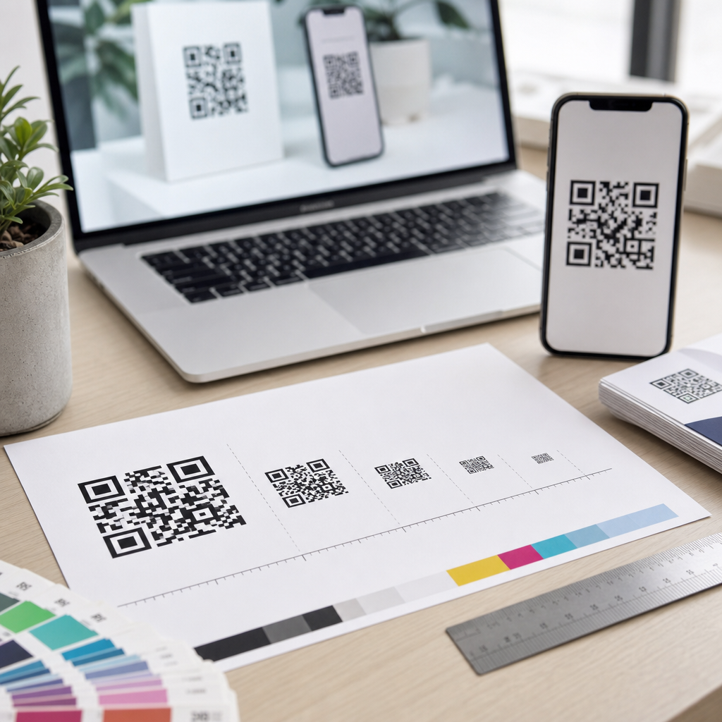
For most printed materials handled at arm’s length, 2 x 2 centimeters is a common bare minimum, but I rarely recommend staying that small unless the data payload is short and the print quality is excellent. On flyers, brochures, and business cards, 2.5 to 3 centimeters is usually safer. On packaging viewed on a shelf or in hand, 3 to 4 centimeters often performs better. On storefronts, event banners, and transit ads, sizing should scale aggressively with expected scanning distance.
Print QR Code Size Guidelines by Use Case
Print introduces variables that digital designers often underestimate: ink spread, paper texture, lamination glare, curvature, folds, and imperfect placement. On business cards, the challenge is limited space. A 0.8-inch to 1-inch code can work if it points to a short dynamic link and sits on a clean background. On postcards and brochures, 1 to 1.25 inches gives more margin for reliable scanning. For product packaging, I usually start at 1.2 inches and test upward when the surface is curved, matte varnish is absent, or the code appears near nutritional panels and dense typography.
Menus are a useful example. During the pandemic, many restaurants rushed into QR menu deployment and printed codes far too small, often below 0.75 inch, then laminated them under reflective plastic. The better implementations used at least 1.25 inches, strong black-on-white contrast, and placement away from table edge shadows. Those details reduced the awkward “move your phone closer, then farther” dance that slows service and irritates guests.
Large-format print requires thinking about scan behavior, not just canvas dimensions. A QR code on a trade show backdrop may be physically huge, yet still fail if attendees cannot stand at the right distance or if booth lighting creates glare. Billboards present another issue: many are not realistic QR placements because moving vehicles cannot safely scan them. In those cases, a short memorable URL often serves the audience better. Good QR code design best practices include rejecting placements that do not match human behavior.
| Use Case | Typical Scan Distance | Recommended Starting Size | Design Notes |
|---|---|---|---|
| Business card | 20–30 cm | 2.5 cm / 1 in | Use dynamic link, high contrast, generous quiet zone |
| Flyer or brochure | 30–50 cm | 3 cm / 1.2 in | Avoid folds, keep off busy imagery |
| Product packaging | 30–60 cm | 3–4 cm / 1.2–1.6 in | Account for curves, varnish, and shelf lighting |
| Poster | 1–2 m | 10–20 cm / 4–8 in | Scale to viewing distance; test in actual venue |
| Storefront window | 1–3 m | 15–25 cm / 6–10 in | Watch reflections and interior backlighting |
Digital QR Code Size Guidelines for Screens, Presentations, and Mobile
Digital QR codes behave differently because there is no ink spread, but there are still constraints. Pixel dimensions, screen brightness, compression, scaling artifacts, and device camera quality all matter. For websites and landing pages, a QR code that appears between 160 and 240 pixels square is usually a practical floor for desktop viewing, assuming sufficient contrast and a simple destination. On presentation slides shown in meeting rooms, start much larger and base the size on the farthest viewer who is expected to scan. A code that looks prominent on your laptop can become tiny when projected in a bright room.
One common mistake is placing a QR code on a mobile webpage for users who are already on their phones. That is rarely useful unless the goal is cross-device transfer, such as opening a desktop page on mobile, sharing Wi-Fi to another device, or moving from digital signage to a handset. When a QR code appears on a smartphone screen, users must use another device to scan it. In many cases, a standard button is better. Good design starts with context, not habit.
For digital signage, retail displays, and conference screens, leave substantial white space around the code and avoid animated backgrounds. Compression from exported slides or ad platforms can blur module edges, especially after repeated resizing. I always recommend exporting QR assets as SVG when supported, because vector output preserves sharp edges at any scale. PNG can also work well, but only when generated at sufficient resolution and never stretched beyond its native dimensions.
Brightness and contrast strongly influence on-screen scanning. Dark gray on black may suit a brand palette, but phone cameras need a clear luminance difference. The safest choice remains dark modules on a light background. If the background is colored, keep it flat and pale. If a screen uses PWM dimming or sits behind tinted glass, test in the intended environment. A code that scans under office lighting can struggle in sunlight, on glossy kiosks, or on low-quality monitors.
Design Best Practices That Influence Size, Readability, and Brand Fit
QR code design best practices go far beyond choosing dimensions. The code should be generated in the correct format, sized according to payload and distance, rendered with crisp edges, and integrated into the layout without sacrificing scanability. Dynamic QR codes are often better for marketing because they shorten the encoded URL, reduce density, and allow the destination to change without reprinting the asset. Platforms such as Bitly, QR Code Generator Pro, Beaconstac, and Scanova also provide analytics, which helps teams compare performance across placements.
Color customization is possible, but contrast is nonnegotiable. Dark blue on white can work well. Yellow on white usually fails. Reversing a code to white modules on a dark background can work if the generator and scanner interpret it correctly, but it is less universally reliable than the traditional dark-on-light approach. Gradients, shadows, and patterned fills create risk because they reduce edge clarity. If brand expression matters, apply it around the code, in the call-to-action, or in a well-tested logo overlay rather than inside the modules themselves.
Logos require restraint. Adding a centered logo is common, but it consumes data area and depends on error correction to remain scannable. Small overlays usually perform well when the code has enough size headroom, but oversized logos can break lower-end phone scans. I advise clients to test with older Android devices, budget phones, cracked screens, and mediocre lighting, because those edge cases reveal real-world failure points. Premium iPhones are not the only audience.
Placement and instruction also affect results. A QR code should be paired with a clear call-to-action such as “Scan to view the menu,” “Scan for setup instructions,” or “Scan to claim the rebate.” Specific intent increases scans more than decorative treatment does. Nearby explanatory text can also provide a fallback URL for accessibility and trust. Users are more willing to scan when they know what happens next and when the destination domain appears legitimate.
Testing, Accessibility, and Common Mistakes to Avoid
Testing is the step most teams skip and the one that most often determines success. Before approving a print run or campaign launch, test the QR code at actual size, on actual material, and in actual lighting. Scan it with iOS and Android devices, both native camera apps and common third-party scanners if your audience uses them. Test from realistic angles and distances. If the code links to a landing page, evaluate the whole journey: page speed, mobile responsiveness, cookie banners, and app deep-link behavior. A scannable code that opens a slow page still underperforms.
Accessibility deserves explicit attention. Do not rely on color alone to distinguish the QR code area. Ensure the call-to-action is readable and that any linked destination is accessible on mobile devices. In public spaces, place codes where wheelchair users can approach them and where glare does not disproportionately affect shorter viewing angles. If the code unlocks critical information such as instructions, forms, or payments, provide an alternate access method. Inclusive design improves completion rates for everyone.
The most common mistakes are predictable: making the code too small, encoding a long static URL, removing the quiet zone, placing it on a busy image, using low contrast colors, exporting at low resolution, and skipping environmental testing. Another frequent issue is overusing QR codes where a tap target, NFC tag, or short URL would be easier. The best practitioners treat QR as one interface option among several, not an automatic design element. When the use case fits, though, a properly sized and tested code is fast, measurable, and familiar to users worldwide.
QR code size guidelines for print and digital are ultimately about reducing friction. The right size depends on viewing distance, data density, error correction, material, lighting, and the user’s device, but the principles are consistent. Start with the 10-to-1 distance rule for print, preserve a four-module quiet zone, favor short dynamic links, keep contrast high, and scale up whenever customization or environmental complexity increases. For print, use conservative minimums and test on the final substrate. For digital, use sharp vector assets, sufficient pixel dimensions, and screen-specific contrast checks. Across both channels, pair the code with a clear call-to-action and a trustworthy destination.
As a hub for QR code design best practices, this topic connects size, placement, branding, accessibility, and testing into one system. A beautiful code that does not scan is a failed design, while a clean, well-sized code can support packaging engagement, contactless experiences, lead capture, support content, and attribution with very little user effort. If you are creating or revising QR assets, audit your current codes against these guidelines, test them in real conditions, and update any placement that asks too much of the scanner or the user. Small adjustments in size and layout often produce the biggest gains in scan performance.
Frequently Asked Questions
What is the minimum recommended QR code size for print materials?
For print, a widely used starting point is at least 2 x 2 cm, or roughly 0.8 x 0.8 inches, for simple QR codes scanned at close range. That said, there is no single minimum that works in every situation because print size depends on scanning distance, data density, error correction level, and print quality. A practical rule many designers follow is that the scanning distance should be about 10 times the width of the QR code. For example, if a user will scan from 20 cm away, a code around 2 cm wide is often appropriate. If the code will be viewed from farther away, such as on a poster, sign, or storefront display, the code needs to scale up accordingly.
The amount of encoded content also matters. A short URL produces a less complex QR code with larger modules, which usually scans more easily at smaller sizes. A long URL, vCard, Wi-Fi credential, or PDF link can create a denser matrix with smaller modules, which means the overall code often needs to be printed larger to preserve readability. If you use a higher error correction level to protect against damage or logo overlays, that can also increase complexity and push the ideal print size upward. In professional print workflows, it is best to test the final exported file at actual size before production rather than relying on a generic minimum.
How does scanning distance affect the ideal QR code size?
Scanning distance is one of the most important factors in QR code sizing because users need to capture the full code clearly within the camera frame. A common guideline is the 10:1 rule: the ideal scanning distance is approximately 10 times the width of the QR code. In reverse, that means the code width should be about one-tenth of the expected scanning distance. If someone will scan from 1 meter away, the QR code should be around 10 cm wide. If the scan happens at 5 meters, the code may need to be about 50 cm wide. This is especially important for large-format uses such as posters, billboards, menus behind counters, event signage, and retail window graphics.
Distance is not the only consideration, though. Environmental conditions can force you to size even larger than the basic ratio suggests. Low light, reflective surfaces, angled placement, moving users, poor camera quality, and busy surroundings all reduce scan reliability. In those cases, increasing the code size gives users more tolerance and improves first-attempt scans. If your audience will interact quickly, such as in transit stations or outdoor advertising, larger codes are usually worth the extra space because they reduce hesitation and improve response rates.
Why do data amount and error correction change the size requirements of a QR code?
A QR code is made up of small square modules, and the more information you encode, the more modules are required to store that data. As the code becomes denser, each individual module becomes smaller unless you increase the overall dimensions of the code. Smaller modules are harder for smartphone cameras to distinguish, especially when the code is printed on textured material, displayed on a low-resolution screen, or viewed in less-than-ideal lighting. That is why a QR code containing a short redirect URL can often be used at a smaller size than one containing a long direct link, contact card, or payment payload.
Error correction has a similar effect. QR codes include built-in redundancy levels—commonly L, M, Q, and H—that allow the code to remain scannable even if part of it is damaged or obscured. Higher error correction is useful when a code may be scratched, folded, or partially covered by a logo, but it increases the number of modules in the symbol. That added complexity usually means you need a larger overall code size to maintain reliable scanning. In practical terms, if you want the most flexibility in design and the smallest possible footprint, keep the encoded content short, use a sensible error correction level, and test the final code at the exact size and medium where it will appear.
What size guidelines should I follow for digital screens and mobile displays?
For digital use, QR codes should be large enough to scan easily across a range of screen sizes, resolutions, and viewing distances. On websites, landing pages, presentation slides, and desktop displays, a QR code should generally appear clearly and not be reduced to a small decorative element. In many cases, 150 to 300 pixels square is a practical baseline for desktop and tablet viewing, but the right size depends on how far the viewer is from the screen and how dense the code is. For presentations viewed from across a room, the code often needs to be much larger, occupying a meaningful portion of the slide rather than sitting in a corner.
On mobile screens, the biggest challenge is usability context. If a QR code is displayed on a phone, the user usually cannot scan it with the same device unless they use a screenshot or another app, so digital QR codes are often more effective on secondary screens such as laptops, kiosks, digital signs, or tablets. Screen brightness, glare, motion, refresh artifacts, and low contrast can all interfere with scanning, so a crisp high-contrast code with adequate margins is essential. Designers should also avoid shrinking the code responsively without limits. A QR code that looks acceptable in a layout may still become too small to scan once viewed on smaller screens or at arm’s length.
What other design factors affect QR code scanning besides the overall size?
Size is critical, but it is only one part of reliable QR code performance. The quiet zone, which is the empty margin around the QR code, is essential because scanners use it to distinguish the symbol from surrounding graphics. Without enough quiet space, even a correctly sized code can fail. Strong contrast is also necessary: dark modules on a light background remain the safest choice, while low-contrast color combinations, gradients, or patterned backgrounds often reduce scan accuracy. Print sharpness matters too. Ink spread, low-resolution output, textured surfaces, and material glare can blur module edges and make the code harder to read.
Placement and context are equally important. A code positioned on a curved bottle, near a fold, too close to trim, or behind reflective glass may scan poorly even if the dimensions are technically correct. Logos and branding treatments should be used carefully, because covering too much of the code or altering finder patterns can break functionality. For digital use, pixel clarity, screen resolution, and zoom behavior can affect readability. The most dependable approach is to generate the code in a high-quality format, preserve the quiet zone, use short data where possible, and test it on multiple devices in real-world conditions. In practice, the best QR code is not simply the one that fits the layout, but the one that scans quickly and consistently for the intended audience.


