Best placement strategies for QR codes determine whether a scan happens in one second or never at all. In practice, placement is not a cosmetic decision. It is the point where design, user intent, lighting, distance, printing, and device behavior meet. A beautifully branded code can still fail if it sits too high on a poster, too low on packaging, or too close to a reflective surface. For marketers, retailers, event teams, and product designers, that failure means lost traffic, missed conversions, and broken measurement.
QR code design best practices start with a simple definition. A QR code is a two-dimensional matrix barcode that stores data, most often a URL, and a smartphone camera reads that pattern through contrast and alignment. Placement strategy is the deliberate choice of where the code appears, how large it is, what surrounds it, and what the user is doing when they encounter it. As someone who has tested QR deployments on packaging, storefronts, direct mail, trade show walls, menus, and mobile screens, I have seen the same pattern repeatedly: the highest-performing codes are placed where scanning feels natural, not forced.
This matters because smartphone scanning is now routine, but attention is scarce. People will scan only when the code is visible, trustworthy, and easy to capture in a single motion. Good placement also supports branding, accessibility, analytics, and compliance. This hub article covers the full framework for QR code design best practices with placement at the center, so you can build future pages, campaigns, and internal guidance around a reliable standard.
Start with scan context, not artwork
The best QR code placement begins by answering one question: what is the user physically doing at the moment you want the scan? On a cereal box, the shopper may be standing under mixed retail lighting, holding the product at arm’s length. On a restaurant table tent, the diner is seated and scanning downward. On a transit poster, the passerby is moving quickly and may have only a few seconds. These contexts change the correct height, angle, size, and call-to-action more than any brand preference does.
In field reviews, I map placement against three variables: viewing distance, dwell time, and hand position. Short-distance scans with stable posture, such as product packaging or business cards, can support smaller codes. Long-distance scans, such as windows, billboards, and event backdrops, require much larger symbols and stronger contrast. Low dwell time environments need the code in the primary visual path, not buried near legal copy. If users have to stop, twist, or shield glare, scan rates drop sharply.
For a practical rule, place the QR code where the eye naturally lands after the headline, image, or offer. If the code is the main action, it should sit near the message that explains the benefit of scanning. If it is secondary, it should still be discoverable without hunting. Placement should serve intent first and brand balance second.
Choose locations that match line of sight and reach
Physical ergonomics matter. A code on a wall poster usually performs best between chest and eye level because users can frame it quickly with one hand. On counters, tabletop displays, and menu inserts, central lower-third placement often works because the phone points down naturally. On packaging, front or side panels outperform awkward bottom placements unless the bottom is the only large uninterrupted surface.
I avoid placing codes near folds, seams, bottle curves, perforations, tear strips, or shrink-wrap distortions. Curved cans and narrow neck labels can warp modules enough to reduce reliability, especially when branded styling already lowers contrast. For flexible pouches, the panel can wrinkle after filling, so the best placement is often a flatter side zone with generous quiet space. On shipping boxes, keep the consumer-facing code separate from warehouse barcodes to prevent scanning confusion.
Screen-based placement has its own rules. If a QR code appears on a mobile device, asking the same user to scan it with that device creates friction unless you provide a wallet pass, deep link, or share option. For desktop landing pages, position the code adjacent to the action it supports, such as app download, check-in, or sign-up. Avoid placing it near auto-rotating carousels or moving backgrounds that interfere with recognition.
Size, distance, contrast, and quiet space decide scan reliability
Many placement failures are actually sizing failures. A dependable working formula is a scanning distance ratio of about 10:1, meaning a code should be roughly one unit wide for every ten units of scanning distance. A 2-inch code is comfortable at around 20 inches. A 10-inch code is more realistic for viewing from about 100 inches, or just over 8 feet. This is not absolute, because camera quality, lighting, and error correction matter, but it is a strong planning baseline.
Contrast should be high, ideally dark modules on a light matte background. Reversed white-on-dark codes can work, but they are less forgiving in low light and on glossy materials. Quiet space, the empty margin around the code, is nonnegotiable. ISO/IEC 18004 guidance and major generator tools consistently reinforce the need for clear separation so scanners can detect symbol boundaries. Logos, decorative frames, or crowded text that invade this area create preventable scan errors.
When teams ask whether branded QR codes are safe, my answer is yes, if customization respects detection rules. Rounded dots, center logos, and color palettes can work when testing confirms readability across common devices like recent iPhone and Android models. Placement should also account for shadows and reflections. A code printed under spot UV, laminated gloss, or direct sunlight may appear strong in mockups yet fail in real conditions.
Placement standards by format and environment
Different media demand different placement decisions. The table below summarizes field-tested guidelines used in campaign planning and production reviews.
| Format | Best placement zone | Typical scan distance | Key design notes |
|---|---|---|---|
| Product packaging | Front lower-right or side panel on flat area | 8 to 24 inches | Keep off seams, curves, and nutrition/legal clutter |
| Posters and flyers | Lower-middle to lower-right within main reading path | 12 to 48 inches | Add a clear CTA and enough size for walk-up scans |
| Storefront windows | Eye-level section away from glare and door handles | 18 to 60 inches | Test day and night reflections before print approval |
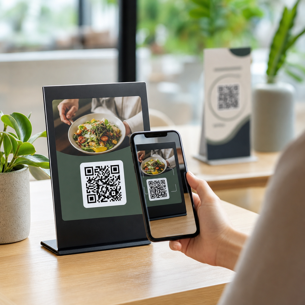
| Menus and table tents | Centered or lower third facing seated users | 8 to 20 inches | Use matte stock and simple instructions |
| Direct mail | Near the offer, not isolated on back panel | 10 to 18 inches | Support with one benefit-focused sentence |
| Trade show booths | At waiting zones, counters, and demo stations | 12 to 72 inches | Avoid giant backdrop-only placement without close option |
| Digital screens | Static area beside the message or presenter | Varies widely | Hold on screen long enough for camera focus and action |
These guidelines work because they align the code with user posture and decision timing. A booth visitor waiting for a demo has time to scan a counter sign. A pedestrian passing a window does not want to crouch or step back into traffic. Matching environment to placement improves both usability and campaign measurement.
Use calls-to-action and surrounding content to support placement
A QR code without context underperforms, even when placed correctly. People want to know what happens next. The strongest placements pair the code with a brief, direct instruction and a benefit statement. “Scan to view the menu,” “Scan for installation video,” or “Scan to claim 10% off today” consistently outperform generic prompts. This is part of design best practice because the content around the code influences whether users notice and trust it.
Placement should preserve that support text. Do not cram the code into a corner where the explanatory copy becomes too small, wraps awkwardly, or competes with disclaimers. On packaging, place the CTA on the same panel whenever possible. On print ads, keep the CTA within immediate proximity so the eye reads message and action as one unit. If legal language is required, separate it visually from the scan path.
Trust signals also help. Brand colors, a known domain preview, secure language for transactions, and recognizable product imagery reduce hesitation. In campaigns involving payments, tickets, or authentication, placement should never mimic random stickers or overlaid labels that people might associate with tampering. Clean integration into the original design is safer and more credible.
Test placements across devices, lighting, and real behavior
Testing is where strong QR programs separate from decorative ones. I recommend printing prototypes at actual size and placing them in the actual environment before final production. Scan with multiple phones, including older mid-range Android devices, because flagship cameras are more forgiving. Test in daylight, warm indoor light, and low light. Check how quickly the camera detects the code, whether autofocus hunts, and whether users need to reposition.
Usability testing should include ordinary people, not just the design team. Ask them to approach the poster, shelf talker, package, or sign and complete the scan without coaching. Observe where they naturally stand and whether their first attempt succeeds. Small adjustments, moving the code three inches higher, increasing size by 20 percent, or removing a glossy coating, often make the difference between a seamless experience and a failed one.
Use dynamic QR codes when measurement matters. Platforms such as Bitly, QR Code Generator Pro, Flowcode, and Beaconstac allow destination updates and scan analytics by campaign. Placement insights become stronger when data shows which format, store area, or mailer version produced the highest engagement. Analytics do not replace physical testing, but they reveal patterns worth scaling.
Common placement mistakes and how to avoid them
The most common mistake is treating the QR code as an afterthought added during final layout. That leads to tiny symbols, cramped margins, and poor panel choices. Another frequent issue is placing the code where people cannot pause safely, such as near escalators, curb edges, or fast-moving corridors. Convenience is not enough; safe scanability matters.
I also see too many codes placed on glossy windows, metallic foils, and transparent labels without accounting for reflection and background interference. On dark packaging, teams sometimes use low-contrast brand colors that look elegant but scan inconsistently. Another problem is over-branding: oversized logos, custom shapes, or illustration overlays that consume the finder patterns and quiet space. Brand expression should never compromise machine readability.
Finally, many organizations forget the landing experience. A perfectly placed code fails if it opens a slow, non-mobile page, a broken link, or irrelevant content. QR code design best practices extend beyond the symbol itself. Placement, message, destination, and measurement must function as one system. When they do, scans increase, user frustration drops, and the code becomes a reliable bridge between physical and digital touchpoints.
Best placement strategies for QR codes work because they respect how people move, look, and decide. The core principles are consistent: place the code in the natural line of sight, size it for real viewing distance, protect contrast and quiet space, avoid distortion and glare, and pair the scan with a clear benefit. Whether the code appears on packaging, a storefront, a table tent, a flyer, or a digital screen, performance improves when placement is treated as a user experience decision rather than a decorative one.
As a hub for QR code design best practices, this article establishes the standards that support every related topic: branded QR customization, packaging implementation, print production, campaign analytics, accessibility, and landing page optimization. Start with environment and intent, then validate with real-world testing and dynamic tracking. That sequence prevents costly reprints and weak engagement.
If you are updating your QR code design and branding program, audit every current code against these placement rules, test the weak spots in real conditions, and document a repeatable placement standard for future campaigns.
Frequently Asked Questions
What is the most important factor when deciding where to place a QR code?
The most important factor is scanability in the real-world moment when someone encounters the code. That means placement should be based less on decoration and more on user behavior, viewing distance, lighting, camera access, and the physical surface where the QR code appears. A code may look perfectly aligned in a design mockup and still underperform if it is positioned too high for comfortable scanning, too low to notice quickly, or in a spot where glare, folds, shadows, or movement interfere with phone cameras.
In most cases, the best placement is where the user naturally pauses and can hold a phone steady for one to three seconds. On posters, that is usually around chest-to-eye level. On packaging, it is often on a flat, visible panel that is easy to reach and not distorted by curves or seams. On tables, displays, or event signage, it should sit where people can approach without blocking traffic or bending awkwardly. Effective placement also includes enough surrounding white space, a clear call to action, and a size that matches expected scanning distance. If one principle guides every decision, it is this: place the QR code where it is easiest to notice, understand, and scan immediately.
How high or low should a QR code be placed on posters, signs, and displays?
For most public-facing materials, QR codes perform best when placed within a comfortable scanning zone, generally around chest to eye level for the average adult. This range helps users spot the code quickly and scan it without stretching upward, crouching downward, or angling the phone awkwardly. If a code is too high, people may notice it but choose not to scan because the action feels inconvenient. If it is too low, it may be overlooked entirely or feel physically uncomfortable to access, especially in busy retail, transit, or event environments.
Placement should also reflect the context of use. A poster viewed while standing in a hallway can support a center or lower-middle placement if the code is still easy to reach visually and physically. A trade show banner may need the QR code lower than the main headline but high enough to avoid obstruction by tables, bags, or crowds. In storefront windows, avoid placing the code where reflections from glass or direct sunlight reduce visibility. For larger signs viewed from farther away, increase the code size and keep it in a visually stable area of the layout rather than the extreme edges or corners. The ideal setup lets a person see the message, understand why they should scan, and complete the scan in one smooth motion.
Where should a QR code go on product packaging to maximize scans?
On packaging, the best QR code placement is usually on a flat, highly visible panel that users can access without rotating the product excessively or fighting glare from glossy materials. The code should not sit across folds, corners, seals, perforations, or curved surfaces that distort the pattern and reduce readability. Even if a package design is visually strong, a QR code placed on an uneven edge, near crimped material, or over textured finishes may fail at the exact moment a customer tries to scan it.
Strong packaging placement also depends on customer intent. If the QR code supports pre-purchase decisions, place it on an outward-facing panel shoppers can scan while the item is on the shelf. If it supports onboarding, setup, authenticity checks, recipes, instructions, or loyalty activation after purchase, place it where customers are likely to see it during unboxing or first use. Contrast matters as well: use a clean background, preserve quiet space around the code, and avoid reflective laminates when possible. It is also smart to keep the code away from legal clutter and dense copy so it does not disappear visually. The goal is to position the code where the customer naturally looks, has enough time to scan, and understands the benefit immediately.
How do lighting, glare, and surface materials affect QR code placement?
Lighting and material choice have a major impact on scan performance, which is why placement should always account for environmental conditions, not just design layout. QR codes placed under harsh spotlights, behind glass, on metallic finishes, or on glossy coatings can become difficult to scan because reflections wash out portions of the code. Similarly, dim environments can reduce contrast, especially when the code is printed small or on a dark background. A technically correct QR code can still perform poorly if the camera struggles to capture it clearly.
To improve results, place QR codes on matte or low-glare surfaces whenever possible and avoid areas likely to reflect overhead lights, windows, or outdoor sun. On glass doors or windows, test the code at different times of day because reflections change as lighting conditions shift. On curved bottles, foils, flexible packaging, or textured labels, choose the flattest available zone and maintain strong contrast between the code and its background. If glare is unavoidable, increase code size and simplify nearby design elements so the camera can isolate the code more easily. In short, the right placement is not only where users can reach the code, but where their phones can read it reliably under actual viewing conditions.
Should QR codes be tested before finalizing placement, and what should that testing include?
Yes, testing is essential. The best placement strategy is never based on assumptions alone because real-world conditions often expose problems that are invisible in a digital proof. A QR code can pass technical generation checks and still fail due to poor placement, insufficient size, awkward scanning angles, crowd flow, packaging curvature, low contrast, or environmental glare. Testing helps confirm that the code is easy to notice, easy to understand, and easy to scan on the first attempt.
Effective testing should include multiple phone models, both iOS and Android devices, and different camera apps or native scanning methods. Test from the expected user distance, under the actual lighting conditions, and on the real material or production sample rather than only on-screen artwork. If the code is going on a poster, test it at the mounted height. If it is going on packaging, test it after printing, folding, sealing, or labeling. Confirm that the destination page loads quickly and is mobile-friendly, since good placement can still lose conversions if the post-scan experience is weak. It is also useful to test whether people notice the code naturally and understand the call to action without explanation. The strongest placement is validated by user behavior, not just by design preference.


