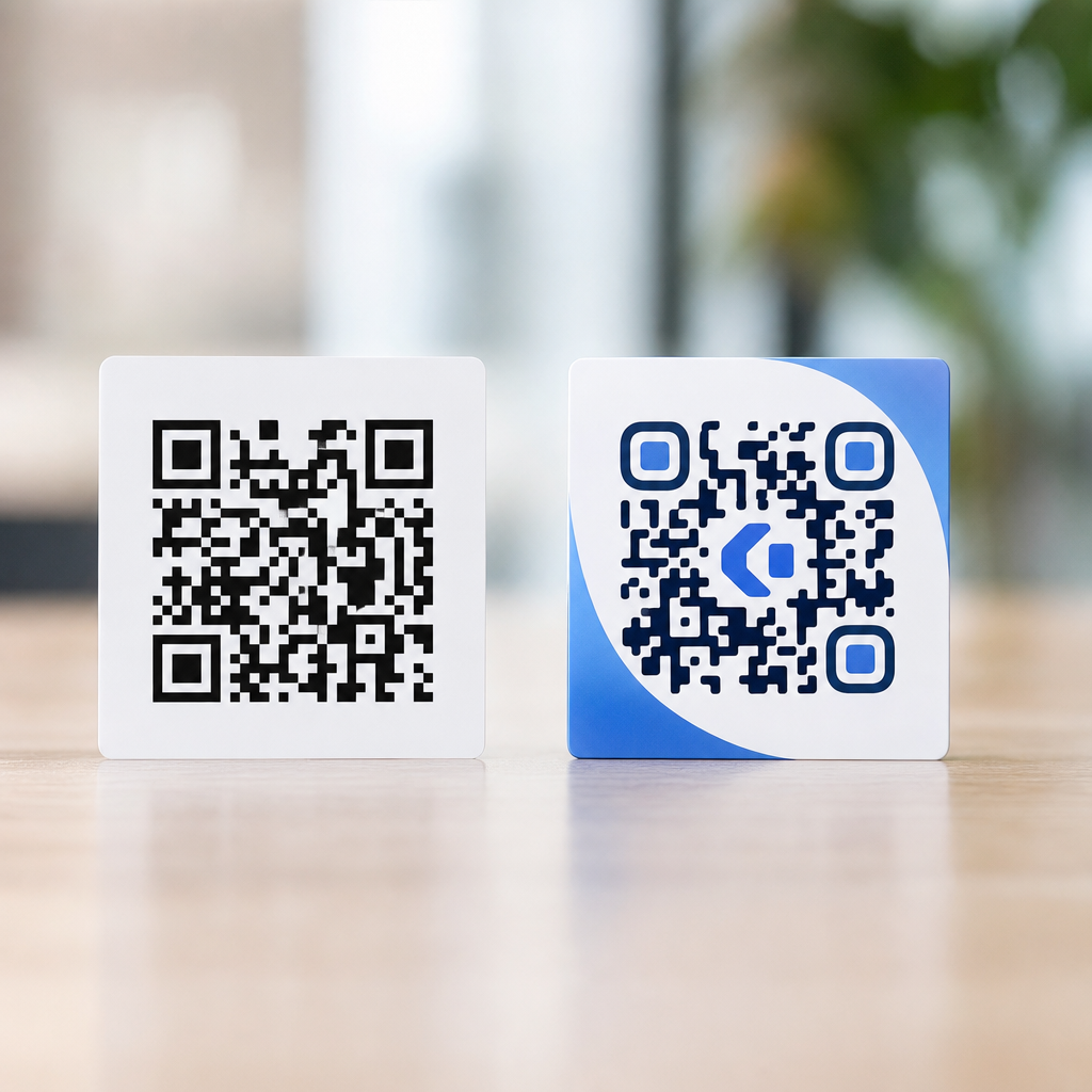

Best practices for digital QR code placement start with a simple truth: a QR code only works when people notice it, trust it, and can scan it without friction. In digital environments, placement decisions affect all three outcomes. A code tucked into a crowded hero banner, placed too close to a screen edge, or shown at the wrong size may technically be visible yet still underperform. I have tested QR placements across landing pages, email campaigns, webinar slides, mobile apps, retail displays, and social creative, and the pattern is consistent: strong scans come from context-aware placement, not from decoration alone.
Digital QR code placement refers to where and how a scannable code appears on a screen-based asset such as a website, email, presentation, kiosk, app, digital sign, or social ad. Print placement follows one set of rules because paper is static, lighting varies, and scan distance is tied to physical size. Digital placement introduces different constraints: responsive layouts, dark mode, pixel density, viewport cropping, autoplay motion, compression, accessibility overlays, and the fact that users often try to scan one device from another. Because this article sits within QR code design and branding, it focuses on the practical bridge between visual design and scanning performance.
The distinction between print and digital design considerations matters because teams often reuse the same QR asset everywhere. That shortcut creates problems. A code sized appropriately for a poster may dominate a mobile email. A transparent PNG that looks elegant on a landing page can fail against video or gradient backgrounds. A bottom-corner placement that works in print can be obscured by cookie banners, app navigation bars, or social platform interface chrome. Good digital QR code placement protects readability, supports user intent, and fits the brand system without sacrificing function.
This hub article explains the standards that consistently improve scan rates in digital channels, highlights where digital and print requirements diverge, and gives you a practical framework for choosing placement by screen type, layout, and user journey. If you manage campaigns across both physical and on-screen media, this is the baseline guidance that keeps your QR codes usable, measurable, and visually coherent.
Why digital placement is different from print placement
Print and digital QR code design share core rules: adequate contrast, a clear quiet zone, error correction, and a destination that loads quickly. The difference is environmental control. In print, once a code is produced, the design is fixed. In digital, the same code may appear on a 27-inch desktop monitor, a compressed email in Outlook, a mobile viewport in Gmail, or a social story with interface overlays. Placement therefore must account for dynamic containers and device behaviors, not just aesthetics.
One of the biggest differences is scan context. A printed flyer is often scanned by the same phone the user is holding. A digital QR code is frequently scanned from a second device: a phone pointed at a laptop screen, a conference attendee scanning a webinar slide, or a shopper scanning an in-store digital sign. That means distance, angle, glare, and screen brightness matter more. I usually recommend testing digital placements at realistic viewing distances rather than relying on on-canvas previews. A QR that looks perfect in Figma can become unreliable on a bright kiosk under overhead lights.
Digital assets also introduce motion and interference. Video backgrounds, animated transitions, modal popups, and sticky headers can distract from or partially cover a code. Compression can soften edges. Retina displays can mask sizing issues during design review, while lower-density monitors reveal them. In practice, digital QR placement must be treated as a usability decision first and a branding decision second.
Core placement rules that improve scan success
The most dependable rule is to place the QR code where the eye naturally pauses, not where the designer finds empty space. On landing pages, that is often near the primary call to action or immediately below a concise value proposition. On webinar slides, the strongest location is usually the right or lower-right content zone after accounting for title bars and presenter video windows. In email, a code should sit within the main content column, not in the margin where some clients crop or stack elements unpredictably.
Leave sufficient surrounding space. The quiet zone should remain clear even in responsive states, meaning padding must survive mobile stacking and component resizing. ISO/IEC 18004 defines the QR code structure, and while designers often speak loosely about margins, scanners need a clearly separated symbol boundary. In digital use, cluttered backgrounds and adjacent icons are common causes of missed scans because they visually merge with finder patterns.
Contrast is equally important. Black on white remains the most reliable combination. Brand colors can work, but only when luminance contrast stays high and the background remains uniform. Avoid placing a code over photography, gradients, animated textures, or translucent overlays. If branding requires a layered composition, add a solid container behind the code. That single design move fixes many failures without changing the code itself.
Size should be based on expected viewing distance and device type. For screens, there is no universal pixel rule that works everywhere, but practical testing consistently beats assumptions. If a code is meant to be scanned from a laptop screen by a nearby phone, it can be modest. If it appears on presentation slides or digital signage, it needs far more visual prominence. What matters is not the raw pixel dimension in the design file but the rendered size in the actual environment.
Channel-by-channel guidance for websites, email, apps, and screens
On websites, place QR codes only where they advance a specific cross-device task. Useful examples include sending a desktop visitor to an app download page, opening a mobile wallet pass, or continuing checkout on a phone. Avoid dropping a QR into the footer simply because it fits. That usually adds visual noise and gives no clear reason to scan. The strongest placements sit near copy that explains the benefit in one sentence, such as “Open this on your phone for in-store navigation” or “Scan to continue in the app.”
In email, remember that many subscribers open on mobile, where scanning a code from the same device is awkward unless the app offers built-in image recognition. For that reason, QR codes in email perform best for audiences likely to view messages on desktop during work, such as B2B webinars, event registration, software onboarding, and travel confirmations. Keep the code inside the safe content width, use a static image format, and include a visible text link below it for accessibility and fallback.
Inside mobile apps, QR code placement should be used carefully. If the user is already on a phone, a visible QR often makes little sense unless another device will scan it or the app supports saving and sharing. More effective in-app placements include account pairing screens, smart TV login, device setup, and peer-to-peer sharing workflows. In those cases, center placement with strong contrast and minimal surrounding UI works best because users are performing a focused task.
For presentations, virtual events, and digital signage, codes need generous size, long dwell time, and stable positioning. A QR flashed for three seconds at the end of a fast slide sequence will underperform no matter how well designed it is. I advise keeping the code on screen for at least fifteen to thirty seconds during spoken explanation, with a short URL as backup. For retail displays and kiosk loops, avoid lower corners that may be hidden by bezels or reflective glare.
| Channel | Best placement zone | Main risk | Recommended fallback |
|---|---|---|---|
| Website | Near task-specific call to action | Decorative use without purpose | Button and short URL |
| Main content column | Mobile opens on same device | Linked button under code | |
| Presentation | Right or lower-right content area | Short display time | Verbal prompt and vanity URL |
| Digital signage | Center-right at eye level equivalent | Distance and glare | Large text CTA and SMS option |
| Mobile app pairing | Centered task screen | Competing interface elements | Numeric pairing code |
Branding, accessibility, and responsive design considerations
Brand customization should never compromise scan reliability. Logos, rounded modules, custom colors, and frames can all work, but only after the base code scans consistently. In production, I start with a plain high-contrast QR, verify performance, then layer brand treatments incrementally. The safest customizations are a branded frame with a call to action, a subtle logo with sufficient error correction, and color adjustments that preserve contrast. The riskiest are transparent backgrounds, low-contrast palettes, and excessive shape stylization.
Accessibility is not optional. A QR code is an image-based interaction, so it needs nearby explanatory text, a meaningful alt attribute when appropriate, and a direct clickable alternative. Users with low vision, motion sensitivity, or assistive technology may not engage with the code itself. Clear supporting copy solves this. “Scan to download the app” is weaker than “Scan with your phone camera to download the iOS or Android app, or use the link below.” The second version states the action, device, and fallback.
Responsive behavior deserves special attention. A code that sits elegantly beside copy on desktop may drop below the fold on mobile or become too small after a two-column module collapses. Set minimum rendered sizes, preserve padding around the symbol, and test in real clients and browsers. For websites, inspect breakpoints manually rather than trusting component libraries. For email, test in Gmail, Apple Mail, and Outlook because image handling and scaling vary. For social placements, preview with platform overlays, especially in stories and reels formats where interface elements consume edge space.
Data and privacy also shape placement choices. If scanning leads to personalized content, sign-in, payment, or health information, the surrounding copy should set expectations clearly. Trust increases when users know where the code leads before they scan. Branded domains, concise destination labels, and visible security cues reduce hesitation and improve completion rates.
Measurement, testing, and common mistakes to avoid
Effective digital QR code placement is measurable. Use dynamic QR codes when you need to update destinations, track scan counts, segment campaigns, or compare placements across channels. Pair QR analytics with UTM parameters in Google Analytics 4, Adobe Analytics, or your CRM so scans connect to downstream actions such as registrations, purchases, or app installs. A scan rate alone does not prove success; what matters is whether the placement drives the intended next step.
A practical testing workflow starts with three variables: location, size, and supporting copy. On a webinar slide, for example, you might compare lower-right versus right-center placement, then test a larger code, then change the CTA from “Scan me” to “Scan to download the checklist.” In repeated tests, descriptive prompts almost always outperform generic ones because they answer the user’s immediate question: why should I scan this now?
Several mistakes appear repeatedly. The first is using a QR code where a button would be easier, especially on mobile-first pages. The second is shrinking the code to preserve layout balance. The third is placing it on complex imagery. The fourth is omitting a fallback link. The fifth is failing to test in the real environment, including distance, brightness, and device mix. Another common issue is reusing a print-oriented asset with a fine decorative border or embedded logo that becomes muddy after compression on digital channels.
The best digital QR implementations are intentional. They give the code a single job, place it where that job makes sense, support it with plain-language context, and validate performance with analytics and field testing. If you are building a QR code design and branding system that spans print and digital, treat placement as a strategic decision rather than a finishing touch. Audit your current assets, remove decorative codes that add no value, and redesign the rest around real scan conditions. That approach produces cleaner layouts, stronger trust, and more successful scans across every screen.
Frequently Asked Questions
What makes a digital QR code placement effective?
Effective digital QR code placement comes down to three fundamentals: visibility, context, and scanability. People need to notice the code quickly, understand why they should scan it, and be able to complete the scan without effort. In practice, that means placing the QR code in an area of the screen where attention naturally flows, such as near a headline, call to action, product detail, or event prompt. It also means avoiding cluttered backgrounds, competing visual elements, and placements that make the code feel secondary or accidental.
Good placement also depends on user intent. A QR code shown on a webinar slide, landing page, app screen, or email should support the specific action the user is already considering. For example, if the audience is reading about a downloadable guide, the code should appear close to that offer rather than somewhere generic in the footer. Supporting text matters as much as location. A short instruction like “Scan to register,” “Scan to view the menu,” or “Scan to download the app” reduces hesitation and improves trust because users know what will happen next.
Finally, effective placement removes friction. The code should be large enough to scan comfortably, isolated from edges, and displayed long enough for users to respond. In digital settings, many underperforming QR codes fail not because the design is poor, but because the placement ignores real user behavior. When the code is positioned where people are already looking, paired with a clear benefit, and easy to scan in a single attempt, performance improves significantly.
Where should a QR code be placed on a landing page, email, or digital ad?
The best placement depends on the format, but the rule is consistent: put the QR code close to the moment of intent. On a landing page, that usually means near the primary offer, sign-up section, or conversion-focused content block. If the page is promoting an app, event, coupon, or downloadable asset, the QR code should sit near the main headline or call-to-action area rather than being buried far below the fold. On longer pages, repeating the code in a second strategic location can help, especially if users need more information before deciding to scan.
In email, placement should account for mobile behavior and limited attention. A QR code often performs best lower in the message after enough context has been provided, but still before the footer. If it appears too early, recipients may not yet understand its value. If it appears too late, they may never reach it. The surrounding copy should explain exactly why the code is there and what the reader gets by scanning. Since many users open email on the same phone they would use to scan, it is also wise to provide a clickable fallback link or button alongside the code.
For digital ads, simplicity is critical. The QR code should not compete with too many messages, logos, or visual effects. It needs breathing room and a clear purpose. On display ads, connected TV screens, webinar slides, and presentation visuals, placing the code in a stable corner or side panel often works well because it remains visible without obscuring the main message. The key is to align placement with attention patterns while preserving enough clear space for accurate scanning.
How large should a digital QR code be, and how much space should surround it?
There is no one-size-fits-all dimension, but digital QR codes should always be large enough to scan quickly on the target device and at the expected viewing distance. A code that looks fine on a designer’s monitor may become frustratingly small on a laptop, tablet, or mobile screen. On presentation slides, webinar screens, and digital signage, the code generally needs to be significantly larger because users may be scanning from several feet away. On websites and emails, the code should remain comfortably visible without forcing users to zoom or reposition their device repeatedly.
Equally important is the quiet zone, or the empty space surrounding the QR code. This margin helps scanning software distinguish the code from nearby content. If text, icons, buttons, borders, or busy graphics crowd the edges, scan reliability can drop even if the code itself is technically high quality. A common best practice is to leave clear space around all sides and avoid placing the code flush against screen edges, image containers, or colored overlays. In digital design, this spacing is often what separates a code that looks integrated from one that actually performs.
Testing is the most reliable way to validate size and spacing. Check the code on different screen sizes, operating systems, email clients, and presentation environments. Test from realistic distances and under normal lighting conditions. If users need more than a second or two to get a successful scan, the code may be too small, too crowded, or too visually compromised. Strong performance usually comes from a combination of sufficient size, clean spacing, and realistic quality control rather than design aesthetics alone.
Why do some digital QR codes get seen but still fail to generate scans?
A visible QR code can still underperform if users do not trust it, understand it, or find it easy to use. One common issue is lack of context. If a code appears without a clear explanation, many users simply ignore it. They may wonder where it leads, whether it is safe, or if scanning is worth the effort. This is especially true in digital settings where users are already being asked to click, tap, subscribe, watch, or download. A QR code needs a specific value proposition, not just presence.
Another major reason is poor user flow. In some environments, scanning creates unnecessary friction. For example, if someone is reading an email or webpage on their phone, they may not be able to scan the code easily with that same device. In these cases, the code may be visible but impractical, which lowers scan rates. Similarly, QR codes shown briefly on slides, animations, or video ads may disappear before users have time to open their camera and respond. Placement is not only about where the code appears, but also when and for how long it remains accessible.
Design and technical issues also contribute. Low contrast, overly stylized customization, crowded placement, and poor rendering quality can all damage scanability. Even a slight mismatch between audience context and code behavior can hurt results. If users expect a quick coupon and instead land on a slow, non-mobile-friendly page, they are less likely to engage with future codes. High-performing QR codes succeed because the visual placement, message, and destination all work together as part of one smooth interaction.
How can you test and optimize digital QR code placement for better performance?
The best way to optimize digital QR code placement is to treat it like any other conversion element and test it systematically. Start by identifying the goal: registration, product view, menu access, app install, lead capture, or another action. Then test different placements relative to the surrounding content. On a landing page, compare above-the-fold placement versus mid-page placement near a conversion block. In email, test whether scan rates improve when the code appears after a short explanation versus next to the main CTA. On webinar slides or digital displays, measure whether a fixed placement with longer on-screen time performs better than a brief appearance in a busy layout.
Use scan analytics, click-through data, on-page behavior, and conversion tracking to evaluate results. A QR code can generate scans but still fail at the next step, so optimization should go beyond scan count. Look at bounce rates, completion rates, and device behavior after the scan. If a code is attracting attention but not producing conversions, the issue may be the destination experience rather than the placement itself. If there are few scans, review visibility, instructional text, display duration, and screen context before changing the offer.
It is also important to test under real-world conditions, not just in a design file or staging environment. View the QR code on multiple devices, different screen brightness levels, varied internet connections, and realistic distances. Ask whether users can understand the action immediately and complete it without confusion. Small adjustments such as moving the code closer to supporting copy, increasing its size, improving contrast, or adding a fallback link can meaningfully improve performance. The strongest QR placements are rarely accidental; they are refined through repeated observation, testing, and practical user-centered decisions.