QR code design best practices directly affect scan rates, user trust, and campaign performance, which is why design decisions should be treated as conversion decisions rather than cosmetic choices. A QR code is a two-dimensional matrix barcode that stores data in a grid of dark and light modules, typically linking users to a website, app download, payment page, menu, file, or authentication flow. In practice, a high-performing code must balance visual branding with machine readability, because the best-looking code fails if cameras cannot decode it quickly under real-world conditions.
I have tested QR codes on product packaging, retail signage, trade show booths, direct mail, restaurant menus, and vehicle wraps, and the pattern is always the same: scan success rises when design follows technical rules first and branding second. The most important variables are contrast, quiet zone, size, error correction, data density, placement, and destination experience. When any one of those is ignored, scan friction increases. Users rarely try more than once if the code looks unclear, the page loads slowly, or the call to action is vague.
This matters because QR codes now sit at the intersection of offline media and digital measurement. Marketers use them to attribute foot traffic, ecommerce teams use them on inserts and packaging, and operations teams use them for inventory, support, and payments. Smartphone camera apps on iPhone and Android have made scanning routine, but convenience has also raised expectations. People expect a code to work instantly, from a reasonable distance, in imperfect lighting, on older devices, and through social apps that compress images. Strong QR code design best practices are therefore about usability, accessibility, and measurable business outcomes.
As a hub topic, QR code design best practices covers the full framework: how to build a scannable symbol, how to apply brand elements without breaking it, how to adapt for print and screen, and how to validate performance before launch. The principles are stable even as design styles change. If your goal is maximum scan rates, the standard is simple: make the code easy to notice, easy to understand, easy to decode, and worth scanning.
Start with scannability fundamentals, not decoration
The first rule of QR code design best practices is that scanners read structure, not intent. A QR code contains finder patterns in three corners, alignment patterns in larger versions, timing patterns, format information, and data modules. When designers heavily stylize these elements, they often reduce the code’s tolerance for blur, glare, perspective distortion, and low-resolution reproduction. In production work, I treat every visual modification as a risk that must be justified by testing.
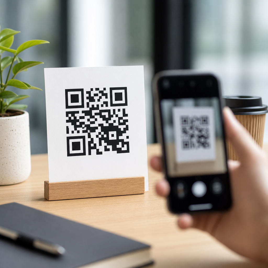
High contrast is nonnegotiable. The safest combination is a dark foreground on a light background, ideally black on white. Many branded colors still work, but contrast must remain strong enough for smartphone cameras to separate modules cleanly. Light-on-dark reversals can scan in some contexts, yet they are less reliable across lower-end devices and poor lighting. Gradients, shadows, textured backgrounds, and transparency effects are common causes of failure because they create inconsistent edges. If a code must sit on a photo or patterned surface, place it inside a solid light container.
The quiet zone is equally important and often overlooked. This is the empty margin around the code, typically at least four modules wide on all sides. Without that margin, scanners may struggle to identify where the symbol begins and ends, especially on crowded posters, packaging layouts, and digital ads with dense visual elements. I have seen perfectly valid codes fail only because a border, headline, or brand pattern was pushed too close to the edges.
Data density also drives readability. The more characters you encode, the more complex the matrix becomes, which reduces scanning ease at small sizes. Use short URLs, dynamic QR codes, or redirects to keep module count low. A compact code is more forgiving when printed on corrugate, fabric, labels, or glossy surfaces that introduce distortion.
Choose the right size, placement, and viewing distance
QR code size should be determined by expected scanning distance, camera quality, and environmental constraints, not by empty space in a layout. A practical baseline many printers use is at least 2 x 2 centimeters for close-range scans, but that is only a starting point. For signage, posters, shelf talkers, or windows, the code usually needs to be significantly larger. One dependable field rule is a scan distance ratio of roughly 10:1, meaning a code intended to be scanned from 10 feet away should be about 1 foot wide. That rule is conservative, but it helps avoid undersizing.
Placement matters just as much as size. Put the code where users can approach it safely and point a phone without awkward angles. On store windows, avoid locations blocked by reflections or door handles. On product packaging, keep it off folds, seams, curved edges, and tear zones. On tabletop displays and menus, avoid the gutter near bindings. On outdoor assets, consider sun glare and the direction of foot traffic. If users have to crouch, step into a road, or tilt their phone sharply, scan rates drop.
Context should guide placement. A QR code on a billboard can technically scan, but only when the destination is simple and the dwell time is realistic, such as at a bus stop or in slow traffic where permitted. For moving audiences, short memorable URLs may outperform QR codes. In contrast, trade show booths, direct mail pieces, event badges, museum labels, and point-of-sale displays are ideal because people can scan at close range with time to act.
Always reserve room for surrounding instructional text. A code with no explanation forces users to guess the value. A code with a clear prompt like “Scan to view installation guide” or “Scan for 10% off today” consistently performs better because the user immediately understands the payoff.
Use branding carefully without weakening the code
Branding can improve trust and recognition, but only when it respects the technical anatomy of the symbol. Custom colors, rounded modules, frame treatments, and embedded logos are common and often effective. The mistake is assuming the code can absorb unlimited styling because error correction exists. Error correction helps recover damaged data, but it should be treated as resilience, not spare decorative capacity.
The safest branded approach is moderate customization: keep the finder patterns highly recognizable, maintain strong contrast, preserve the quiet zone, and avoid shrinking data modules too aggressively. If you add a logo in the center, increase error correction appropriately and test across multiple devices. In my experience, centered logos work best when they occupy a modest portion of the code and sit inside a clean shape rather than bleeding into surrounding modules.
Frames and calls to action often lift scan rates more than deep visual customization. A branded frame that says “Scan to shop the look” or “Scan for setup instructions” gives users confidence without altering the underlying matrix much. This is especially useful in retail packaging, where a code with a plain border can look operational, while a framed code appears intentional and user-focused.
Color choice should also account for the substrate. A navy code on matte kraft paper may look elegant on screen but lose contrast in print. Metallic inks, spot varnishes, embossing, and foil stamping can create glare or broken edges that cameras struggle to decode. For premium packaging, I usually recommend keeping the QR code area functionally simple even if the surrounding design is elaborate.
Match error correction, data type, and destination to the use case
Not every QR code should be generated the same way. Error correction levels typically range from L, M, Q, to H, with higher levels allowing more recovery from damage or obstruction at the cost of increased density. For plain black-and-white print on flat surfaces, a moderate level is often sufficient. For codes that include a logo, may be partially obscured, or will live in physically demanding environments, higher error correction is often justified. The tradeoff is that the matrix becomes more complex, so size may need to increase.
Dynamic QR codes are usually the better choice for marketing and lifecycle content because they allow destination changes without reprinting the symbol. They also support analytics such as scan count, time, device type, and location data at an aggregated level, depending on the platform. Tools such as Bitly, Beaconstac, QR Code Generator Pro, and Flowcode are commonly used for dynamic management and reporting. Static codes still make sense for fixed information like Wi-Fi credentials, plain text, or permanent identifiers.
The destination experience is part of QR code design best practices because scan success does not end at the camera. If the landing page is slow, non-mobile-friendly, or mismatched with the call to action, campaign performance suffers even when the code itself scans perfectly. Every QR journey should land on a fast mobile page with a single obvious next step. If the code promises a menu, show the menu first. If it promises support, do not dump users on a generic homepage.
| Design factor | Best practice | Why it improves scan rate |
|---|---|---|
| Contrast | Dark code on light solid background | Makes module edges easier for cameras to detect |
| Quiet zone | Minimum four-module clear margin | Helps scanners isolate the code from nearby graphics |
| Data load | Use short or dynamic URLs | Creates a simpler matrix that scans more easily at smaller sizes |
| Logo use | Keep centered logos modest and tested | Preserves enough readable data for decoding |
| Placement | Flat, visible, low-glare, easy-to-reach location | Reduces angle, reflection, and user effort problems |
| Landing page | Fast mobile page aligned to CTA | Converts intent immediately after the scan |
Test across devices, materials, and real environments
Testing is where strong QR code design best practices become reliable execution. I never approve a code based only on a desktop preview or one successful scan from a current flagship phone. A proper QA process includes iPhone and Android devices, native camera apps, older hardware, different lighting conditions, and both print and digital reproductions. If the campaign is high value, test from expected distances and angles in the actual environment.
Material testing is critical. Codes printed on corrugated boxes can spread ink and soften module edges. Glossy laminates and acrylic signs can produce reflections. Fabric banners can ripple. Social platforms and messaging apps can compress images, introducing artifacts that weaken small codes on screen. Even office printers can distort output enough to create false confidence or false failure during early reviews. Use production-like proofs whenever possible.
Performance should be measured, not assumed. Track scan-through rate relative to impressions where possible, and compare variants of size, CTA wording, placement, and landing page. In direct mail, one offer line can outperform another more than any color treatment. In stores, moving a code from the bottom shelf strip to eye-level signage can have a larger impact than changing the shape of modules. The lesson is practical: optimize the whole scan context, not only the symbol.
Accessibility also deserves attention. Ensure text near the code is legible, instructions are concise, and any linked page meets mobile accessibility basics. Include a fallback short URL when the context allows it. That supports users whose devices or settings interfere with scanning and improves resilience in low-connectivity situations.
Build a repeatable design system for long-term consistency
The most effective teams turn QR code design best practices into a reusable standard rather than reinventing each code. Create approved templates for packaging, print ads, in-store signage, presentations, and digital screens. Define minimum size, preferred error correction, safe logo treatment, quiet zone requirements, CTA formats, and approved color combinations. This reduces avoidable errors and speeds up campaign production.
Governance matters because QR codes often cross departments. Brand teams focus on aesthetics, production teams focus on print constraints, ecommerce teams focus on attribution, and legal teams may require disclosures. A documented checklist keeps those priorities aligned. It should answer practical questions: What is the destination? Is the URL dynamic? Has the mobile page been tested? Is there a fallback URL? Does the code meet minimum contrast and size rules? Was it scanned from the intended distance on multiple devices?
Consistency also builds user confidence. When customers repeatedly see clearly framed, trustworthy codes that lead to useful content, they become more willing to scan future codes from the same brand. That cumulative effect is easy to underestimate. Good QR design is not just about one successful scan; it is about establishing a dependable interaction pattern across every touchpoint.
QR code design best practices are ultimately a discipline of clarity. Use strong contrast, preserve the quiet zone, limit data density, size for real viewing distance, place codes where people can scan comfortably, and brand with restraint. Then connect the scan to a fast, relevant mobile experience and validate everything in real conditions. If you are building a QR Code Design & Branding program, start by auditing every live code against these standards, fix the weak points first, and turn the winners into templates your team can scale.
Frequently Asked Questions
What QR code design choices have the biggest impact on scan rates?
The biggest scan-rate drivers are contrast, size, quiet zone, placement, and destination clarity. A QR code works by allowing a camera to distinguish dark modules from light background areas, so strong contrast is essential. In most cases, a dark code on a light background performs best, while low-contrast combinations, gradients, metallic finishes, or busy image overlays can reduce readability. Size also matters because the code must be large enough to scan comfortably from the expected viewing distance. If people are scanning from a poster, storefront window, product box, table tent, or event banner, the code should be scaled for that context rather than treated as a one-size-fits-all graphic.
The quiet zone is another major factor. This is the empty margin around the QR code, and it helps scanning software recognize where the code begins and ends. When designers place text, borders, patterns, or background graphics too close to the edges, scan reliability often drops. Placement matters just as much. A code hidden in a corner, wrapped around curved packaging, placed under glare, or positioned where users must crouch or reach awkwardly will naturally get fewer successful scans. Finally, users need a clear reason to scan. Even a technically perfect QR code can underperform if there is no visible call to action explaining what happens next. “Scan to view the menu,” “Scan to download the app,” or “Scan for 10% off” reduces hesitation and improves both trust and conversion.
How much can you customize a QR code without hurting readability?
You can customize a QR code significantly, but only within the limits of machine readability. Branding elements such as custom colors, rounded modules, stylized corners, and centered logos can work well if the code still preserves strong contrast, sufficient error correction, and clean structural patterns. The key principle is that visual styling should support recognition without interfering with the scanner’s ability to identify finder patterns, alignment patterns, timing patterns, and the underlying module grid. In practical terms, customization should never obscure the code’s core geometry.
The safest approach is to make one design change at a time and test aggressively across multiple devices, lighting conditions, and scanning apps. For example, adding a logo in the center is common, but the logo should be modest in size and paired with an appropriate error correction level so the code remains readable. Similarly, branded colors are often fine if the background stays light and the foreground remains dark enough to be detected quickly by smartphone cameras. Problems usually begin when brands push too far with reversed colors, transparent backgrounds, decorative textures, or heavy image integration. A well-designed branded QR code should still look unmistakably scannable at a glance. If users cannot instantly recognize it as a QR code, or if older phones struggle to read it, the design has crossed from conversion asset into design liability.
What is the ideal size and placement for a QR code in print and digital formats?
The ideal size depends on the scanning distance and environment, but the general rule is that the farther away the user is, the larger the QR code must be. For close-range uses such as product packaging, receipts, business cards, brochures, menus, and table signage, a modestly sized code is often enough if it remains sharp and high contrast. For medium- to long-distance placements such as posters, trade show graphics, storefront signs, billboards, and presentation slides, the code must be enlarged substantially so users can scan without zooming in, stepping too close, or struggling to hold their phone steady. Designers should think in terms of real-world behavior: if the audience is walking past, standing in line, sitting in an audience, or viewing from a vehicle, the code must match that context.
Placement should make scanning feel effortless. Put the code where it is easy to see, easy to approach, and easy to frame within a phone camera. Avoid corners that are visually ignored, folds in printed materials, curved surfaces, reflective finishes, low-light areas, or locations blocked by product shelves and fixtures. In digital formats, make sure the code appears large enough on screen and is not compressed, blurred, or crowded by interface elements. On presentations and videos, leave the code on screen long enough for someone to notice it, unlock their phone, open their camera, and complete the scan. In all cases, support the placement with whitespace and a direct call to action so users know exactly what the code is for and why it is worth their time.
Why are contrast, quiet zone, and error correction so important in QR code design?
These three elements directly affect whether a QR code can be detected and decoded quickly. Contrast helps the camera separate foreground modules from the background. Without clear visual separation, the software may fail before it even attempts to decode the data. This is why dark-on-light combinations consistently outperform more decorative but lower-contrast treatments. Quiet zone is the empty border around the code, and it gives scanners the visual boundary needed to isolate the symbol from surrounding content. If that margin is reduced or contaminated by nearby text, images, or design elements, detection becomes less reliable, especially in fast-moving or low-quality scan situations.
Error correction allows a QR code to remain scannable even if part of it is obscured, damaged, or stylized. This is what makes it possible to add a logo, tolerate minor print defects, or still function despite scratches and wrinkles. However, error correction is not a license to overdesign. It improves resilience, but it does not eliminate the need for proper contrast, spacing, and structural integrity. A common mistake is assuming that a high error correction level can compensate for poor design decisions such as tiny module size, crowded margins, or low-contrast color palettes. The best-performing QR codes use error correction as a support mechanism, not as a rescue plan. When contrast, quiet zone, and error correction are handled correctly together, scans feel instant, which improves trust and reduces user drop-off.
How can you test and optimize QR code performance before launching a campaign?
Testing should be treated as part of conversion optimization, not as a final design checkbox. Start by scanning the code on multiple devices, including newer and older smartphones, across both iOS and Android. Test in different lighting conditions such as bright daylight, indoor ambient light, glare-heavy environments, and lower-light settings. Also test the code at the intended viewing distance and angle. A QR code that scans perfectly from a designer’s laptop screen at arm’s length may fail on glossy packaging, a restaurant table, a high-mounted sign, or a busy event backdrop. If the code will be printed, test printed proofs at actual size rather than relying on digital mockups.
Optimization should go beyond scan success and include user experience after the scan. Confirm that the destination page loads quickly, displays properly on mobile, and matches the promise of the call to action. If users scan to access a coupon, menu, app, payment flow, registration page, or product information, the landing experience should be immediate and friction-free. Using dynamic QR codes can also help because they allow you to update the destination and track campaign performance without reprinting the code. Review metrics such as scan volume, time, location, device patterns, and downstream conversion behavior to see where design or messaging may be limiting results. In many cases, small improvements like stronger CTA copy, better placement, larger size, or higher contrast can produce meaningful gains in scan rate and overall campaign performance.


