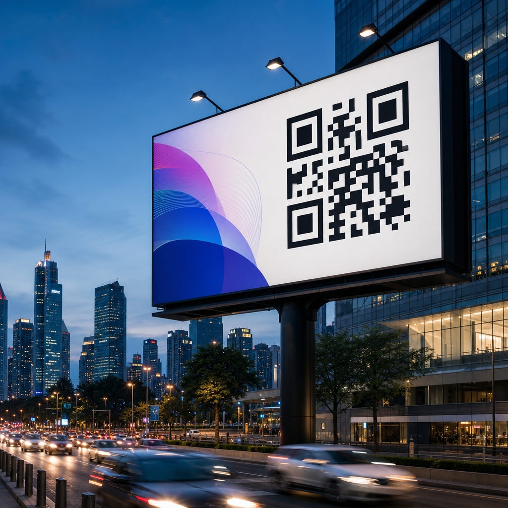
Designing QR codes for billboards and large formats requires a different mindset than designing codes for flyers, packaging, emails, or app screens. A QR code that scans instantly from six feet away can fail completely from a moving car, under midday glare, or on a weathered vinyl banner. In practice, large-format QR code design sits at the intersection of print production, mobile camera behavior, human attention, and campaign analytics. That is why teams handling out-of-home advertising, event signage, retail windows, transit shelters, and stadium graphics must treat the code as a functional conversion element, not a decorative add-on.
In this context, large format means any placement viewed from a distance, often in uncontrolled lighting and at varying speeds. Billboards are the clearest example, but the same design rules apply to building wraps, trade show walls, mall atriums, airport signage, bus stops, and roadside banners. Print vs digital design considerations matter because a QR code does not behave the same way across substrates and screens. Print introduces ink spread, material texture, installation distortion, and environmental wear. Digital signage introduces pixel density, refresh behavior, moire effects, and brightness management. I have tested both, and the failures usually come from ignoring the physical conditions around the scan, not from the code generator itself.
The core objective is simple: make the QR code easy to notice, easy to understand, and easy to scan on the first attempt. That requires choosing the right encoded destination, controlling physical size, preserving contrast, protecting the quiet zone, and placing the code where the audience has enough time to act. It also requires realistic expectations. A roadside billboard seen at highway speed is a weak environment for long interactions, while a transit shelter or store window can produce strong scan rates. When teams design for those realities, billboard QR codes become reliable gateways to landing pages, app downloads, coupons, maps, menus, lead forms, and attribution systems.
How print and digital environments change QR code performance
The biggest mistake in QR code design is assuming one asset works everywhere. Print and digital each introduce distinct technical constraints. In print, the code is fixed at production. Once the billboard is installed, any sizing or contrast mistake is expensive to correct. Ink gain can thicken modules, low-grade substrates can blur edges, and uneven surfaces can warp the square geometry scanners expect. Sunlight, rain, dust, and fading also reduce readability over time. For that reason, print QR codes need more margin for error than the same code displayed on a high-resolution screen.
Digital large-format displays remove some printing risks but create others. LED boards and digital kiosks may use coarse pixel pitches that distort fine QR modules. Motion graphics, transitions, or rotating creative can interrupt the scan window. Brightness that looks striking to the human eye can still wash out contrast for a phone camera, especially if auto-exposure shifts. On some outdoor displays, I have seen codes fail because the black modules were rendered as dark gray against a branded gradient, which appeared acceptable on a design proof but collapsed under daylight. Digital placements should therefore be tested on the actual hardware, at actual viewing distance, with multiple phone models.
User behavior also differs. People standing near a screen may expect interactivity and be ready to scan, while people viewing a printed billboard may need a stronger prompt and a simpler destination. This is why print vs digital design considerations are central to campaign planning. The medium shapes the scan conditions, the time available, and the user’s willingness to take out a phone.
Minimum size, scan distance, and placement rules that actually work
The most practical sizing rule is to relate code size to scan distance. A common baseline is a 10:1 ratio: for every ten units of viewing distance, use one unit of code width. In plain terms, a code intended to scan from ten feet away should be roughly one foot wide. That is a starting point, not a guarantee, because phone camera quality, lighting, error correction level, and encoded density all affect results. When the audience may scan from moving walkways, across a street, or through glass, I recommend sizing above the minimum.
Placement matters as much as size. Put the code where the viewer naturally pauses, not in a corner chosen only to preserve layout symmetry. On a bus shelter, eye-level placement near the right side often performs well because many people hold their phone in the right hand and approach from the sidewalk. On retail windows, avoid mounting codes too low where reflections from cars and foot traffic interfere. On billboards, lower-center or lower-right placement usually outperforms top-edge placement because it is easier to frame in a phone camera without tilting excessively.
The destination URL should also be short in structure, even if a dynamic QR code handles the redirect. Dense codes are harder to scan at distance because they contain more modules. A dynamic short link can reduce visual complexity while preserving campaign flexibility. I strongly prefer dynamic codes for large formats because they let marketers update destinations, fix broken paths, and track scans without replacing printed assets.
| Placement Type | Typical Scan Distance | Recommended QR Width | Best Use Case |
|---|---|---|---|
| Store window | 2 to 6 feet | 4 to 8 inches | Offers, hours, reservations |
| Transit shelter poster | 3 to 8 feet | 6 to 10 inches | Apps, maps, coupons |
| Trade show wall | 4 to 12 feet | 8 to 18 inches | Lead capture, product demos |
| Roadside billboard | 20 feet and beyond | 24 inches or larger | Brand lift, simple landing pages |
Contrast, branding, and error correction without breaking scannability
Branding should support recognition, but scannability always comes first. The safest design is still a dark foreground on a light background with a clean quiet zone around all sides. ISO/IEC 18004 defines the symbol structure, and while modern scanners are forgiving, they are not magic. Low contrast, transparent backgrounds, over-styled finder patterns, and crowded layouts remain the main reasons branded codes fail. In client reviews, I often ask one direct question: if the logo vanished, would the code still scan instantly? If the answer is uncertain, the design is too fragile for a billboard.
Error correction can help absorb moderate customization. QR codes use four standard levels: L, M, Q, and H. Higher levels restore more damaged data but increase module density. For large-format branding, Q or H is often useful when adding a centered logo or allowing minor wear, yet that choice should be balanced against scan distance. A denser code may require a larger print size to maintain reliability. The tradeoff is real, and the right choice depends on how much of the symbol is being altered and how far away users will scan.
Color selection deserves more discipline than many campaigns give it. Black on white remains the benchmark because smartphone cameras detect it reliably under varied exposure. Dark blue, deep green, or dark burgundy can also work if the background is very light and the contrast ratio is strong. Metallic inks, glossy laminates, neon colors, and gradients are risky, especially outdoors. If a brand palette requires a nonstandard treatment, print proofs should be tested under sunlight, shade, and evening conditions before final production.
Print production details that determine real-world scan rates
Production quality is where many well-designed codes fail. Vector artwork is essential for large-format print because raster images can introduce soft edges when scaled. I insist on SVG, EPS, or press-ready PDF output, never a low-resolution PNG stretched to billboard size. The quiet zone should remain intact after trimming, mounting, and installation. Installers sometimes place hardware, seams, or frame edges too close to the code, and that alone can make scans inconsistent.
Material choice changes readability. Matte surfaces usually outperform glossy ones because they reduce glare. Mesh banners can work for very large codes, but the open pattern can disrupt smaller module shapes if the code is too dense. Adhesive window vinyl may look sharp indoors and become reflective from the street. Fabric backdrops can wrinkle, subtly deforming the square grid. Each substrate should be matched to viewing distance and environment, not just price.
Environmental durability also matters. Outdoor placements face UV exposure, wind stress, grime, and temperature shifts. If the campaign runs for weeks or months, fading can lower contrast significantly. Protective laminates help, but they must be chosen carefully to avoid reflections. For long-duration placements, schedule periodic field checks with actual phones. I have seen codes pass prepress approval, launch correctly, and then degrade enough within a month to hurt conversions because the site faced west and took direct afternoon sun.
Digital display considerations for large screens and motion environments
Digital signage seems easier because the asset can be updated instantly, but scan reliability still depends on display physics. LED walls use discrete diodes arranged by pixel pitch. If the QR modules map poorly to that grid, edges appear jagged or broken, especially from close range. A code that looks fine on a laptop preview may perform badly on a 10 mm pitch outdoor screen. The fix is simple: size the code generously, keep module counts lower through short dynamic URLs, and preview on the actual display before launch.
Animation should be restrained. A QR code should stay on screen long enough for the user to unlock a phone, open the camera, frame the code, and tap the prompt. In most public environments, that means a stable display window of at least eight to ten seconds, with no interfering transitions. Avoid placing the code over video, gradients, or rapidly changing backgrounds. Even if the human eye can isolate it, auto-focus and exposure systems may struggle.
Brightness and color temperature affect scan success too. Excessive brightness can bloom highlights and flatten edge definition in phone cameras. Extremely cool white backgrounds may also create harsh reflections on glass-covered displays. The practical approach is to test the final creative at full operational brightness during day and night cycles, using current iPhone and Android devices. If scans slow down, reduce complexity before increasing visual flair.
Messaging, landing pages, and measurement for large-format QR campaigns
A billboard QR code succeeds only when the message around it answers three questions immediately: what do I get, why should I act now, and what happens after I scan? Clear call-to-action copy consistently improves performance. “Scan for menu,” “Scan for directions,” and “Scan to claim 20% off today” outperform vague prompts like “Learn more.” The best large-format QR campaigns keep the promised action tightly aligned with the landing page. If the sign offers a coupon, the page should open directly to the coupon, not a generic homepage.
Mobile landing pages must load fast and minimize friction. Compression, responsive design, and lightweight forms are not optional. On many outdoor campaigns, users scan while standing, commuting, or multitasking, so every extra tap reduces completion rates. Deep links can be effective for apps, but always provide a mobile web fallback in case the app is not installed. UTM parameters, first-party analytics, and platform reporting from tools such as Bitly, Beaconstac, or QR Code Generator Pro help attribute performance by location and creative version.
Measurement should extend beyond raw scan counts. Look at unique visitors, bounce rate, conversion rate, time of day, and device mix. Compare placements by context, not just volume. A mall atrium may produce fewer scans than a transit hub but far higher conversion because users have more time to complete the action. Use those insights to refine future creative, placement, and destination choices across the broader QR code design and branding program.
Designing QR codes for billboards and large formats is ultimately a systems problem. The code itself matters, but so do viewing distance, motion, contrast, substrate, lighting, messaging, and landing-page quality. Print vs digital design considerations are the center of that system because each medium changes how cameras interpret the symbol and how people behave around it. Teams that respect those differences get faster scans, lower production waste, and more dependable attribution.
The clearest rules are also the most valuable. Keep the destination simple. Use dynamic codes. Size for real scan distance, then add margin. Preserve high contrast and a clean quiet zone. Choose materials and display settings that minimize glare and distortion. Test on-site with multiple phones before full rollout, and monitor performance after launch. These steps are not aesthetic preferences; they are the operating basics of successful large-format QR code design.
For brands building a stronger QR code design and branding strategy, this hub topic provides the foundation for every related decision in the print and digital workflow. When the code is treated as a conversion tool rather than a graphic accent, large-format placements become measurable, user-friendly entry points into the customer journey. Audit your current signage, test one high-intent destination, and use the results to set a stronger standard for every future campaign.
Frequently Asked Questions
What makes QR codes for billboards and large-format advertising different from QR codes used on smaller print materials?
QR codes for billboards, transit ads, building wraps, stadium signage, trade show graphics, and other large-format placements have to perform in far more demanding real-world conditions than codes printed on brochures, product packaging, or posters viewed at arm’s length. In a large-format setting, viewers may be scanning from many feet away, at an angle, while walking, while sitting in traffic, or under inconsistent lighting. That changes the entire design approach. A code that looks perfectly acceptable on a desktop proof can become difficult to scan once it is installed high above eye level, printed on textured material, exposed to glare, or partially weathered over time.
The biggest difference is that large-format QR codes must prioritize immediate readability over visual novelty. In smaller formats, designers sometimes have more flexibility to stylize the code, reduce quiet space, or place it in crowded layouts because the user can simply move closer. On a billboard, that margin for error disappears. The code needs sufficient physical size, strong contrast, clear isolation from background elements, and placement that gives people enough time to notice it, decide to scan it, and complete the scan. That is especially important in out-of-home campaigns where attention is limited and the environment is not controlled.
There is also a production difference. Large-format printing introduces variables such as ink spread, substrate texture, installation seams, scaling artifacts, and environmental wear. Even if the source file is technically correct, poor print execution can reduce scan reliability. In addition, campaign teams often need stronger analytics and more thoughtful landing-page strategy for large-format placements because scans may come from different times of day, locations, and audience behaviors. In short, billboard QR code design is not just “make the code bigger.” It is a usability, production, and measurement problem all at once.
How large should a QR code be on a billboard or other large-format display?
There is no single universal size that works for every billboard, wallscape, kiosk, or event banner, because scan distance, traffic speed, viewing angle, and placement height all affect performance. That said, the safe rule is to design the code based on the actual distance from which people are expected to scan, not based on how it looks in the artwork file. If a code is intended for pedestrians standing nearby, it can be relatively modest. If it must be scanned from across a sidewalk, from a parking area, or from a vehicle stopped at a light, it needs to be substantially larger and easier to identify at a glance.
As a practical guideline, many designers start by evaluating the intended scan distance and then building in extra margin rather than aiming for a theoretical minimum. Large-format QR codes generally need generous dimensions because real users are not scanning in laboratory conditions. They are dealing with sunlight, shaky hands, imperfect phone cameras, and limited time. A code that is technically scannable from a certain distance may still underperform if people cannot notice it quickly or frame it comfortably within their camera view. That is why conservative sizing usually outperforms aggressive, space-saving layouts.
Just as important as the code itself is the quiet zone, the empty margin around it. If the surrounding graphics are too close, the phone may struggle to distinguish the code from the background, especially at distance. The code should also not be placed too high, too low, or too near visual clutter such as dense typography, busy photography, or reflective surfaces. Before final production, teams should print test versions at scale or simulate viewing conditions from the expected distance. In large-format work, field testing often reveals size problems that are easy to miss on screen.
What design choices improve scan reliability for billboard QR codes?
The most effective design choices are usually the simplest ones: high contrast, a clean background, adequate quiet space, minimal distortion, and conservative customization. Dark code modules on a light, matte background remain the most dependable option. While branded colors can work, they should only be used if contrast remains strong enough for quick mobile detection. Soft gradients, low-contrast palettes, metallic inks, and transparent overlays may look sophisticated in a design presentation, but they often reduce real-world scan performance once printed at large scale and viewed under variable lighting.
Shape and styling should also be handled carefully. Rounded modules, embedded logos, decorative frames, and custom finder patterns can be acceptable if tested thoroughly, but every visual modification increases risk. On a billboard or oversized banner, it is usually smarter to preserve a fairly standard QR structure and express branding around the code rather than inside it. The code should also remain perfectly square and undistorted. Stretching it to fit a layout, placing it over folds or seams, or positioning it across uneven material can make scanning unreliable.
Placement matters as much as aesthetics. The code should appear in an area with enough visual separation that the viewer immediately understands it is interactive. A short call to action such as “Scan for tickets,” “Scan for directions,” or “Scan to claim offer” improves response because it explains the benefit and reduces hesitation. In addition, the landing page behind the code should be mobile-optimized, fast-loading, and tightly aligned with the promise on the sign. A beautifully designed QR code still fails as a campaign tool if the destination page is slow, confusing, or not worth the effort of scanning.
How do lighting, weather, and installation conditions affect QR code performance in outdoor advertising?
Environmental conditions have a major impact on whether a large-format QR code performs consistently over time. Sun glare can wash out contrast, especially on glossy finishes or laminated surfaces. Shadows can obscure portions of the code during parts of the day. Rain, dirt, fading, wrinkles, and material wear can all reduce readability. Even the angle of installation matters. A code mounted on a curved surface, mesh banner, or uneven panel may be harder for phone cameras to interpret than the same code on a flat, nonreflective substrate.
This is why production and installation teams should be included early in the design process. The choice of material, finish, and print method is not just a fabrication issue; it directly affects scan success. Matte finishes are often safer than glossy ones because they reduce reflections. Strong black-and-white or similarly high-contrast combinations usually hold up better outdoors than subtle brand-driven color choices. If the code will be exposed for a long campaign, the artwork should allow enough resilience that minor fading or surface wear does not immediately compromise usability.
Testing should reflect actual environmental conditions whenever possible. It is not enough to verify that the QR code scans indoors from a laptop display or a small proof print. Teams should test under daylight, at expected viewing angles, and from realistic positions on the sidewalk or roadside. If the placement is temporary, such as at an event or festival, test after installation rather than assuming the file will behave the same way in context. Outdoor QR success depends on the whole chain: design, print quality, material choice, physical placement, and environmental exposure.
How should marketers track and optimize QR code performance for billboards and other out-of-home campaigns?
Tracking starts with using dynamic QR codes whenever possible. A dynamic code allows marketers to update the destination URL without reprinting the creative, which is especially valuable in large-format campaigns where replacement is expensive and slow. It also enables scan analytics, including total scans, time-based patterns, device information, and in some cases location-level trends. For billboard and out-of-home campaigns, that flexibility is critical because teams often need to optimize messaging, landing pages, promotional timing, or traffic routing after launch.
To get meaningful performance data, the QR code should point to a dedicated, mobile-first landing experience with campaign-specific tracking parameters. That makes it easier to attribute scans accurately and compare results across placements, creative versions, cities, venues, or event periods. For example, one billboard near a commuter corridor may produce strong morning engagement while another near an entertainment district performs better in the evening. Without campaign-specific URLs and analytics structure, those insights can be lost. Good QR measurement should connect scans not just to traffic, but to downstream outcomes such as signups, purchases, coupon redemptions, app installs, or lead submissions.
Optimization should go beyond scan count alone. A high number of scans with poor landing-page conversion may indicate that the call to action is compelling but the post-scan experience is weak. A low scan rate may point to issues with placement, size, contrast, or the audience’s ability to scan safely and comfortably in that environment. Strong teams review both creative and behavioral data together. They test different calls to action, simplify destination pages, compare placements, and use dynamic redirects to improve relevance over time. In large-format QR campaigns, the best results usually come from treating the code not as a decorative add-on, but as a measurable conversion pathway that deserves the same rigor as any digital acquisition channel.


