QR code contrast guidelines for print and screens determine whether a code scans instantly or fails in front of a customer. Contrast, in this context, means the measurable visual difference between the dark modules that encode data and the lighter background that surrounds them. Readability is the scanner’s ability to distinguish those modules accurately under real viewing conditions, including glare, motion, distance, poor lighting, and imperfect printing. In my work reviewing branded QR campaigns for packaging, retail signage, menus, and mobile landing pages, contrast has been the single most common reason attractive codes underperform. Teams often focus on logo placement or shape styling first, yet scanning success usually depends more on luminance separation, quiet zone preservation, and output quality than on any decorative treatment.
This matters because QR codes now bridge physical and digital experiences in nearly every industry. Restaurants use them for menus and ordering, manufacturers place them on labels for instructions and traceability, event organizers rely on them for ticketing, and marketers use them to connect posters, direct mail, and social ads to measurable destinations. A code that fails even occasionally creates friction at the exact moment a user is ready to act. That friction reduces conversions, increases support requests, and weakens trust in the brand. Good contrast design is therefore not only a technical specification but a business requirement that affects campaign performance, accessibility, and customer experience across both print and screens.
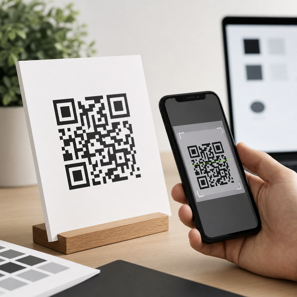
At a practical level, the core rule is simple: use a dark foreground on a light, solid background, and preserve enough contrast that smartphone cameras and decoding software can separate the pattern quickly. The nuance lies in how contrast behaves across coated paper, matte labels, LED displays, tinted packaging, gradients, and branded color palettes. Different substrates absorb ink differently, screens emit light rather than reflect it, and camera processing can misread low-contrast combinations that still look acceptable to the human eye. This hub article explains the full set of color, contrast, and readability principles you need to design QR codes that remain on brand without sacrificing scan reliability.
Why contrast is the foundation of QR code readability
A QR code works because a scanner identifies the position markers, alignment patterns, timing pattern, and data modules as a structured grid. For that process to succeed, the image must present clear edges and stable tonal differences. Scanners do not care whether a code matches a visual identity; they care whether the symbol can be segmented from its background and corrected through error correction. In testing, I have seen a plain black-on-white code scan from six feet away while a beautifully branded navy-on-charcoal version failed at arm’s length. The reason is straightforward: insufficient luminance contrast forces the camera to hunt for edges, increases motion blur sensitivity, and causes thresholding errors during decoding.
Foreground and background should therefore be chosen by relative lightness, not by hue alone. Two colors can look distinct to a designer on a calibrated monitor yet collapse into similar grayscale values in a phone camera pipeline. Deep blue on black, red on dark brown, or metallic gold on cream may satisfy a brand palette but often produce inconsistent results. The safest specification is a very dark code on a very light background, ideally close to black on white. If brand colors are required, verify them in grayscale and test under multiple lighting conditions. Contrast should remain obvious even when saturation is removed, because many scanners effectively evaluate tonal separation first.
Another essential factor is the quiet zone, the blank margin around the code. ISO/IEC 18004 defines the QR Code symbology and requires a clear border at least four modules wide on all sides. Designers sometimes let background imagery, text, or decorative frames intrude into that space, assuming the code itself remains readable. In practice, reducing the quiet zone often hurts scanning more than moderate styling inside the symbol. The scanner uses that clean perimeter to distinguish the code from surrounding content. Good contrast extends beyond the modules; it includes a calm, uninterrupted field around the symbol so the software can localize it instantly.
Best color combinations for print and digital QR codes
The most reliable color combination for a QR code is black on white, followed closely by other dark-on-light pairings such as dark navy on white, dark green on ivory, or charcoal on pale yellow. These combinations create strong luminance separation while remaining flexible enough for branded environments. In print, uncoated white stock with rich black or dense process black usually performs well because it minimizes glare and preserves edge definition. On screens, a near-black foreground against a bright neutral background works well across LCD and OLED devices because the symbol remains legible despite varying brightness settings and color profiles.
Some color combinations are consistently risky. Light foregrounds on dark backgrounds can scan, but they are less dependable because many scanners are tuned for dark modules on a light field. Inverted codes may also suffer when reflections, screen dimming, or print noise reduce edge clarity. Red is another common problem area. Phone camera sensors and image processing often treat red with less apparent detail than darker neutral tones, so red modules on a white background may appear weaker than expected. Pastel foregrounds, metallic inks, translucent varnishes, and neon hues also reduce reliability, especially under mixed lighting. If such treatments are nonnegotiable, increase code size, keep the background plain, and validate with broad device testing.
For teams balancing branding and usability, the useful question is not “Can this color scan once?” but “Will this color scan quickly for most users in average conditions?” That standard is far stricter. A luxury cosmetics package might support a dark plum code on a pale blush carton, but only if the printed density is high, the finish is matte, and the quiet zone remains clean. A stadium concourse screen may display a white-on-dark code successfully at large scale, yet the same treatment can fail on a dim phone screen shared in sunlight. Favor combinations that preserve margin for error, because real users do not scan in lab conditions.
How print materials change contrast performance
Print introduces variables that designers often underestimate. Ink gain can make dark modules spread slightly on absorbent stock, softening corners and shrinking white gaps. On glossy substrates, specular reflections create bright hotspots that wash out parts of the code from certain angles. Textured materials such as kraft paper, fabric labels, corrugated board, and embossed packaging can break module edges or create uneven backgrounds. Even when the artwork file is technically correct, production can reduce effective contrast enough to cause intermittent scan failures. That is why QR code contrast guidelines for print must account for substrate, finishing, and viewing distance, not just color values chosen on screen.
In production reviews, I recommend asking printers for physical proofs whenever the code appears on packaging, point-of-sale signage, or direct mail with a strong call to action. A contract proof or short press run reveals whether the chosen ink, paper, and coating preserve clean module separation. Matte varnish is generally safer than gloss over the code area because it controls glare. Foils, spot UV, and metallic effects should be kept away from the symbol unless extensive testing confirms reliability. Minimum size also matters: a code that is technically high contrast can still fail if the modules become too small for the output method. For many print use cases, 0.4 millimeter modules are a practical baseline, with larger sizes preferred for distance scanning.
Placement affects print readability as much as color. Codes wrapped around bottle curves, folded over box edges, or placed near perforations and seams can distort the square geometry that scanners expect. Outdoor posters and window clings add environmental complications such as backlighting, rain, and shifting reflections. In these contexts, increasing contrast alone may not solve the problem; you may also need larger physical size, simplified surrounding design, and stronger error correction. The best print QR codes are not merely visible. They are physically stable, glare-aware, and easy to isolate from the background at the moment a user raises a phone.
How screen displays affect QR code contrast
Screens present the opposite challenge from print because they emit light and vary continuously by device, brightness, anti-glare coating, and environment. A QR code that looks crisp on a desktop monitor may bloom on an aging projector, clip on an LED billboard, or wash out on a smartphone used outdoors. OLED screens can produce deep blacks, but aggressive battery saving, auto-brightness, and tinted display modes can reduce perceived separation. LCDs may shift contrast off-axis, affecting scans from angled viewpoints. For digital QR deployments, the safest approach is to design with conservative color choices and enough size to survive real-world display limitations.
Animation and scaling deserve special attention. Marketers often place QR codes into video end cards, carousel ads, conference slides, or digital out-of-home units. If a code appears for only a few seconds, contrast must be strong enough for instant acquisition, and the symbol must remain static while users aim their cameras. Moving backgrounds, subtle parallax, and transparency overlays can interfere with detection even when the code itself remains visible. Likewise, responsive web layouts sometimes resize QR images too small on mobile screens. A code intended for desktop sharing should not automatically shrink below practical scan size on tablets or phones.
When QR codes are displayed on consumer devices for another device to scan, brightness control is critical. I have seen support teams blame code design when the real issue was a user presenting a ticket at 20 percent screen brightness behind a cracked privacy screen. Event and transit apps often solve this by forcing a high-brightness ticket view with a plain white background and black code. That design choice is not cosmetic; it directly improves throughput at entry gates. If your QR code is shown on a screen, optimize the full display state, not just the image asset.
Practical contrast rules, testing methods, and common mistakes
The most dependable workflow is to set explicit pass criteria before finalizing artwork. Use a dark foreground, a light uniform background, a four-module quiet zone, and sufficient symbol size for the scanning distance. Generate the code in vector format when possible so edges remain sharp across outputs. Choose an error correction level that fits the design treatment; higher correction supports modest logos or styling, but it does not rescue poor contrast or a damaged quiet zone. Then test with iPhone and Android devices, native camera apps, and at least one dedicated scanning app if the use case is operationally critical.
| Design factor | Recommended practice | Common failure |
|---|---|---|
| Foreground/background | Very dark code on very light solid background | Mid-tone on mid-tone branded palette |
| Quiet zone | Clear margin at least four modules wide | Text, borders, or images touching the code |
| Print finish | Matte or low-glare area around the symbol | Gloss, foil, or reflective coating over modules |
| Screen display | High brightness and static presentation | Dim display, animation, or transparent overlay |
| Testing | Check multiple devices, angles, and lighting conditions | Approving after one successful office scan |
Testing should mimic actual use. For packaging, scan under retail lighting, from expected shelf angles, and after the package is assembled. For posters, test from realistic approach distances and in sunlight if applicable. For screens, test at low and high brightness, with dark mode enabled on nearby interfaces, and on older phones with average cameras. A code that scans eventually is not good enough. Measure time to first successful scan and the percentage of successful scans across devices. In campaign audits, even a one-second reduction in scan friction can produce meaningfully better engagement because users abandon quickly when the first attempt fails.
The most common mistakes are predictable: using low-contrast brand colors, placing the code over photography, shrinking it to preserve layout, adding a logo that blocks key modules, inverting the symbol without testing, and assuming error correction compensates for everything. It does not. Error correction helps when a portion of the symbol is obscured or damaged, but the scanner still needs clean localization and tonal separation. Another frequent error is exporting a raster image at low resolution, which blurs module edges on print or screen. Crisp geometry, strong contrast, and disciplined testing consistently outperform more elaborate treatments.
Building a branded QR system without sacrificing readability
Strong QR branding is possible when the system starts with nonnegotiable technical rules. Define approved foreground and background pairings, minimum sizes by channel, clear-space requirements, and prohibited treatments such as gradients, reflections, and busy image overlays. Document separate standards for packaging, signage, email, social, in-app display, and out-of-home screens because each medium has different risk factors. Then create a small library of pretested templates rather than allowing every campaign to invent its own code style. This approach speeds production, protects performance, and makes future internal linking across your broader QR code design and branding content easier to support.
Brand expression should happen around the code more than inside it. Use surrounding typography, calls to action, frames outside the quiet zone, and contextual imagery that explains the value of scanning. If you add a logo to the center, keep it modest and verify that the selected error correction level still leaves comfortable redundancy. Adobe Illustrator, Figma plugins, and established generators such as QR Code Generator Pro, Beaconstac, and Bitly all make styling easy, but easy styling is not the same as reliable implementation. The highest-performing systems I have worked on treat the QR symbol as an engineered asset inside a branded composition, not as a decorative canvas.
The payoff is measurable. High-contrast QR codes scan faster, reduce user hesitation, and improve the consistency of attribution across offline and digital channels. They also age better: when lighting changes, printers vary, or users present damaged screens, well-designed codes retain more margin for error. If you are building a QR code design and branding program, make contrast your governing standard for color, contrast, and readability decisions. Audit existing codes, test them in the environments where people actually scan, and update your design system so every future code starts from proven contrast guidelines rather than guesswork.
Frequently Asked Questions
What does contrast mean in a QR code, and why is it so important for print and screen use?
Contrast in a QR code is the visual difference between the darker data modules and the lighter background behind them. In practical terms, it is what allows a phone camera or scanner to quickly separate the encoded pattern from everything around it. If that difference is strong and clean, the scanner can identify the finder patterns, alignment areas, and data modules almost instantly. If the contrast is weak, the code may still look attractive to a human eye, but it becomes much harder for a camera sensor and decoding software to interpret accurately.
This matters on both print and screens because real-world scanning conditions are rarely ideal. A code might be viewed at an angle, under glare, in dim light, on textured packaging, or from a moving hand. In those conditions, even a small drop in contrast can cause a failed scan or repeated scan attempts. For printed pieces, ink gain, paper stock, matte versus gloss finishes, and color shifts during production can reduce effective contrast. On screens, brightness settings, reflections, low-quality displays, dark mode interfaces, and tinted overlays can all interfere with readability.
From a performance standpoint, contrast is one of the most important factors in QR reliability because it directly affects whether the scanner can distinguish the code’s structure quickly enough to decode it without hesitation. Good contrast improves scan speed, lowers abandonment, and reduces friction at the moment when a customer is ready to engage. That is why strong contrast is not just a technical preference; it is a usability requirement and often the difference between a campaign that converts and one that gets ignored.
What are the best color combinations for QR code readability?
The safest and most effective approach is to use a dark foreground on a light background. Black on white remains the benchmark because it creates maximum clarity for almost every scanning environment. Dark navy on white, deep charcoal on pale cream, and other clearly separated combinations can also work well, provided the contrast remains high. The key principle is not necessarily the specific brand colors themselves, but whether the scanner can consistently tell the modules apart from the background under varying real-world conditions.
Combinations that often cause trouble include light colors on white, mid-tone colors against similar-value backgrounds, metallic inks, gradients, and reversed codes where a light code sits on a dark field. Some modern scanners can read reversed or stylized codes, but they are still less dependable, especially in poor lighting or on lower-quality phone cameras. Red on black, orange on yellow, silver on white, pastel-on-pastel, and glossy low-contrast pairings are particularly risky because they may appear visually pleasing while performing poorly in scanning tests.
For branded campaigns, the best practice is to preserve brand expression around the code rather than inside the code if contrast becomes questionable. If the code itself must use brand colors, test the exact production file on the final material and on the actual devices your audience is likely to use. What scans in a bright studio on a flagship phone may fail on a mid-range device in a retail aisle. A good rule is simple: choose combinations with a clearly dark code, a clearly light background, and no ambiguity when seen at a glance.
How much contrast does a printed QR code need to scan reliably on packaging, posters, and marketing materials?
A printed QR code needs strong, consistent contrast across the entire symbol, not just in the digital artwork before production. Designers sometimes approve a code because it looks sharp on screen, but the printed result can lose readability due to substrate texture, ink spread, registration issues, varnishes, or color shifts on press. For reliable scanning, the dark modules should remain solid and well-defined, while the light background should stay clean and uncluttered. Any reduction in that separation can make the module edges appear soft, which slows recognition and increases failure rates.
Packaging presents additional complexity because the surface is often curved, glossy, flexible, or exposed to wear. A code printed on a reflective pouch, shrink sleeve, or coated carton may have technically acceptable artwork but poor real-world readability because glare washes out the dark-light distinction. Posters and signage face their own problems, such as distance, ambient sunlight, and motion from passersby. In all of these cases, higher contrast gives the scanner more tolerance and improves the odds of a successful read from imperfect viewing angles.
As a working guideline, aim for the darkest practical modules on the lightest practical background, preserve a clean quiet zone around the code, and physically test samples from final production. Do not rely only on PDF proofs or monitor previews. Print the code at intended size, place it on the actual material, and scan it in likely use conditions: indoor lighting, outdoor light, glare, arm’s-length distance, and different phone models. Reliable print performance comes from combining strong contrast with realistic testing, not from aesthetics alone.
Do screen-based QR codes need different contrast considerations than printed QR codes?
Yes, screen-based QR codes should be evaluated differently because displays introduce their own set of scanning variables. Unlike print, screens emit light, which changes how contrast is perceived by both the human eye and the camera sensor. Brightness levels, display resolution, anti-aliasing, color calibration, viewing angle, and screen protectors can all affect readability. A QR code that appears crisp on a designer’s laptop may become harder to scan on a dim kiosk display, a low-brightness phone, or a digital sign viewed in sunlight.
One common issue with on-screen codes is reduced effective contrast caused by glare or insufficient brightness. Another is the use of overlays, gradients, or animated backgrounds behind the code. Even when the code technically remains visible, these design elements can confuse edge detection and reduce decoding speed. Dark mode can also introduce problems when a code is inverted or placed on a dark interface with only moderate tonal separation. In many cases, a standard dark-on-light code inside a clearly defined white container performs much better than a heavily stylized code integrated directly into the interface.
The best practice for screens is to maintain high contrast, avoid visual noise around the code, size it appropriately for the expected scanning distance, and test on multiple devices at different brightness settings. Also check performance when the viewing screen is tilted, partially reflective, or used in bright ambient conditions. Screen QR codes often fail not because the code itself is invalid, but because the display environment weakens contrast enough to challenge the camera. Strong visual separation remains the most dependable solution.
How can you test whether a QR code has enough contrast before launching a campaign?
The most reliable way to test QR contrast is to evaluate the code in the exact conditions where people will actually scan it. Start by reviewing the final design, not an earlier draft, and test the code at its final size, color values, placement, and output method. If it is for print, test printed samples from the actual substrate and finish. If it is for screens, test the live code on the real display hardware. Then scan using multiple phones, including both newer and older devices, because camera quality and decoding performance vary widely.
Testing should go beyond the question of whether the code scans once. Measure how quickly it scans, how consistently it scans, and how tolerant it is to common real-world challenges. Try different distances, angles, indoor and outdoor lighting, glare, motion, and partially dimmed screens. If users must pause, reposition the phone, or make repeated attempts, the code may be technically scannable but operationally weak. That usually signals that contrast, size, placement, or surrounding design needs improvement.
It is also wise to test edge cases that often expose weak contrast: glossy packaging under store lighting, posters behind glass, mobile screens in sunlight, and branded color treatments with lower tonal separation than black on white. In practice, contrast problems are often discovered only when the code leaves the design environment and enters the real world. A code is ready for launch when it scans fast, scans repeatedly, and scans across a range of devices and conditions without user effort. That level of consistency is the standard to aim for.


