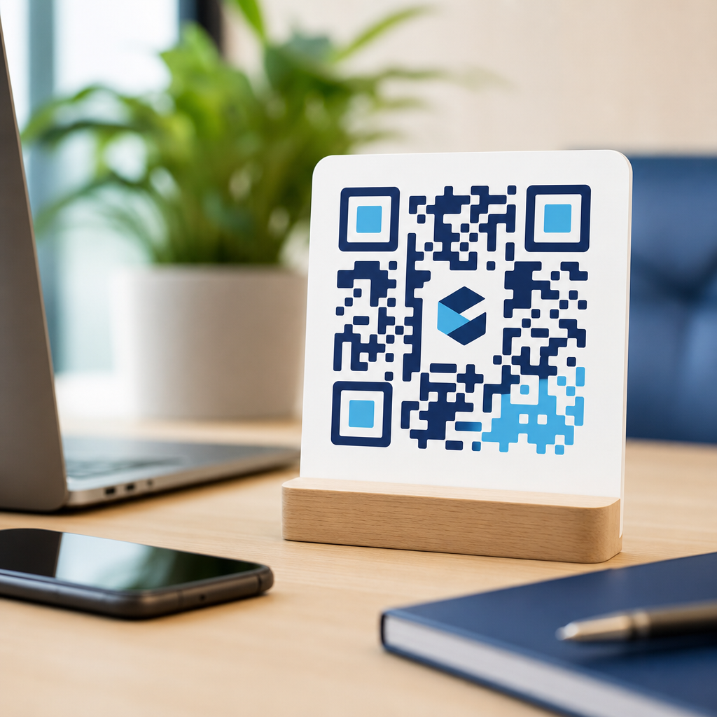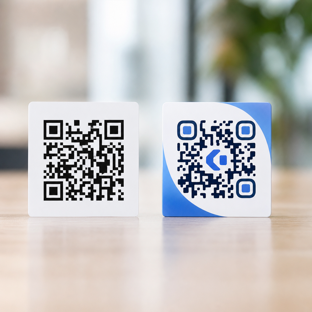
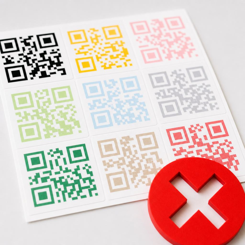
Color mistakes can break QR codes even when the artwork looks polished, on-brand, and technically correct to a designer. In practice, scannability depends less on aesthetics and more on whether a phone camera and decoding software can separate dark modules from a lighter background fast enough to reconstruct the symbol. I have tested branded QR campaigns on packaging, posters, menus, trade show walls, and app screens, and the same pattern appears repeatedly: teams focus on logo placement and ignore color contrast, print behavior, glare, and lighting. The result is a code that passes internal review but fails in the wild.
A QR code is a two-dimensional matrix barcode made of small square modules arranged in a fixed structure that includes finder patterns, alignment patterns, timing patterns, format information, and data regions. Readability is the decoder’s ability to detect that structure from a captured image. Contrast is the luminance difference between foreground and background. Color matters because cameras do not read design intent; they convert reflected or emitted light into values, apply exposure and sharpening, then let software search for the geometric signature of the code. If the visual separation is weak, inconsistent, or distorted, the scan fails.
This hub page explains the color, contrast, and readability issues that matter most in QR code design and branding. It covers why some stylish palettes perform poorly, how print and screen environments change perceived contrast, what happens when gradients, metallic inks, or dark mode are introduced, and which testing methods catch failures before launch. If you are building a branded code for retail packaging, restaurant signage, direct mail, or digital display, these principles are not optional. A QR code only succeeds when it scans quickly, from common devices, at realistic distances, under imperfect lighting, and without asking the user to try twice.
Why color breaks QR codes more often than shape or logo changes
Most modern generators let you customize module shapes, add rounded corners, embed a center logo, and recolor the symbol. Designers often assume color is the safest customization because the code structure remains intact. In real deployments, color is the highest-risk variable because it changes the signal the camera sees before decoding begins. A decoder cannot correct for poor detection. Error correction helps recover damaged or obscured data after the symbol has been found, but it does not rescue a code the camera never isolates from its background.
The most common failure is insufficient light-dark separation. A navy code on a black package, a pastel code on a cream label, or a mid-gray code on brushed aluminum may look elegant but provide too little luminance contrast. Many smartphones preprocess images aggressively, especially in low light. They lift shadows, reduce noise, and compress tonal differences, which can make subtle color separations collapse into the same value range. I have seen dark green on red holiday packaging test acceptably in a bright office and fail in a retail aisle because warm store lighting reduced the apparent contrast further.
Another frequent problem is “inverted thinking.” Teams remember that some apps can scan white codes on black backgrounds and assume inversion is broadly safe. It is not. Some operating systems and camera apps handle reversed polarity better than others, and printed reversed codes are especially fragile when glare, fingerprints, or surface texture are present. The safest standard remains dark modules on a light background with a clear quiet zone around the symbol.
How cameras actually interpret color and contrast
Phone cameras do not read QR codes as a designer sees them in Illustrator or Figma. They capture light through a sensor, apply auto exposure, white balance, demosaicing, sharpening, and contrast adjustments, then pass the processed image to a decoder. Because detection begins from image contrast rather than brand semantics, the best-performing QR codes are designed around luminance, not hue. Blue and yellow can feel dramatically different to a human eye, yet if their brightness levels are too similar after camera processing, the code can fail.
This is why “different colors” are not enough. A saturated royal blue on a dark charcoal background may have strong brand recognition but poor machine readability. Likewise, red on black is a notorious problem because camera sensors and image pipelines can render red modules darker yet noisier, especially in dim conditions. Metallic substrates add another complication: specular reflection creates bright hotspots that erase modules temporarily. Laminated menus, glossy flyers, and foil pouches often fail not because the code file is wrong, but because the reflective finish alters the captured image.
Distance also changes effective contrast. At a few inches, modules occupy enough pixels for the decoder to infer edges. At several feet, especially on signage, subtle module edges blur together. Colors that barely pass at close range often fail at intended use distance. For that reason, readability should always be judged at deployment distance, on target materials, with ordinary consumer phones rather than only desktop previews or generator app thumbnails.
The safest color rules for branded QR codes
If you need a single rule, use a dark foreground on a light, matte background and keep the quiet zone clean. In production, that means near-black, deep navy, dark green, or similarly dense modules placed on white or a very pale solid background. The background should not contain patterns, photography, texture, or transparency effects inside the quiet zone. I recommend checking contrast in grayscale because a quick desaturation preview reveals whether your attractive palette still preserves machine-readable separation.
Branding can still work within these constraints. Many successful retail and hospitality campaigns use a brand color for the modules while preserving high luminance contrast. Starbucks-style deep green can work on white. A luxury brand can use rich black on warm ivory paper. A fintech app can place a dark indigo code on a light mint card if the mint remains bright enough and the interface does not introduce gradients behind the symbol. The discipline is simple: let brand color support the code, not overpower it.
Quiet zone discipline is equally important. ISO/IEC 18004 defines the QR code structure and emphasizes the clear margin around the symbol. In practical terms, that empty border helps the decoder distinguish the code from nearby artwork or text. Color mistakes often creep into the quiet zone through decorative boxes, shadows, or textured backgrounds. Even when the modules themselves are readable, a contaminated quiet zone delays detection or causes complete failure.
High-risk color treatments and what to use instead
Several treatments consistently underperform in field tests. Gradients are the first. A gradient can create local areas where some modules become too light relative to adjacent background regions. Transparent overlays cause similar issues because the underlying image changes the effective background from one part of the code to another. Metallic inks, embossing, spot gloss, holographic film, and reflective laminates all reduce consistency across viewing angles. Neon colors can also be unpredictable on low-quality printers because dot gain and substrate absorption shift the intended values.
The safer replacement is flat color with predictable reproduction. If you want depth, place the code in a solid panel that contrasts with the surrounding design rather than styling the code itself aggressively. If you want a premium effect, use uncoated stock, matte varnish, or a contrasting label area instead of foil over the symbol. If you need the code on a photograph, add a solid light block underneath and preserve the quiet zone. These small compromises protect the one function that matters: a first-attempt scan.
| Treatment | Common failure mode | Safer alternative |
|---|---|---|
| Light modules on dark background | Inconsistent support across camera apps; glare worsens reversal | Dark modules on white or very light solid background |
| Gradient fill | Local contrast drops in part of the symbol | Single flat dark color |
| Photo behind code | Busy detail confuses edge detection and quiet zone | Solid panel beneath code |
| Metallic or glossy finish | Reflections erase modules at angle | Matte print area |
| Pastel-on-pastel palette | Low luminance contrast after camera processing | Deep foreground with pale background |
| Transparent background | Uncontrolled contrast on different surfaces | Fixed light background color |
Print variables that change color after approval
Many QR code failures begin after the design is approved. A code that scans on a calibrated monitor can degrade on press because CMYK conversion changes density, coated stock adds glare, and small modules fill in from dot gain. Thermal labels are another common issue. On direct thermal printers, heat variation can soften edges, while synthetic labels may reflect overhead lighting more strongly than plain paper. Flexographic packaging introduces its own tolerances, particularly on films and pouches where registration and ink spread can affect sharpness.
I advise clients to request physical proofs for any high-volume QR deployment, especially if the code is small, colorized, or printed on unusual materials. Test under store lighting, daylight, and shadow. Scan with both iPhone and Android devices, using native camera apps and at least one third-party scanner. If the code is meant for a shelf talker or poster, test from expected approach distance. If it sits on curved packaging, test on the actual curve because distortion near edges can interfere with finder pattern recognition.
Color management matters here. Pantone spot colors can be useful when a brand requires precise reproduction, but the chosen ink still needs enough density against the substrate. Rich black is often safer than a complex dark brand mix because it prints more consistently. When in doubt, prioritize scannability over color fidelity. A QR code is a functional interface element, not a decorative icon.
Screen-based QR codes, dark mode, and digital display pitfalls
Digital QR codes avoid print defects but introduce other color problems. OLED screens can render deep blacks beautifully, yet screen brightness, reflections, moire from photographed displays, and app-level theming can still reduce readability. Dark mode creates a specific risk: teams place a light code on a dark interface because it matches the product aesthetic. Some devices scan it, some hesitate, and some fail when the user lowers brightness or tilts the phone.
A better digital approach is to preserve the same rule used in print. Present the QR code inside a light card or modal even within a dark interface. Keep the code large, use a static background, and avoid animated gradients or particle effects nearby. If the code appears on a presentation screen or kiosk, do not let brand videos or moving textures sit behind it. Movement reduces edge stability and can trigger rolling shutter artifacts on certain cameras.
For cross-device reliability, test screenshots and live rendered screens separately. Compression in messaging apps, email clients, and social platforms can soften module edges or alter contrast. A QR code that scans within your app may fail after being screenshotted, resized, and reposted by users. That distribution reality should inform the original color and size choices.
Testing methods that catch color and readability failures early
The fastest way to prevent broken branded QR codes is structured testing before release. Start with a grayscale check. If the code and background blend when desaturated, revise the palette. Next, test at multiple sizes and distances. Use at least two recent iPhones and two Android phones from different manufacturers because camera tuning varies. Scan in bright light, low indoor light, and angled light. Then print the code on the actual substrate or view it on the actual display environment.
I also recommend testing with intentional abuse: a slightly wrinkled label, a fingerprint on glossy stock, reduced screen brightness, and a quick scan while walking. Real users do not stage perfect scans. They glance, point, and move on. If the code only works when centered carefully in ideal light, the design is not production-ready. Dynamic QR platforms such as Bitly, QR Code Generator Pro, and Beaconstac are useful for management and analytics, but no platform can compensate for poor physical readability. The camera must detect the symbol first.
As this hub expands, related pages should go deeper into contrast ratios, inverted codes, gradients, print finishes, dark mode, packaging tests, and accessibility considerations. The core principle remains unchanged: choose color with machine vision in mind, validate it in the real environment, and protect the quiet zone relentlessly. When you do that, branded QR codes can look refined and still scan instantly. Review your current codes, replace risky palettes, and build every future design around contrast first.
Frequently Asked Questions
Why do QR codes fail when the colors look clean, stylish, and perfectly on-brand?
Because scanners do not judge a QR code the way a designer does. A phone camera and decoding software are not looking for something that feels balanced or visually polished; they are trying to detect a clear pattern of dark modules against a lighter background quickly and reliably. When the contrast between foreground and background is too low, or when the chosen colors are too similar in brightness even if they look different in hue, the scanner may not be able to separate the data pattern well enough to decode it.
This is why a QR code can look excellent in a mockup and still perform poorly in the real world. Brand palettes often rely on subtle tone-on-tone combinations, muted neutrals, gradients, metallic effects, or reversed color treatments that reduce the visual distinction the scanner needs. Human eyes can often still “see” the code, especially on a large screen or in ideal lighting, but camera sensors are dealing with glare, motion blur, exposure shifts, reflections, and automatic image processing. Under those conditions, aesthetic color choices that seemed harmless can become decoding failures.
The practical rule is simple: prioritize strong luminance contrast over style-first color harmony. Dark foreground, light background, and consistent tones across the code remain the safest approach. If branding matters, apply it carefully around the QR code rather than weakening the code itself. A code that matches the campaign but does not scan is not branded well; it is broken.
Which color combinations are most likely to break a QR code?
The riskiest combinations are those with weak light-dark separation, even when the colors seem visually distinct. Common problem pairs include navy on black, red on orange, dark green on brown, pastel foregrounds on white, gold on cream, and medium gray on light gray. These combinations often fail because the scanner cares far more about brightness contrast than color identity. Two colors can be very different in brand terms yet still too close in tonal value for reliable detection.
Another major issue is using light colors for the modules and dark colors for the background. While some advanced decoders can handle inverted or unusual treatments, you should not depend on that. Standard QR performance is strongest when the modules are dark and the background is light. Reversing that relationship introduces unnecessary risk, especially across different phone models, older camera systems, third-party scanning apps, and poor environmental conditions.
Gradients, metallic inks, translucent overlays, photographic fills, and textured backgrounds also create trouble. A gradient may leave one portion of the code scannable and another too faint to read. Metallic or glossy finishes can reflect overhead light and wash out key areas. Transparent color treatments can shift depending on what sits behind the code. In all of these cases, the code may technically exist, but the scanner sees inconsistent information. If the code is going on packaging, signage, menus, or event graphics, solid dark modules on a plain light background are still the most dependable choice.
Does contrast matter more than the actual brand colors used in the QR code?
Yes. In practice, contrast is the foundation of QR scannability. You can often make a branded QR code work if the foreground remains sufficiently dark and the background remains sufficiently light, but once contrast drops too far, no amount of visual refinement will save it. This is one of the most common mistakes in custom QR campaigns: the team selects approved brand colors first and assumes the code will scan because the layout is technically correct. In reality, a correctly structured code can still fail if the scanner cannot distinguish its data pattern fast enough.
What matters most is not whether the colors are brand-approved, but whether they produce a strong tonal difference under real-world scanning conditions. That includes indoor lighting, daylight, angled viewing, screen brightness, print finish, and camera auto-exposure behavior. A code that scans on a designer’s calibrated monitor may fail on matte packaging under warehouse lighting or on a trade show wall under bright overhead fixtures. The same color pair can perform differently depending on material and environment.
The best approach is to treat brand colors as a secondary design layer, not the primary decision-maker. Use the darkest brand color available for the modules if possible, and pair it with the lightest practical background. If your brand system does not offer enough contrast, create a scanning-safe exception. Good branding supports function. It does not require sacrificing function.
Can gradients, transparency, shadows, or decorative effects interfere with scanning?
Absolutely. Decorative styling is one of the fastest ways to turn a working QR code into a fragile one. Gradients can reduce contrast across parts of the symbol, causing some modules to appear darker than others and making the pattern harder to reconstruct. Transparency can let background imagery or color noise bleed through the code. Shadows, glows, bevels, and other effects can distort module edges, which matters because QR decoding depends on the scanner identifying clean, predictable geometry.
Problems become even more obvious in physical applications. On packaging, glossy coatings and curved surfaces can alter how decorative effects are perceived by the camera. On posters or windows, reflections can erase subtle tonal differences. On screens, transparency and layered interface elements can create moiré, blur, or inconsistent contrast depending on brightness and viewing angle. Decorative effects that seem minor in design software often become significant once the code is photographed rather than viewed directly.
If you want a QR code to perform reliably, keep the data area visually simple. Use solid fills, crisp edges, and a quiet background. If you need creative expression, place it around the code rather than inside the modules. You can style the surrounding container, add a brand frame, include a call to action, or use color elsewhere in the composition. The safest place for creativity is around the symbol, not in the signal the scanner must decode.
How can I test whether a colored QR code is still safe to use before launching it?
Test it in the same messy conditions where real people will encounter it, not just in a perfect studio preview. Start by scanning the code with multiple devices, including both newer and older phones if possible. Test native camera apps as well as common third-party scanners. Check performance at different distances and angles, because a code that scans only when centered perfectly is already too fragile for most campaigns.
Then test across realistic environmental variables. For print, evaluate it under bright daylight, indoor ambient lighting, and harsh overhead lights. Check glossy versus matte proofing if relevant. For screens, try different brightness settings, dark mode surroundings, and slightly dirty or fingerprinted displays. If the QR code will appear on packaging, menus, trade show walls, or retail signage, test on the actual substrate and at final size. Material, finish, and placement all affect how the camera captures contrast.
You should also test with speed in mind. A good QR code should scan quickly, not eventually. If users have to pause, reframe, move closer, or try more than once, your color treatment is already too risky. Fast first-pass scanning is the standard to aim for. If results are inconsistent, simplify the design: darken the modules, lighten the background, remove effects, and increase the quiet zone clarity. The goal is not to prove that the code can scan under ideal circumstances. The goal is to confirm that it scans effortlessly under normal ones.