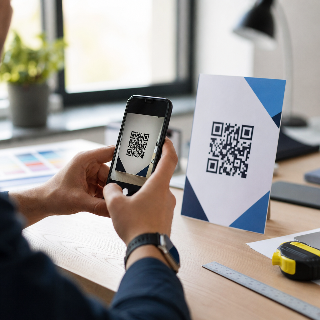
How to test QR code visibility before launch starts with understanding a simple fact: a beautifully branded code that scans poorly is a failed asset. In QR code design, visibility means more than whether people can see the symbol on a page or package. It includes contrast, quiet zone integrity, module definition, viewing distance, lighting tolerance, print fidelity, screen behavior, and how reliably camera software decodes the pattern under real conditions. Readability is the practical outcome of all those variables working together. If a customer has to tilt a phone, move closer, shield glare, or try multiple times, the code is not truly visible, even if it looks attractive.
I have tested QR codes on retail packaging, restaurant tables, trade show banners, direct mail, and mobile screens, and the same issue appears repeatedly: teams review the design on a desktop monitor, approve it, and discover after production that the code fails in the environments that matter. Dark green on black may match brand guidelines, a glossy laminate may elevate the package, and a small code may preserve layout balance, but each decision can quietly reduce scan reliability. Because QR codes often sit at the point of conversion, weak visibility affects signups, payments, app downloads, warranty registration, product authentication, and in-store engagement.
Testing before launch prevents expensive reprints, campaign underperformance, and avoidable user frustration. It also protects the brand. People interpret a failed scan as sloppiness, not as a technical edge case. This article explains how to evaluate color, contrast, and readability systematically so a QR code performs in the field, not just in mockups. You will learn what to check, how to simulate real-world conditions, which tools and standards matter, and where design tradeoffs are acceptable. As the hub for this topic, it also frames the questions every deeper guide should answer: Will this code scan at typical distance, under common lighting, on average phones, after printing, and within the visual style the brand requires?
Define visibility in measurable terms before reviewing the design
The first step is to replace subjective approval with measurable criteria. When stakeholders say a QR code “looks clear,” they usually mean it is large enough on a design board and not visually cluttered. That is not a test plan. A usable visibility standard defines target scan distance, intended surface, expected lighting, likely device mix, and maximum acceptable scan time. For example, a tabletop code in a restaurant may need to scan within two seconds from 30 to 60 centimeters under warm, uneven indoor lighting using mid-range Android and iPhone cameras. A poster code in a transit station may need to scan from 1.5 to 3 meters under glare and motion. Once those conditions are specified, design decisions can be evaluated against them.
Key terms matter here. Contrast is the luminance difference between the dark modules and the light background. Readability refers to whether the camera and decoding software can distinguish and interpret the module grid accurately. Quiet zone is the empty margin around the code; ISO/IEC 18004 requires a four-module quiet zone, and violating it remains one of the most common causes of failures in branded layouts. Error correction, often set to levels L, M, Q, or H, determines how much damage or visual modification the code can tolerate. Higher error correction helps when logos or styling remove data area, but it does not rescue poor contrast or inadequate size.
A practical pass/fail standard should include at least five metrics: first-scan success rate, average time to scan, success across device types, success across lighting conditions, and success after final production output. I recommend setting a minimum first-scan success rate of 90 percent in intended conditions and 75 percent in stressed conditions before approving launch. Stressed conditions include low light, oblique angles, glossy reflection, or slight motion. These thresholds are not arbitrary; they reflect what users perceive as effortless versus annoying. The goal is not theoretical scannability but consistent real-world performance.
Test color and contrast with luminance, not brand intuition
The most reliable QR code uses a dark foreground on a light background. Black on white remains the benchmark because smartphone cameras, autofocus systems, and decoding libraries are optimized for strong tonal separation. Brand teams often ask whether colored QR codes are acceptable. The answer is yes, if the contrast is high enough and the background stays clean. A deep navy code on white usually performs well. A pastel code on cream usually does not. The risk rises further when both colors are saturated but similar in luminance, such as red on dark orange or forest green on burgundy. To the eye they may look distinct, but the camera may compress them into nearly the same tonal value.
Use a contrast workflow that evaluates luminance, not just hue. Sample the foreground and background in a design tool such as Adobe Illustrator, Photoshop, or Figma, convert them to grayscale, and inspect whether the modules still separate clearly. If the code becomes muddy in grayscale, scan reliability is at risk. For printed work, request hard proofs because coated stocks, uncoated papers, and flexible packaging films shift perceived density. On screens, test in dim mode, at reduced brightness, and with night settings disabled and enabled. I have seen a code pass on a calibrated MacBook display and fail on a budget Android phone because screen brightness and glare flattened the contrast.
As a rule, avoid inverted schemes, meaning light modules on dark backgrounds, unless extensive device testing proves they work in the exact context. Some scanners handle inverse codes, but support is inconsistent. Gradients are also risky because they create uneven module edges and variable contrast across the symbol. If branding demands a gradient, keep the darkest values within the modules and preserve a solid light background. Metallic inks, embossing, foil stamping, translucent varnishes, and glossy finishes require extra caution because they change reflectance under angle and light. A code that reads under studio lighting can fail under retail ceiling spots or direct sun because specular glare erases module boundaries.
| Design choice | Visibility risk | Recommended test | Preferred fix |
|---|---|---|---|
| Dark code on white background | Low | Distance and device scan test | Keep strong tonal separation |
| Colored code on light background | Medium | Grayscale review and print proof | Darken modules or lighten background |
| Inverse light-on-dark code | High | Multi-device field test | Return to dark-on-light |
| Gradient-filled modules | High | Lighting and angle stress test | Use solid module color |
| Metallic or glossy finish | High | Glare test under actual lighting | Switch to matte or add white panel |
Validate size, distance, and print quality under real conditions
Size is inseparable from visibility. A QR code can have excellent contrast and still fail because the modules are too small for the intended scan distance. A useful starting rule is that scanning distance should be roughly ten times the code width, though environment and camera quality can shift that range. A 3-centimeter code is comfortable up close on packaging or a business card, but inadequate on a wall poster where people stand meters away. More important than total width is module size after accounting for data density. A short URL encoded with low complexity creates larger modules than a long URL stuffed with tracking parameters. Dynamic QR codes help because they shorten the encoded payload and keep the symbol simpler.
Always test from the user’s natural position, not the designer’s ideal position. On shelf packaging, that means scanning while holding the product, not while laying it flat under office lights. On a menu board, it means standing at queue distance while other people move around. For window signage, it means scanning through reflections from both inside and outside. I often mark three zones during testing: expected distance, farthest plausible distance, and awkward angle. If the code only works in the expected zone, it may still underperform because users rarely behave exactly as planned.
Print quality introduces another layer of failure. Dot gain on porous stock can thicken dark modules and shrink white spaces. Low-resolution output can blur corners. Misregistration on labels can contaminate edges. Thermal printers, common in logistics and food service, can create banding that weakens fine detail. Ask vendors for production specs, including printer resolution, substrate type, lamination, and finishing process. Then test the final produced sample, not only the digital proof. A code printed at 300 dpi on matte paper behaves differently from the same file printed on corrugated board or flexible pouch film. If the application uses variable printing across SKUs or batches, inspect multiple units because inconsistency itself becomes a visibility risk.
Stress-test readability across devices, lighting, and surfaces
A prelaunch scan on one recent iPhone is not enough. Camera quality, autofocus behavior, image processing, and decoding software vary widely across devices. Build a device set that reflects the audience: at minimum one current iPhone, one older iPhone, one recent mid-range Android, and one lower-cost Android. If the campaign targets older demographics or broad public environments, expand the sample. Native camera apps differ from third-party apps, but native camera performance is the baseline that matters most because that is how most people scan today.
Lighting is where many attractive codes fail. Test under bright daylight, diffuse indoor light, warm restaurant light, backlit conditions, and low light. Introduce glare intentionally by changing the angle of the light source across glossy material. Then test tilt and curvature. Codes printed on bottles, cups, and pouches can distort enough to disrupt decoding, especially when the symbol is placed across a curved seam. On screens, moire patterns, cracked glass, smudges, and low brightness all influence results. A code on an LED display may also flicker in ways cameras interpret poorly.
Document each test with a repeatable matrix: device, operating system, app used, distance, angle, lighting type, surface type, first-scan success, and time to scan. This turns anecdotal feedback into evidence. In projects I have led, the matrix often reveals patterns faster than visual review. For example, a branded charcoal code on beige packaging may pass on flagship phones but fail on low-cost Android models in warm retail light. That points to marginal contrast, not random bad luck. Likewise, a code that passes flat proofs but fails on wrapped bottles indicates placement distortion. The solution then becomes specific: improve tonal contrast, increase size, reposition to a flatter panel, or change finish.
Protect readability when branding, logos, and layout enter the design
The hardest visibility problems usually appear after marketing refinements, not at the first code generation stage. A plain code scans, then someone rounds module shapes, inserts a logo, removes quiet zone space, places the symbol over a photo, and matches the palette to campaign colors. Each edit may seem minor, but QR code readability depends on structural discipline. If you add a logo, keep it small and centered, increase error correction thoughtfully, and retest on the final size. Error correction can compensate for missing data areas, but only within limits. If the logo blocks too much data or encroaches on finder patterns, failure is likely.
Background images are another common issue. Even when a semi-transparent white panel is added behind the code, texture from the underlying photo can reduce edge clarity. The safest branded approach is to place the code on a solid light panel with an intact quiet zone and use surrounding design elements, not the code matrix itself, to carry expressive branding. Rounded modules and custom eyes can work if the generator is reputable and the modifications are conservative, but novelty should never outrank scan performance. Use established platforms such as QR Code Generator, Bitly, Beaconstac, or Adobe Express carefully, and verify output with independent scanners rather than trusting preview screens alone.
Layout also matters. Do not crowd the code with body text, icons, coupon borders, or die lines. The camera needs a clear target. Strong calls to action should sit near the code, but not within the quiet zone. If the package includes multiple machine-readable marks, such as barcodes, Data Matrix symbols, or NFC instructions, separate them visually so users know what to scan and cameras lock onto the intended code quickly. A simple label such as “Scan for setup guide” or “Scan to verify authenticity” improves both human attention and scan context. Clarity of purpose supports visibility because users hold the camera more steadily when they know what action the code should trigger.
Build a launch checklist and approve only after field validation
The final safeguard is a formal checklist tied to launch approval. Confirm that the encoded destination resolves quickly, uses a short and stable URL, and does not redirect through a chain that delays feedback after scanning. Verify dark-on-light contrast, compliant quiet zone, adequate size for intended distance, production-proof accuracy, and field performance across representative devices. Test at least one batch from final production, not just prepress samples. If the code is dynamic, confirm analytics and destination rules before mass distribution so later edits do not create trust issues.
Field validation should happen where the code will actually live: on shelf, at the table, on the poster, in sunlight, under store lighting, behind glass, or on a moving queue line. Watch real people scan without coaching. Note hesitation, repositioning, and second attempts. Those behaviors reveal weak visibility even when the scan eventually succeeds. If problems appear, fix the simplest root cause first: stronger contrast, larger size, flatter placement, matte finish, cleaner background, or restored quiet zone. Launch only when the code performs effortlessly in the context that earns the conversion.
Testing QR code visibility before launch is ultimately risk management for customer experience. Color, contrast, and readability are not cosmetic details; they determine whether the code fulfills its job at the exact moment someone is ready to act. The most dependable approach is straightforward: define measurable success, keep tonal contrast high, preserve structure, test final production in real environments, and approve only after field evidence supports the design. If you are building a QR Code Design & Branding program, make this process your standard and review every new code against it before it reaches the public.
Frequently Asked Questions
1. What does QR code visibility really mean before launch?
QR code visibility is not just about whether the code is physically noticeable on a label, poster, package, screen, or sign. In practice, visibility means the code can be found quickly and scanned reliably in the environments where people will actually use it. A QR code may look attractive in a design mockup but still fail if the contrast is too low, the quiet zone is crowded by graphics, the modules are softened by poor printing, or the code becomes unreadable under glare, shadows, or distance.
Before launch, visibility should be evaluated as a combination of visual discovery and technical readability. Users need to spot the code easily, recognize it as scannable, position their camera comfortably, and receive a successful scan without repeated attempts. That means testing color contrast, code size, spacing around the symbol, print sharpness, surface material, screen brightness, and placement within the overall design. If any of those factors work against the camera’s ability to distinguish the QR pattern, the code may underperform even if it looks polished.
A useful way to think about visibility is this: the code must remain easy for both humans and phone cameras to interpret. Human users need confidence that the code is there and worth scanning. Camera software needs clear module edges, sufficient tonal separation, and an undisturbed finder pattern. When brands test visibility before launch, they are really validating whether the code performs under real-world conditions, not just whether it appears on the artwork.
2. How can I test whether a QR code will scan reliably in real-world conditions?
The best approach is to test the QR code in the exact contexts where it will be used, not only in a studio or on a high-resolution proof. Start by printing or displaying the code at its intended final size. Then scan it with multiple devices, including older smartphones, mid-range Android phones, and newer iPhones, because camera quality and decoding software vary. Test native camera apps as well as common QR scanning apps if your audience may use both.
Run scans at different distances and angles. A code that works only when the phone is held perfectly straight and very close is not robust enough for launch. People scan from slightly off-center, while walking, under indoor lighting, in sunlight, or through reflections on glossy packaging. Test in bright light, low light, mixed light, and with mild glare. If the code appears on product packaging, test curved surfaces, textured materials, and shrink wrap. If it appears on a screen, test brightness settings, dark mode surroundings, different display sizes, and cracked or smudged screens that can affect user behavior.
You should also track how many attempts it takes to get a successful scan. Reliable performance usually means the code scans quickly on the first attempt for most users. If several devices struggle, review the fundamentals: contrast between foreground and background, preservation of the quiet zone, adequate size for expected scanning distance, and clear module definition. Real-world scan testing is less about passing one technical check and more about proving consistency across environments, devices, and user habits.
3. What design factors most often reduce QR code readability?
The most common readability problems come from over-designing the code or placing it into layouts that interfere with decoding. Low contrast is one of the biggest issues. Light gray on white, metallic ink on colored packaging, or brand colors with similar tonal values may look elegant but often scan poorly. Cameras need a strong distinction between dark modules and a lighter background. In most cases, dark-on-light remains the safest choice.
Another major problem is damage to the quiet zone, the blank margin around the QR code. Designers sometimes place text, borders, patterns, or background elements too close to the symbol. That margin helps scanning software isolate the code from surrounding content. When it is reduced or interrupted, scan reliability can drop sharply. Similarly, adding logos, heavy styling, gradients, or decorative effects can distort module shapes or finder patterns, especially if the customization exceeds the code’s error-correction tolerance.
Size and print quality also matter. If the QR code is too small for the expected viewing distance, users will need to move closer than is practical. If printed with ink spread, blur, dot gain, or low-resolution output, module edges become less distinct. On screens, anti-aliasing, dim brightness, and moiré effects can also reduce clarity. The most dependable QR code designs prioritize function first: strong contrast, clean edges, sufficient quiet zone, appropriate sizing, and restrained branding that does not compromise decodability.
4. How do I choose the right QR code size and placement for visibility?
Choosing the right size starts with the scanning context. A code on a business card can be smaller because it will be viewed from close range, while a code on a store window, transit ad, or product display needs to be much larger because users will scan from farther away. As a general rule, size should be tied to expected scan distance, but practical testing is still essential because device cameras, lighting, and user positioning all affect performance. A code that seems large enough in theory may still struggle if it is mounted high, placed on a curved surface, or surrounded by visual clutter.
Placement is equally important. Put the code where people naturally look and where they can physically approach it with a phone. Avoid locations near folds, seams, bottle curves, corners, reflective coatings, or areas likely to be obscured by hands, stickers, or shelving. Make sure there is enough breathing room around the code so it does not compete with nearby graphics. If the user has to hunt for the code or contort the phone to frame it, scan rates will suffer even if the code itself is technically valid.
It also helps to support the code with context. A short call to action such as “Scan to view demo” or “Scan for setup guide” can improve discovery and intent. In visibility testing, evaluate not only whether the code scans, but whether users notice it quickly, understand its purpose, and can access it comfortably. The right size and placement make scanning feel effortless, which is exactly what you want before launch.
5. What should be included in a final QR code visibility checklist before launch?
A strong pre-launch checklist should confirm both technical readiness and user experience. First, verify the destination URL or content path is correct, live, mobile-friendly, and loads quickly. Then confirm the QR code itself uses adequate contrast, has a clean quiet zone on all sides, maintains sharp module definition, and is exported or printed at sufficient resolution. If the code includes a logo or custom styling, make sure those elements have been tested across multiple devices and environments rather than approved only by appearance.
Next, test the final production version, not just a design file. Scan the code from the actual package, sign, insert, poster, or screen where it will appear. Use different phones, different camera apps, and different lighting conditions. Check first-scan success rate, scan speed, and whether users can do it without adjusting their position excessively. If the code will be used in retail or public spaces, test while standing, moving slightly, and dealing with reflections or ambient distractions. These are the real conditions that determine launch performance.
Finally, include a human review. Ask a few people unfamiliar with the design to locate the QR code, explain what they think it does, and try scanning it without instruction. Their feedback often reveals practical issues that technical checks miss, such as unclear placement, weak calls to action, or awkward scan angles. A final visibility checklist should ensure the code is not only valid, but genuinely usable. That is the difference between a QR code that exists on an asset and one that actually delivers results after launch.


