QR code campaign failures usually trace back to one simple problem: the code was treated as a gimmick instead of a user journey. A QR code is only a bridge between a physical touchpoint and a digital destination, and that bridge fails when the scan experience is slow, unclear, risky, or irrelevant. I have audited underperforming campaigns across retail, events, packaging, out-of-home advertising, and restaurant operations, and the pattern is consistent. The code itself is rarely the issue. The failure happens in strategy, placement, destination design, analytics, governance, or trust. Understanding what went wrong matters because QR codes now sit at the intersection of mobile behavior, attribution, offline media, and conversion optimization. They can shorten paths to purchase, reduce friction in support flows, and create measurable offline-to-online traffic. They can also waste media spend at scale when basic execution is ignored.
In practical terms, a failed QR code campaign is one that does not achieve the intended next action at an acceptable scan rate, completion rate, or return on investment. A campaign may technically generate scans yet still fail if visitors bounce, if the landing page is not mobile friendly, if attribution is broken, or if the offer does not match the context. Common failure indicators include low unique scans relative to impressions, high page abandonment, poor form completion, coupon abuse, broken redirects, and customer complaints about safety. The lesson is not that QR codes do not work. They work very well when the context, value exchange, and destination are aligned. This hub page examines the most common QR code campaign failures, why they happen, how to diagnose them, and what teams should change before launching the next activation.
Failure Starts Before the Scan: Weak Strategy and No Clear User Value
The earliest mistake is launching a QR code without defining the exact user outcome. Teams often say they want “engagement,” but engagement is not a destination or an action. A commuter seeing a transit poster, a shopper holding product packaging, and an attendee standing in a trade show aisle have different needs, time constraints, and intent. When a code points every audience to the same generic homepage, scan curiosity quickly turns into abandonment. In one retail audit I worked on, product shelf talkers drove to the brand home page rather than to the specific SKU page, store locator, or coupon. The scans looked respectable on day one, but session duration was low and conversions were negligible because the landing experience ignored purchase intent.
Strong strategy answers three questions before the code is printed: why would someone scan, what happens immediately after the scan, and how will success be measured. The best campaigns provide a clear value exchange such as instant product information, a warranty registration flow, a limited-time offer, event check-in, video instructions, or fast payment. The user should understand the reward before lifting the phone. A code beside “Learn more” is weaker than a code beside “Scan for ingredient list and allergen details” or “Scan to claim 20% off today.” Precision matters because QR code behavior is highly contextual. If the message on the asset does not match the user’s moment, the campaign is already failing before the camera opens.
Poor Placement, Bad Design, and Physical Environment Mistakes
Many QR code campaign failures are physical execution failures masquerading as digital problems. Codes are placed too high on signage, too low on shelves, on reflective surfaces, across folds in print, on moving vehicles, behind glass, or in dim areas with inconsistent lighting. Designers also shrink codes to preserve aesthetics, reduce quiet zones, overlay logos too aggressively, or use low-contrast brand colors that compromise scan reliability. The ISO guidance behind two-dimensional symbols exists for a reason: error correction helps, but it does not rescue every bad design choice. A beautiful poster that cannot be scanned from a normal viewing distance is not creative excellence; it is media waste.
Distance-to-size ratios are often ignored. A code on a billboard viewed from several meters away needs to be substantially larger than one on a tabletop tent card. Print production introduces risk as well. I have seen campaigns fail because matte proofs were approved but final materials used glossy lamination that created glare under store lighting. Another common issue is clutter. When multiple QR codes appear on one asset without clear labels, users hesitate or pick the wrong path. The simplest fix is often the most effective: one code, one promise, one next step, placed where a user can safely pause long enough to scan it.
Landing Pages That Break the Experience
Scanning is not the conversion; it is the start of the conversion path. A huge share of failed QR code campaigns collapse at the destination. The page loads too slowly on mobile data, opens a desktop layout, asks for excessive permissions, triggers a PDF download, or forces users into a generic app store detour. Core Web Vitals are not abstract metrics here. On QR traffic, every extra second of load time increases abandonment because the user is often standing, walking, shopping, or waiting in line. Mobile-first design is nonnegotiable. The page must load fast, display clearly on common screen sizes, and make the next action obvious above the fold.
Message match is equally important. If the printed asset promises a recipe, the page should open directly to that recipe, not a category page with filters. If the code is on packaging for setup instructions, the destination should land on the exact product support content, ideally with the model preselected. Restaurant QR menu failures taught this lesson clearly. During the rapid shift to contactless menus, some operators posted codes that opened giant PDF menus, tiny text, and outdated pricing. Guests blamed the restaurant, not the file format. The better implementations used lightweight pages, category anchors, accessible typography, and direct links to ordering or payment where relevant. Relevance and speed determine whether a scan becomes action.
Measurement Failures: No Tracking, Wrong KPIs, and Misread Data
Another major source of failure is poor measurement. Teams print static QR codes to a bare URL, then discover they cannot distinguish poster traffic from packaging traffic, store A from store B, or one creative from another. Without dynamic redirects, campaign parameters, or event tracking, optimization becomes guesswork. I regularly recommend a measurement stack that includes dynamic QR management, tagged destination URLs, analytics events for page view, scroll, click, add-to-cart, form start, and completion, plus a dashboard that separates unique scans from repeat scans. This is essential because a high scan count can hide low user quality, while a modest scan count can still produce strong revenue if intent is high.
The wrong KPI can also produce false confidence. For awareness media, scan-through rate relative to estimated impressions may matter. For packaging, product education completion or support deflection may be the real objective. For coupons, redemption rate and incremental revenue matter more than raw scans. Some brands celebrate scan spikes caused by internal testing, employee curiosity, or repeat scans from the same small audience. Others undercount success because privacy controls or in-app browsers affect session attribution. Good analysis requires triangulation: compare scan logs, analytics sessions, downstream conversions, and contextual variables like placement, timing, and offer. A QR code campaign fails twice when performance is weak and nobody can tell why.
Trust, Security, and the Fear of Unknown Links
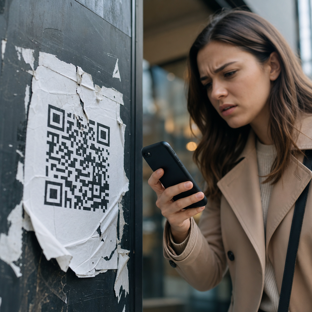
Users have learned to be cautious. Phishing attacks and malicious sticker overlays have made people more skeptical of unknown QR codes, especially in public spaces. Trust failures often suppress scans before any technical metric appears. If a poster does not show the destination brand, if the call to action feels vague, or if the code is placed in an environment where tampering is possible, hesitation rises. In hospitality and parking, I have seen legitimate codes ignored because customers worried the link might be fraudulent. This is not paranoia; it is rational digital behavior.
Brands can reduce this friction with visible destination cues, short branded domains, tamper-evident placement, and plain-language explanations of what happens after scanning. “Scan to view our menu at brand.com” is stronger than “Scan here.” On packaging, printed trust markers and customer support references help. For payments, PCI-conscious flows and wallet integrations are better than improvised forms. Security is also an operational issue. If redirect rules are poorly governed, old codes can point to expired pages, unsecured links, or the wrong market. Trust is cumulative and fragile. Once users encounter one broken or suspicious scan, they become less likely to scan the next code a brand publishes.
Operational Problems: Ownership Gaps, Expired Links, and No Testing Discipline
Some QR code campaigns fail because nobody truly owns them end to end. Creative approves the artwork, media places it, web publishes the page, analytics tags the URL, and operations prints the materials, yet no one runs a final live-environment test. This is where preventable errors appear: redirects looping, pages blocked by geolocation, inventory offers sold out, forms missing autofill support, or codes leading to staging environments. Dynamic codes reduce reprint risk, but they also require governance. Redirect destinations need change control, expiration policies, and monitoring.
Testing discipline should reflect real conditions, not office assumptions. Scan on older phones, low battery mode, weak cellular signal, bright sunlight, dim interiors, multiple camera apps, and both major mobile operating systems. Test every code variant after installation, not just before shipment. For regulated industries, validate consent language and record-keeping. For multilingual environments, confirm locale routing. The teams that avoid failure treat QR code campaigns like product releases, not decorative print assets.
| Failure point | What went wrong | Practical fix |
|---|---|---|
| Call to action | Reason to scan was vague or weak | State exact benefit and immediate outcome |
| Placement | Code was too small, reflective, or unreachable | Adjust size, contrast, height, and lighting conditions |
| Destination | Landing page was slow, generic, or not mobile friendly | Use fast, context-specific mobile pages |
| Tracking | Scans could not be attributed or compared | Deploy dynamic codes, tagged URLs, and event analytics |
| Trust | Users feared unsafe or tampered links | Show branded domains and secure, transparent destinations |
| Operations | Links expired or were never tested in the field | Assign ownership, monitor redirects, and test live conditions |
Channel-Specific Lessons from Retail, Events, Restaurants, and Packaging
Different channels fail in different ways. In retail, shelf-edge QR codes often underperform because shoppers are in comparison mode and need immediate product proof, not brand storytelling. The fix is to deliver concise benefits, reviews, stock status, or instant savings. At events, booth traffic codes fail when attendees are expected to complete long lead forms on crowded floors. Better event flows capture minimal data, then continue the conversation by email or SMS. In restaurants, menu codes fail when they replace hospitality with friction. Guests want fast browsing, readable menus, allergen clarity, and simple ordering, not a maze of pop-ups and forced app downloads.
Packaging introduces another set of lessons. People scan packaging for authenticity checks, instructions, warranty registration, recycling guidance, ingredients, promotions, or reordering. These are not interchangeable intents. A consumer holding a skincare product in the bathroom wants usage guidance quickly. A parent scanning baby formula packaging may want safety information and preparation steps. A code that dumps both users onto a homepage ignores context and loses trust. The best packaging journeys use product identifiers, geotargeting where appropriate, and persistent destinations that remain useful after the initial purchase. Channel context should shape every campaign decision, from copy to analytics.
How to Build a Better Failure Review Process
When a QR code campaign disappoints, teams often jump straight to redesigning the code itself. That is usually the wrong response. Start with a structured postmortem. Compare expected versus actual scan rate, bounce rate, conversion rate, and downstream outcomes. Review photos of the live placement. Check page speed on mobile networks. Verify redirect logs, analytics tagging, and heatmaps if available. Interview front-line staff who observed real customer behavior. In my experience, staff feedback is especially revealing because they hear the questions users ask out loud: “What do I get if I scan this?” “Is this safe?” “Why is it asking me to download something?”
A useful failure review ends with prioritized fixes, not vague lessons. Separate root causes into strategy, creative, physical placement, destination UX, analytics, and operations. Then rerun the campaign with controlled changes. For example, keep the media placement constant while testing a clearer call to action and a shorter mobile path. Or preserve the offer but replace a generic landing page with a product-specific page. This disciplined approach turns failed QR code campaigns into a source of insight. Most failures are recoverable because the channel itself is flexible. With dynamic destinations, clearer incentives, better testing, and tighter governance, the next scan can perform very differently from the last.
QR code campaign failures are rarely mysterious. They happen when teams ignore context, underinvest in mobile experience, skip measurement design, or assume curiosity alone will carry the user forward. The fix is a connected system: a clear reason to scan, a scannable physical execution, a fast and relevant destination, trustworthy presentation, accurate tracking, and accountable operations. Each element supports the others. If one breaks, performance drops quickly.
As the hub for failures and lessons learned, this page should guide every future review of underperforming QR activations. Use it to diagnose low scan rates, high abandonment, trust issues, broken redirects, weak offers, and attribution gaps. Then apply the lessons across related campaign types, from packaging and retail signage to events, menus, direct mail, and out-of-home placements. QR codes can produce measurable offline-to-online results, but only when the full journey is designed with care. Audit your current campaigns, document the failure points, and fix the experience before printing the next code.
Frequently Asked Questions
Why do so many QR code campaigns fail even when the code itself works?
Most QR code campaign failures have very little to do with whether the code technically scans. In audits across retail stores, event signage, product packaging, restaurant tables, and outdoor advertising, the most common issue is that the QR code was treated like a novelty rather than part of a complete customer journey. A functioning code only solves one small piece of the experience. If the person scanning does not immediately understand what they will get, why it matters, and what to do next, the campaign starts losing performance the moment the camera opens.
In practice, failure usually comes from friction after the scan. The landing page may load slowly, the destination may not match the promise made on the poster or package, or the page may not be mobile-friendly. In other cases, the call to action is vague, such as “Scan here” with no explanation of the benefit. People are much more likely to scan when the value is explicit, such as “Scan to view today’s menu,” “Scan for 15% off,” or “Scan to watch the installation guide.” Trust also matters. If the design feels suspicious, the branding is inconsistent, or the destination URL looks unfamiliar, users hesitate. The result is a campaign that appears to have decent visibility but poor engagement because the overall experience is unclear, inconvenient, or irrelevant.
The key lesson is that a QR code is only a bridge between a physical touchpoint and a digital destination. If either side of that bridge is weak, performance drops. Strong campaigns define the audience, the intent, the offer, the landing page, and the next action before the code is ever generated. When marketers skip that planning and add a code as an afterthought, the campaign may be technically functional but strategically ineffective.
What are the most common mistakes brands make with QR code landing pages?
The landing page is where many QR code campaigns quietly fail. One of the biggest mistakes is sending users to a generic homepage instead of a purpose-built mobile destination. Someone who scans from a shelf tag, trade show booth, flyer, or restaurant table expects to arrive at content directly related to what they just saw. If they land on a busy homepage and have to search for the promised information, the experience feels broken. Every extra tap, scroll, or decision reduces the chance of conversion.
Another frequent problem is poor mobile optimization. QR scans happen overwhelmingly on smartphones, yet many destinations still feature slow-loading pages, oversized pop-ups, tiny text, hard-to-tap buttons, or forms that are frustrating on mobile devices. A campaign may attract curiosity in the real world, only to lose users because the digital experience is not built for speed and clarity. This is especially damaging in environments where attention is limited, such as sidewalks, retail aisles, queues, or live events.
Mismatch is also a major issue. If the physical asset promises a coupon, menu, demo, product specs, booking page, or exclusive content, the landing page must deliver that exact outcome immediately. Campaigns underperform when users scan for one thing and receive something broader, unrelated, or premature, such as a generic newsletter signup. Effective QR destinations have one job, one audience, and one obvious next step. They should reinforce the original message, load fast, feel trustworthy, and make completion easy. That is what turns a scan into meaningful engagement rather than a dead end.
How does unclear messaging around the QR code hurt campaign performance?
Unclear messaging is one of the fastest ways to reduce scan rates. Many campaigns display a QR code with little or no context, assuming people will scan out of curiosity. That assumption usually does not hold up in real environments. People are busy, skeptical, and selective with their attention. If they do not know what they will get, how long it will take, or whether it is worth the effort, most will ignore the code. A simple, visible explanation often makes the difference between passive exposure and active engagement.
The strongest QR code campaigns answer three questions immediately: what is this, why should I scan it, and what happens next? For example, “Scan to see allergen info,” “Scan to claim your event discount,” or “Scan to watch a 30-second setup video” gives people a clear reason to act. Compare that with vague language like “Learn more” or no instruction at all. Generic prompts create uncertainty, and uncertainty lowers action. This matters even more in physical settings where users have only a few seconds to notice and decide.
Good messaging also sets expectations. If the scan leads to a form, payment option, download, or app install, that should be communicated upfront. Surprising users after the scan increases drop-off and can damage trust. Clear messaging improves not just scan volume but scan quality because it helps attract users who are actually interested in the next step. In other words, the copy beside the code is not decoration. It is conversion strategy. Brands that treat it casually often mistake low engagement for low interest, when the real issue is that the offer was never clearly communicated.
Can placement and environment cause a QR code campaign to fail?
Yes, and this is one of the most underestimated factors in campaign performance. A QR code may be perfectly designed and linked to an excellent landing page, but if it is placed where scanning is awkward, unsafe, rushed, or physically impractical, results will suffer. Placement should always reflect real user behavior. For example, codes on moving vehicles, high billboards, reflective windows, dimly lit areas, crowded counters, or surfaces that require people to bend, reach, or stand in traffic are often poor choices. The campaign may generate impressions, but not usable scan opportunities.
Environmental conditions matter just as much. In restaurants, a code placed under a condiment bottle or on a table that is frequently wiped and damaged can reduce usability. At events, a code near a congested entrance may be seen by thousands but scanned by very few because attendees are focused on getting inside. In retail, a code placed too low on shelving or among excessive visual clutter can disappear into the environment. Even print size, contrast, glare, and distance affect success. If users have to struggle to align their camera, the campaign introduces friction before the journey even begins.
Effective placement starts with a realistic question: can the target user comfortably scan this code in the moment it is presented? If the answer is no, performance will be weak regardless of creative quality. The best campaigns test codes in the actual environment, using different phones, lighting conditions, and distances. They account for motion, crowd flow, attention span, and physical accessibility. In short, QR code strategy is not just about what users see. It is about what users can easily do.
What should brands do differently to prevent QR code campaign failures?
Brands should begin by treating the QR code as one step in a broader conversion path, not as the campaign itself. That means defining the audience, the context, the expected motivation, and the desired next action before creating the code. Start with the user’s moment: where are they, what are they trying to accomplish, how much time do they have, and what would feel useful right now? A QR code on product packaging may need to deliver support information, authenticity verification, or usage tips. A code in out-of-home advertising may need to capture interest quickly with a simple offer and a fast mobile page. A code at an event may need to streamline registration, agenda access, or lead capture. The destination should match the moment precisely.
Brands should also improve execution discipline. Use a clear call to action, make the value explicit, and ensure the page loads quickly on mobile networks. Keep the experience tightly aligned from physical touchpoint to digital result. If the message promises a discount, show the discount immediately. If it promises information, remove distractions and make that information easy to consume. Track performance with meaningful metrics, not just scans. Scan counts alone do not reveal where the journey is failing. Measure landing page engagement, completion rate, bounce rate, and downstream conversion so problems can be diagnosed accurately.
Finally, test everything in real conditions before launch. Verify scan speed across devices, confirm that the code works at the intended size and distance, review the page under average mobile connectivity, and watch how real users interact with the experience. Small issues compound quickly in QR campaigns because the user’s attention window is short. The brands that succeed are usually not doing anything flashy. They are simply reducing friction, increasing clarity, and respecting user intent at every stage of the journey. That is the real fix for most QR code campaign failures.