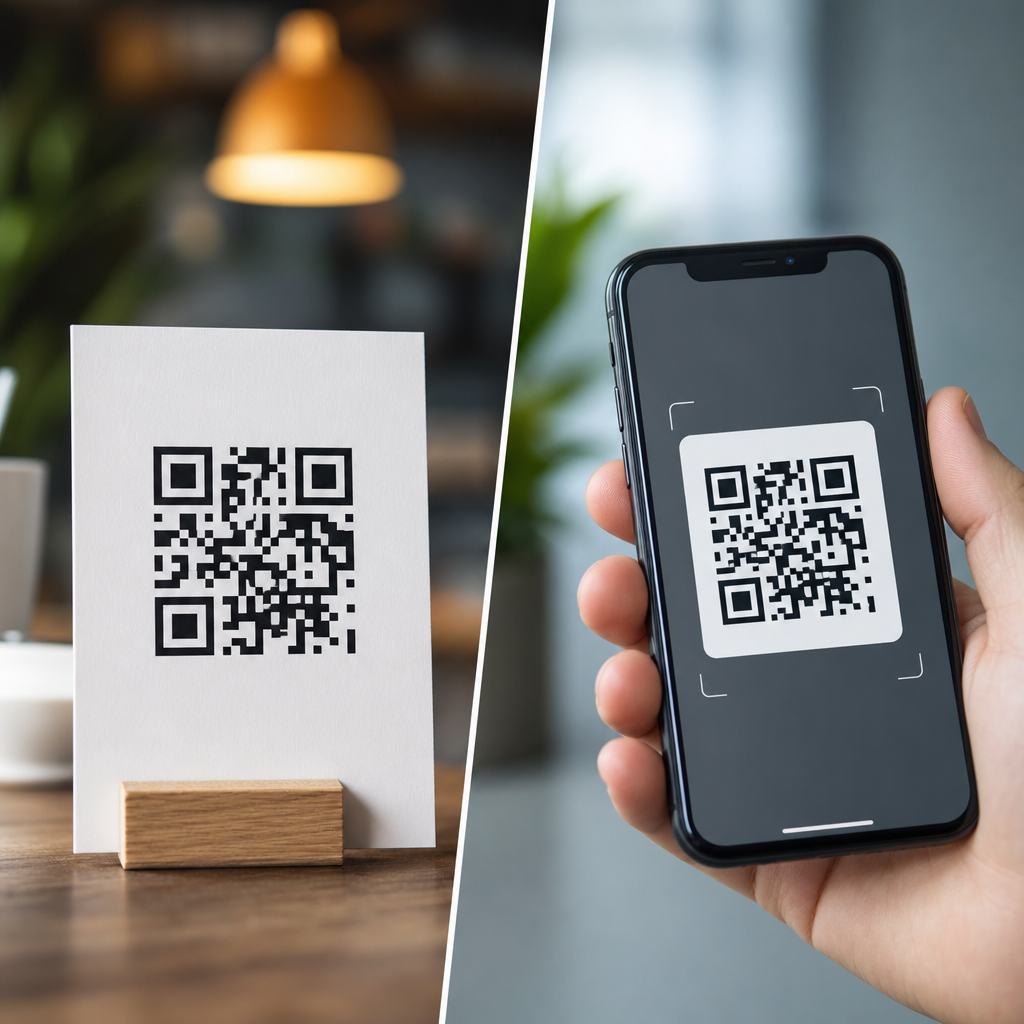
Print and digital QR codes serve the same basic function, but the design decisions behind them are not interchangeable. A code printed on packaging, signage, menus, or direct mail has to survive physical distance, lighting, ink spread, paper texture, and camera angle. A code shown on a website, app, email, kiosk screen, or social post faces a different set of constraints, including pixel density, responsive layouts, dark mode, compression artifacts, and screenshot sharing. In practice, the best QR code design starts by matching the code to its viewing environment, not by applying one visual style everywhere.
A QR code is a two dimensional matrix barcode that stores data in a grid of dark and light modules. Smartphones decode those modules by detecting three finder patterns, interpreting alignment markers, and reconstructing the encoded payload with error correction. Print vs digital QR codes therefore differ less in what they are and more in how reliably scanners can read them under real conditions. That distinction matters because branding teams often focus on colors, logos, and templates before addressing scan distance, contrast ratios, minimum size, or display behavior. I have audited campaigns where the same branded code worked perfectly in an email footer yet failed on a corrugated shipper because the quiet zone was trimmed and the background absorbed contrast.
For a sub-pillar on QR code design and branding, print vs digital design considerations are foundational. They affect conversion rate, accessibility, production cost, and campaign measurement. A restaurant menu code that scans instantly reduces friction; a retail poster code that fails even ten percent of the time can materially cut response. The core rule is simple: design for the medium first, brand second, and test in the exact context where the code will appear.
What changes between print and digital QR code design
The most important difference is environmental variability. Printed QR codes exist in uncontrolled physical spaces. People scan them while walking past a storefront, standing under fluorescent lights, or holding a phone one handed on a train platform. Digital QR codes usually appear in controlled interfaces, but they introduce display-specific issues such as low contrast themes, retina scaling, browser zoom, and image compression. Because of this, a design that is technically valid can still be operationally weak if it ignores where the code will be seen.
Size is the first design variable to separate. In print, minimum size should be determined by scanning distance. A practical rule used in packaging and out of home work is a scan distance ratio of roughly 10:1, meaning a code intended to be scanned from one meter away should be about ten centimeters wide. That is not a universal law, but it is a dependable planning baseline. On screens, physical size matters less than rendered pixel dimensions. A code that appears at 120 by 120 pixels may work on a modern phone, but it leaves little safety margin once a logo, rounded modules, or a tinted background are added. I generally recommend starting at 240 pixels square or larger for digital placements, then validating responsiveness across devices.
Contrast is the second major separator. Print introduces substrate and ink behavior. Uncoated stock can soften edges through dot gain, while glossy laminates can create reflections that obscure modules. Digital surfaces do not have ink spread, but they can suffer from anti aliasing, brightness shifts, and poor legibility in dark mode. In both media, the safest standard remains dark modules on a light background with a clear quiet zone. In branded work, color inversion, gradients, or image fills should be treated as exceptions that require extensive testing, not defaults.
Print QR code design considerations
Print QR code design starts with materials and production methods. A code printed offset on coated paper behaves differently from one printed flexographically on cardboard or thermally on labels. Each process changes edge sharpness, consistency, and contrast. On packaging, I have seen rich black builds create registration issues that slightly blur module boundaries; a simple solid black often scans better. On textile tags or textured labels, fibers and irregular surfaces can interrupt module definition. That is why production proofing matters as much as artwork approval.
Placement is equally important. A print QR code should sit on as flat and undistorted a surface as possible. Curved bottles, folded cartons, spine edges, and seams all increase scanning errors because the camera no longer sees a regular square grid. If a curved package is unavoidable, the code must be larger and isolated from other busy graphics. Quiet zone protection is critical here. ISO/IEC 18004, the primary QR code specification, defines the structure that decoders expect, and in practice most scanners need a quiet zone of at least four modules on all sides. Trimming into that margin is one of the most common print failures.
Distance, lighting, and dwell time also shape print design. A code on a tabletop menu can be smaller than one on a window poster because the user stands close and has time to frame the shot. A transit shelter ad has to work at speed and in changing light. For those placements, increasing module size, simplifying branding effects, and using a short URL redirect with a dynamic QR code improve reliability and post-launch flexibility. Dynamic codes are especially useful in print because they let marketers update landing pages without reprinting materials, preserving campaign value when offers, inventory, or compliance details change.
Digital QR code design considerations
Digital QR code design is governed by rendering quality and interface context. The code may appear inside an email client, a mobile app, a webinar slide, a point of sale screen, or a social graphic compressed by the platform. Each environment can alter sharpness and contrast. Email clients often downscale images; presentation tools may export slides as compressed video; social platforms can re-encode assets. A QR code that looked crisp in Figma or Adobe Illustrator may become soft after delivery. For digital use, exporting as SVG where supported preserves edge integrity, while high resolution PNG is safer for environments that mishandle vectors.
Screen based scanning also creates a unique interaction problem: users may need a second device. If a QR code appears on a phone screen, the same phone cannot easily scan it unless the user takes a screenshot and uses an image based scanner, which adds friction. That means digital QR codes perform best in cross device contexts such as desktop to phone, TV to phone, kiosk to phone, or printed PDF to camera. When the code must appear on mobile, always provide a plain clickable link nearby. This is not just a usability courtesy; it protects conversion when the scan path is impractical.
Responsive design must be considered early. A QR code embedded in a website hero banner can shrink dramatically on mobile layouts, especially when stacked beneath headlines and buttons. I recommend setting a minimum rendered size and preventing CSS rules from scaling it below that threshold. Dark mode is another recurring issue. If the interface inverts colors or places the code on a dark card, the quiet zone can disappear visually into the surrounding layout. Keeping the code within a fixed light container avoids that failure while preserving the broader interface theme.
Branding, customization, and scan safety across both media
Branded QR codes can increase recognition and trust, but every customization consumes readability margin. Common treatments include center logos, rounded modules, custom eyes, colored foregrounds, and background imagery. These can work when the underlying code has enough error correction and sufficient module size, but they are not free improvements. Error correction levels L, M, Q, and H determine how much damage or obstruction a code can tolerate. Designers often jump to H when adding a logo, yet higher error correction also creates denser patterns for the same payload, which can reduce scan reliability at small sizes. The right choice depends on content length, output size, and viewing conditions.
My standard approach is conservative: shorten the payload using a redirect, generate a less dense code, use a simple logo mark no larger than about fifteen to twenty percent of the symbol area, maintain strong contrast, and test with multiple scanning apps on older devices as well as current phones. That approach consistently outperforms heavily stylized codes that look distinctive in mockups but fail in the field. Visual uniqueness matters, especially in crowded retail or event environments, yet clarity remains the first job of the symbol.
| Design factor | Print priority | Digital priority |
|---|---|---|
| Minimum size | Based on scan distance and physical placement | Based on rendered pixels and responsive behavior |
| Contrast | Affected by ink, stock, glare, and texture | Affected by screens, dark mode, and compression |
| Quiet zone | Protected from trim, folds, and nearby graphics | Protected from UI containers and background bleed |
| File format | Vector preferred for press output | SVG or high resolution PNG depending platform |
| User path | Usually direct camera scan from physical object | Often cross device; link fallback may be needed |
Testing, analytics, and operational best practices
The most reliable QR code design process includes generation, proofing, contextual testing, and measurement. Start with a reputable generator that supports dynamic URLs, error correction selection, vector export, and scan analytics. Tools from Bitly, QR Code Generator Pro, Beaconstac, Flowcode, and enterprise marketing platforms can all work if governance is clear. What matters is version control, redirect management, and data ownership. For brand teams, the code asset should be treated like any other controlled marketing component, with naming conventions, approved variants, and destination oversight.
Testing must happen in situ. For print, review physical proofs under the lighting conditions users will encounter. Scan from the expected distances using both iPhone and Android cameras, then try older devices with weaker autofocus. Check for failures caused by glare, shrink wrap, folds, or low ink density. For digital, test on different browsers, operating systems, and brightness settings. Send the email, upload the social asset, publish the landing page, and scan the actual delivered version rather than the design file. Many teams skip this last step and miss compression artifacts until after launch.
Analytics complete the feedback loop. Dynamic QR codes can record scans by time, location, and device category, revealing whether a design works as intended. If a poster campaign gets strong impressions but low scans in one venue, the issue may be placement height or glare rather than message quality. If a webinar slide receives fewer scans than expected, the code may have been too small on livestream video. These observations should inform the next iteration. Good QR code design is not static artwork; it is a measured interaction system tied to medium, environment, and user behavior.
Print vs digital QR codes are best understood as two execution contexts for the same technology, each with distinct design rules. Print demands attention to physical size, distance, materials, production tolerances, and environmental lighting. Digital demands attention to rendering quality, responsive layouts, dark mode, platform compression, and whether a second device is required. Across both, the nonnegotiables remain clear contrast, intact quiet zones, sensible error correction, and realistic testing.
For teams building a QR code design and branding program, this hub topic should guide every downstream decision, from packaging standards and menu templates to email modules and presentation graphics. The practical benefit is straightforward: when you design for the medium instead of forcing a single visual treatment everywhere, scans increase and campaign friction drops. Use this page as your baseline, then audit each placement by size, context, user path, and test results before publishing the next code.
Frequently Asked Questions
What is the biggest design difference between print and digital QR codes?
The biggest difference is the viewing environment. A printed QR code has to work in the physical world, where distance, glare, uneven lighting, paper texture, ink gain, curved surfaces, and camera angle all affect scan reliability. Because of that, print QR codes usually need more physical size, stronger contrast, more generous quiet zones, and more conservative styling. A code on packaging or a poster may be scanned from arm’s length or farther away, so designers have to account for real-world friction that does not exist on a screen.
Digital QR codes operate in a controlled display environment, but they come with their own design constraints. Screen-based codes must remain sharp across devices, resolutions, and responsive layouts. They may appear inside emails, apps, websites, kiosks, or social posts, where scaling, compression, dark mode, and screenshots can alter how the code renders. In other words, print design is mostly about durability under physical conditions, while digital design is about maintaining clarity across variable screen contexts. The function is the same, but the design logic is different.
Why do printed QR codes usually need to be larger than digital QR codes?
Printed QR codes generally need more size because the user is scanning through space rather than directly from a lit screen held close to the camera. On a flyer, menu board, product box, or retail sign, the scanner may be several inches or several feet away. The farther the scanning distance, the larger the code needs to be for a phone camera to resolve its modules clearly. Add in motion, poor lighting, glossy materials, shadows, and perspective distortion, and the case for larger print codes becomes even stronger.
Print also introduces production variables that can soften the code’s edges. Ink spread can make dark modules bleed outward, while absorbent paper, textured stock, or low-quality printing can reduce crispness. Even if the code looked perfect on screen during design, it may behave differently once physically produced. A larger printed code gives more tolerance for these imperfections. By contrast, digital QR codes can often be displayed smaller because they are rendered with precise edges on high-resolution screens, but they still must remain large enough to scan comfortably without pinching, zooming, or awkward positioning.
How do color, contrast, and background choices differ for print versus digital QR codes?
In both formats, contrast is critical, but the risks are different. Printed QR codes depend heavily on dependable dark-on-light contrast because ambient lighting can reduce legibility fast. A code that looks stylish in a mockup may fail in practice if it is printed on kraft paper, metallic packaging, tinted labels, or glossy signage. Print designers should be cautious with low-contrast palettes, gradients, and busy backgrounds, since natural shadows and reflections can make an already marginal code unscannable. In most cases, simple high-contrast combinations perform best.
Digital QR codes also need strong contrast, but screen environments introduce additional issues such as brightness settings, dark mode inversion, display glare, image compression, and platform rendering differences. A QR code embedded in a social graphic, email banner, or app screen may be compressed or resized automatically, reducing edge clarity. Backgrounds that are acceptable on a desktop monitor may become problematic on a dim mobile screen. Designers should also consider accessibility and readability under different viewing settings. Whether in print or digital, decorative styling should never override scan performance, but print usually demands even more discipline because the environment is harder to control once the code is produced and distributed.
Can the same QR code design be used for both print and digital placements?
Sometimes, but it is usually not the best approach. The underlying destination URL or dynamic QR code can absolutely be the same, but the visual execution often should be adapted to the channel. A single design may technically function in both places, yet still underperform because it was optimized for neither. For example, a code styled for a website hero section might be too small or too low-contrast for product packaging, while a code designed for a large printed sign may feel oversized or visually heavy inside a mobile interface.
The smarter approach is to treat print and digital as separate performance environments. Keep the encoded data consistent if needed, but tailor size, spacing, contrast, file format, placement, and surrounding instructions to the use case. Print versions may need more white space, larger dimensions, and simpler styling. Digital versions may need responsive scaling, crisp raster or vector output, and testing across device types. The goal is not visual uniformity for its own sake; it is scan reliability in the specific context where the user encounters the code.
What are the best practices for testing print and digital QR codes before launch?
Testing should reflect real usage, not just what looks good in a design file. For print, that means producing physical proofs and scanning them under realistic conditions. Test from the actual expected distances, under bright and dim lighting, on the intended material, and at the likely viewing angle. If the code is going on packaging, test it on the final substrate, including curved surfaces if applicable. If it will appear on signage, test while standing where customers will actually stand. Also scan with multiple phone models and camera apps, because a code that works on one device may be slow or inconsistent on another.
For digital, test across operating systems, browsers, screen sizes, and display modes. Make sure the code remains sharp in responsive layouts, inside emails, on high-density mobile screens, and after platform compression on social channels. Check dark mode behavior, screenshot sharing, and whether the code is being resized by templates or CMS components. It is also wise to verify the landing page experience after the scan, since QR performance is not just about readability but about the complete path from scan to destination. The most effective teams test both scanability and user flow, because a technically scannable QR code still fails if the post-scan experience is slow, broken, or mismatched to the context.


