Optimizing QR code landing pages for conversions starts with a simple truth: scanning is only the first micro-commitment, while the landing page is where intent either turns into revenue or disappears. A QR code landing page is the mobile-first destination opened after a user scans a code on packaging, signage, direct mail, receipts, menus, product inserts, event displays, or out-of-home media. Conversion rate optimization, often shortened to CRO, is the process of increasing the percentage of visitors who complete a desired action such as buying, booking, calling, downloading, registering, redeeming an offer, or submitting a form. In QR campaigns, this discipline matters more than many teams expect because the scan usually happens in a distracted real-world setting, on a phone, under time pressure, and with limited patience. I have audited campaigns where scan volume looked healthy, yet sales lagged because the landing page loaded slowly, repeated the QR code message poorly, or asked users to do too much before any value was clear. The most effective QR code landing pages remove friction immediately, match the promise that triggered the scan, and guide users toward one obvious next step. They also account for context: a shopper scanning from shelf talkers behaves differently from a conference attendee scanning a booth sign or a diner scanning a takeout flyer. When you optimize these pages intentionally, you improve not only conversion rate but also campaign attribution, media efficiency, customer experience, and the quality of first-party data collected from offline traffic.
Match the scan context and message to the landing page
The highest-converting QR code landing pages feel like a direct continuation of the scan experience. Message match is the first principle: if the QR code invites users to “Get 15% off today,” the page headline should confirm that discount instantly, not force visitors to hunt for it below a generic hero image. If the code on product packaging says “See setup instructions,” the page should open to setup guidance before presenting accessories, cross-sells, or account prompts. This alignment lowers cognitive load and reassures users they reached the right destination.
Context shapes intent, so optimize by placement. A QR code on a store window often captures high-intent local traffic; that landing page should prioritize hours, location, inventory, reservations, or tap-to-call actions. A code on a conference badge insert may attract colder interest, so the page should briefly explain value, establish credibility, and offer a low-friction conversion such as downloading a guide. In direct mail, where users often scan from home, longer-form copy can work if the offer is strong. In transit ads or event venues, speed wins; the page must communicate the core value within seconds because users may be walking, waiting, or multitasking.
Use dynamic QR codes and campaign parameters so one creative concept can route users to segmented pages based on source, region, device, time, or product line. This improves relevance without reprinting codes. UTM parameters remain essential for analytics platforms such as Google Analytics 4, Adobe Analytics, and CRM attribution systems. Segmentation lets you answer practical questions: did the in-store display convert better with a coupon page, a product demo, or a store locator? Did event scans produce more demos when the form had two fields instead of five? Precise routing turns optimization from guesswork into a measurable system.
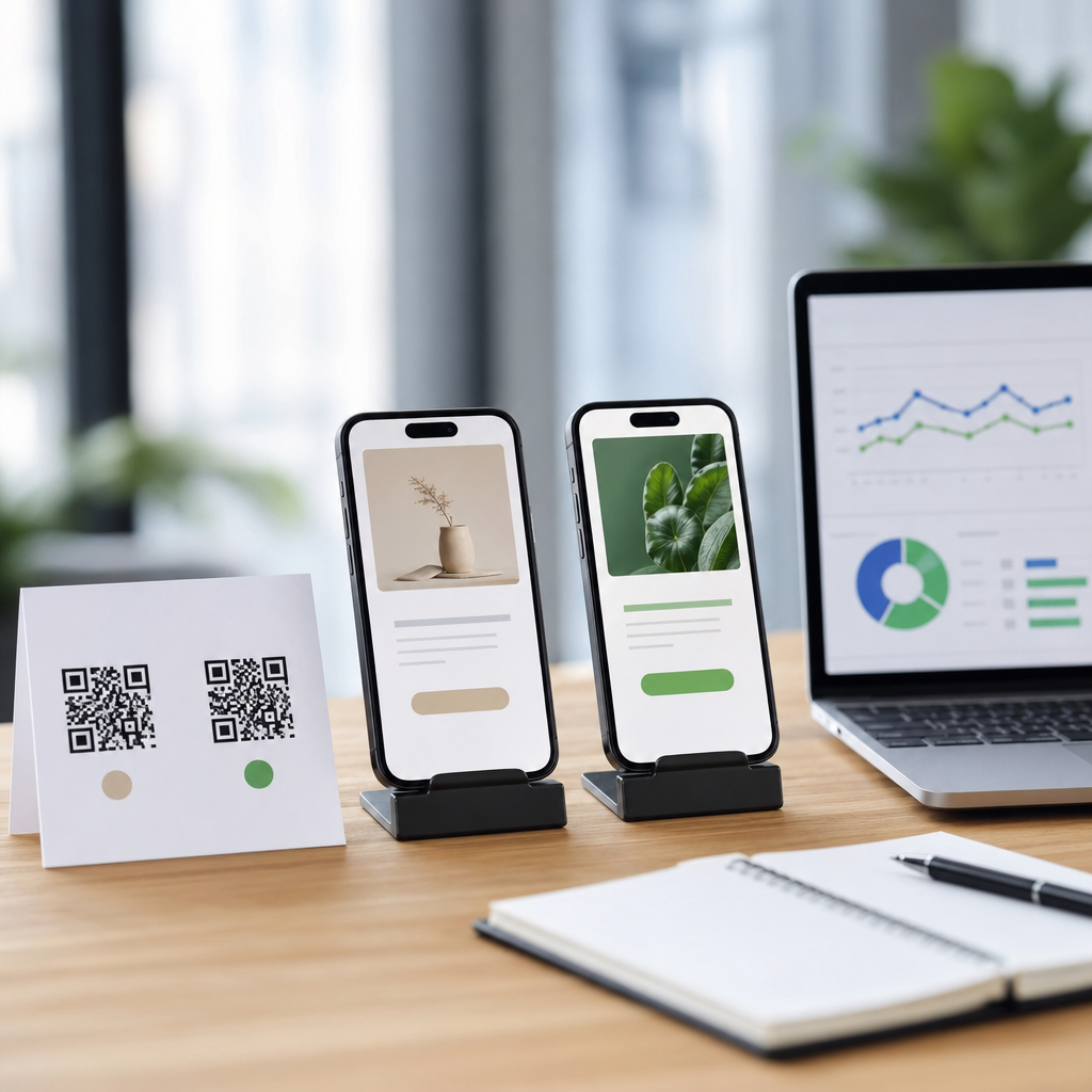
Build a mobile-first page that removes friction fast
Because nearly every QR scan happens on a smartphone, mobile-first design is not optional. The page must load quickly on inconsistent cellular connections, render cleanly on small screens, and avoid elements that interfere with touch behavior. Core Web Vitals are useful here: a slow Largest Contentful Paint, unstable layout, or delayed interactivity can suppress conversions before copy has a chance to work. Compress images, minimize render-blocking scripts, defer nonessential tags, and use modern formats such as WebP when practical. In many audits, shaving one to two seconds from load time produced a larger conversion lift than any headline test.
The page structure should reflect how mobile users actually scan. They want confirmation, clarity, and action. Put the headline, value proposition, primary call to action, and any time-sensitive offer above the fold. Keep tap targets large enough for thumbs, maintain readable font sizes, and avoid dense text walls. Sticky call-to-action bars can help on longer pages, especially for purchases, booking flows, or coupon redemption. Autofill support, wallet integrations, Apple Pay, Google Pay, and click-to-call options reduce form friction and are especially effective for local services and quick transactions.
Trust cues matter more on QR code landing pages because the jump from physical media to digital can feel abrupt. Include recognizable brand elements, concise privacy language near forms, and proof points such as reviews, security badges, return policies, or partner logos where relevant. If the scan was triggered by a poster or package, use matching visual identity so users instantly recognize continuity. Avoid intrusive pop-ups on entry; they often hide the very content users scanned to find. If compliance requires consent banners or age gates, configure them to be mobile-friendly and as lightweight as regulations allow.
Design conversion paths around one primary action
A QR code landing page should usually have one primary conversion goal. Multiple competing actions dilute attention, especially on mobile. Decide whether the page exists to sell, capture a lead, start a trial, deliver a coupon, trigger a call, or educate before a later step. Then build the page around that objective. Supporting links can remain available in the footer or secondary modules, but the visual hierarchy should clearly favor the main action.
Strong calls to action are specific and benefit-led. “Claim 15% Off,” “Book Your Free Fitting,” “Watch the 60-Second Setup,” and “Get Today’s Menu” outperform vague buttons like “Submit” or “Learn More” because they tell users exactly what happens next. When the next step involves a form, ask only for information necessary at that stage. For early-funnel QR campaigns, email and first name may be enough. For a service booking, time slot and contact details are essential, but optional fields should remain hidden unless they truly improve routing or sales readiness.
Progressive disclosure often converts better than long forms. If the offer is complex, let users choose an option first, then reveal the relevant fields. Multi-step forms can work well when they create momentum, but only if each step is obvious and short. Progress indicators reduce uncertainty. Error handling must be clear, inline, and forgiving. I have seen major losses from simple issues such as numeric keyboards not appearing for phone fields, coupon codes failing silently, or embedded calendars breaking on certain devices. Before launching any QR campaign, test the complete path across iPhone and Android devices, common browsers, and both Wi-Fi and mobile data conditions.
Use testing, analytics, and benchmarks to improve results
Conversion optimization depends on disciplined measurement. Start with a clean event taxonomy: scans, landing page sessions, engaged sessions, primary CTA clicks, form starts, form completions, add-to-cart actions, purchases, calls, map opens, coupon saves, and assisted conversions. In GA4, configure key events and conversions consistently, and verify campaign parameters are preserved across redirects, payment gateways, and app handoffs. Heatmaps and session replay tools such as Microsoft Clarity or Hotjar can reveal hesitation points that standard analytics miss, including rage taps, dead clicks, and scroll abandonment.
Testing should prioritize hypotheses with the clearest link to user friction. For QR code landing pages, the most productive experiments usually involve headline clarity, offer framing, CTA wording, image choice, page length, proof placement, and form simplification. Traffic volume can be limited in offline campaigns, so avoid testing too many variables at once. Sequential A/B tests are often more practical than complex multivariate designs. Where traffic is low, complement experiments with qualitative methods such as intercept surveys, moderated usability tests, or recordings from field reps who observe scan behavior in stores or at events.
Benchmarking helps set expectations, but context matters. A retail coupon page may convert far differently from a B2B demo page or a post-purchase support page. Use internal baselines first: compare by placement, audience, offer type, and device mix. A scan-to-session rate below expectations may indicate camera issues, code placement, or redirect delays rather than a landing page problem. A strong session rate with weak CTA clicks usually points to message mismatch or poor visual hierarchy. High CTA clicks with weak completion rates often signal form or checkout friction. Read the funnel diagnostically rather than chasing a single percentage.
| Metric | What it shows | Common problem if low | Typical fix |
|---|---|---|---|
| Scan-to-session rate | Whether scans become usable visits | Slow redirects, broken links, weak connectivity | Use fast hosting, fewer redirects, dynamic code testing |
| Bounce or early exit rate | Immediate relevance and trust | Message mismatch, cluttered design, poor load speed | Align headline to QR promise, simplify top section |
| CTA click-through rate | Strength of offer and hierarchy | Vague CTA, distracting options, weak value proposition | Use one clear action and specific button copy |
| Form completion rate | Friction after intent is expressed | Too many fields, validation errors, poor mobile UX | Shorten forms, improve autofill, fix error messaging |
| Revenue per scan | Overall business impact | Low order value or poor downstream conversion | Improve offer targeting, checkout flow, upsell logic |
Personalize offers and content without creating confusion
Personalization improves conversion when it sharpens relevance, not when it adds complexity. With QR campaigns, useful personalization usually comes from known context: product SKU, store location, event, language, weather, daypart, or loyalty status if the user is recognized. A beverage brand can send users scanning from a summer display to recipes featuring that flavor and a retailer coupon valid at nearby stores. A restaurant chain can route lunch-hour scans to the midday menu while evening scans emphasize reservations or family bundles. These adjustments feel helpful because they reflect the scan situation.
The mistake is overpersonalizing before trust is established. Pages that instantly request permissions, account creation, or excessive personal data often underperform. Start with the obvious value first. Then use progressive personalization, such as recommending the nearest branch after a ZIP code entry or customizing content after one selection. Location-aware experiences can be highly effective for store visits, but they should always provide manual alternatives because location services are not universally enabled and may be inaccurate indoors.
Personalized offers should also preserve consistency with inventory, pricing, and operations. If a QR code on a shelf promotes an offer that is unavailable online or out of stock locally, conversion losses follow quickly. Connect campaigns to product feeds, inventory systems, or promotional calendars whenever possible. Teams often focus on creative and forget operational accuracy, yet reliability is a conversion factor. Users are more likely to complete a purchase or submit a lead form when the page reflects real availability, real deadlines, and a clear fulfillment path.
Create a hub that supports every conversion stage
As a sub-pillar hub within QR code analytics, tracking, and optimization, this page should help readers navigate the entire conversion improvement workflow. That means covering high-intent entry points while signaling deeper paths such as QR code A/B testing, mobile landing page speed, CTA optimization, form design, coupon redemption tracking, offline-to-online attribution, event QR measurement, retail scan analysis, and post-scan user behavior reporting. A strong hub page does not replace those supporting articles; it frames the topic, defines the main levers, and shows how each deeper article solves a specific optimization problem.
Internal linking should follow the user journey. Link from strategy sections to implementation guides, from analytics sections to reporting templates, and from page design advice to specialized content on mobile UX, checkout optimization, and consent management. This structure helps readers move naturally from diagnosis to action. It also clarifies topical authority: someone arriving with a narrow question about button copy or form fields can discover the broader system that influences QR landing page conversions.
For teams managing real campaigns, governance matters. Establish naming conventions for QR assets, standardized UTM structures, conversion definitions, QA checklists, and reporting cadences. Document ownership across creative, analytics, paid media, web development, CRM, and store operations. Many conversion issues are not design failures at all; they arise from unclear accountability, expired promotions, broken redirects, inconsistent tagging, or unsupported mobile browsers. A hub page should make that operational reality visible so optimization becomes repeatable, not ad hoc.
Optimizing QR code landing pages for conversions means treating the landing page as the decisive bridge between offline attention and online action. The fundamentals are clear: match the page to the scan promise, design for mobile speed and usability, focus users on one primary action, measure the funnel precisely, and personalize only when it improves relevance without adding friction. The strongest programs also build a durable system around these principles, with dynamic routing, reliable analytics, disciplined testing, and connected supporting content that answers the next question a marketer or analyst will have.
When done well, conversion rate optimization turns QR codes from simple access points into measurable growth channels. It improves campaign efficiency, reduces wasted media spend, increases revenue per scan, and gives teams cleaner insight into how physical touchpoints influence digital outcomes. Small fixes can create outsized gains: a tighter headline, a shorter form, a faster page, or a more specific call to action often lifts results immediately because mobile users reward clarity.
If you manage QR campaigns across packaging, retail, events, direct mail, or local marketing, start with one landing page audit this week. Review the scan context, load speed, message match, CTA clarity, and analytics setup, then prioritize the highest-friction issue first. Consistent iteration is how QR code landing pages convert better over time, and it is how this entire optimization topic becomes a repeatable advantage.
Frequently Asked Questions
1. What makes a QR code landing page different from a regular landing page?
A QR code landing page is different because the user arrives with a very specific context and usually on a mobile device. Unlike a standard landing page that may receive traffic from search, email, social media, or paid ads, a QR landing page is triggered by a physical-world interaction such as scanning a code on product packaging, a poster, a table tent, a receipt, or direct mail. That means the visitor has already taken a small action, but that action is only a micro-commitment. The real conversion still depends on what happens after the scan.
Because of that, QR code landing pages must be designed for continuity. The message, offer, and visual cues on the page should closely match whatever the person just scanned. If someone scans a QR code on a restaurant menu, they expect ordering, menu details, or a promotion immediately. If they scan from product packaging, they may expect setup instructions, warranty registration, reviews, or a reorder option. Any disconnect between the scan source and the destination creates friction and increases abandonment.
They also need to be faster, simpler, and more mobile-first than many traditional landing pages. QR visitors are often standing in a store aisle, walking through an event, sitting at a restaurant table, or glancing at a mailer. They are not usually in a relaxed browsing mode. Strong QR landing pages reduce choices, load quickly, show the value proposition above the fold, and make the next step obvious. In practical terms, that often means a short headline, one primary call to action, concise supporting copy, tap-friendly buttons, and minimal form fields. The best-performing QR landing pages respect urgency, context, and device limitations at every step.
2. What are the most important elements for improving conversions on a QR code landing page?
The biggest conversion drivers are relevance, speed, clarity, trust, and a low-friction call to action. Relevance comes first. The page must instantly confirm that the scan was worthwhile by reflecting the exact campaign, location, product, or offer tied to the QR code. A generic landing page is one of the fastest ways to lose momentum. If the code promises a discount, the discount should be visible immediately. If it promises product information, that information should not be buried beneath unrelated content.
Speed is just as critical. Mobile users are highly sensitive to delays, and QR traffic is often impatient by nature. Compressing images, reducing scripts, simplifying layouts, and using responsive design all help improve load times. A slow page is not just a technical problem; it directly weakens conversion performance by breaking the momentum created by the scan.
Clarity means the visitor should understand three things within seconds: where they are, why it matters, and what to do next. A strong headline, supporting subtext, and a single prominent CTA usually outperform cluttered layouts with multiple competing actions. Visual hierarchy matters here. The most important information should appear at the top of the page, and the CTA should be large, obvious, and easy to tap with one hand.
Trust signals are especially important when asking users to buy, subscribe, register, or share information. Include recognizable branding, secure checkout indicators, short testimonials, ratings, privacy reassurance, and concise explanations of what happens next. If the page asks for personal information, explain why it is needed and keep the request minimal.
Finally, reduce friction wherever possible. Use shorter forms, autofill-friendly inputs, mobile wallets, guest checkout, and clear error handling. Every extra step gives users another reason to abandon the process. The most effective QR landing pages feel seamless: the scan leads to a page that loads instantly, makes the offer obvious, and allows the user to act with as little effort as possible.
3. How should I match QR code landing pages to different scan contexts and user intent?
Matching the landing page to scan context is one of the most important principles in QR conversion optimization. A person scanning a code on retail packaging behaves differently from someone scanning at a trade show booth, on a poster in public transit, or on a post-purchase insert. The landing page should reflect not only the offer but also the environment, mindset, and likely goal of the visitor at that exact moment.
For example, a code on in-store packaging may need to answer product questions quickly, highlight benefits, show reviews, or provide a limited-time incentive to complete a purchase. A code on a receipt may be better suited for loyalty enrollment, review collection, referral offers, or repeat purchase incentives. A code at an event may need to focus on lead capture, scheduling a demo, downloading a brochure, or accessing exclusive content. A code on a restaurant table should prioritize menu access, ordering, waitlist actions, or a timely upsell. The landing page should not force all these audiences through the same generic funnel.
One effective strategy is to create segmented QR destinations based on placement, campaign, and audience. Dynamic QR codes are especially useful because they allow marketers to change the destination without reprinting the code, run A/B tests, and personalize the experience by channel or location. You can tailor headlines, CTAs, offers, and imagery to align with specific contexts while tracking which placements produce the highest-quality conversions.
Intent signals should drive page structure. High-intent users often need a short path to conversion, such as “Buy Now,” “Book a Demo,” or “Claim Offer.” Lower-intent users may need reassurance first, including benefits, FAQs, reviews, or proof points. In both cases, the best QR code landing pages remove guesswork. They meet users where they are, reflect why they scanned, and guide them toward the next logical action without unnecessary detours.
4. What metrics should I track to measure QR code landing page performance?
To measure performance effectively, track more than just scans. Scans tell you there was initial interest, but they do not tell you whether the landing page actually converted that interest into meaningful action. Start by separating scan volume from landing page sessions, because some users may scan but never fully load the page due to weak connectivity, technical issues, or fast drop-off. From there, look at conversion rate as the primary outcome metric. This should be tied to the page’s main objective, whether that is a purchase, form submission, signup, download, booking, or coupon redemption.
Engagement metrics also matter. Bounce rate, time on page, scroll depth, CTA click-through rate, and form completion rate can reveal where friction exists. If scan volume is healthy but CTA clicks are weak, the value proposition or page layout may need improvement. If users click the CTA but fail to complete the form or checkout, the problem may be in the final conversion flow rather than the landing page itself.
Context-specific measurement is particularly useful for QR campaigns. Track performance by code placement, campaign source, location, product line, print asset, or audience segment. A QR code on packaging may convert very differently than the same code concept on direct mail or outdoor signage. Using dynamic QR code tools, UTM parameters, event tracking, and analytics platforms can help identify which physical touchpoints generate the strongest downstream results.
Device and technical metrics should not be overlooked. Monitor mobile load time, browser breakdown, operating systems, and page errors. Since QR code traffic is overwhelmingly mobile, technical problems can quietly destroy conversion potential. It is also valuable to analyze assisted conversions and repeat visits when relevant. Some scans may begin the journey, while the final purchase happens later. A complete measurement strategy looks at the scan, the page experience, the immediate conversion, and the broader customer path so you can optimize the entire funnel instead of just the entry point.
5. What are the most common mistakes that hurt QR code landing page conversions?
One of the most common mistakes is sending users to a homepage or generic page instead of a purpose-built mobile landing page. This creates unnecessary navigation and forces visitors to figure out what to do next. The momentum from the scan is strongest in the first few seconds, and a vague destination wastes that attention. Another frequent issue is poor message match. If the QR code promises one thing and the landing page shows something else, users lose confidence immediately.
Slow loading times are another major conversion killer. Heavy images, bloated scripts, intrusive pop-ups, and complex page structures can make a mobile landing page feel frustrating before the user even sees the offer. Equally damaging is overcrowding the page with too many choices. Multiple CTAs, dense text blocks, and distracting design elements dilute focus and make the next step less obvious. In most QR scenarios, simplicity wins.
Long or awkward forms are also a serious problem. If a user scans a code while on the move, asking for excessive information can quickly cause abandonment. The same is true for checkout flows that are not mobile-optimized or do not support easy payment methods. Small tap targets, hard-to-read text, and layouts that require zooming are signs that the experience was not designed with real QR users in mind.
Another mistake is failing to test and iterate. Many marketers launch QR campaigns without validating load speed, device compatibility, CTA placement, offer framing, or analytics tracking. Without testing, it is difficult to know whether weak performance is caused by the code placement, the page itself, or the conversion flow after the page.