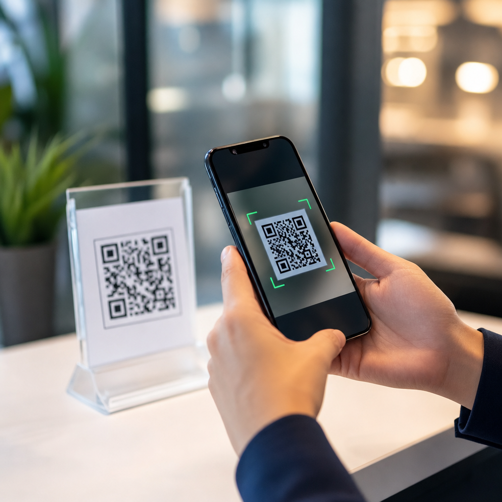
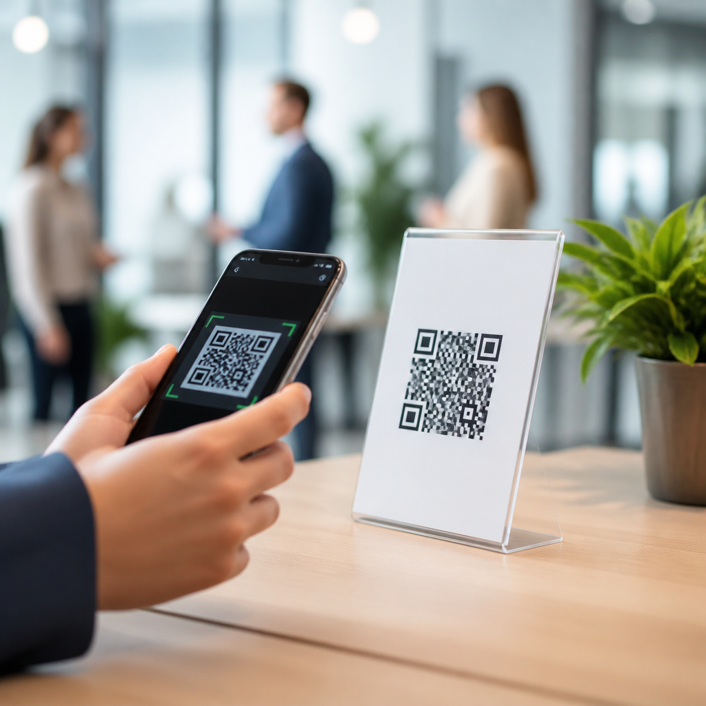
QR codes became mainstream because they remove friction: one camera scan can open a menu, verify a payment, download an app, or start a support flow. Yet the same convenience that makes them useful also creates hesitation. QR code skepticism is the reluctance people feel before scanning, usually driven by uncertainty about where the code leads, what data will be collected, and whether the interaction is legitimate. In security, privacy, and compliance work, I have seen this skepticism appear in every setting, from restaurant tables to factory floors. It is not irrational. A QR code hides its destination until after the scan, and that hidden step changes how users judge risk.
Reducing QR code skepticism means designing trust into the full experience, not merely printing a cleaner code. User trust is the confidence that the scan will do what the organization claims. Transparency is the practice of making destination, purpose, ownership, and data handling easy to understand before and after the scan. Together, trust and transparency determine adoption rates, completion rates, and complaint volume. They also affect broader outcomes such as payment conversion, form completion, account enrollment, and support costs. If users pause, second-guess, or abandon the scan, the campaign underperforms even when the technical code works perfectly.
This matters more now because QR use expanded faster than user education. During the pandemic, many people learned to scan out of necessity, but they did not always learn how to evaluate safety. At the same time, attackers recognized the opportunity. Security teams now use the term quishing to describe phishing delivered through QR codes. Fraudsters place stickers over legitimate codes, send codes in email attachments, or post signs that route victims to fake login and payment pages. When people hear about these incidents, they generalize the risk to all QR experiences. That means legitimate brands inherit suspicion created by bad actors.
For organizations, the practical question is simple: how do you make a QR code feel safe enough to scan while remaining compliant and easy to use? The answer starts with treating the QR code as a trust journey. The printed or displayed code is only the entry point. The surrounding context, the visible brand signals, the destination URL, the landing page copy, the consent language, the mobile page performance, and the support options all influence user confidence. This hub article explains the core principles of user trust and transparency, the controls that reduce perceived risk, and the operational practices that sustain confidence over time.
Why people distrust QR codes in the first place
Most users do not distrust the square pattern itself; they distrust the information asymmetry around it. A standard link shows a recognizable domain before a click. A QR code does not. The user must act before they can inspect the destination, and that creates a decision under uncertainty. In my work, skepticism usually clusters around four questions: Where will this take me? Is this really from the company named on the sign? What will happen to my data? And what if something goes wrong? If an organization cannot answer those questions instantly, trust drops.
Context also shapes perception. A QR code on official packaging with matching brand colors, a known domain, and a customer service number feels safer than a code taped to a parking meter. Environmental clues matter because users make snap judgments. Device behavior matters too. Modern phone cameras often preview the URL before opening it, which helps, but many users still ignore the preview or do not know what a legitimate domain should look like. Attackers exploit that gap with typosquatted domains and lookalike landing pages. Once users know this is possible, skepticism becomes a rational defense mechanism.
Privacy concerns add a second layer. Many people now understand that scans can reveal location, device type, referral source, timestamp, and campaign identifiers. If the scan leads to a form, app store listing, or payment screen, the concern increases. Users want to know whether scanning alone triggers tracking, whether cookies will be set, and whether personal data is required to complete the task. Transparent organizations explain this in plain language. Opaque ones create suspicion even when their practices are lawful.
Trust signals that make users more willing to scan
The most effective trust signals are visible before the scan. Start with ownership clarity. The code should sit next to the organization name, logo, and a short explanation of purpose, such as “Scan to verify product authenticity” or “Scan to pay on our secure site.” Vague prompts like “Scan me” underperform because they ask for action without justification. In field testing, I have consistently seen higher scan rates when the user knows the exact outcome in seven words or fewer.
Domain clarity is equally important. If possible, print the destination domain near the code, not just inside the encoded link. A user may not read every character, but they will notice whether the domain aligns with the brand. Using a short link can be operationally convenient, yet generic shorteners often reduce trust because they hide the destination further. Branded short domains are far better, provided they are memorable and consistently used. For example, a retailer using pay.brand.com signals legitimacy more clearly than an unrelated shortener string.
Visual consistency matters because users compare what they see with what they expect from the brand. Keep typography, color, tone, and iconography aligned with other official channels. Do not overdesign the code itself if it harms readability. A stylized QR code that fails on older cameras damages trust faster than a plain code ever could. Accessibility is part of trust too: adequate contrast, sufficient quiet zone, and placement that avoids glare or awkward scanning angles all reduce friction and show care.
Finally, include fallback options. A short URL, NFC tap, customer service line, or manual code entry path reassures users that they are not trapped. Trust increases when people retain control. If a user declines to scan but can still complete the task another way, the brand appears more credible, not less.
Transparency practices that reduce uncertainty
Transparency is the discipline of removing ambiguity before it becomes suspicion. The first rule is to state the purpose of the scan in plain language. Users should know whether the code opens a menu, verifies a ticket, starts a payment, downloads a PDF, joins Wi-Fi, or launches a support chat. The second rule is to disclose material data practices at the right moment. Do not bury critical details in a privacy policy footer. If a scan initiates location-based tracking, lead capture, or account linking, say so near the code or immediately on the landing page.
Landing page design is where many trust programs succeed or fail. The page should confirm that the user arrived in the right place with explicit identifiers: brand name, page purpose, and recognizable domain. If authentication or payment is required, explain why. If consent is needed, separate it from unrelated marketing permissions. Patterns that pressure users into broad consent may increase short-term form submissions, but they damage confidence and elevate compliance risk. Clear choices perform better over time because users feel respected.
Organizations should also explain how users can verify legitimacy. This can be as simple as “Check that the page address ends in ourcompany.com” or “Our staff will never ask you to scan a code to reset your bank password.” These micro-instructions improve user judgment and reduce support burden. Good transparency does not assume trust; it teaches safe verification behaviors.
| Trust issue | User question | Best transparency response | Example |
|---|---|---|---|
| Unknown destination | Where does this scan go? | Print the domain and page purpose beside the code | “Opens verify.brand.com to check warranty status” |
| Brand impersonation | Is this really official? | Use consistent branding and a verification note | “Official code from Brand Support; staff never cover signs with stickers” |
| Data collection | What information are you taking? | Disclose tracking and form fields before submission | “We record scan time and device type; email is optional” |
| Payment risk | Could this be fraudulent? | Explain the payment flow and display the legal merchant name | “Payment processed on pay.brand.com by Brand Retail LLC” |
| No recovery path | What if it fails? | Offer fallback methods and support contacts | “Use brand.com/pay or call support” |
Security controls users can see and understand
Back-end controls matter, but visible controls matter just as much because they influence behavior. HTTPS is nonnegotiable. Users may not understand TLS handshakes, but they recognize the padlock and expect encrypted pages. Use HSTS, maintain valid certificates, and avoid mixed content warnings. If the QR code starts a login or payment flow, require strong authentication where appropriate and keep the session scoped narrowly. Security headers, bot mitigation, and fraud monitoring are critical, but they are invisible. Pair them with visible cues the user can evaluate.
One useful pattern is destination confirmation. Some brands use an intermediate page that clearly states the next action, especially for payments, downloads, or external partners. This should not become a friction-heavy redirect maze, but a brief confirmation screen can reassure cautious users. Another effective control is tamper awareness in physical environments. On posters, kiosks, meters, and tables, inspect for overlays and establish replacement procedures. In high-risk areas, use anti-tamper labels, serialized assets, or dynamic digital displays that are harder to alter.
Standards and frameworks help guide these decisions. The NIST Cybersecurity Framework supports governance, risk assessment, and protective controls. OWASP guidance is useful for secure landing pages, input handling, and session management. ISO 27001 informs information security management, while privacy programs often align with GDPR, CCPA, or sector-specific rules. Users will not ask about these by name during a scan, but the operational maturity they drive shows up in a cleaner, safer experience.
Building a trustworthy QR code journey from scan to completion
Trust is cumulative. The moment before the scan sets expectations; the landing page either confirms or breaks them. Start by mapping the full journey. Identify the object carrying the code, the user intent, the environment, the device behavior, the target page, and the completion event. Then ask where uncertainty appears. In one retail rollout I reviewed, the code on product packaging opened a generic home page instead of the expected authenticity checker. The mismatch caused abandonment because users thought the code was fake. Changing the link to a dedicated verification page and adding “Check authenticity at verify.brand.com” increased completions substantially.
Performance is part of credibility. Slow mobile pages, intrusive interstitials, or app-download traps feel suspicious because they do not match the promised action. Keep the first page lightweight, purpose-specific, and mobile optimized. If the user needs to log in, explain why before prompting. If they need to grant permissions, request only what is necessary and at the moment of use. A camera-based AR experience may need motion or camera access; a simple coupon page does not. Over-requesting permissions is one of the fastest ways to reinforce skepticism.
Copywriting deserves more attention than most teams give it. Strong trust copy is concrete: “Scan to register your appliance warranty in under two minutes” is better than “Unlock your experience.” It sets expectations, signals restraint, and reduces cognitive load. The best pages also include a clear support route. A visible help link or phone number tells users the organization is accountable after the scan, which is a powerful credibility marker.
Measurement, testing, and governance for long-term confidence
You cannot reduce QR code skepticism by intuition alone. Measure it. Useful indicators include scan-to-open rate, open-to-completion rate, bounce rate on the first landing page, time to complete, support contacts per campaign, fraud reports, and percentage of users choosing fallback paths. Segment by environment: packaging, in-store signage, direct mail, email, events, and employee materials behave differently because the trust baseline differs. A poster in a transit station faces more skepticism than a code printed inside a sealed product box.
Testing should focus on trust variables, not only design aesthetics. A/B test explanatory labels, domain display formats, trust badges, placement of privacy disclosures, and confirmation page wording. In one campaign, moving the visible domain from small footer text to a line directly under the code improved scans because users could validate the destination earlier. Another common win is replacing generic marketing language with task-specific wording. However, do not assume every badge helps. Too many seals, icons, or warnings can look performative and make the page feel less authentic.
Governance keeps trust from eroding as campaigns scale. Maintain an inventory of active QR codes, owners, destinations, expiration dates, and approved use cases. Dynamic QR platforms such as Bitly, QR Code Generator PRO, Beaconstac, and enterprise campaign tools can simplify management, but they require change control and access governance. Broken redirects, expired pages, and orphaned codes are trust failures. Review physical placement regularly, especially in public spaces vulnerable to sticker substitution. Train frontline staff to explain what the code does, what domain users should expect, and what red flags should prompt reporting.
How this hub connects the broader user trust and transparency topic
User trust and transparency is not one tactic; it is a set of related practices that should inform every QR deployment. This hub anchors that work. From here, teams should go deeper into subtopics such as branded links versus generic shorteners, anti-tamper methods for physical signage, secure QR payment design, privacy notices for scan-based campaigns, consent collection on mobile landing pages, accessibility requirements, and incident response for fraudulent code reports. Each of those subjects deserves dedicated treatment because each addresses a specific point where skepticism forms.
The common principle across all subtopics is straightforward: users are more willing to scan when they can recognize the sender, predict the outcome, verify the destination, understand the data exchange, and recover easily if something goes wrong. Organizations that respect these expectations see better adoption and fewer trust-related issues. Those that treat the code as a novelty graphic or a pure conversion shortcut usually create the very hesitation they hoped to avoid.
Reducing QR code skepticism is therefore not about persuasion alone. It is about operational honesty made visible. Clear purpose statements, branded and verifiable domains, secure landing pages, proportionate data collection, fallback options, and ongoing governance turn uncertainty into confidence. If you manage QR programs under a security, privacy, or compliance mandate, start with one audit: review every live code from the user’s perspective, before the scan and after it. Fix the moments that hide intent, obscure ownership, or ask for too much too soon. Trust grows when transparency becomes the default.
Frequently Asked Questions
Why are people skeptical of QR codes in the first place?
People hesitate because scanning a QR code asks them to take an action before they fully understand what will happen next. Unlike a printed URL, a QR code hides the destination until after the scan, which naturally creates uncertainty. Many users wonder whether the code will open a legitimate website, trigger a payment request, download something unexpected, or collect personal data without clear consent. That concern is not irrational. Public awareness of phishing, fake payment links, and misleading redirects has made people more alert to anything that feels opaque or difficult to verify at a glance.
QR code skepticism also increases when the context feels weak or inconsistent. For example, if a code appears on a sticker placed over another sticker, on a sign with no branding, or in an environment where fraud would be easy to attempt, users are more likely to pause. The same is true when the code is presented without any explanation of what it does. People are far more comfortable scanning when they know exactly what to expect, such as “View our menu,” “Check in for your appointment,” or “Pay your invoice securely.” In practice, reducing skepticism starts with accepting that hesitation is often a sign of healthy user judgment, not resistance for its own sake.
What is the best way to make a QR code feel safer and more trustworthy?
The most effective way to make a QR code feel trustworthy is to remove ambiguity before the scan ever happens. Start by pairing the code with plain-language instructions that explain exactly what the user will get. Instead of showing only a code, add clear text such as “Scan to see today’s menu,” “Scan to download our official app,” or “Scan to pay at checkout.” This gives the interaction a purpose, which immediately lowers suspicion. If possible, also display the destination domain in readable text so people can recognize the brand or website before scanning.
Visual trust signals matter as well. Use consistent branding, professional design, and placement in locations users already associate with your business or organization. A QR code printed on official packaging, checkout materials, support documents, or in-app instructions feels more legitimate than one appearing with no context. It also helps to avoid cluttered layouts or aggressive calls to action that make the code feel promotional or deceptive. From a security and compliance perspective, trust grows when users can verify identity, understand intent, and predict the outcome of the interaction. The safer the experience feels before the scan, the lower the skepticism will be.
How can businesses address privacy concerns when using QR codes?
Privacy concerns usually come from a lack of transparency. Users want to know what information, if any, will be collected once they scan. To address this, businesses should explain the purpose of the QR code and be upfront about any data practices tied to the destination. If the scan leads to a form, login page, app download, or analytics-enabled landing page, say so clearly. If location, device, or contact information may be processed, the user should not have to discover that after the fact. A short privacy notice near the code or a clear disclosure on the landing page can make a major difference.
It is also important to practice data minimization. Only ask for information that is necessary for the transaction or service. If a user is scanning to read a menu, they should not be forced into unnecessary registration. If they are scanning for support, keep the path as simple and relevant as possible. Over-collecting data creates friction and reinforces distrust. Strong privacy practices, secure pages, visible HTTPS, and clear consent language all help communicate that the interaction is controlled and respectful. In many cases, skepticism decreases not because users suddenly love QR codes, but because the organization proves it is handling the interaction responsibly.
Should you show users where a QR code leads before they scan it?
Yes, whenever possible, you should provide destination clues before the scan. One of the main reasons QR codes create hesitation is that they obscure the next step. Even though many modern smartphones preview a URL after scanning, users still feel more confident when they have some level of verification in advance. Listing the domain near the code, using recognizable branding, and describing the landing page’s purpose all help establish legitimacy. If the code leads to a known subdomain or campaign page, displaying that information can reassure users that the interaction is official and not a redirect to an unknown source.
This is especially important in high-trust or high-risk scenarios such as payments, account access, healthcare, customer support, and compliance workflows. In these situations, users need stronger confirmation that the QR code is part of a legitimate process. A useful best practice is to combine the QR code with a fallback option, such as a short typed URL, customer service contact, or alternate access path. That way, users who are still uncomfortable scanning have another way to proceed. Offering choice reduces pressure, and reducing pressure is often one of the fastest ways to build trust.
What mistakes make QR code skepticism worse?
The biggest mistakes are vagueness, inconsistency, and poor security hygiene. A QR code with no explanation, no visible brand, and no indication of what happens next will naturally trigger doubt. The same is true when the code sends users through multiple redirects, opens a page that does not match the promise on the sign, or lands on a site that looks outdated or unprofessional. Even small mismatches, such as different brand names, unfamiliar domains, or confusing page titles, can make users feel they have entered the wrong place. Once trust drops, conversion usually drops with it.
Another common mistake is treating convenience as more important than user assurance. Forcing QR codes into every interaction, especially when a simple URL or in-person option would work just as well, can create resistance. Businesses also undermine trust when they fail to monitor for tampering, such as fraudulent stickers placed over legitimate codes in public areas. Finally, asking for too much too soon, whether that means payment details, personal information, or app permissions, can intensify skepticism immediately. The goal is not just to make scanning possible; it is to make the entire experience understandable, verifiable, and consistent from first glance to final action.