QR codes look simple, but optimizing QR codes for mobile screens requires decisions about size, contrast, error correction, file format, placement, and testing conditions that directly affect scan speed and completion rates. In the QR Code Design & Branding field, this topic sits at the intersection of visual design and mobile usability because a code that looks attractive on a desktop mockup can fail the moment it appears inside a social ad, email, PDF, app screen, or presentation. Mobile screens introduce constraints that print designers do not face: varying pixel densities, dark mode interfaces, screen glare, motion, limited viewing distance, and competing interface elements. Understanding print vs digital design considerations is essential because the same branded QR code may perform well on packaging yet struggle on a smartphone display.
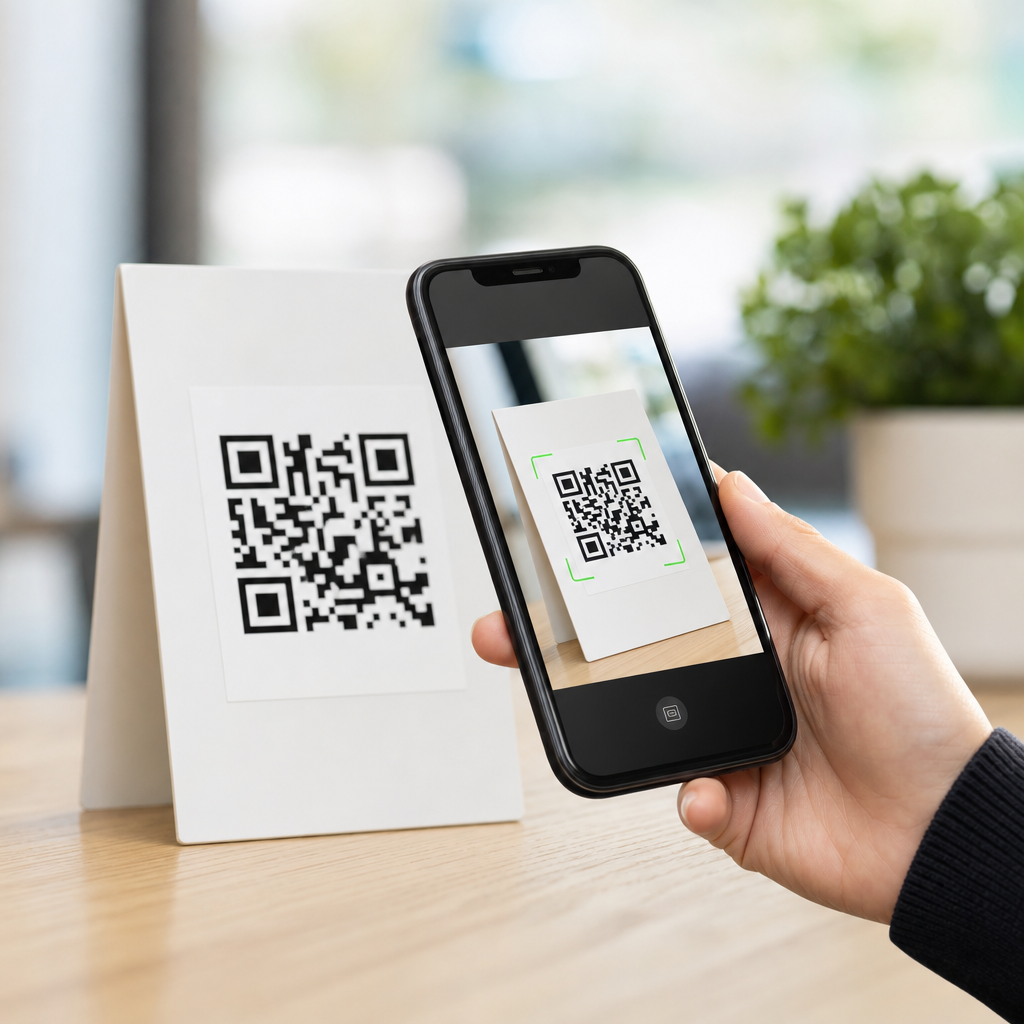
A QR code is a two-dimensional matrix barcode made of square modules that encode data such as a URL, payment string, Wi-Fi credential, or app deep link. When a phone camera detects the finder patterns in three corners and resolves the module grid, software decodes the content and prompts an action. Optimization means designing the code and the surrounding experience so the scanner can recognize it quickly across real mobile conditions. In practice, that includes preserving a clear quiet zone, choosing a scannable color contrast, avoiding over-stylization, selecting a realistic display size, and using dynamic QR codes when campaign tracking or destination updates matter. I have seen teams blame “bad cameras” for weak results when the actual issue was a low-contrast code embedded inside a glossy in-app creative.
This matters because mobile is now the default scanning environment for most consumer campaigns. Restaurant menus, event check-ins, retail displays, paid social creatives, and email promotions are routinely opened and scanned on phones. If the code appears on one device and must be scanned by another, the design needs to accommodate arm’s-length viewing, lower brightness settings, and interface chrome around the image. If the same device is expected to scan a code displayed on itself, that is impossible without special workflows, so the content must also offer a tappable fallback. Strong mobile QR design reduces friction, protects brand trust, and improves measurable outcomes such as scan-through rate, landing page completion, and assisted conversions.
Why mobile screen optimization differs from print
Print QR design starts with physical dimensions, viewing distance, and substrate. Digital QR design starts with rendered pixels, screen brightness, compression, and context inside an interface. That difference changes the failure modes. In print, common problems include ink spread, warped placement on curved packaging, and reflections from laminated stock. On mobile screens, common problems include anti-aliasing blur, screenshots saved at low resolution, color overlays, tiny placements inside banners, and codes displayed too close to other high-contrast UI elements. A printed code is usually scanned by a separate phone camera. A mobile-screen code may be viewed on a laptop, tablet, kiosk, television, or another phone, each with different sharpness and brightness.
The practical rule is that digital codes usually need cleaner edges and more conservative styling than print codes. On packaging, you may get away with a larger decorative frame because the symbol itself can be physically large. Inside a mobile ad unit, every pixel is contested, so designers often shrink the symbol until modules become too dense for reliable decoding. That tradeoff gets worse when the destination URL is long and the code version increases. Dynamic QR platforms help because a short redirect URL creates a simpler pattern than a long static string. Simpler patterns scan faster on mobile screens, especially under glare or motion.
Another difference is user behavior. Printed codes are often scanned intentionally: a shopper pauses, points the camera, and waits. Digital codes may appear while someone is scrolling, multitasking, or watching a presentation. That means scan windows are shorter. A successful mobile-screen QR code must be recognizable almost instantly, with no ambiguity about where to aim or what happens next. Clear labels such as “Scan to view menu” outperform unlabeled codes because they reduce hesitation and set an expectation. In campaign audits, I consistently find that adding explicit action text and preserving whitespace around the symbol improves real-world scan volume more than cosmetic styling changes do.
Core design specifications for mobile-readable QR codes
The first specification is size. For mobile screens, a useful baseline is to keep the rendered QR code at least 180 to 240 pixels wide in most consumer contexts, then increase from there when viewing distance grows. Tiny codes can still work on high-density displays, but only if the module count is low and the image is perfectly sharp. For social posts, presentation slides, connected TV companion prompts, and webinar screens, aim much larger because the phone camera is resolving the code from farther away. A common field formula is distance divided by ten for minimum physical size in print; digitally, use that logic conceptually and then test on target devices rather than trusting a mockup.
The second specification is contrast. The safest choice remains dark modules on a light background, ideally close to black on white. Many branded combinations scan, but not all branded combinations scan consistently. Low-luminance contrast, gradients crossing module boundaries, and translucent overlays are frequent digital failures. Night mode screenshots can make already-muted codes worse. If brand colors must be used, verify contrast with actual devices, not only on a calibrated design monitor. QR readers care less about “color harmony” than about edge separation and predictable module boundaries.
The third specification is structural integrity. Maintain the quiet zone, typically four modules wide, on all sides. Do not let captions, buttons, borders, or image crops invade that zone. Protect finder patterns and alignment patterns from decoration. Rounded modules, embedded logos, and custom eyes can work, but every modification consumes decoding tolerance. Error correction helps, usually levels M or Q for branded codes, yet it is not a license to redesign the symbol freely. If a logo covers too much central area or a frame clips the quiet zone, the code may fail even with high error correction.
| Design factor | Mobile screen guidance | Print comparison |
|---|---|---|
| Minimum display size | Usually 180–240 px or larger, depending on distance | Set by physical dimensions and scanning distance |
| Contrast | Use strong light-dark separation; avoid gradients over modules | Can tolerate more texture if physically large and sharply printed |
| Quiet zone | Keep four modules clear from UI elements and crops | Keep clear from folds, die cuts, and nearby graphics |
| File handling | Prefer SVG or high-resolution PNG to prevent blur | Vector preferred for prepress scaling accuracy |
| Testing | Check across devices, brightness levels, and screenshots | Check under lighting, substrate, and distance conditions |
File formats, rendering, and compression pitfalls
For digital use, file handling is as important as the original design. I strongly recommend generating QR codes as SVG for responsive layouts and as high-resolution PNG when a raster asset is required by an ad platform or email builder. SVG preserves crisp module edges at any size, which is valuable on retina-class screens and within responsive components. Problems arise when teams export a small raster code from a design tool, then scale it up in presentation software or a CMS. Interpolation softens edges, introduces gray pixels, and reduces scanner confidence. That is especially harmful for dense codes with small modules.
Compression is another overlooked issue. Social platforms, messaging apps, and content management systems often recompress uploaded images. JPEG is a poor choice for QR codes because lossy artifacts interfere with the module grid. PNG generally preserves edges better, but repeated export cycles can still introduce blur if the code is placed inside a larger image and then resized. The safest workflow is to place the vector or a sufficiently large PNG into the final layout at native dimensions, then preview the exact published asset on target devices. If the code will live inside a video, test frame capture and pause states, because motion compression can distort the symbol during transitions.
Rendering behavior also varies by environment. Email clients may downscale images on mobile. Presentation tools may compress embedded assets. In-app webviews can apply zooming or responsive scaling that changes the apparent module sharpness. That is why a QR code that scans from a source file may fail once published. The correct question is not “Does the code work?” but “Does the code work in the final channel after rendering, compression, and user interaction?” Teams that adopt this mindset catch problems before launch.
Placement, context, and call-to-action strategy
Placement determines whether people notice and can physically scan the code. On mobile-relevant screens, avoid corners crowded by navigation, dismiss icons, or status bars. Keep the code away from moving carousels, autoplay subtitles, and patterned backgrounds. Give it breathing room and pair it with concise explanatory text. The best-performing call to action states both the action and the value: “Scan to compare plans,” “Scan to claim 15% off,” or “Scan to open the app install page.” Generic labels like “Scan me” are weaker because they ask for effort before communicating benefit.
Digital placements need extra care when users may be on a single device. A QR code in an email opened on a phone cannot be scanned by that same phone unless the user switches devices or uses image-based workarounds. In those cases, always include a direct button or text link below the code. This is one of the most important print vs digital design considerations. Print can assume a second device, usually the phone in the user’s hand. Digital cannot. Good hub-page guidance for this subtopic should therefore treat QR as one access method among several, not the only path.
Context also affects scan confidence. On a webinar slide, presenters should leave the code visible for long enough to unlock the camera, frame the shot, and confirm the destination. Five seconds is often too short; fifteen to thirty is more realistic. On digital signage, loop timing matters. On retail screens facing bright windows, screen glare can overpower low-contrast codes. On app screens, if the code supports account linking or payments, the surrounding microcopy should explain security and expected behavior, because users are rightly cautious about scanning unknown destinations.
Testing methodology and performance measurement
Reliable optimization comes from structured testing, not assumptions. My standard process is to test at least three phone models, two brightness levels, and multiple real viewing distances. I also test with the native camera app on iOS and Android because scan behavior differs from third-party apps. Then I test screenshots, because many users attempt to scan codes shared in chat, social, or support threads after saving an image. If a code only works under ideal conditions, it is not production-ready. Record whether the camera detects the code immediately, how long decode takes, and whether the landing page loads correctly after the scan.
Measurement should continue after launch. Dynamic QR code platforms such as Bitly, QR Code Generator, Beaconstac, and Flowcode can track scans by time, device, and campaign. Pair those metrics with analytics on the destination page to see whether scans turn into meaningful actions. High scans with low completion can indicate mismatch between the call to action and the landing page, not necessarily a code problem. Conversely, low scans with strong conversion may suggest the code is reaching qualified users but lacks visibility. For this sub-pillar hub, the core lesson is that design quality and campaign performance must be evaluated together.
Accessibility belongs in testing as well. Users with older devices, cracked screens, reduced brightness, or visual impairments should still have a clear path. That means large enough presentation, high contrast, and a fallback URL or button. It also means avoiding instructions that depend on color alone. Inclusive design improves overall scan performance because the same choices that support accessibility also support faster machine recognition.
Common mistakes in print and digital QR execution
The most common mistake is shrinking the code to fit the layout instead of adjusting the layout to fit the code. The second is using branded colors without checking luminance contrast. The third is exporting a low-resolution raster asset and enlarging it later. Other frequent issues include cropping the quiet zone, placing the code over photography, adding heavy shadows, and using static QR codes with long URLs that create overly dense patterns. In print, a curved bottle or reflective laminate may be the culprit. In digital, the same code may fail because it was embedded inside a compressed Instagram Story creative or scaled down by an email template.
Another mistake is forgetting the destination experience. A fast scan into a slow, non-mobile landing page wastes the advantage of good QR design. If the article is guiding readers across the broader QR Code Design & Branding topic, this point deserves emphasis: optimization does not end at the symbol. The destination should be mobile-first, secure with HTTPS, quick to load, and consistent with the promise made beside the code. Clear continuity between code, call to action, and landing page builds trust and improves conversion.
Optimizing QR codes for mobile screens comes down to disciplined design choices that respect how cameras, screens, and people behave in the real world. Start with the fundamentals: adequate size, sharp rendering, strong contrast, a protected quiet zone, and restrained branding. Then account for the biggest print vs digital design considerations. Print is governed by physical materials and distance, while digital is governed by pixels, compression, interface context, and the possibility that the viewer has only one device. Add explicit call-to-action text, always provide a tappable fallback in digital placements, and validate performance in the final published environment rather than in a design file.
As a hub article within the QR Code Design & Branding subtopic, the main benefit is clarity: once you understand the differences between print and digital execution, you can build QR experiences that scan quickly, look on-brand, and convert reliably. The strongest teams treat QR codes as functional interface elements, not decorative add-ons. Audit your current codes on real phones, fix the obvious issues first, and use those findings to guide every future campaign.
Frequently Asked Questions
What size should a QR code be on a mobile screen for fast, reliable scanning?
For mobile screens, the best QR code size is the largest size that fits comfortably within the layout without competing with essential interface elements. In practice, a code generally needs enough on-screen space for the camera to detect its modules clearly, especially when the user is scanning from another phone or from a screen displayed in an ad, email, PDF, slide deck, or app. A useful rule is to avoid making the code a small decorative element. If it appears too tiny relative to the screen, users must zoom, reposition, or move devices awkwardly, which slows scanning and increases abandonment.
Size decisions should also account for viewing distance and device resolution. A QR code inside a presentation slide viewed from several feet away needs to be much larger than one in a mobile checkout screen held in the hand. On high-density mobile displays, a code may look sharp to the eye while still being too small for quick camera recognition if its individual modules are compressed. To improve scan performance, give the code enough physical presence, preserve a clear quiet zone around it, and avoid crowding it with buttons, captions, or decorative frames. The most dependable approach is to test the intended display size on actual devices under realistic conditions, because scan speed depends on both pixel dimensions and the context in which users encounter the code.
How important are contrast and color choices when optimizing QR codes for mobile screens?
Contrast is one of the most important factors in QR code performance on mobile screens. Scanners work best when there is a strong difference between the foreground modules and the background, typically with a dark code on a light background. While branded color palettes can make a QR code look more polished, low-contrast combinations often reduce recognition speed or cause complete scan failure, especially on screens with glare, reduced brightness, or color shifts. A stylish design that works in a static mockup can become unreliable when viewed in sunlight, on dim displays, or inside compressed social media placements.
For best results, prioritize functional contrast first and branding second. Deep black or very dark tones against white or very light backgrounds remain the safest choice. If brand colors must be used, verify that the code still maintains strong luminance contrast rather than relying only on hue differences. Gradients, translucent overlays, busy image backgrounds, and reversed light-on-dark designs can all create scanning issues unless they are tested carefully. Mobile screens introduce extra variables such as auto-brightness, reflections, dark mode interfaces, and platform rendering differences, so color decisions should be validated on multiple devices. If the QR code must appear within a branded creative, isolating it inside a clean high-contrast container is usually the most effective compromise between aesthetics and usability.
What level of error correction should I use for QR codes displayed on mobile screens?
Error correction matters because it determines how well a QR code can still scan if part of it is obscured, stylized, compressed, or degraded by screen conditions. QR codes support different error correction levels, and higher levels allow more damage or distortion to be tolerated. For mobile screen use, this becomes especially relevant when the code appears inside ads, emails, PDFs, or app interfaces where scaling, image compression, or overlays may affect clarity. If you are adding a logo, customizing module shapes, or placing the code in a visually rich design, a moderate to higher error correction level often provides useful resilience.
That said, higher error correction is not automatically better in every case. Increasing error correction also increases data density, which can make the code more visually complex and harder to scan at small sizes. This is a common problem on mobile screens where available space is limited. The right choice depends on the amount of content encoded, the display size, and the degree of customization. If the QR code links to a short URL and uses minimal styling, a moderate level typically balances robustness and simplicity well. If the design includes branding elements or will be reproduced across many digital placements, moving higher may be justified. The key is to avoid treating error correction as a substitute for good design. Clear contrast, adequate size, proper spacing, and realistic testing still have a bigger impact on scan success than error correction alone.
Which file format works best for QR codes used across mobile ads, emails, PDFs, apps, and presentations?
The best file format depends on where the QR code will be used, but in most workflows, vector formats are preferred for master assets because they preserve sharp edges at any size. Formats such as SVG, EPS, or PDF are ideal when the code may be resized across campaigns, slides, landing pages, or design systems. Since QR codes rely on crisp module boundaries, vectors help prevent the softening and distortion that can happen when raster images are repeatedly exported or scaled. This is especially important in the QR Code Design & Branding space, where one asset may be adapted for social creatives, email headers, digital brochures, app screens, and event materials.
Raster formats like PNG can still work very well when exported correctly for their final display environment. PNG is usually a better choice than JPEG because it preserves edges cleanly without compression artifacts. JPEG compression can introduce blurring and noise around the modules, which may reduce scan reliability on smaller mobile screens. If you are placing the code into a mobile interface, email, or social ad platform that requires raster upload, export the PNG at a sufficiently high resolution and verify that the platform does not downscale or recompress it aggressively. In short, keep a vector master, generate optimized PNG variants for digital placements when necessary, and always review the final rendered version in the actual environment where users will scan it.
How should I place and test a QR code so it performs well on mobile screens in real-world conditions?
Placement and testing are where many QR code designs succeed or fail. A technically correct QR code can still underperform if it is placed too close to screen edges, surrounded by distracting visual elements, covered by interface controls, or shown too briefly in motion content. On mobile screens, placement should support immediate recognition and easy action. That usually means keeping the code in a stable, prominent area with enough surrounding whitespace, away from navigation bars, close buttons, or cluttered copy blocks. If the QR code appears in a social ad, video frame, email, or presentation, users need enough time and visual clarity to identify it, open their camera, and complete the scan without rushing.
Testing should mimic actual user conditions rather than ideal studio conditions. Evaluate the code on iPhone and Android devices, on different screen sizes, at different brightness levels, and in both indoor and outdoor lighting where glare may be present. Test scans from common use cases, such as one phone scanning another phone, a tablet scanning a laptop screen, or a user scanning a projected slide from a distance. Also check what happens after the scan: the landing page should load quickly, be mobile-friendly, and match the promise of the QR code context. Completion rate depends on the full journey, not just scan recognition. A disciplined testing process that covers layout, contrast, timing, file quality, and destination performance is the best way to optimize QR codes for mobile screens with confidence.


