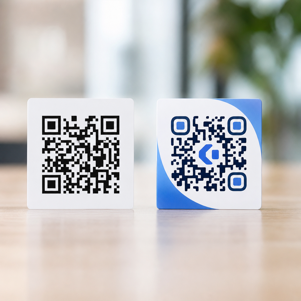

A branded QR code with a logo in the center does more than look polished; it improves recognition, strengthens trust, and can lift scan rates when it is designed within the technical limits of QR code error correction. If you want to know how to add a logo to a QR code step by step, the core process is simple: generate a dynamic or static code, choose a high-contrast design, upload a clean logo file, place it within the safe central area, test across multiple devices, and export at a resolution suited to print or screen. The details matter because a QR code is still a machine-readable symbol first and a brand asset second.
In practice, I have seen two common outcomes. Teams that treat logo integration as a quick cosmetic edit often create beautiful codes that fail under glare, distance, or low-end phone cameras. Teams that design with scanning physics in mind usually get the best of both worlds: a code that reflects the brand and still performs reliably on packaging, menus, posters, business cards, direct mail, and retail displays. This article is the hub for logo integration in QR codes, so it covers the full workflow, the technical constraints behind it, and the design decisions that separate a dependable branded code from a risky one.
Before getting into the steps, define the key terms. A QR code is a two-dimensional matrix barcode made of dark and light modules arranged in a square grid. Error correction is the built-in redundancy that allows a scanner to recover missing or damaged parts of the code. The four standard levels are L, M, Q, and H, with H providing the most recovery capacity and usually the best fit when adding a central logo. The quiet zone is the empty margin around the code; removing or crowding it is one of the fastest ways to break scanability. A static QR code stores the final destination directly in the symbol, while a dynamic QR code points to a short URL that can be edited later and measured with analytics.
Why does logo integration matter? Users decide in seconds whether a code looks legitimate. In retail, hospitality, events, and B2B marketing, a recognizable mark can reduce hesitation because it signals ownership and intent. It also helps a code feel native to a package or campaign instead of pasted on as an afterthought. At the same time, branding introduces tradeoffs. A larger logo covers more modules, color choices can reduce contrast, and decorative frames can interfere with finder patterns. The goal is not maximum customization. The goal is the strongest visual identity that still scans instantly in real conditions.
Step 1: Choose the right QR code type and destination
The first decision is whether to create a static or dynamic QR code. If the destination may change, use a dynamic code. Dynamic QR codes are usually the better choice for campaigns, restaurant menus, product packaging, app downloads, and event registration because you can update the landing page without reprinting the code. They also support tracking metrics such as scans by time, device, and location, depending on the platform. Static codes work well for permanent information like Wi-Fi credentials, vCards, or a fixed URL that will not change.
The destination affects logo integration because dense data creates denser symbols. A simple short URL produces a cleaner code with more space for customization. A long URL, contact record, or multi-field payload creates a more complex grid that leaves less tolerance for decorative changes. This is why many professional generators route dynamic codes through a short redirect domain. If you want the easiest path to adding a logo safely, keep the encoded content compact and use a trustworthy generator such as QR Code Generator, Bitly, Beaconstac, Uniqode, Flowcode, or Adobe Express for lighter use cases.
Also decide where the code will appear. A logo-safe QR code for a mobile screen can still fail on corrugated packaging, glossy labels, or storefront glass. I plan the use case first: scanning distance, lighting, likely phone quality, and print method. A code on a table tent in a dim restaurant needs stronger contrast and larger physical size than one embedded in an email. This context should shape every step that follows.
Step 2: Set up the code for logo placement
To add a logo successfully, start with high error correction, usually level H. Error correction does not make a bad design good, but it gives the code more resilience when the center is partially covered. Most modern generators expose this setting directly or apply it automatically when a logo is added. Even with H, do not assume the code can tolerate aggressive customization. The recovery percentage is not a design allowance for arbitrary obstruction because scanning conditions vary widely.
Next, preserve the structure scanners rely on. The three large finder patterns in the corners help the camera locate and orient the code. The alignment patterns and timing patterns help with decoding. Never place a logo over those elements. Keep the logo centered, where interference is least risky. Maintain a quiet zone of at least four modules on all sides, and more if the code sits on a busy background. If you place a branded QR code over photography, add a solid white backing shape behind the full symbol, not just behind the logo.
Module style matters too. Square modules are the safest. Rounded dots, soft corners, and custom eyes can work, but every stylistic change moves away from the standard form scanners expect. If you are adding a logo for a mission-critical use case such as payments, event entry, or medication packaging, stay conservative: black or very dark modules on a white background, square cells, level H correction, and a modest central mark.
Step 3: Prepare the logo file correctly
The best logo file is simple, high contrast, and optimized for small sizes. In most projects, a transparent PNG or SVG works best. SVG is ideal when the generator supports it because vector artwork stays crisp at any export size. If the platform only accepts raster files, use a PNG with clean edges and enough resolution to avoid blur. Avoid thin taglines, small legal text, or intricate gradients inside the logo. At the scale used in a QR code center, those details turn to noise.
I usually create a logo variant specifically for QR use. Instead of the full corporate lockup, use the icon, monogram, or simplified badge. If the brand mark is wide, place it inside a white circle or rounded square so it reads clearly without covering too much of the matrix. The white container also separates the logo from nearby modules and improves recognition. For many brands, this container produces a better result than dropping the mark directly onto the code.
Color choice is straightforward. Dark logo on a light container is safest. If the logo must use brand colors, ensure the overall contrast remains strong. Many scan failures happen not because the logo is too large, but because designers pick low-contrast palettes such as pastel modules on white or a metallic foil print that reflects light. Phone cameras need a clear luminance difference more than they need exact brand fidelity.
Step 4: Add the logo and keep it within safe size limits
In most QR code generators, the workflow is similar: enter the destination, choose dynamic or static, set colors and shape options, upload the logo, and scale it within the center. As a rule, keep the logo small enough that the code still looks like a QR code at a glance. A practical range for the logo container is often around 15 percent to 25 percent of the code’s width, though the safe maximum depends on data density, error correction, and styling. Lower density codes can tolerate more coverage. Dense codes cannot.
Use the preview, but do not trust it alone. Some platforms show a desktop scanner simulation, which is helpful but incomplete. What matters is real-world scanning on actual phones. If your generator offers automatic logo background knockouts, compare the result with a manually controlled white badge. Automatic masking can leave awkward edges or trim modules too aggressively. Manual control is usually cleaner.
| Design choice | Best practice | Common failure |
|---|---|---|
| Error correction | Use level H when adding a logo | Leaving default lower correction on a customized code |
| Logo size | Keep the center mark modest and readable | Oversized logo covering too many modules |
| Contrast | Dark modules on a light background | Low-contrast brand colors or reflective finishes |
| Quiet zone | Leave clear space around the entire code | Cropping tight or placing the code on cluttered art |
| Shapes | Prefer square modules for critical uses | Heavy stylization plus a logo plus dense data |
If you are wondering how big a logo can be in a QR code, the honest answer is that there is no universal percentage that guarantees performance. Safe sizing depends on the symbol version, encoded content, print size, and camera conditions. That is why testing is not optional. It is part of the design step, not something saved for the end.
Step 5: Test scanability on real devices and surfaces
Professional QR code design lives or dies in testing. I test on both iPhone and Android native cameras, then on at least one older device with a weaker camera. Scan from expected distances, under bright and dim lighting, and at slight angles. If the code will be printed, print it at final size on the actual substrate or the nearest equivalent. Ink gain on uncoated paper, glare on laminate, and texture on fabric can all change performance.
Run practical tests, not just pass-fail checks. How quickly does the camera lock on? Does it scan from arm’s length? Does one platform struggle more than another? A code that eventually scans after two seconds of hunting may underperform in a busy store or trade show. Test when the code is partially wrinkled, slightly scratched, or viewed through a plastic sleeve if those conditions are realistic. This is where high error correction pays off, but only if the base design is sound.
There are also workflow checks. Confirm the destination URL resolves quickly, uses HTTPS, and loads well on mobile. If you use a dynamic QR code, verify redirects and analytics. A branded symbol that scans perfectly but lands on a slow, nonresponsive page still fails the user experience. The code and landing page are one system.
Step 6: Export for print and digital use
Once the code passes testing, export it in the right formats. For print, vector PDF, EPS, or SVG is preferred because it preserves sharp edges. For digital placement, PNG is widely supported and reliable. Keep the physical size appropriate for distance. A common baseline is at least 2 x 2 centimeters for close-range scanning, but larger is better as distance increases. On posters, storefronts, or trade show graphics, size should be driven by viewing distance, not by leftover layout space.
Protect the quiet zone in every layout handoff. I have seen approved QR codes fail because someone in production cropped the margins to make the design tighter. Document minimum size, clear space, approved colorways, and prohibited alterations in a simple brand spec. If multiple teams will use the code, store master assets in a shared library and link them to related resources across your QR Code Design & Branding content so future updates stay consistent.
For ongoing campaigns, monitor scan analytics and revise if needed. If one placement underperforms, the issue may be context rather than the logo itself: poor lighting, awkward height, weak call-to-action copy, or an oversized viewing distance. Treat the logo as one variable in a broader conversion path.
Common mistakes, edge cases, and the best long-term approach
The most common mistakes are predictable: oversized center logos, low contrast, missing quiet zones, busy backgrounds, decorative frames that crowd the symbol, and using a full brand lockup instead of a simplified mark. Another mistake is adding a logo to a very dense static code carrying too much data. When possible, shorten the payload with a dynamic redirect and simplify the visual treatment. Less encoded complexity gives you more branding headroom.
Edge cases deserve caution. Inverted codes with light modules on dark backgrounds can work, but they are less forgiving. Metallic inks, embossing, engraving, and embroidery look premium but often reduce reliability. If you need those finishes, increase size, simplify styling, and test even more aggressively. For payment flows, ticketing, and regulated environments, prioritize function over ornament. A plain code with a small logo badge usually outperforms an elaborate branded one.
The best long-term approach is to build a repeatable template: approved generator, dynamic by default, level H correction for logo use, simplified logo asset, strong contrast, documented quiet zone, and a testing checklist. That process saves time and prevents last-minute fixes. Add a logo to a QR code only when it supports the user’s confidence and the campaign’s goals. If it weakens scan reliability, scale it back. Start with one branded code, test it in the real world, and turn the winning setup into your team standard.
Frequently Asked Questions
1. How do you add a logo to a QR code step by step?
To add a logo to a QR code, start by deciding whether you need a static or dynamic QR code. A static code sends users to one fixed destination and cannot be edited later, while a dynamic code lets you change the destination after printing and often provides scan tracking. Once you choose the type, enter your destination URL or content into a QR code generator and create the base code. Next, select a design that keeps the QR code easy to scan. In most cases, that means using a dark foreground and a light background with strong contrast, avoiding busy patterns that can interfere with readability.
After the base code is generated, upload a clean version of your logo, ideally a PNG with a transparent background or a sharp SVG file if the platform supports it. Place the logo in the center of the QR code, which is typically the safest area for branding because it avoids the corner finder patterns and alignment zones that scanners rely on. Keep the logo modest in size so it does not block too much of the code. A common best practice is to let the logo cover only a limited central portion, depending on the code’s error correction level and complexity.
From there, choose a higher error correction setting, usually level H, if you plan to place a logo over the code. Error correction allows the QR code to remain functional even when part of it is obscured. Then test the finished code thoroughly before downloading it for use. Scan it on both iPhone and Android devices, try different camera apps, and test it at realistic print or display sizes. Finally, export the QR code at a resolution appropriate for where it will appear. For digital use, a crisp PNG may be enough, while for print, a high-resolution file or vector format is usually the better choice.
2. Will adding a logo to a QR code make it harder to scan?
Adding a logo can affect scanability, but when it is done correctly, a branded QR code can still perform very well. The key is understanding that every QR code has technical limits. A logo works because QR codes use error correction, which allows scanners to reconstruct missing or damaged data. However, error correction is not unlimited. If the logo is too large, if the color contrast is weak, or if the design removes too much visual data from the code, scanning reliability can drop quickly.
In practice, the safest approach is to keep the logo centered and relatively small, use high contrast between the code and background, and avoid placing branding over the three large corner markers. It also helps to generate the code at a sufficient size from the beginning. Very dense QR codes with lots of encoded information leave less room for a logo, which is one reason dynamic QR codes are often preferred. Because the encoded destination is shorter behind the scenes, the pattern can be simpler and more forgiving.
The best way to know whether your logo is hurting performance is to test the QR code in real conditions. Scan it under bright and dim lighting, from different distances, and on screens as well as printed samples. If scans are inconsistent, reduce the logo size, increase contrast, simplify the design, or raise the error correction level if possible. A polished branded QR code should balance visual identity with fast, dependable scanning, not sacrifice usability for appearance.
3. What size should the logo be inside a QR code?
There is no single universal logo size that works for every QR code because the safe logo size depends on the code’s data density, error correction level, and final use case. That said, a common guideline is to keep the logo within the central area and avoid covering more than a small portion of the overall code. Many designers aim for roughly 15% to 25% of the code area, but the exact safe limit varies. If the QR code contains more information, the pattern becomes denser, and the available room for a logo becomes smaller.
Rather than focusing only on percentages, think in terms of preserving the code’s functional structure. The three finder squares in the corners must remain completely visible, and the surrounding quiet zone, the empty margin around the QR code, should not be disturbed. The logo should also not extend so far outward that it interferes with the internal modules scanners use to decode the symbol. A compact, well-cropped logo usually performs better than a wide or detailed mark with extra whitespace around it.
The most reliable method is to start small and test upward. Place a modest logo in the center, scan the code across several devices, then increase the logo size gradually only if performance remains strong. If the code will be printed on packaging, signage, or business cards, test it at the final print size, not just on a large monitor. The right logo size is the largest one that still preserves quick and consistent scanning in real-world conditions.
4. What kind of logo file works best for a QR code?
A clean, simple logo file works best. In most cases, a PNG with a transparent background is the most practical choice because it allows the logo to sit neatly in the center of the QR code without an awkward white box around it. If your QR code platform supports vector uploads, an SVG can be even better because it stays sharp at any size and is ideal for high-quality print production. Whichever format you use, the logo should be crisp, properly cropped, and free from unnecessary visual clutter.
Simple logos usually outperform detailed ones inside QR codes. Small text, thin lines, gradients, shadows, and fine decorative elements can become muddy or unreadable once scaled down. A bold icon, monogram, or simplified brand mark tends to work best because it remains recognizable without taking up too much space. If your full logo includes a long company name, consider using only the icon portion in the QR code and relying on surrounding design elements to reinforce the brand.
It is also important to think about contrast and shape. A logo with clear edges and a defined silhouette is easier to integrate than one with a busy background. Some generators add a white padding area behind the logo to help separate it from the QR pattern, which can improve readability. If your logo is dark and the QR code is also dark, make sure the logo does not visually disappear into the design. The goal is a branded center mark that is recognizable, clean, and technically safe for scanning.
5. Should you use a static or dynamic QR code when adding a logo?
Both static and dynamic QR codes can support a logo, but dynamic QR codes are often the better option for branded marketing use. A static QR code permanently stores the final destination in the code itself. That makes it simple and sometimes cost-effective, but it also means you cannot update the link after the code is printed or published. If you make a mistake, change landing pages, or want to reuse the code in a future campaign, you may need to replace the entire asset.
A dynamic QR code, by contrast, points to a short redirect URL that can be edited later. This gives you much more flexibility and is especially valuable if the QR code will appear on packaging, posters, menus, direct mail, or other printed materials. Dynamic codes also often come with analytics, allowing you to track scans by time, device, or location depending on the platform. From a design standpoint, dynamic QR codes can also be easier to brand because they frequently encode less visible data, resulting in a less dense pattern that can better tolerate a center logo.
If your only goal is a one-time, fixed destination and you do not need scan data or future edits, a static code may be enough. But if brand consistency, campaign management, testing, and long-term flexibility matter, a dynamic QR code is usually the smarter choice. In either case, the process of adding a logo is similar: generate the code, apply a high-contrast design, place the logo carefully in the center, and test the final result extensively before distribution.