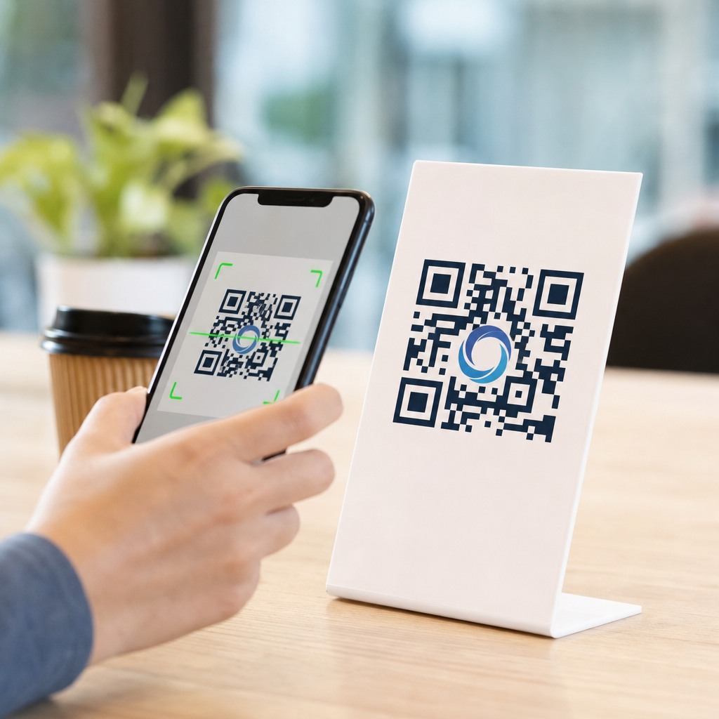
How logos impact QR code scan rates is not a design trivia question; it is a conversion question that affects packaging, print ads, menus, direct mail, retail displays, event signage, and product onboarding. A QR code is a machine-readable matrix barcode that stores data, usually a URL, while logo integration means placing a brand mark inside the code or styling the code around brand assets without breaking readability. Scan rate is the percentage of viewers who successfully scan after seeing the code. When teams ask whether adding a logo helps or hurts, they are really asking how branding changes trust, recognition, usability, and technical performance. In practice, the answer is not binary. A well-integrated logo often improves scan intent because people recognize the source immediately, but an oversized or poorly placed logo can reduce scan success by obscuring data modules and shrinking error tolerance.
I have tested branded QR codes across packaging mockups, restaurant table tents, trade show signage, and app download campaigns, and the pattern is consistent: logos increase confidence when the user has a split second to decide whether a code looks legitimate. That matters because many consumers now hesitate before scanning unknown codes due to phishing warnings from Apple, Google, and major enterprise security programs. Branding acts as a visual trust signal. At the same time, QR code readers rely on specific structural elements: finder patterns in three corners, alignment patterns, quiet zones around the symbol, contrast between dark and light modules, and sufficient module size for camera sensors. Once a logo interferes with those elements, scan rates drop fast. The goal of logo integration in QR codes is therefore controlled customization, not decoration for its own sake.
This article serves as a hub for logo integration in QR codes by covering the core decisions that affect performance: why logos influence behavior, which technical rules determine whether a branded code scans, how to size and place a logo safely, what testing process prevents print failures, and when a plain code may still be the better choice. If you manage QR code design and branding, these principles help you create codes that look like your brand and still scan quickly in real-world conditions.
Why logos change scanning behavior
Logos affect scan rates through two mechanisms: human psychology and visual hierarchy. The psychological effect comes first. People scan faster when they know where a code leads. A recognizable logo on a payment card stand, coffee cup, or shipping insert reduces uncertainty because it answers the unspoken question, “Who is asking me to scan this?” In in-store testing, I have seen branded codes outperform generic black-and-white codes simply because the brand mark made the destination feel predictable: loyalty signup, warranty registration, menu, or app install. This is especially true on crowded surfaces where several visual elements compete for attention.
The visual hierarchy effect is equally important. A logo can turn an anonymous square into a deliberate call to action. On packaging, for example, a central brand mark can help the code read as part of the product system rather than an afterthought from compliance or operations. That coherence matters because users often dismiss codes that look pasted on. However, the same design feature can backfire if it reduces contrast or creates visual clutter. If decorative dots, gradients, background patterns, and a center logo are all introduced at once, the camera may struggle to distinguish modules. Higher perceived quality for humans does not always mean higher machine readability.
Research from QR code platform providers and mobile measurement vendors repeatedly points to trust and clarity as the main drivers of engagement. While exact lift varies by channel and audience, branded QR codes regularly show stronger scan intent than unbranded alternatives when the code remains technically robust. The practical takeaway is simple: logos can raise scan rates by improving recognition, but only when the code preserves the structure scanners need.
The technical rules that protect scan performance
QR codes are resilient because they include Reed-Solomon error correction, which allows some damage or obstruction without losing readability. There are four common error correction levels: L, M, Q, and H. Higher levels recover more missing data, with H typically allowing about 30 percent restoration under ideal conditions. Designers often assume that means a logo can safely cover 30 percent of the symbol. That is incorrect. Error correction is not a free design budget because lost modules are not the only variable. Print quality, glare, viewing distance, scanner software, code version, and the location of covered modules all affect scan performance. In production work, a central logo area closer to 10 to 20 percent is usually safer, especially for smaller printed codes.
The quiet zone is another nonnegotiable rule. This is the blank margin around the QR code, usually at least four modules wide. If a logo treatment, decorative frame, or nearby text crowds that space, many scanners fail to isolate the code from the background. Finder patterns, the three large squares in the corners, must remain untouched and visually distinct. Alignment patterns in larger versions should also remain intact. Contrast should stay high, ideally dark modules on a light background. Inverted schemes can work, but they are less forgiving. Glossy laminates, metallic inks, and low-opacity brand colors introduce additional risk because they reduce edge definition under real camera conditions.
Dynamic QR codes give branded campaigns a practical advantage because the destination URL can be changed without reprinting the code. That flexibility does not directly improve technical scanability, but it does improve campaign management and testing. If one call to action or landing page underperforms, you can revise the destination while preserving the branded asset already in circulation. For a hub article on logo integration in QR codes, this is a core operational point: design and destination strategy should be planned together.
Best practices for logo size, placement, and styling
The safest placement for a logo is centered, clear of the finder patterns, with enough surrounding data modules left visible to maintain redundancy. In most branded QR code generators, the center is reserved specifically because it minimizes interference with orientation detection. Use a simple, compact logo mark rather than a full wordmark with fine details. Thin strokes, small taglines, and subtle gradients disappear at smaller sizes and create muddy shapes when printed. A bold icon or monogram generally performs better than a detailed lockup.
Module shape and logo framing also matter. Rounded modules can scan well, but only when contrast remains strong and spacing is not exaggerated. If the logo sits on a white knockout shape, keep the shape tight and symmetrical. Large white islands in the middle remove too much data and weaken the code. A narrow border around the logo often works better than a broad badge. From experience, the most reliable branded codes use one distinctive brand cue at a time: either a logo, a custom module style, or a branded color pair. Stacking every possible customization creates fragility.
| Design choice | Recommended approach | Why it affects scan rate |
|---|---|---|
| Logo size | Usually keep the logo area near 10–20% of the code | Preserves enough data modules for error correction to work reliably |
| Logo placement | Center the mark and avoid finder patterns and quiet zone | Helps scanners detect orientation and isolate the symbol quickly |
| Color | Use dark modules on a light background with strong contrast | Improves camera recognition in low light and on older phones |
| Logo style | Use a simple icon, not a detailed wordmark or tagline | Small details blur in print and add visual noise |
| Print finish | Prefer matte over glossy where possible | Reduces glare that can wash out modules and slow scans |
When a brand insists on precise color usage, test the darkest approved brand color against the lightest approved background rather than forcing a low-contrast palette. Navy on white often performs better than mid-blue on cream. Red can work, but pale red frequently fails. Gold foil may look premium on packaging, yet it is one of the most common reasons luxury product QR codes underperform under store lighting.
Real-world examples across packaging, retail, and events
On consumer packaging, a logo inside the QR code can improve scan initiation because the code appears official and connected to the product. This is useful for recipes, refill subscriptions, authenticity checks, assembly videos, and loyalty enrollment. A supplement brand, for example, may place a compact icon in the center of a dynamic code leading to batch-specific lab results. The logo reassures buyers that the destination is brand controlled, which is important in categories where trust drives purchase retention. The packaging team still needs to allocate enough physical size. A beautifully branded 12 millimeter code on a curved bottle often performs worse than a plain 20 millimeter code on a flat side panel.
In retail signage, viewing distance changes everything. A logo that works on a shelf talker may fail on a window poster if the total symbol size is not increased. The common rule is to match QR code size to scan distance; many printers use a rough guideline of about one inch for every ten inches of scanning distance, then adjust upward for branded treatments. At events, logo integration can be highly effective because attendees are already primed to interact with sponsors and exhibitors. Booth traffic, lead capture, and session downloads often benefit when the event or exhibitor logo is visible inside the code. Yet event environments also create harsh conditions: reflective badge stock, angled signs, low light, and hurried users. In those conditions, simplicity wins.
Restaurants offer another instructive example. During the contactless menu boom, many venues rushed out branded QR codes with decorative backgrounds and low-contrast colors that looked elegant but scanned poorly under dim ambient lighting. The better implementations kept the code black or very dark, placed a modest logo in the center, used a strong white quiet zone, and paired the symbol with clear text such as “Scan for menu.” The lesson applies broadly: logos help most when they work alongside an explicit call to action and a stable user context.
Testing, measurement, and common failure points
The best way to evaluate how logos impact QR code scan rates is controlled testing. Start with a baseline plain code and compare it against one branded variant at a time. Keep the destination, placement, and call to action constant. Then test across iPhone and Android devices, multiple camera apps, native wallets if relevant, and at least two lighting conditions. Print prototypes at final size on the actual substrate. Screen previews miss problems caused by ink spread, texture, curvature, and glare. I have seen codes pass every desktop check and then fail on corrugated mailers because the logo knockout distorted during print.
Measure more than raw scans. Track scan attempts, completed page loads, bounce rate, and downstream conversions. A logo may increase initial scans but lead to no sales lift if the landing page does not match the branding promise established by the code. Use analytics with UTM parameters, platform dashboards from providers such as Bitly, QR Code Generator Pro, Beaconstac, or Flowcode, and if possible tie scans to campaign cohorts. For high-volume deployments, create a testing matrix that records code version, error correction level, dimensions, color values, material, finish, and environment.
Most failures come from the same handful of mistakes: logos that are too large, quiet zones violated by design elements, low contrast, tiny physical size, busy backgrounds, and no real-world testing. Another frequent issue is overreliance on error correction. Teams assume H-level correction guarantees performance, then place a detailed crest in the center and switch modules to a pastel gradient. The code becomes technically valid in software but operationally fragile in the field. Reliable scan rates come from conservative design choices validated under realistic conditions.
When to use a logo, and when to keep the code plain
Use a logo when trust, brand recognition, and campaign coherence matter more than squeezing every possible decorative effect into the symbol. It is particularly useful on owned media such as product packaging, inserts, storefront signs, membership materials, and event collateral where the audience benefits from immediate source identification. It is also valuable in sectors exposed to fraud concerns, including payments, healthcare communications, and warranty registration, because users are more likely to scan when the origin looks legitimate.
Keep the code plain when the environment is already difficult: very small print areas, long scanning distances, reflective surfaces, poor lighting, or mission-critical flows where failed scans carry a high cost. Warehouse labels, utility notices, industrial equipment tags, and safety documentation often prioritize universal readability over brand expression. In those contexts, the best branding move may be surrounding the code with branded layout elements while leaving the symbol itself simple.
Logos can absolutely improve QR code scan rates, but they do so by strengthening trust and recognition, not by replacing technical discipline. The strongest branded QR codes respect the fundamentals: preserve the quiet zone, protect finder patterns, maintain high contrast, keep the logo compact, choose adequate physical size, and test on real devices in real conditions. If you are building out QR code design and branding standards, treat logo integration as a performance decision backed by measurement. Start with one branded variant, validate it across your channels, and expand from proven templates rather than one-off artwork. That approach produces QR codes that look like your brand, scan quickly, and convert consistently. Review your current codes, test a branded version against your baseline, and use the results to define a repeatable standard for future campaigns.
Frequently Asked Questions
How does adding a logo to a QR code affect scan rates?
Adding a logo to a QR code can improve scan rates when it increases trust, recognition, and visual attention, but it can also reduce scan rates if it interferes with readability. In practice, a logo often helps because people are more likely to engage with a code that clearly looks connected to a known brand rather than a generic black-and-white square with no context. On packaging, menus, print ads, direct mail, retail displays, and event signage, viewers make split-second decisions. A branded QR code can signal legitimacy and reduce hesitation, especially when consumers are increasingly cautious about where a scan might take them.
That said, QR codes are machine-readable patterns first and design elements second. If a logo covers too much of the code, weakens contrast, disrupts the quiet zone, or is paired with overly stylized modules, scan performance can drop. This is why the real impact of logos on scan rate is not simply positive or negative; it depends on execution. A well-integrated logo can lift conversions by making the code more noticeable and trustworthy. A poorly integrated logo can lower conversions by creating friction during scanning. The strongest approach is to treat logo placement as part of conversion optimization, not just branding, and validate performance with real-world testing across the distances, lighting conditions, materials, and devices your audience will actually use.
What is the safest way to place a logo inside a QR code without hurting scannability?
The safest method is to place a small, high-contrast logo in the center of the QR code while preserving the code’s key functional areas. Most QR codes can tolerate some obstruction because of built-in error correction, but that tolerance is not unlimited. A good rule is to keep the logo modest in size, avoid covering critical alignment patterns, and make sure the surrounding modules remain clearly defined. In most cases, using a higher error correction level during QR code generation provides more flexibility for logo insertion, but it should not be treated as permission to aggressively block the pattern.
Just as important, preserve the quiet zone, which is the blank margin around the QR code. Many scan failures come not from the logo itself but from designers crowding the code with backgrounds, borders, text, or decorative shapes. Maintain strong contrast between foreground and background, use crisp edges, and avoid glossy printing or textured surfaces that can distort the code under real lighting. If the logo contains fine detail, simplify it for the QR application so it remains visually recognizable without overwhelming the matrix. Finally, test the finished code on multiple phone models, from different distances and angles, because a code that scans perfectly on a designer’s phone at a desk may perform much worse in a restaurant, on store shelving, or in outdoor event conditions.
Do branded QR codes perform better than plain QR codes in marketing and packaging?
Branded QR codes often perform better than plain QR codes because they create stronger visual hierarchy and brand association, both of which influence scan behavior. In marketing environments, people rarely scan a code just because it exists. They scan when the code catches attention, feels credible, and promises a clear benefit. A logo can reinforce all three. On product packaging, a logo in the code can help the scan feel like an official route to setup instructions, warranty registration, product authentication, recipes, or product education. In direct mail and print advertising, branding can reduce skepticism and make the code feel less anonymous. In retail displays and signage, it can improve recognition at a glance when consumers are making quick decisions.
However, branded does not automatically mean better. A plain QR code with excellent placement, strong contrast, ample size, and compelling call-to-action can outperform a branded code with weak usability. The best results usually come from combining branding with conversion fundamentals: clear value proposition, good visibility, mobile-friendly destination, and placement that matches user intent. For example, on a menu, a branded QR code should still be large enough to scan easily in low light and should clearly indicate what happens next, such as “View Menu” or “Order at Table.” On packaging, it should be placed where customers naturally look during onboarding or product use. In other words, branding can be a multiplier, but only if the core scanning experience is already solid.
What design mistakes with logos most commonly reduce QR code scan rates?
The most common mistakes are making the logo too large, reducing contrast, violating the quiet zone, and over-stylizing the code to match brand aesthetics. A logo that dominates the center of the code may look polished in a mockup but can block too many data modules for reliable scanning. Similarly, switching from dark-on-light contrast to softer branded colors can make the code harder for phone cameras to detect, especially under dim lighting, glare, or when printed on textured materials. Light gray on white, metallic ink, or transparent overlays are especially risky in real-world conditions.
Another frequent issue is integrating the logo into a cluttered overall design. Designers may place the QR code over photography, gradients, packaging patterns, or busy signage without enough separation from the background. This weakens the scanner’s ability to isolate the code. Rounded modules, custom eyes, frames, and decorative borders can also introduce readability issues if pushed too far. In print, low resolution, ink spread, poor trimming, and small reproduction size create additional problems. There is also a strategic mistake: using a branded QR code without a clear call-to-action. Even a perfectly scannable code can underperform if viewers do not know why they should scan it. The logo may attract attention, but the surrounding message must still answer the user’s question: what do I get if I scan this right now?
How can businesses test whether a logo is helping or hurting QR code scan rates?
The most reliable method is controlled A/B testing using two or more versions of the same QR experience: one plain code, one branded code, and sometimes additional variants with different logo sizes or styling treatments. Each code should lead to a trackable destination so scan volume, completion behavior, and downstream conversions can be measured separately. This matters because a code can generate scans but still perform poorly if users bounce from the landing page or fail to complete the intended action. For packaging, retail, and signage, it is especially useful to test in the real environments where the code will appear, not just on-screen.
Businesses should evaluate more than raw scan count. Measure scan success rate, time to successful scan, repeat scan attempts, landing page engagement, and final conversion outcomes such as purchases, registrations, downloads, table orders, or product activations. Test across multiple devices, operating systems, and camera qualities, as well as under realistic conditions like low light, angled viewing, movement, distance, and reflective surfaces. If the branded version increases attention but creates more failed scan attempts, the net performance may still be worse. The goal is not simply to make the code look on-brand; it is to maximize usable scans and business results. A data-driven testing process helps businesses find the balance where brand visibility strengthens trust and response without compromising the technical reliability that QR codes depend on.


