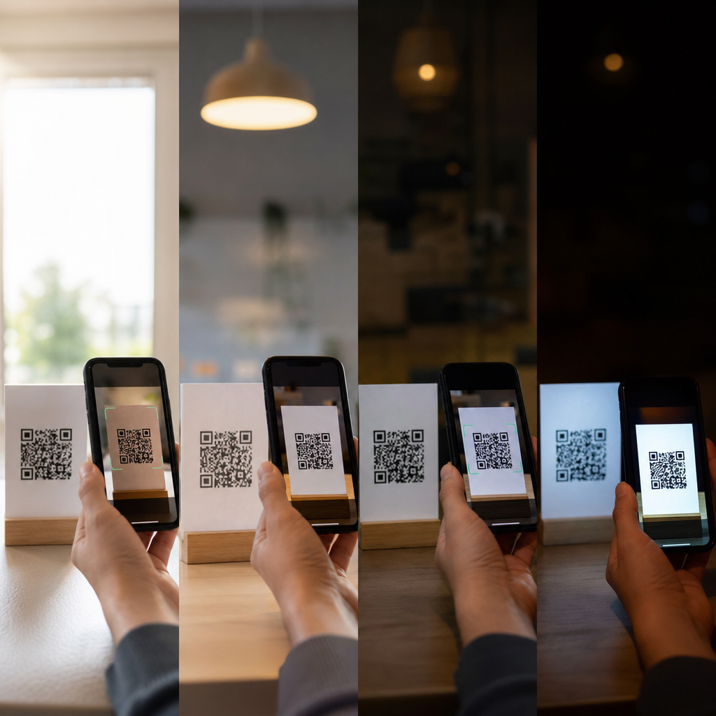
Lighting conditions determine whether a QR code scans instantly or fails after repeated attempts. In practical deployments, I have seen the same code perform flawlessly on a calibrated desktop print and then break on glossy packaging under supermarket spotlights. That gap is not random. It is the result of how cameras, screens, surfaces, contrast ratios, and environmental light interact with the structure of the symbol itself. For brands using QR codes on packaging, menus, posters, mailers, retail displays, and product labels, lighting is not a minor production detail. It directly affects conversion, customer trust, and campaign performance.
A QR code is a two-dimensional matrix barcode made of dark and light modules arranged in a square grid. Scanning works when a camera captures enough detail to detect finder patterns, read module boundaries, and decode the stored data with error correction. Readability describes how easily that process happens in real conditions, not just in design software. Color and contrast matter because cameras do not interpret designs the way humans do. A stylish code with low luminance contrast, reflective ink, or weak edge definition may look acceptable to a designer yet remain difficult for a phone camera to decode.
This makes lighting a central issue within QR code design and branding. Brand teams often want custom colors, gradients, reversed schemes, metallic finishes, textured backgrounds, or screen-based placements. Those choices can work, but only when they preserve the optical conditions scanners need. Light intensity, direction, color temperature, glare, shadowing, and flicker all influence the camera’s exposure and the software’s ability to separate foreground from background. In plain terms, if the camera cannot clearly tell which squares are dark and which are light, scanning slows down or fails.
This hub article explains how lighting conditions impact QR code scanning with a focus on color, contrast, and readability. It covers print and digital use cases, common failure points, design thresholds, testing methods, and practical fixes. If you manage branded QR codes, this is the foundation for every related decision, from choosing colors and materials to approving packaging finishes and display placements.
Why lighting changes QR code performance
QR scanning depends on image capture first and decoding second. Before any app reads the data, the camera must produce a usable image. In strong balanced light, the sensor captures sharp transitions between dark modules and light background areas. In poor light, the camera raises ISO sensitivity, slows shutter speed, or applies noise reduction. That can blur edges, add grain, and flatten the distinction between modules. The result is a code that technically exists but no longer presents crisp boundaries for the decoder.
Directional light creates another problem: glare. On laminated menus, glossy boxes, and glass storefront signs, a bright reflection can wash out part of the symbol. Even if only one finder pattern is obscured, acquisition time increases. When I review failed scans from retail environments, glare is one of the most common causes, especially where overhead LEDs hit packaging at an angle. Matte substrates usually outperform gloss because they scatter light more evenly and preserve visible contrast.
Uneven lighting also matters. A QR code partially covered by shadow can lose readable contrast in one area while remaining visible in another. Modern smartphone cameras compensate aggressively, but automatic exposure often optimizes for the overall scene rather than the code region. If the background is bright and the code sits in a darker pocket, the modules may merge together. This is why a poster near a window can scan differently at noon and at dusk, even though the design never changes.
Color, contrast, and the physics of readability
The most reliable QR codes use dark foreground modules on a light background because this maximizes luminance contrast. Luminance contrast matters more than hue contrast. A navy code on a black background may appear stylish, but a camera often sees both as similarly dark values. Likewise, a pastel yellow code on white may be legible to the human eye at close range while remaining too low-contrast for a mobile sensor at normal scanning distance.
In production, I advise teams to evaluate contrast in grayscale before approving branded colors. If the code still stands out clearly when color information is removed, scanning reliability usually improves. This approach aligns with how many computer vision pipelines effectively assess the image: they prioritize brightness differences and edge detection, not branding intent. Tools such as Adobe Color Contrast Analyzer, WebAIM contrast checkers, and smartphone grayscale previews provide fast early validation, though real-world camera testing remains essential.
Color temperature influences capture too. Warm incandescent lighting can shift whites toward yellow, while cool LEDs can push surfaces toward blue. A code that barely passes contrast thresholds in neutral light may fail after that shift. Red-on-black combinations are particularly risky because phone cameras and image processing pipelines can render them with weak tonal separation. Metallic inks, translucent varnishes, and pearlescent coatings are also hazardous because their apparent contrast changes with viewing angle and illumination.
| Design choice | Effect under bright light | Effect under low light | Practical recommendation |
|---|---|---|---|
| Black on white | Highest reliability, strong edge detection | Usually still readable | Use as baseline standard |
| Dark brand color on light solid background | Good if grayscale contrast is strong | Can soften if color value is too close | Test in grayscale and at distance |
| Light code on dark background | Possible but less forgiving | More decoding failures | Avoid unless thoroughly tested |
| Metallic or glossy finish | Glare can block modules | Specular highlights worsen noise | Prefer matte coatings |
| Gradient background | May work in controlled conditions | Uneven exposure hurts readability | Keep quiet zone and code area flat |
How print materials and surfaces interact with light
Surface finish can make or break a well-designed code. On paper labels, uncoated stock often scans better than gloss because it reduces specular reflection. On flexible packaging, curved surfaces introduce distortion and shifting reflections. Bottles, foil pouches, and shrink sleeves are frequent offenders. Even when the code itself has proper contrast, curvature can alter module geometry enough that scanning slows, especially at longer distances or with older phone cameras.
Outdoor installations add another layer of complexity. Direct sunlight can create extreme dynamic range, where one side of a code is overexposed and another is in shade. Backlit signage can help, but only if brightness is even and the display resolution is sufficient. For vehicle decals, storefront windows, and event banners, placement angle is as important as design. Tilting a sign slightly or moving it away from a reflective surface often improves scan rates more than redesigning the code.
Packaging teams should also consider the full finishing stack. Spot UV over a QR code may look premium and still reduce usability. Embossing or textured varnish can interrupt module edges. Transparent labels on dark containers may inherit the product color beneath them, unexpectedly lowering contrast. The safest practice is to isolate the QR code in a flat, matte, high-contrast panel with a clear quiet zone around it.
Screen-based QR codes and display brightness
Digital QR codes face different lighting challenges. On screens, there is no print reflectance, but there is still ambient glare, brightness management, refresh behavior, and pixel structure. A code displayed on a dim phone screen in sunlight often becomes unreadable because reflections overpower emitted light. Increasing screen brightness usually helps more than enlarging the code, although size still matters at distance.
Large-format displays introduce moire effects, low pixel density at close range, and automatic brightness changes. In restaurants and at events, I have seen digital menu boards lower brightness to save energy, unintentionally making on-screen QR codes harder to scan under bright house lighting. OLED displays can provide excellent black levels, but aggressive power-saving modes and screen dimming can reduce effective contrast over time.
Flicker from PWM dimming or LED signage is a subtler issue. Most users never notice it, but cameras may capture banding or rolling artifacts. If a QR code appears on a sign with visible scan inconsistency, record slow-motion video of the display. If you see bands, the display behavior may be contributing. For mission-critical scans, static printed codes still outperform many dynamic display setups.
Common design mistakes that become worse in bad lighting
The most frequent mistake is assuming that a code which scans once in the studio is production-ready. Low contrast colors, busy backgrounds, logos that occupy too much central area, thin quiet zones, and over-stylized module shapes can all pass in ideal light and fail in stores, lobbies, sidewalks, or cars. Lighting does not create these weaknesses, but it exposes them.
Another mistake is relying on brand colors without adjusting for tonal value. Deep green, burgundy, or cobalt may all work if placed on a very light background, yet fail on cream, kraft, silver, or transparent stock. Designers sometimes compare colors on a calibrated monitor and forget that print density, substrate absorption, and ambient light will shift the final result. A QR code should be treated more like a functional interface element than a decorative icon.
Inverted codes are also overused. Some modern scanners can decode light modules on dark backgrounds, but reliability is lower, especially in low light or at small sizes. The finder patterns lose the visual dominance that helps detection. If a reversed style is required for campaign aesthetics, compensate with larger size, stronger surrounding contrast, high error correction, and broader device testing.
Testing methods that reveal real scanning risk
The only dependable way to validate readability is structured testing across lighting environments and devices. A practical test matrix includes bright office light, indirect daylight, direct daylight, warm indoor light, low light, and angled glare. Use both iPhone and Android devices across at least two camera quality tiers. Test native camera apps first because they reflect mainstream user behavior, then test within relevant third-party apps if your audience uses them.
Distance and time-to-scan should be measured, not guessed. I typically record whether the code is recognized within one second at intended use distance. If users must hunt for focus, move closer than expected, or tilt the item repeatedly, the design is underperforming. Screenshots and mockups are not evidence. Printed proofs, final materials, and live displays are.
Analytics can also indicate lighting-related problems. If a store poster gets lower scans than a website placement despite similar traffic, inspect environmental conditions before changing the offer. If one package colorway underperforms another, compare print contrast and finish. Small environmental differences often explain what looks like a marketing issue.
Best practices for dependable scanning across environments
Use dark modules on a light matte background whenever possible. Preserve a clear quiet zone on all sides. Keep the code on a flat area free of folds, seams, texture, and competing graphics. Choose brand colors by tonal separation, not appearance alone. Avoid metallic inks, gloss varnish, and transparent placements unless testing proves they hold up under glare.
For screens, raise brightness, enlarge the code for expected distance, and avoid placing it over moving video or patterned content. For print, proof on the actual substrate and finish, not just on office paper. If scanning is business-critical, such as payments, check-ins, authentication, or product registration, prioritize readability over decoration every time.
As the hub for color, contrast, and readability within QR code design and branding, this page establishes the main rule: lighting conditions are inseparable from design decisions. A QR code is only successful when real cameras can decode it quickly in the environments where customers actually encounter it. Audit your current codes under realistic lighting, fix contrast weaknesses, and build future designs around proven scanning performance.
Frequently Asked Questions
Why do QR codes often fail to scan in bright light or under direct spotlights?
Bright light does not automatically make a QR code easier to scan. In many real-world settings, direct sunlight, retail spotlights, and overhead LEDs create glare, reflections, and blown-out highlights that interfere with how a phone camera reads the code. A QR code scanner relies on clearly distinguishing dark modules from light background areas. When a glossy label or laminated menu reflects a harsh light source, parts of the symbol can appear washed out or mirrored, reducing visible contrast and confusing the scanner.
This issue is especially common on packaging, countertop displays, window signage, and coated print materials. The code itself may be technically correct, but if the lighting creates hotspots across the finder patterns or central data area, the camera may struggle to separate the QR code’s structure from the surrounding reflection. Modern smartphone cameras also use auto-exposure and auto-focus systems that react to bright highlights. If the reflective area dominates the frame, the camera may expose for the glare instead of the code, making the dark squares look softer or less defined than they really are.
The most effective fix is usually not changing the data in the code, but improving the physical presentation. Matte finishes, lower-gloss substrates, better placement angles, and avoiding direct spotlight reflection can dramatically improve scan reliability. If a code must appear on shiny packaging, increasing quiet zone spacing, enlarging the symbol, and maintaining strong tonal contrast can help compensate for difficult lighting. In short, bright environments are not the problem by themselves; uncontrolled reflections are.
How does low light affect QR code scanning on printed materials and screens?
Low light changes the way cameras capture detail. In dim restaurants, evening events, warehouses, transit stations, or low-lit retail aisles, a smartphone camera has less light available to define the edges of the QR code. To compensate, the phone often raises ISO sensitivity, slows shutter speed, or applies more aggressive image processing. That can introduce blur, digital noise, and softer edge definition, all of which make it harder for scanning software to detect the code’s geometry quickly.
Printed QR codes in low light can fail even when the design looks acceptable in normal office conditions. A code on a menu, poster, or mailer may appear readable to the human eye, but scanners need crisp separation between the light and dark modules. If the background is slightly tinted, the print density is weak, or the code is on a textured surface, low illumination magnifies those weaknesses. What scans instantly under controlled lighting may become inconsistent under candlelight, ambient bar lighting, or shadowed indoor conditions.
Screen-based QR codes can also become harder to read in low light, though for different reasons. If the display brightness is too low, the contrast between the code and the screen background may not be strong enough for the camera to lock on quickly. In addition, some phones reduce screen brightness automatically in dark environments, which can make on-screen QR codes appear dim or gray rather than clean black and white.
To improve low-light performance, use larger codes, stronger contrast, and cleaner print production. On screens, raise brightness when possible and avoid dark-mode styling that reduces separation. In print, prioritize solid black on a bright white background, keep the code free from decorative overlays, and test in the actual lighting environment where users will scan it. Low light is manageable, but only if the code is designed with enough visual tolerance to survive it.
Do glossy surfaces and reflective packaging make QR codes harder to scan?
Yes, often significantly harder. Glossy varnishes, foil labels, laminated cards, plastic wrappers, curved bottles, and metallic packaging can all undermine scanning performance even when the QR code artwork is perfectly generated. The reason is simple: reflective materials alter what the camera sees. Instead of a stable pattern of dark and light modules, the scanner may capture glare streaks, warped highlights, or distorted contrast across the code surface.
On curved or flexible packaging, the challenge increases further. Curvature can bend the code visually, stretching or compressing parts of the symbol. Combine that with reflective film and overhead retail lighting, and the scanner may struggle to recognize the finder patterns consistently. This is one of the most common causes of field failures for QR codes on consumer goods. A code that scans flawlessly from a flat paper proof can break once it is printed on glossy, curved packaging and placed under real store lights.
There are several practical ways to reduce this risk. Using a matte substrate or matte spot treatment around the code is one of the most reliable improvements. Increasing code size helps because each module becomes easier for the camera to resolve, even when parts of the symbol are visually compromised. Avoid placing the code over folds, seams, high-curvature areas, or packaging edges. It is also wise to preserve a generous quiet zone so reflections near the border do not interfere with detection.
For premium packaging, designers sometimes want metallic inks, dark backgrounds, or integrated visual styling. Those choices can work, but they require careful testing under realistic lighting, at multiple scan distances, and on different phone models. Reflective packaging is not automatically incompatible with QR codes, but it leaves much less room for design error. If scan speed matters, surface finish should be treated as a performance variable, not just a visual one.
What level of contrast is needed for a QR code to scan reliably in different lighting conditions?
Reliable scanning depends heavily on strong contrast between the dark modules and the lighter background. At a technical level, the scanner needs to identify the code’s structural patterns quickly and separate them from surrounding visual noise. In ideal conditions, many color combinations can work. In practical deployments, however, lighting variations reduce the margin for error. Shadows, glare, dimness, tinted materials, and screen brightness shifts all weaken contrast as captured by the camera, even if the code looks attractive to the human eye.
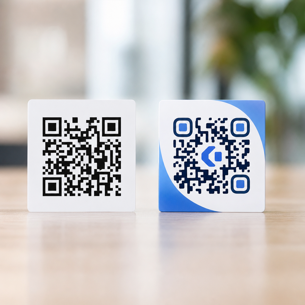
That is why black on white remains the safest standard. It provides the clearest luminance difference and holds up best when lighting is less than perfect. By contrast, fashionable combinations such as dark blue on red, gray on black, metallic silver on white, or pastel tones may look branded, but they often fail in real use because the camera perceives less separation than the designer expects. The problem becomes even worse under warm retail lighting, outdoor sunlight, or low-light indoor conditions, where color shifts and reflections reduce effective readability.
A good rule is to prioritize luminance contrast over brand aesthetics when scan performance matters. The dark elements should be genuinely dark, and the background should be genuinely light. Avoid reversed codes unless they have been thoroughly tested, and be careful with gradients, textures, transparency, or image overlays that interfere with the module pattern. Even though QR codes include error correction, that feature should not be treated as a substitute for proper contrast. Error correction helps recover from partial damage or obstruction, but it cannot fully rescue a code that is consistently hard for the camera to see.
If the QR code will be used across multiple environments, test it under bright daylight, harsh indoor spotlighting, normal office light, and low-light mobile conditions. A contrast choice that passes on a desktop monitor may fail on printed packaging or a poster behind glass. In most cases, high-contrast simplicity produces the fastest and most dependable scan results.
How can brands test QR codes to make sure lighting conditions will not cause scanning problems?
The best approach is to test QR codes in the environments where people will actually use them, not just on a designer’s screen or a proof sheet under ideal office lighting. Lighting-related failures usually appear only after deployment, when the code is exposed to supermarket spotlights, window glare, restaurant shadows, trade show lighting, or outdoor daylight. A code that seems perfectly functional during design review can become inconsistent once material finish, placement height, viewing angle, and camera behavior enter the equation.
Start by testing production-realistic samples rather than artwork alone. That means the final print method, final substrate, final coating, final packaging shape, and final display brightness if the code is digital. Then scan with multiple phone models, because camera quality, autofocus behavior, exposure handling, and scanner software differ across devices. Check performance from typical user distances and angles, not only close-up. Many failures occur because the code scans only when a user carefully lines it up, which is not the same as a frictionless real-world interaction.
It is also important to test across a range of lighting conditions: direct sunlight, indirect daylight, overhead office lighting, low indoor light, and bright spotlit retail conditions. If the code appears on glossy or curved material, deliberately test for reflections and edge distortion. Watch for practical warning signs such as delayed focus, repeated attempts, the need to tilt the phone, or successful scans only at very short distances. Those are indicators that the design may be marginal even if it eventually works.
From an optimization standpoint, brands should evaluate code size, contrast, quiet zone, surface finish, placement, and surrounding graphics together. Small improvements in each area can produce a major gain in scan reliability. The goal is not merely whether the QR code can be scanned, but whether it scans quickly and predictably for ordinary users in uncontrolled lighting. That standard is what separates a technically valid QR code from one that performs well in the field.