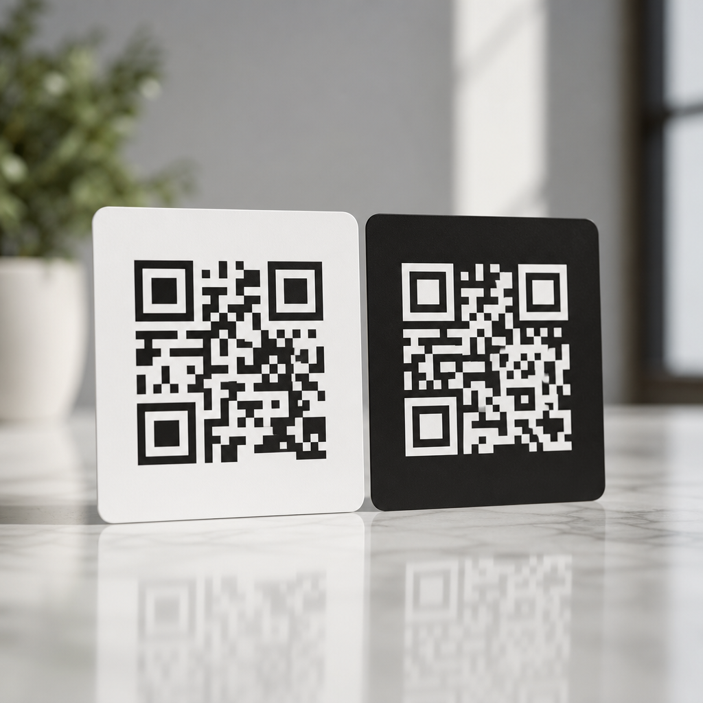
Dark vs light QR codes is not just a design preference; it is a scanning performance decision that affects readability, accessibility, print reliability, and brand consistency. In QR code design, “dark” usually means a code made with black or another deep foreground color placed on a light background, while “light” usually refers either to a pale code on a dark background or to low-contrast styling that reduces the difference between modules and background. The distinction matters because QR scanners do not read aesthetics first. They detect contrast, finder patterns, module boundaries, and quiet zones. When those signals are weak, scan speed drops and failure rates rise.
I have tested QR codes across packaging, retail signage, event badges, menus, direct mail, and mobile screens, and the same rule appears repeatedly: dark-on-light codes outperform light-on-dark codes in most real-world conditions. That does not mean light QR codes are unusable. It means they require more careful control of contrast ratio, lighting, material finish, screen brightness, and device camera quality. If you are building a branded experience under the broader QR Code Design & Branding strategy, color, contrast, and readability are the technical foundation. Without them, even a beautiful code becomes friction.
This hub article explains which option is better, why scanner behavior favors certain color combinations, when inverted or stylized codes can still work, and how to choose safely for print and digital environments. It also serves as the central guide for color, contrast, and readability decisions, so it covers the principles that support more specialized pages on branded QR palettes, accessibility, testing methods, print production, and scan optimization. If your goal is a QR code that looks on-brand and scans instantly, start here.
Why dark QR codes usually scan better
Dark QR codes on light backgrounds are the default best practice because they align with how imaging systems isolate shapes. A scanner app or native camera first converts what it sees into patterns with measurable luminance differences. Black modules on a white background create strong separation, making finder patterns at three corners easy to detect. The higher the contrast, the easier it is for software to distinguish module edges, compensate for perspective, and decode damaged areas using error correction.
In plain terms, a standard black-on-white QR code gives the camera the clearest possible map. This matters on older phones, in low light, at awkward angles, and on textured materials. It also matters in motion. A customer walking past a poster has only a second or two to frame the code. Strong contrast reduces hesitation and rescans. ISO/IEC 18004, the core QR Code specification, does not require black and white specifically, but practical deployment standards consistently favor dark foregrounds and light backgrounds because they deliver the most reliable symbol reflectance difference.
In field testing, dark navy on white, deep green on cream, and charcoal on matte kraft labels can work almost as well as black on white if the luminance contrast remains high. The exact hue is less important than the brightness gap. Designers often focus on brand color values in RGB or CMYK, but scanners respond more strongly to relative lightness than to marketing intent. That is why a richly branded deep plum can scan well while a trendy pastel lavender often struggles, even when both feel visually intentional.
When light QR codes can work, and where they fail
Light QR codes can work when the code is still visually lighter only in hue but remains sufficiently darker in luminance than its background, or when an inverted design is executed with exceptional contrast and tested heavily. In practice, truly light modules on a dark field are riskier. Many scanners still perform worse with reversed polarity because blooming, reflections, and shadow detail can soften the module grid. The issue is not that every inverted code fails. The issue is that its tolerance window is smaller.
I see this most often on restaurant menus, black product packaging, and digital ads using white QR codes on dark backgrounds for a premium look. On a flagship phone in bright conditions, these can scan fine. On a midrange Android under warm indoor lighting or on glossy laminated stock, performance can drop sharply. White modules also pick up glare differently than black modules. Small hotspots from overhead lights can wipe out edges and merge module boundaries. A code that passed a studio test may fail on a bar counter at night.
There are cases where a light-looking QR code is acceptable: a pale gold code on a very dark matte box, a white code on dark navy in a high-resolution mobile app, or a reversed code with oversized quiet zone and larger module size on trade show graphics. But these are controlled uses, not universal recommendations. If scan reliability is the priority, light QR codes are the exception, not the baseline.
Color, contrast, and readability rules that matter most
Color, contrast, and readability are the core variables in this subtopic because they determine whether the scanner can separate signal from noise. The most important rule is simple: keep the foreground significantly darker than the background. Contrast can be evaluated visually, but visual approval is not enough. You need luminance contrast, not just hue contrast. Red on green may feel different to the eye, yet produce weak grayscale separation. Similarly, metallic inks, translucent varnishes, gradients, and photographic backgrounds often reduce practical readability even when the design mockup looks strong.
The quiet zone is equally critical. Every QR code needs an empty margin around the symbol, typically four modules wide. When designers place a code over a busy image or let background graphics creep into that margin, scan performance drops. Rounded modules, embedded logos, and custom eyes can still work, but they all consume part of the code’s tolerance budget. If you also lower contrast with a light color scheme, the combined risk multiplies.
Size matters too. A low-contrast code often needs to be physically larger to remain dependable. For print, I generally increase size before increasing stylistic complexity. For screens, I avoid tiny corner placements where brightness, compression, and moiré can interfere. Readability is not only about whether a code scans once. It is about whether it scans quickly, across devices, without coaching.
| Design choice | Scan reliability | Best use case | Main risk |
|---|---|---|---|
| Black on white | Excellent | Universal default for print and screen | Minimal branding flexibility |
| Dark color on light background | Very high | Branded packaging, menus, posters | Poor results if luminance contrast is reduced too far |
| White or light color on dark background | Moderate | Premium packaging, dark UI, event visuals | Glare, lower tolerance, inconsistent device performance |
| Gradient or image-filled code | Low to moderate | Campaign creative with extensive testing | Module edge loss and decoding failure |
Print versus screen: why environment changes the answer
The question “dark vs light QR codes: which is better?” can only be answered fully by separating print from screen. In print, ink gain, paper texture, coating, and ambient light shape performance. On uncoated paper, dark codes usually hold edges well, while light reversed codes can lose crispness against dense backgrounds. On glossy labels, reflections punish light modules more severely. Thermal printers add another layer: fine reversed detail can break up, especially on small labels used in logistics or healthcare.
On screens, brightness and resolution help, but they do not eliminate contrast requirements. OLED displays can present sharp white-on-black designs, yet screen dimming, cracked protectors, fingerprint smudges, and outdoor glare still interfere. Social graphics often compress images, softening edges around stylized QR codes. In mobile apps, dark mode creates pressure to invert codes, but a better approach is often placing a standard dark-on-light QR code inside a light card container. That preserves brand interface styling without sacrificing scan speed.
Distance also changes the equation. A code on a storefront window must scan from farther away and through reflections. A code inside an email may be scanned from a second device at close range. The harsher the environment, the less freedom you have with light or low-contrast treatment. That is why campaign teams should not approve one design and assume it behaves identically on a website, product box, billboard, and LCD kiosk.
Branding without breaking the code
Good QR branding does not start with color experimentation. It starts with deciding what can change safely. The safest customizations are dark brand colors, light neutral backgrounds, larger symbol size, and a clean call-to-action near the code. Next come moderate shape adjustments, such as softened corners or slightly customized eyes, followed by a centrally placed logo that stays within tested limits. The riskiest moves are reversed polarity, gradients, transparency, patterned backgrounds, and low-contrast palettes.
For example, a cosmetics brand might use a deep burgundy QR code on a soft blush carton and still achieve strong results because the code remains dark relative to the package. A luxury spirits brand might prefer white on black for shelf impact, but should compensate with larger size, matte finish, and extensive multi-device testing. A SaaS company using a QR code in dark mode onboarding screens can place the code on a white tile instead of inverting it. That preserves both usability and visual cohesion.
Tools such as Adobe Illustrator, Figma, Canva, Beaconstac, QR Code Generator Pro, and Bitly make customization easy, but easy editing is not the same as safe deployment. The best workflow is generate, style conservatively, test on at least five devices, print a proof at final size, and then validate under the actual lighting conditions where users will scan. That process catches more failures than aesthetic review ever will.
How to test QR code readability the right way
Testing is where the dark-versus-light debate stops being subjective. A QR code is readable if ordinary users can scan it quickly under realistic conditions. I recommend testing iPhone and Android devices, older midrange phones, native camera apps, and at least one third-party scanner. Test indoors, outdoors, under warm light, and at off-angle positions. Measure not only successful scans, but time to first scan and number of retries. A code that works after three attempts is not production-ready.
Use final materials whenever possible. Screen captures are not substitutes for printed proofs. If the code will appear on corrugated packaging, metallic labels, acrylic signs, or fabric badges, test those exact substrates. If it will appear in email, test it displayed on dim and bright screens and scanned from another device. For digital placements, check image compression after upload to ad platforms or CMS tools. Compression artifacts can damage tight module geometry, especially in stylized designs.
Also test fail states. Put the code where users naturally hold the product, fold the brochure slightly, reduce screen brightness, and introduce common glare. These are ordinary conditions, not edge cases. Teams that test only in ideal light often conclude that a light QR code is “fine,” then discover support complaints after launch. Reliable QR design comes from testing for friction before users experience it.
Best-practice recommendations for this color and contrast hub
If you need one answer, choose a dark QR code on a light background. It is better for readability, faster for scanning, more forgiving across devices, and easier to reproduce in print. Use near-black or another dark brand color if you want customization without much risk. Keep the background plain and light. Maintain a full quiet zone. Increase size before adding visual complexity. Treat logos, rounded modules, and custom eyes as optional layers, not substitutes for contrast.
Use light-on-dark QR codes only when the brand context truly demands it and only after rigorous testing. Prefer matte surfaces, larger dimensions, stronger surrounding whitespace, and simple layouts. Avoid placing any QR code over photos, gradients, or busy textures unless you have no alternative and have validated the final output carefully. Remember that readability is a user experience metric. Every failed scan costs attention, trust, and often conversion.
As the hub for color, contrast, and readability within QR Code Design & Branding, this page establishes the governing principle for every related decision: branding should support scan performance, not compete with it. Start with contrast, protect the quiet zone, test in real conditions, and choose dark-on-light unless there is a compelling reason not to. If you are updating existing QR assets, audit your current codes today and replace weak low-contrast designs before they cost more scans.
Frequently Asked Questions
Are dark QR codes better than light QR codes for scanning?
In most cases, yes. Dark QR codes on a light background are the most reliable option because they align with how QR scanners are designed to detect contrast, structure, and module boundaries. A standard QR code works best when the foreground is clearly darker than the background, which makes it easier for smartphone cameras and scanning software to separate the code pattern from its surrounding area. This is especially important in real-world conditions where lighting is inconsistent, the code may be printed at a small size, or the camera is moving slightly during the scan.
Light QR codes, especially pale designs on dark backgrounds or low-contrast color combinations, often introduce avoidable scanning issues. The problem is not simply that they look different. It is that reduced contrast can cause the code’s individual squares to blur together, making finder patterns and timing patterns harder to recognize. While some modern devices can still read inverted or stylized codes, performance is much less predictable across phones, apps, and environments. If your goal is maximum scan success, fewer user errors, and better compatibility across print and digital formats, a dark foreground on a light background remains the strongest default choice.
Why does contrast matter so much in QR code design?
Contrast is one of the most important technical factors in QR code performance because scanners depend on a strong visual difference between the code modules and the background. When contrast is high, the camera can quickly identify the edges of the QR pattern and process the encoded data accurately. When contrast is weak, the scanner may struggle to distinguish where one module ends and another begins, which increases scan time, causes repeated failed attempts, or prevents recognition altogether.
This becomes even more important when a QR code is used outside ideal conditions. A code may be viewed under glare, printed on textured packaging, displayed on a low-brightness screen, or photographed from an angle. In those situations, any reduction in contrast makes the code less forgiving. Dark-on-light designs typically hold up better because they preserve visual clarity even when environmental factors reduce image quality. Brands often want to use custom colors for aesthetic reasons, and that is possible, but the safest approach is to maintain a deep foreground color against a distinctly lighter background. Good contrast protects usability, accessibility, and campaign performance all at once.
Can light or inverted QR codes still work if they match a brand design?
They can work, but they should be treated as a higher-risk design choice rather than a guaranteed equivalent to traditional dark QR codes. A light or inverted QR code may scan successfully in controlled settings, especially if the contrast is still fairly strong and the code is large enough. However, the margin for error is smaller. What looks elegant in a brand mockup may become frustrating in practice when users try to scan the code quickly on older devices, in dim lighting, or from glossy printed materials.
If brand consistency is a priority, the best compromise is usually to keep the QR code functionally conventional while styling it within safe limits. For example, instead of using a very pale foreground on a dark background, use a dark brand color for the code and a light neutral background. This preserves brand identity without sacrificing readability. If you do want to use a light or reversed code, it is essential to test it across multiple phones, camera apps, print sizes, and lighting conditions before publishing. Design flexibility is possible, but scanning reliability should always come first because a QR code that fits the brand but fails to scan defeats its purpose.
Are dark QR codes better for printing and real-world marketing materials?
Yes, dark QR codes are generally more dependable in print because they tolerate common production issues better than light or low-contrast alternatives. Printed materials introduce variables that are easy to underestimate, including ink spread, paper texture, color shifts, glare from coated surfaces, and loss of detail at smaller sizes. A dark foreground on a light background tends to remain readable even when the print is not perfect, while lighter or more delicate designs are more likely to lose definition and become difficult for scanners to interpret.
This matters across packaging, posters, menus, direct mail, product labels, business cards, and signage. A code may look sharp on a designer’s screen but behave differently once it is printed and viewed from a distance or under retail lighting. Dark QR codes also tend to create a clearer quiet zone, which is the empty space around the code that scanners need to isolate it from nearby text or graphics. For marketers, that translates into more consistent scan performance and a better user experience. If a campaign depends on immediate action, such as redeeming an offer, opening a menu, or visiting a landing page, reliability in print is a major reason to favor dark QR codes.
How can you make a stylish QR code without hurting scan reliability?
The key is to customize carefully without weakening the fundamentals that scanners rely on. Start with a strong contrast ratio, ideally using a dark foreground and a light background. From there, you can introduce brand colors, rounded modules, subtle frame elements, or a center logo as long as the code remains easy to distinguish and the core patterns are not disrupted. The finder patterns, spacing, and quiet zone should stay clean and unobstructed, because those structural elements help devices identify the code quickly.
It is also important to test beyond the design file itself. Check the QR code on different phone models, both iPhone and Android, and test it in bright light, low light, and at realistic scanning distances. If the code will be printed, test the actual printed version rather than relying only on a digital preview. Avoid low-contrast combinations such as light gray on white, pastel on dark navy, or metallic effects that reflect light unevenly. In short, the best QR code design balances brand presentation with technical clarity. Stylish codes can absolutely work, but the most effective ones respect the basic rule that readability comes before decoration.


