QR codes look simple, but beginners regularly make avoidable mistakes that weaken scans, waste print budgets, and create the false impression that the technology is unreliable. A QR code is a two-dimensional matrix barcode that stores data such as a URL, text string, contact card, Wi-Fi credential, payment payload, or app deep link. Modern smartphones read them through native camera apps, and businesses use them across packaging, menus, posters, tickets, product manuals, retail displays, and direct mail. In my work auditing campaigns, the same pattern appears again and again: the code itself usually is not the problem. The mistake is almost always in the planning, design, destination, testing, or measurement.
This matters because a QR code sits at a fragile moment between offline attention and online action. If the code is too small, poorly contrasted, linked to a dead page, or placed where glare blocks the camera, the user simply leaves. Unlike a mistyped web address, a failed scan feels instantaneous and final. That is why understanding QR code myths and misconceptions is so important for beginners. Many assume any code works anywhere, that branded designs scan just as well as plain ones, or that a static code can be edited later. Those beliefs lead to expensive reprints and lost conversions. A strong QR strategy combines symbol quality, mobile destination design, analytics, governance, and honest expectations. When those elements are aligned, QR codes are fast, measurable, and remarkably effective. When they are ignored, even a technically valid code can fail in the real world.
Myth 1: Any QR Code Works the Same
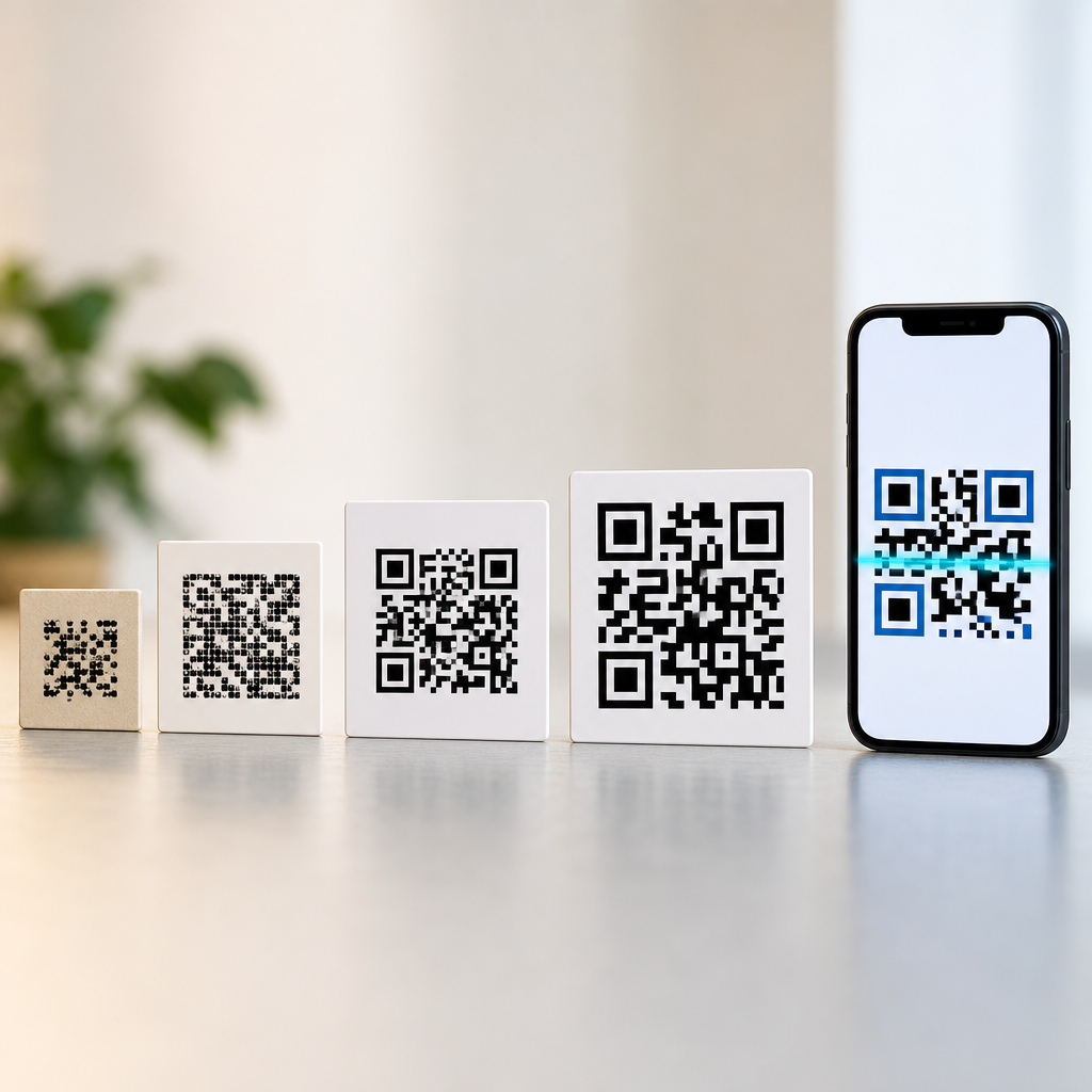
The most common misconception is that a QR code is a generic square and all versions perform equally. In reality, scan reliability depends on data density, module size, error correction level, contrast, print quality, and environmental conditions. A simple URL encoded in a Version 2 code behaves very differently from a long tracking link forced into a dense symbol. More data means smaller modules, and smaller modules are harder for cameras to resolve at distance or in low light. That is why experienced teams shorten URLs, remove unnecessary parameters, and use dynamic redirects when they need flexibility. The goal is not to make the code fashionable; it is to make the modules large and clean enough for real cameras used by impatient people.
Beginners also confuse static and dynamic QR codes. A static QR code directly embeds the final destination, so once printed it cannot be changed. A dynamic QR code usually points to a short redirect URL managed by a service platform, allowing updates to the final landing page, campaign tagging, or pause rules without replacing the printed symbol. I have seen restaurants print tens of thousands of table tents with static menu links, then redesign their site structure and break every code overnight. Dynamic codes would have avoided that failure. The tradeoff is dependence on the redirect platform, so teams should review uptime, export options, SSL support, and ownership of the short domain before committing.
Myth 2: Design Matters More Than Scannability
Another beginner mistake is treating the QR code as a decorative asset first and a machine-readable symbol second. Custom colors, embedded logos, rounded modules, gradients, and illustrated frames can work, but only within technical limits. The essential rules are simple: maintain strong contrast between dark modules and a light background, preserve the quiet zone around the symbol, and avoid covering finder patterns or alignment patterns. ISO/IEC 18004 defines the QR Code specification, and while designers do not need to memorize it, they do need to respect its practical implications. A code that looks beautiful in a mockup may become unreadable on textured packaging, glossy labels, or low-resolution office prints.
I usually tell beginners that black on white remains the benchmark because it removes variables. If a brand requires customization, test from a production sample, not from a pristine screen. One cosmetics client used pale gold modules on cream packaging because the result looked premium under studio lighting. In stores, overhead glare and low contrast made scanning inconsistent. After switching to a darker foreground and adding more clear space, scan completion improved immediately. The lesson is direct: branding should support usability, not compete with it. If a consumer must tilt a package repeatedly to force a scan, the design has failed regardless of how polished it appears in the style guide.
Myth 3: Placement and Size Are Minor Details
Placement is one of the biggest reasons QR campaigns underperform. Beginners often put codes where there is no practical scanning angle, too little dwell time, or too much visual noise. A code on the bottom shelf of a supermarket fixture may technically exist, but shoppers will not kneel to scan it. A code inside a subway car may receive attention, while a code flashed for two seconds at the end of a presentation usually will not. Context drives performance. People need enough time to notice the code, understand the value, unlock their phone, open the camera, and complete the action. If any step is awkward, usage drops sharply.
Size follows the same principle. There is no universal minimum because required size depends on scan distance, camera quality, and symbol density. A common field rule is a scan distance ratio near 10:1, meaning a 2-centimeter code is comfortable at roughly 20 centimeters, while larger posters need materially larger symbols. The code should also have a quiet zone of about four modules around it. Small packaging, curved bottles, and folded leaflets introduce extra risk because distortion or creases can interfere with decoding. Before approving artwork, print at final size, place it in the actual environment, and test with multiple phones under normal lighting.
| Mistake | What Beginners Assume | What Works Better |
|---|---|---|
| Using long URLs | More detail in the link does not affect scanning | Use short, clean redirects to reduce data density |
| Low-contrast colors | Brand colors are fine if the code is visible to the eye | Prioritize dark foregrounds, light backgrounds, and printed testing |
| Printing tiny codes | Phone cameras can zoom and compensate | Match code size to distance, surface, and symbol complexity |
| Linking to desktop pages | If the site loads, the job is done | Send users to fast, mobile-first landing pages with one clear action |
| Skipping governance | The code can be fixed later without process | Document ownership, redirects, analytics, and content review cycles |
Myth 4: The Destination Page Is Separate from the QR Code
A QR code never succeeds on scanning alone; it succeeds when the post-scan experience fulfills intent quickly. Beginners commonly send traffic to a homepage, desktop PDF, app store listing with no explanation, or a page bloated by scripts and pop-ups. That disconnect is one of the costliest QR code mistakes because it wastes the motivation created in the physical moment. If someone scans a code on a medicine box for dosage guidance, they should not land on a general corporate site and search manually. If a diner scans for a menu, the page should open fast, fit the phone screen, and make categories obvious without pinch-zooming.
The best destinations are mobile-first and single-purpose. They match the promise near the code, load quickly on cellular connections, and remove distractions. In practice, that often means a lightweight landing page with a clear headline, concise supporting text, and one primary action. Google’s Core Web Vitals are relevant here because laggy pages reduce completion rates, especially on 4G or congested public Wi-Fi. I have seen campaigns improve simply by replacing a large PDF with an HTML page and compressing images. Beginners sometimes think the QR code is the campaign and the page is an afterthought. The opposite is true. The code is the bridge; the landing experience is the destination that decides whether attention turns into action.
Myth 5: Tracking a Scan Tells the Whole Story
Many beginners overestimate what QR analytics can prove. A scan count is useful, but it is only the start of measurement. Depending on the platform, you may see total scans, unique scans, timestamps, approximate location derived from IP, device type, and conversion events on the destination page. What you usually cannot claim with certainty is that every recorded scan produced a meaningful human action or an attributable sale. Some people scan twice, some abandon immediately, some share the destination link directly, and some privacy settings limit reporting. Treating scan volume as the only success metric creates false confidence.
Better measurement links the QR event to downstream behavior. Add campaign parameters thoughtfully, connect the landing page to analytics platforms such as Google Analytics 4, and define conversions that match the use case: form completion, coupon redemption, payment initiation, store locator use, or file download. Retail teams often pair QR campaigns with unique offer codes to separate scans from actual redemptions. Event organizers can connect a code on printed badges to session registrations or sponsor lead capture. The important point is precision. Measurement should answer practical questions: which placement worked, which creative drove action, and whether the scan led to business value. Without that layer, beginners misread curiosity as performance.
Myth 6: QR Codes Are Inherently Risky or Already Obsolete
Two opposing myths distort beginner decisions. The first is that QR codes are unsafe by nature. The second is that they are outdated and fading away. Both are wrong. QR codes are simply carriers of data, most often URLs, and the risk depends on what they point to and how users are prepared to evaluate the destination. Phishing via malicious stickers is real, particularly in parking meters, public posters, or shared spaces, which is why brands should use trusted domains, clear labeling, tamper-resistant placement, and destination pages with visible branding. Security is a governance issue, not a reason to avoid the format entirely.
The idea that QR codes are obsolete ignores current behavior and infrastructure. Native smartphone scanning, contactless workflows, digital payments, omnichannel retail, and product traceability all expanded their relevance. In manufacturing and logistics, matrix codes support tracking and authentication. In consumer marketing, they bridge packaging to recipes, tutorials, warranty registration, and loyalty journeys. New regulations in some sectors are also increasing the importance of machine-readable identifiers. What has changed is not whether QR codes matter, but the standard users apply. People expect them to work instantly and lead somewhere useful. Beginners fail when they rely on the novelty of the code instead of the value behind it.
Myth 7: One Good QR Code Can Run Forever Without Maintenance
A final misconception is that once a QR code is live, the job is complete. In reality, QR assets need ownership, review, and maintenance just like any other digital touchpoint. URLs change, products are discontinued, campaigns expire, privacy policies update, and analytics tags break during site migrations. I have audited packaging where the code still scanned perfectly but led to a 404 page because nobody owned the redirect after a platform migration. From the customer perspective, that failure is as damaging as a code that never scanned at all.
A reliable process includes a redirect inventory, naming conventions, documentation of where each code appears, scheduled scan checks, and retirement rules for expired campaigns. If codes are printed on long-life assets such as signage, manuals, or packaging, build evergreen destinations or maintain redirect control for years, not weeks. Teams should also create fallback paths, such as a short readable URL near the code, so users are not stranded if the camera fails or the environment is difficult. This hub exists because QR code myths and misconceptions often hide in operational details. Beginners focus on generating the symbol, while successful teams manage the full lifecycle from creation to content governance to performance review.
Common QR code mistakes beginners make are rarely mysterious. They come from assuming the symbol alone guarantees results, when success actually depends on a chain of decisions: the right code type, scannable design, practical size, smart placement, mobile-first destination, honest analytics, clear security signals, and ongoing maintenance. The biggest misconception is that QR codes are a shortcut. They are not. They are a compact access method that works brilliantly when the surrounding experience is engineered with care.
If you are building your first QR campaign, start with the basics and verify each link in the chain before printing at scale. Use short URLs or dynamic redirects, protect contrast and quiet zones, test production samples on multiple phones, send users to a fast page built for one purpose, and assign ownership for updates and reporting. Done well, QR codes reduce friction between offline interest and online action. Review your current codes today, fix the weak points, and use this hub as the foundation for every deeper article in the QR Code Basics and Education series.
Frequently Asked Questions
What is the most common QR code mistake beginners make?
The most common mistake is treating a QR code like a decorative graphic instead of a functional scanning tool. Beginners often focus on how the code looks on a poster, package, menu, or flyer, but forget that its main job is to scan quickly and reliably under real-world conditions. That leads to problems such as making the code too small, placing it on a busy background, stretching it out of proportion, using low contrast colors, or printing it from a low-resolution file. Any one of those choices can reduce scan performance, and several combined can make the code frustrating or unusable.
Another frequent issue is linking the QR code to a poor destination. Even if the code scans perfectly, the user experience still fails if it opens a broken page, a non-mobile-friendly website, an expired promotion, or a confusing landing page with no clear next step. In practice, QR code success depends on both the symbol itself and what happens after the scan. Beginners sometimes assume that generating the code is the finish line, when it is really the starting point.
A more reliable approach is to think in terms of the full scanning journey. Use a high-quality code image, preserve the required quiet zone around it, maintain strong contrast, and test it on multiple phones before publishing. Then confirm that the destination loads quickly, works well on mobile devices, and matches the context in which the code is being used. When beginners make that shift from “I created a QR code” to “I designed a smooth scan experience,” results usually improve immediately.
Why do some QR codes fail to scan after they are printed?
Printed QR codes often fail because design and production decisions interfere with readability. One of the biggest causes is size. A code that looks fine on a desktop screen can become difficult to scan once it is reduced on packaging, labels, business cards, or small promotional materials. If the modules, the small square elements inside the code, become too tiny, phone cameras may struggle to distinguish them clearly, especially in dim lighting or when the print surface is curved.
Contrast is another major factor. A QR code should typically be dark on a light background. Beginners sometimes reverse that, use trendy brand colors with minimal contrast, place the code over patterns or photography, or add shadows and effects that interfere with detection. Printing methods can also create issues. Ink spread, poor registration, glossy glare, textured materials, and low-resolution exports can all reduce clarity. Even a technically correct code can become unreliable if the final printed output softens edges or introduces visual noise.
Placement matters too. A code printed near folds, bottle seams, package corners, or reflective surfaces becomes harder to scan because users cannot easily align their cameras. Curved objects are especially challenging because the QR matrix can visually distort. The best prevention strategy is simple but essential: export the code in a high-quality format, keep adequate white space around it, print at a practical size, use strong contrast, and test the finished print piece under real conditions. Scan it in different lighting, at different distances, and on both iPhone and Android devices. Many print failures are completely avoidable when testing happens before mass production.
Should beginners use static or dynamic QR codes?
For most beginners, dynamic QR codes are the safer and more flexible choice, especially in business or marketing use cases. A static QR code directly stores the final data, such as a URL, phone number, or text string, inside the code itself. That can work well for simple, permanent information that will never change. However, static codes become a problem when the destination needs to be updated. If a beginner prints thousands of brochures, menu cards, labels, or signs with a static code pointing to the wrong URL or outdated page, the only real fix is reprinting everything.
Dynamic QR codes solve that by pointing to a short redirect URL managed through a platform. The visible code stays the same, but the final destination can be changed later. That makes them useful for campaigns, restaurant menus, product documentation, event materials, retail displays, and any situation where links may need to evolve. Many dynamic systems also offer scan analytics, which can reveal total scans, location trends, device types, and performance over time. For beginners, that data is valuable because it turns the QR code from a passive image into something measurable and optimizable.
That said, static codes still have a place. If the encoded information is fixed, long-term, and unlikely to change, such as a Wi-Fi credential for a specific office or a plain text equipment identifier, static may be perfectly acceptable. The mistake beginners make is choosing static by default without considering future edits, tracking needs, or campaign lifespan. A practical rule is this: if the content might change, if performance matters, or if the code will be printed at scale, dynamic is usually the better option. It offers far more protection against expensive errors.
How much can you customize a QR code without hurting scan reliability?
You can customize a QR code to match a brand, but only within limits. Beginners often assume that because QR codes are common in marketing, they can heavily stylize them with custom colors, logos, rounded modules, decorative frames, or artistic patterns. Some customization is perfectly fine, but too much can make the code difficult for cameras to interpret. The more visual changes you make, the more important it becomes to test aggressively across devices and environments.
The safest customization practices are maintaining high contrast, preserving the square structure, and leaving the quiet zone clear around the code. Dark foreground on a light background remains the most dependable choice. Adding a centered logo is often possible because QR codes include error correction, but the logo should not cover too much of the data area. Likewise, changing the corner markers or module shapes should be done carefully and only through a reputable generator that keeps the underlying code valid. Stretching the code, overlaying it on a photograph, fading parts of it, or blending it into a complex design are common beginner errors that hurt performance more than they help aesthetics.
A good standard is to prioritize usability over novelty. If brand styling improves recognition without reducing readability, it can be worthwhile. If the design team has to ask whether the QR code still looks like a QR code, it may already be over-customized. The right process is to customize modestly, generate the final production file at high quality, and test the exact version being printed or published. In QR design, attractive and scannable is the goal; artistic but unreliable is a costly mistake.
What should beginners check before publishing or printing a QR code?
Before publishing a QR code, beginners should run through a practical pre-launch checklist. First, confirm that the code scans instantly on multiple smartphones, not just one device used by the creator. Test with both iOS and Android, from different distances, and in normal lighting conditions. Then verify that the code leads to the correct destination every time. Broken links, redirects that fail, expired app deep links, and typo-filled URLs are among the most preventable QR code mistakes, yet they happen often when people skip final checks.
Next, evaluate the destination experience itself. The landing page should load quickly, display properly on mobile screens, and clearly match what the user expects from the surrounding context. If the code appears on a product box and promises setup instructions, it should open setup instructions immediately, not a generic homepage. If it is used on a menu, ticket, retail display, or poster, the destination should be frictionless and relevant. Beginners also need to check whether the code includes useful context nearby, such as a short call to action explaining why someone should scan. A QR code without explanatory text can reduce engagement because users do not know what value they will get.
Finally, review production details. Make sure the file format is appropriate for print or digital use, confirm the code is large enough for its viewing distance, preserve the quiet zone, avoid low-contrast color combinations, and inspect the final proof rather than only the original design file. If the code is dynamic, verify that the tracking and destination settings are configured correctly. If it is static, triple-check the encoded content because edits will not be possible after distribution. This last round of testing is where beginners catch the mistakes that would otherwise waste print budgets, lower scan rates, and unfairly make QR technology seem unreliable.