QR codes succeed or fail on user experience long before anyone reaches the destination page. In practice, the scan itself is only one moment in a longer journey that includes noticing the code, trusting it, understanding why it matters, scanning it quickly, and landing on content that matches the promise. When teams treat QR code design best practices as a branding exercise alone, they usually create friction. When they treat QR codes as functional interface elements, scan rates, completion rates, and campaign performance improve.
A QR code is a two-dimensional matrix barcode that stores data such as a URL, vCard, PDF link, Wi-Fi credential, app deep link, or payment instruction. User experience, in this context, means how easily a person can recognize the code, decide to interact with it, scan it under real-world conditions, and complete the intended action without confusion. Optimizing QR codes for user experience requires balancing technical readability, visual design, message clarity, environmental context, accessibility, and post-scan relevance.
I have tested QR codes on retail shelf talkers, restaurant tables, product packaging, conference badges, transit posters, direct mail, and trade show signage. The same lesson appears every time: a “working” code is not the same as a high-performing code. A code may scan in ideal office lighting from six inches away, yet fail on glossy packaging under store lights or on a moving train platform. Good optimization starts with conditions of use, not design software.
This matters because smartphone camera adoption is nearly universal, and both iOS and Android now make QR scanning native through camera apps, lock screens, and visual search tools. That convenience has raised expectations. Users assume scanning should be instant. If it takes more than a second or two, if the destination looks suspicious, or if the landing page is slow, many users abandon. For brands, that means wasted media spend, lower attribution accuracy, and missed conversion opportunities. For publishers and marketers building a QR Code Design & Branding content hub, QR code design best practices must therefore cover the entire experience from first glance to final action.
Start with scan reliability before visual styling
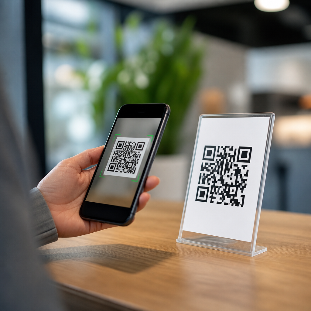
The first rule of QR code design best practices is simple: preserve scan reliability. QR codes use finder patterns, alignment patterns, timing patterns, format information, and data modules that must remain distinguishable to a camera sensor and decoding algorithm. If you distort these structural elements too aggressively, decorative branding will reduce function. Error correction helps, but it is not a license to redesign the code without limits.
Use a sufficient quiet zone, the blank margin around the code. The accepted baseline is four modules on all sides, though I usually add more in busy layouts because surrounding graphics often bleed visual noise into the edge. Maintain high contrast between dark modules and light background; black on white remains the most dependable standard. Colored codes can work well, but pale foregrounds, gradients with low separation, and metallic inks often cause failures. In print, matte finishes usually outperform gloss because glare can obscure modules.
Size should be tied to viewing distance. A common field guideline is roughly one inch of code width for every ten inches of scanning distance, then validate with actual devices. For a restaurant tabletop tent card, a smaller code may be enough because the user is close. For a poster in a station corridor, the code must be larger because users scan from farther away and often while walking. Dense codes with long URLs need more space than simple codes. This is one reason dynamic QR codes usually outperform static ones in design flexibility: the short redirect URL reduces data density and improves readability.
Test across common camera conditions: older phones, cracked screens, low light, bright light, angled viewing, and weak mobile connections. I also test from expected user positions rather than ideal positions. If a code is mounted above shoulder height, many users will scan at an angle. If it appears on product packaging, the curved surface can distort modules. Optimization means planning for those constraints before discussing logos or brand colors.
Make the value proposition obvious at the point of scan
People do not scan QR codes simply because they are present. They scan when the reward is clear, immediate, and believable. Every code should answer three questions before the camera opens: what will I get, why should I trust it, and how long will it take? Without that context, a QR code becomes visual clutter or, worse, something users avoid because phishing stories have made them cautious.
Add a plain-language call to action next to the code. “Scan to view the menu” outperforms “Scan me” because it names the outcome. “Scan to download setup instructions,” “Scan to claim 15% off,” and “Scan to watch the installation video” work for the same reason. The wording should match the placement. On packaging, users often want support, authenticity verification, ingredients, or how-to content. At events, they may want schedules, speaker bios, maps, or lead capture forms. On out-of-home media, they need a fast, mobile-first next step.
Trust signals matter equally. Place the brand name, destination description, or recognizable campaign label near the code. If appropriate, note that the link opens a secure page or official site. For payment or login-related uses, reassure users with exact wording and consistent branding. In restaurant and retail environments, a QR code framed within familiar design language performs better than an isolated square because it looks intentional rather than suspicious.
Context also shapes performance. A QR code on a billboard should not send users to a long multi-step form, because the user is likely in motion and on cellular data. A code on equipment documentation can support longer instructional content because the user is already task-focused. Optimizing the user experience means aligning the offer, the environment, and the expected time commitment.
Use branding carefully without compromising readability
Branding can improve recognition and trust, but only when it supports the scan. The safest path is subtle customization: a logo centered within the code, rounded modules that remain distinct, and brand colors with strong contrast ratios. In my campaigns, the best branded QR codes look intentional without forcing the scanner to work harder. The worst ones try to become illustrations.
Logo insertion works because most QR formats tolerate some obstruction through error correction, typically level Q or H when a logo is placed in the center. Still, every added element consumes tolerance. Large logos, complex center artwork, or transparent knockouts can push a code past reliable decoding. Keep logos compact, surrounded by clear space, and test them at the smallest real deployment size. If a code will appear both on packaging and social graphics, test both, because downscaling often reveals problems first.
Avoid decorative backgrounds, photographic textures, and gradients that cross module boundaries. Many design tools preview these styles attractively, but camera software reads contrast, edges, and geometry rather than brand intent. If you want a more polished presentation, style the container around the code rather than the code itself. A framed label, caption, iconography, or branded landing-page teaser can add personality while preserving function.
Consistency across placements helps users learn what to expect. When a brand uses the same scan frame, icon treatment, CTA style, and landing-page structure across packaging, in-store signage, and print collateral, scan confidence rises. This is why a hub page on QR Code Design & Branding should connect design choices directly to usability outcomes instead of treating them as separate topics.
Match placement, materials, and environment to real scanning behavior
Physical context often determines performance more than code aesthetics. I have seen well-designed QR codes fail because they were placed on curved bottles, behind reflective acrylic, too close to fold lines, or at heights that forced awkward scanning angles. User experience improves when placement follows natural sightlines, reach, and smartphone handling habits.
For packaging, place the code on a relatively flat panel with enough surrounding whitespace and avoid seams, corners, and crimped areas. For posters and point-of-sale signage, position it where users can stop safely and hold their phones steady. For restaurant tables, avoid locations that are shadowed by condiment bottles or covered by condensation. On digital displays, account for moiré patterns, refresh rates, and screen glare; what scans on a laptop may fail on a high-brightness kiosk.
Material choice matters. Uncoated and matte stocks are more forgiving than glossy varnishes. If glossy packaging is mandatory, increase contrast and test under retail lighting. Outdoor placements need weather-resistant printing and strong contrast in direct sun. Small labels require print quality controls because ink spread can blur modules. A technically correct vector file can still print poorly if production tolerances are ignored.
| Placement | Main risk | Best practice |
|---|---|---|
| Product packaging | Curved surfaces, glare, tiny print area | Use a flat panel, matte finish, dynamic code, and larger quiet zone |
| Posters and signage | Distance, motion, poor angle | Increase code size, shorten destination path, add strong CTA |
| Restaurant tables | Low light, spills, clutter | Raise contrast, protect the print, keep code clear of objects |
| Digital screens | Glare, refresh artifacts, scaling | Test on target screen brightness and at intended viewing distance |
| Direct mail | Crowded layout, fold interference | Keep whitespace, place away from folds, pair with a specific offer |
Optimize the destination experience, not just the code
A QR code experience is only as good as the page or asset it opens. If users scan and land on a slow desktop page, a generic homepage, or a form with too many fields, the design has failed even if the code scans perfectly. The destination must fulfill the promise made next to the code with minimal friction.
Use mobile-first landing pages with fast load times, compressed media, readable type, and clear hierarchy. Core actions should appear above the fold: order now, download guide, verify product, join Wi-Fi, add contact, or complete payment. Deep linking can improve performance further by sending users directly into an app screen when the app is installed, while still providing a web fallback. For support content, send users to the exact manual section or video timestamp rather than a broad help center.
Dynamic QR codes are especially valuable here because they allow destination updates without reprinting. If a campaign URL changes, inventory remains useful. They also support analytics such as scan count, time, geography, and device type, which help teams refine creative, placement, and landing-page performance. Use UTM parameters carefully so analytics remain clean and attribution is preserved across channels.
Security and privacy should be explicit. If a scan initiates payment, login, file download, or data collection, clearly identify the destination and request only necessary information. Avoid surprise redirects. Use HTTPS, predictable domains, and visible branding on the landing page. This is not just good compliance practice; it materially improves completion rates because users trust what they can verify.
Measure performance and build a repeatable optimization process
Effective QR code design best practices are measurable. Track more than scans. Scans indicate interest, but conversion rate, bounce rate, completion time, and assisted revenue reveal whether the experience actually works. In one retail program I managed, increasing code size and clarifying the CTA doubled scans, but simplifying the landing page produced the bigger business gain because purchase completions rose far more than scan volume alone.
Create a test plan for each deployment. Validate scan speed on multiple devices, assess print proofs under real lighting, and review the destination on common mobile browsers. Then monitor live performance and compare locations, creative variants, and offers. A/B testing is useful when the traffic is high enough. You can test CTA wording, frame design, logo inclusion, landing-page structure, and incentive level. Keep one variable changed at a time when possible.
Governance matters if QR codes appear across departments. Establish standards for minimum size, quiet zone, contrast, logo use, CTA format, naming conventions, analytics tagging, and approval workflows. Teams using tools such as QR Code Generator Pro, Bitly, Adobe Express, Canva, Figma, and enterprise DAM systems should work from shared templates rather than rebuilding from scratch. That prevents readability mistakes and keeps branding consistent.
Accessibility should be part of the process. QR codes are visual, so always provide an alternate path such as a short URL or NFC option where practical. Make surrounding text legible, use plain language, and ensure the landing page supports screen readers, zoom, and keyboard navigation. Inclusive design broadens reach and reduces frustration. If you are building a sub-pillar hub under QR Code Design & Branding, these operational standards are what turn isolated tips into a reliable system.
Optimizing QR codes for user experience means designing the whole journey, not just the square symbol. Reliable scanning comes first: adequate quiet zone, strong contrast, appropriate size, sensible error correction, and testing in the real environment. Clear calls to action come next: tell users exactly what they get, why they should trust the scan, and how much effort it requires. Branding should reinforce recognition without interfering with structure. Placement, materials, and lighting must reflect how people actually hold and use phones. Finally, the destination needs to be fast, relevant, secure, and easy to complete.
The main benefit of following these QR code design best practices is simple: less friction produces more action. Better scanability increases engagement, clearer messaging improves intent, and stronger landing pages turn curiosity into measurable outcomes. That is why this topic deserves hub-page treatment within any serious QR Code Design & Branding strategy. Each related article can go deeper into testing, dynamic code management, packaging applications, CTA writing, analytics, and accessibility, but the foundation remains the same: design for the user’s moment, not the designer’s mockup.
Audit every QR code your brand currently uses, test each one on real devices in real settings, and fix the weakest step in the journey first.
Frequently Asked Questions
What makes a QR code user-friendly in the first place?
A user-friendly QR code is one that removes uncertainty and effort at every step of the interaction. That starts before the scan even happens. People need to notice the code, understand what it is for, trust that it is safe to use, and feel confident that scanning it will give them something useful. If any of those elements are missing, performance drops even if the code is technically scannable. In other words, a good QR experience is not just about generating a functional pattern; it is about designing a clear path from attention to action.
In practical terms, user-friendly QR codes are easy to see, large enough to scan quickly, placed where a phone can comfortably reach them, and surrounded by enough white space to prevent interference. They also include context, such as a short call to action that explains what happens next. Phrases like “Scan to view the menu,” “Scan for setup instructions,” or “Scan to claim your discount” work better than presenting the code alone. Users should never have to guess why they should scan.
Trust is another major factor. Branded design can help, but only if it does not compromise readability. A QR code that looks polished, uses recognizable brand elements, and appears alongside a clear URL, logo, or supporting message feels more legitimate than an isolated code with no explanation. Finally, the destination matters just as much as the code itself. If the landing page is slow, confusing, or unrelated to what was promised, the overall experience fails. The most effective QR codes behave like functional interface elements: clear, purposeful, fast, and aligned with the user’s expectations from start to finish.
How can I improve QR code scan rates without hurting usability?
The best way to improve scan rates is to reduce friction rather than add visual complexity. Many teams try to increase engagement by styling the code aggressively, but scan rate usually improves more from clarity, placement, and message quality than from decoration. Start with the fundamentals: maintain strong contrast between the code and the background, preserve the quiet zone around the code, and make sure the size is appropriate for the viewing distance. A beautifully branded QR code that fails to scan instantly is less effective than a simple one that works the first time.
Placement has a direct impact on usability. A code placed too high, too low, on a curved surface, behind glare, or in a crowded design area creates unnecessary effort. Users should be able to scan naturally without awkward movement or repeated attempts. If the code appears in print, packaging, signage, or displays, test it in the exact real-world conditions where people will use it. Lighting, material finish, motion, and camera quality all affect results. A code that works on a desktop mockup may fail in a retail aisle or on a street poster.
Strong scan rates also depend on a compelling reason to act. A concise call to action, paired with a clear benefit, consistently outperforms generic presentation. Tell users what they will get and why it is worth their time. “Scan to compare plans,” “Scan to watch the demo,” or “Scan to check availability” gives direction and reduces hesitation. You can further improve usability by using dynamic QR codes for easier destination management and performance tracking, but the key principle remains the same: optimize for immediate understanding, effortless scanning, and a landing experience that fulfills the promise made beside the code.
How important are size, contrast, and placement when optimizing QR codes?
They are critical, because these three factors determine whether the QR code can be scanned quickly and confidently in real conditions. Size affects how easily a phone camera can recognize the pattern, especially from a distance or at an angle. If the code is too small for the environment, users have to move closer, reposition their device, or try multiple times, which introduces friction and abandonment. As a general rule, the farther away the user is expected to stand, the larger the code needs to be. Practical testing in the intended setting is far more valuable than relying on a design file alone.
Contrast is just as important. QR codes perform best when there is a strong difference between the foreground and background, typically dark code elements on a light background. Low-contrast color choices may align with a brand palette, but they often hurt readability, especially in dim light, bright glare, or on lower-quality phone cameras. Busy backgrounds, gradients, patterns, and transparent overlays can also interfere with scanning. The code should visually separate from surrounding elements so the camera can detect it instantly.
Placement influences both visibility and physical ease of use. Users should be able to notice the code quickly and scan it without awkward posture, obstruction, or crowding. On product packaging, the code should not sit on folds, seams, reflective surfaces, or curved corners where distortion can occur. On signs and posters, avoid placing it too high or where lighting creates glare. On screens, make sure the code is not displayed too small or too close to other competing interface elements. When size, contrast, and placement are handled well together, the QR code feels effortless to use, and that directly improves user experience, completion rates, and trust.
Should QR codes be branded, or does branding create more scanning problems?
Branding can improve QR code performance, but only when it supports recognition and trust without interfering with function. The problem is not branding itself; the problem is branding that overrides usability. Adding a logo, custom colors, or stylistic elements can make a QR code feel more credible and visually integrated into a campaign, product, or environment. That can reduce user hesitation, especially when people are cautious about scanning unknown codes. A branded QR code placed next to familiar brand assets often feels safer and more intentional than a plain, context-free code.
However, the code still needs to scan instantly. Over-customization can damage readability if it alters the finder patterns, reduces contrast, removes necessary white space, or introduces decorative effects that confuse camera recognition. Light-on-light palettes, heavy gradients, cramped placement, and oversized center logos are common mistakes. If users need multiple attempts to scan, the design has stopped serving the experience. In that situation, branding is actively hurting performance.
The best approach is balanced branding. Use customization to reinforce trust and visual consistency, but keep the core structure intact and test across a range of devices and lighting conditions. Pair the code with explanatory text, recognizable brand cues, and a clear value proposition. In many cases, surrounding context contributes more to trust than deep visual modification of the code itself. A clean, fully functional QR code with strong brand framing usually outperforms a heavily stylized code that sacrifices speed or reliability. For user experience, the priority should always be function first, branding second.
What should happen after someone scans the QR code to create a better overall experience?
The post-scan experience should feel like a seamless continuation of the promise made before the scan. This is where many QR code campaigns fail. Teams focus on getting the scan, then send users to a generic homepage, an unoptimized mobile page, or content that does not clearly match the call to action. That disconnect creates frustration and weakens trust. If the code says “Scan for setup instructions,” the user should land directly on a mobile-friendly setup page, not a broad navigation menu where they have to search for the right information.
Speed matters immediately after the scan. The destination should load quickly, display well on mobile devices, and minimize unnecessary pop-ups, redirects, or extra clicks. QR code interactions are often quick, situational, and task-driven. People may be standing in a store, at an event, on public transit, or using one hand. In those moments, every second of delay and every extra step increases drop-off. Keep the page focused on the intended action, whether that is viewing details, downloading an app, completing a form, making a payment, or accessing support content.
Consistency is also essential. The messaging, design, and offer on the landing page should align with what users expected from the code. If the printed message promised a coupon, demo, menu, registration form, or tutorial, the destination should deliver that exact experience with no ambiguity. This continuity improves completion rates because users feel confirmed rather than redirected. It is also smart to track behavior after the scan, including bounce rate, engagement, and conversion path, so you can identify where friction appears. Optimizing QR codes for user experience does not end at scanability; it extends through the landing page, the action flow, and the final result the user came for in the first place.


