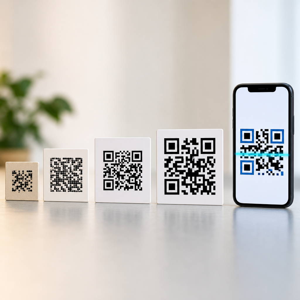
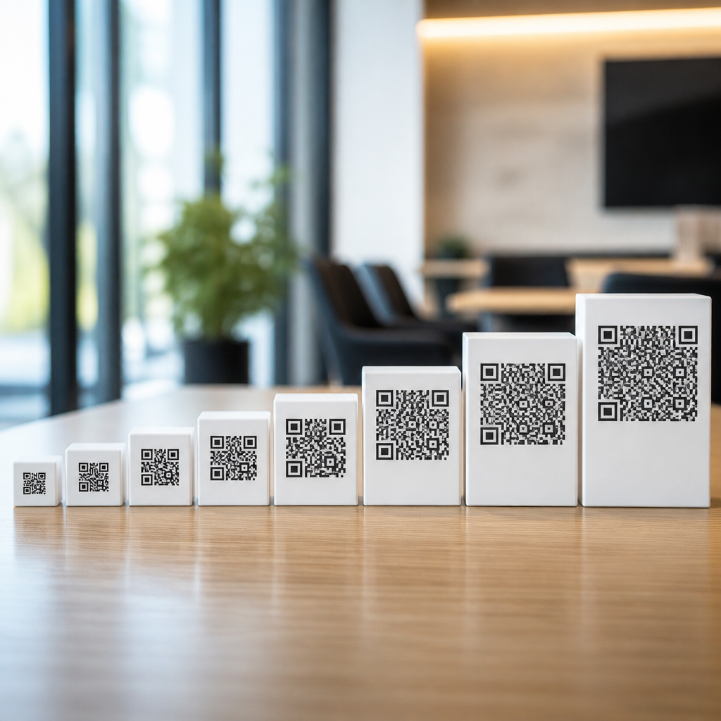
QR code versions are the standardized size levels that determine how much data a symbol can hold, how dense its pattern becomes, and which use cases it supports. If you have ever wondered why one QR code looks compact and another looks crowded with tiny squares, the answer is usually the version. In practice, versions run from 1 through 40, and each step adds more modules, which are the small black and white squares that make the code readable to cameras and scanners. Understanding QR code versions without getting buried in formulas helps marketers, product teams, printers, and operations managers choose codes that scan reliably in the real world.
A QR code is not just a random grid. It is a governed standard defined in ISO/IEC 18004, with fixed structural patterns, error correction rules, and encoding modes. The term version refers specifically to symbol size. Version 1 is a 21 by 21 module matrix, and every higher version adds four modules per side until Version 40 reaches 177 by 177. That growth matters because available space is shared among the finder patterns, timing patterns, alignment patterns, format information, version information on larger symbols, and the data itself. In client work, I have seen teams focus only on character count and miss the more important question: what version will still scan after being printed on corrugated cardboard, curved labels, or restaurant menus under poor lighting?
This topic matters because QR codes now carry far more than website links. They are used for payment flows, ticketing, manufacturing traceability, Wi-Fi onboarding, digital business cards, healthcare workflows, and GS1 Digital Link initiatives in retail packaging. A code that is technically valid can still fail if its version is too dense for the print area, the chosen error correction level, or the expected scanning distance. The practical goal is not to maximize capacity. The goal is to match content, environment, and symbol size so the code scans quickly with an ordinary smartphone. Once you understand how versions 1 through 40 map to real use cases, the rest of QR code technology and standards becomes much easier to apply correctly.
What QR code versions actually mean
The simplest way to think about versions is this: higher versions create larger grids, and larger grids can store more data. Version 1 is the smallest standard QR code, while Version 40 is the largest. Every version increases the module count by four on each side, so Version 2 is 25 by 25, Version 3 is 29 by 29, and so on. This progression is fixed by the standard and does not change from one generator to another. If two platforms produce different-looking symbols for the same content, the difference is usually driven by encoding choices, error correction level, or optimization, not a private interpretation of version numbers.
Capacity depends on more than version alone. The data type matters because numeric data packs more efficiently than uppercase alphanumeric text, and both are more efficient than arbitrary binary data. Error correction level matters too. QR codes use Reed-Solomon error correction in four levels commonly labeled L, M, Q, and H. Higher error correction improves resilience when a code is scratched, smudged, or partly covered, but it also consumes space that could have held data, often pushing the symbol to a higher version. This tradeoff is one of the first things I explain during packaging reviews, because teams often want the most robust code and the smallest label at the same time.
Versions also affect scan behavior. Dense symbols require better focus, more contrast, and enough image resolution for the camera to distinguish individual modules. A Version 3 code printed at the same physical size as a Version 20 code will almost always be easier to scan because its modules are larger. That is why short dynamic URLs are so useful. Instead of encoding long tracking parameters directly into the QR code, you can encode a short redirect and manage the destination server-side. The code becomes lower density, which improves readability and gives you room for stronger error correction.
How versions 1 through 40 are grouped in practice
Although the standard lists forty separate versions, practitioners usually think in ranges. Versions 1 through 9 are small to moderate symbols commonly used for simple URLs, short IDs, contact cards, or Wi-Fi setup strings. Versions 10 through 26 are medium to high density and appear when content grows, especially with vCard fields, long URLs, multilingual text, or embedded application data. Versions 27 through 40 are very dense and are usually reserved for specialized industrial, archival, or offline data scenarios where high capacity is worth the scan difficulty. In everyday consumer marketing, it is relatively uncommon to need anything above the mid-teens if the data is designed well.
Real projects confirm this pattern. On retail shelf talkers, event posters, and menus, I usually see codes landing between Versions 2 and 8 because the payload is a short link. For equipment labels in factories, serialized part identifiers and maintenance metadata may push codes into the low teens, especially when teams insist on encoding more fields directly instead of using a database lookup. In closed-loop environments with dedicated scanners, higher versions can work acceptably because lighting, camera distance, and print quality are controlled. Consumer smartphone scanning is less forgiving, which is why design discipline matters more than theoretical capacity.
| Version range | Typical use cases | Practical strengths | Main limitation |
|---|---|---|---|
| 1 to 4 | Short URLs, basic redirects, simple IDs | Fast scanning, easy printing at small sizes | Limited room for long text or high error correction |
| 5 to 9 | Wi-Fi codes, vCards, app links, menu links | Good balance of capacity and readability | Can become tight on very small packaging |
| 10 to 20 | Longer business data, tickets, industrial labels | Supports richer payloads and stronger redundancy | Needs careful print sizing and contrast control |
| 21 to 30 | Specialized workflows, offline data transfer | High capacity for constrained environments | Harder for phones to scan consistently |
| 31 to 40 | Niche technical applications, archived data blocks | Maximum standard capacity | Very dense; poor fit for most consumer use |
This range-based view is useful because version planning is really about outcomes. If your code will live on glossy packaging under store lighting, a lower version with more white space and larger modules usually beats a high-capacity symbol every time. If your code is part of a machine-readable workflow with a fixed scanner at a known distance, you can use higher versions more confidently. The standard gives you options, but context decides which option is smart.
What changes inside the symbol as versions increase
As versions grow, the code does not simply stretch evenly. More structural elements appear, especially alignment patterns. These smaller square targets help scanners correct distortion, which becomes more likely as the matrix expands. Versions 2 through 6 introduce alignment support, and larger versions add more of these patterns at defined positions. This is essential on curved bottles, flexible pouches, and wrinkled labels because the scanner needs reference points across the symbol, not just in the corners. In production, I have watched high-version codes fail on shrink sleeves where lower-version alternatives scanned immediately because the modules remained large enough to survive the curve.
The version also influences how mask patterns are evaluated. QR generators test different masks to avoid problematic visual artifacts such as large blocks of the same color or patterns that resemble finder markers. Good generators from reputable libraries like ZXing, libqrencode, or commercial platforms handle this automatically, but the result still depends on payload and version. A code that looks visually balanced often scans better because the masking process reduced ambiguity. This is one reason not to judge quality by appearance alone; the best symbol may look slightly different from what a designer expects.
Another structural change is the inclusion of version information for larger symbols. Starting at Version 7, extra metadata is embedded to help the decoder identify the symbol size accurately. Users rarely need to think about this detail, but it explains why larger versions spend even more space on overhead before data is considered. When people ask why their long text suddenly jumps from a manageable code to a visually crowded one, the answer is usually cumulative overhead: more modules, more structural patterns, more error correction codewords, and less efficient data mode choices.
Choosing the right version for print, packaging, and screens
The right version is usually the smallest one that comfortably fits the payload with the chosen error correction level. That rule sounds simple, but applying it well requires thinking about physical size. Scanners read modules, not inches or millimeters. If a symbol is physically tiny and also high version, each module becomes too small to resolve cleanly. Many production teams use a minimum module size guideline, then scale the total symbol around that constraint. On packaging, this often matters more than absolute dimensions because print gain, material texture, and press variation can blur edges.
For print, contrast and quiet zone are critical companions to version choice. The quiet zone is the blank margin around the QR code, typically four modules wide at minimum. Without it, scanners struggle to separate the symbol from nearby text, borders, or images. I regularly see failed tests caused not by the version itself but by a decorative frame or dark background eating into this margin. The practical fix is straightforward: keep the code simple, keep the quiet zone clean, and shorten the payload before increasing the version.
On screens, versions can be somewhat more forgiving because there is no ink spread, but display scaling introduces its own problems. A dense code shown too small on a presentation slide or smartwatch screen may alias or blur. Testing should include the actual brightness, distance, and camera types users will have. For mobile onboarding flows, a Version 2 or 3 code with a short URL often outperforms a larger version carrying full parameters. The extra redirect takes milliseconds, but the improved scan speed is obvious to users.
How standards, encoding choices, and error correction shape version size
QR code technology works best when standards and encoding decisions are treated as part of one system. ISO/IEC 18004 defines the symbol architecture, but implementation choices decide whether your final code is compact or bloated. Character set selection is a major factor. Numeric mode is highly efficient for digits, alphanumeric mode is good for uppercase letters and a limited symbol set, byte mode supports broader text and URLs, and Kanji mode is optimized for specific character encoding patterns. If you place everything into byte mode by default, the symbol may move to a higher version than necessary.
Error correction level is the other major lever. Level L provides the most data capacity but the least redundancy, while Level H offers the strongest recovery from damage at the cost of capacity. There is no universally best setting. On pristine digital screens, M is often sufficient. On consumer packaging where logos, wear, or glare may interfere, Q or H can be justified if the payload is short enough to keep the version manageable. The mistake is choosing high redundancy for a long static URL and then shrinking the printed code to fit the layout. That combination produces dense modules and weak real-world performance.
Modern use cases also bring in linked standards such as GS1 Digital Link. In retail, the move toward 2D codes at point of sale makes version planning more strategic because the symbol may need product identification, web resolution, batch or lot data, and expiry information in one code. The answer is not automatically to jump to a high version. Better data architecture, compressed identifiers where appropriate, and resolver-based design often produce a smaller, more reliable symbol. For most organizations, QR code success comes from disciplined payload design, not maximum symbol capacity.
Common mistakes when working with higher QR code versions
The first mistake is encoding too much direct data. Teams often paste full campaign URLs with long UTM parameters, session identifiers, or human-readable notes into the code. A short managed link usually delivers the same business result with a lower version and better analytics control. The second mistake is adding a logo to the center of a code that is already dense. Logo overlays depend on available error correction headroom. On a high-version symbol with tiny modules, the visual branding may remove exactly the information the scanner needed most.
The third mistake is ignoring test conditions. A QR code that scans perfectly from a laptop screen at arm’s length may fail when printed matte, placed behind curved plastic, or viewed under warehouse sodium lighting. Good testing includes multiple phones, both iOS and Android camera apps, different distances, and damaged samples. I also recommend verifying with at least one dedicated barcode verification or scanning tool when the application is operationally important. Consumer confidence is built on instant scanning. If users have to hunt for focus, they blame the brand, not the standard.
Another common error is treating all generators as equivalent. Reputable software follows the standard, but quality varies in data validation, mask selection, quiet zone handling, vector export, and support for structured data types. For production workflows, use tools that can export SVG or EPS for print, preserve sharp module edges, and document error correction settings clearly. When teams standardize these choices, version decisions become repeatable and easier to govern across packaging, signage, and digital assets.
QR code versions 1 through 40 are best understood as a practical sizing system, not a mathematical puzzle. Each higher version creates a larger grid and more potential capacity, but also more density and tighter scanning demands. For most business uses, the winning strategy is to keep payloads short, choose only as much error correction as the environment requires, and use the smallest version that scans reliably at the intended size. That approach produces faster scans, cleaner design integration, and fewer failures across print and digital channels.
As the hub for QR code technology and standards, this topic connects directly to decisions about payload structure, print specifications, dynamic versus static codes, error correction, quiet zones, and industry initiatives such as product identification and mobile engagement. The version number is not an isolated technical detail. It influences usability, compliance, and measurable campaign performance. When teams understand that relationship, they stop asking how much data they can cram into a code and start asking what users need to scan successfully.
If you manage QR codes for packaging, operations, or marketing, audit your current symbols with version in mind. Check payload length, error correction, physical size, contrast, and quiet zone before you redesign anything else. Then build a version policy for common use cases, from short-link posters to serialized labels. That one step will improve scan reliability and make every future QR code decision easier.
Frequently Asked Questions
What does a QR code version actually mean?
A QR code version is the standardized size level of a QR code. It does not refer to software, design style, or generation date. Instead, it tells you how many modules the code contains. Modules are the tiny black and white squares that make up the full symbol. As the version number increases from 1 to 40, the grid becomes larger, which allows the QR code to store more data.
This is why two QR codes can contain similar types of information but look very different. A lower version usually appears simpler, with fewer squares and more open space. A higher version looks denser because it packs in more modules. In practical terms, version is one of the main factors that affects capacity, physical print size, and ease of scanning.
For most users, the easiest way to think about versions is this: low versions are best for short, simple content, while higher versions are used when more space is needed for longer URLs, contact details, product information, or other data-heavy uses. The version is one of the hidden technical settings that determines how compact or crowded a QR code will look before anyone ever scans it.
Why do some QR codes look simple while others look crowded and complex?
The biggest reason is the version. Every step up in version increases the number of modules in the grid, so the pattern becomes more detailed. A compact QR code with a short web address may use a lower version and therefore have a cleaner, more open appearance. A code holding more content needs a larger grid, which creates the tightly packed look many people associate with complex QR codes.
Data amount is only part of the story, though. Error correction also affects density. QR codes can be built with different levels of redundancy so they still work if part of the symbol is damaged or obscured. Higher error correction improves resilience, but it also uses space that could otherwise hold data. That means the same content can produce a denser code if the error correction setting is higher.
Design choices matter too. If someone adds a logo, uses custom styling, or needs a very small printed label, the generator may compensate by increasing the version or adjusting other settings. So when a QR code looks crowded, it usually means it is carrying more data, using stronger error correction, or both. The visual complexity is not random. It is usually a direct result of practical decisions about what the code needs to do.
How do versions 1 through 40 affect storage capacity and real-world use?
Versions 1 through 40 represent a progression from small, low-capacity QR codes to large, high-capacity ones. At the lower end, the code is ideal for short content such as a compact URL, a basic identifier, or a simple redirect. In the middle range, QR codes can support longer links, app download destinations, event details, or standard business information. At the higher end, they can hold much more data, but they also become denser and typically need more careful sizing and printing.
In real-world use, capacity is not just about how much text can technically fit. It is also about how reliably the code can be scanned in its intended environment. A high-version QR code printed too small on packaging, labels, or signs can become difficult to read because the individual modules are too tiny. On the other hand, a low-version code often scans more easily because the pattern is less dense and more forgiving in challenging conditions.
This is why choosing a version is really about matching the code to the use case. For menus, posters, product packaging, tickets, and marketing materials, the best choice is often the smallest version that comfortably holds the content while remaining easy to scan. Higher versions are useful, but they are not automatically better. The smartest approach is to use only as much capacity as the situation actually requires.
Should I choose a higher QR code version just to be safe?
Usually, no. A higher version gives you more room for data, but it also makes the QR code more complex. That added density can make scanning less reliable if the code is printed small, placed on textured materials, viewed from a distance, or used in poor lighting. In many cases, a lower version is the better choice because it creates a cleaner symbol that scanners can read more quickly and consistently.
Choosing a higher version than necessary can also create avoidable design problems. The code may need to be printed larger to preserve scannability, which takes up more space on packaging, labels, signage, or marketing layouts. If the content is only a short URL, there is little benefit in forcing the QR code into a larger version. You are adding visual complexity without gaining a practical advantage.
The better rule is to use the lowest version that supports your content and error correction needs. If you want flexibility, consider using a short URL or a dynamic QR code that points to editable content. That lets you keep the symbol simpler while still retaining control over the destination later. In other words, planning the content well is usually more effective than automatically moving to a larger version.
How can I tell which QR code version is right for my project without getting into technical math?
The easiest method is to start with the purpose of the QR code, not the version chart. Ask what the code needs to do. If it only needs to open a short web link, you will usually be fine with a lower version. If it needs to store more detailed information directly in the symbol, such as long text, contact records, or structured data, a higher version may be necessary. Most modern QR code generators handle version selection automatically, which is helpful for non-technical users.
Even so, automatic selection should not replace testing. Once the code is generated, look at how dense it appears and consider where it will be used. A code for a business card, bottle label, or small sticker has different constraints than one for a storefront window or trade show banner. If the pattern looks overly crowded for the available print size, simplify the content or shorten the destination link before increasing the physical size too much.
A good practical workflow is simple: keep the content as lean as possible, generate the code, print or display it at the intended size, and test it with multiple phones under realistic conditions. If it scans quickly and consistently, the version is likely appropriate. If not, the answer is often to reduce data, raise print size, or adjust error correction rather than guessing blindly. You do not need to memorize all 40 versions to make a smart decision. You just need to balance content, clarity, and scanning reliability.