QR codes look simple, but color choices can determine whether a code scans instantly or fails in front of a customer. In practical QR code design, the best color combinations balance branding with machine readability, using strong contrast, clean separation between foreground and background, and enough visual consistency for smartphone cameras and decoding software to interpret the symbol correctly. For teams working on packaging, menus, posters, product labels, mailers, event signage, or retail displays, color is not a cosmetic decision. It directly affects scan rate, user trust, and campaign performance.
When designers ask what color combinations work best for QR codes, they are really asking three connected questions: which colors create reliable contrast, which brand-driven variations remain readable, and which treatments introduce risk. Foreground color refers to the dark modules, finder patterns, and timing patterns that make up the scannable structure. Background color is the light area behind those modules, including the quiet zone around the code. Readability means a phone can separate those elements under real conditions such as glare, shadows, low battery cameras, wrinkled labels, or fast movement. Contrast is the measurable difference in luminance and tone between the code and its background, and it matters more than novelty.
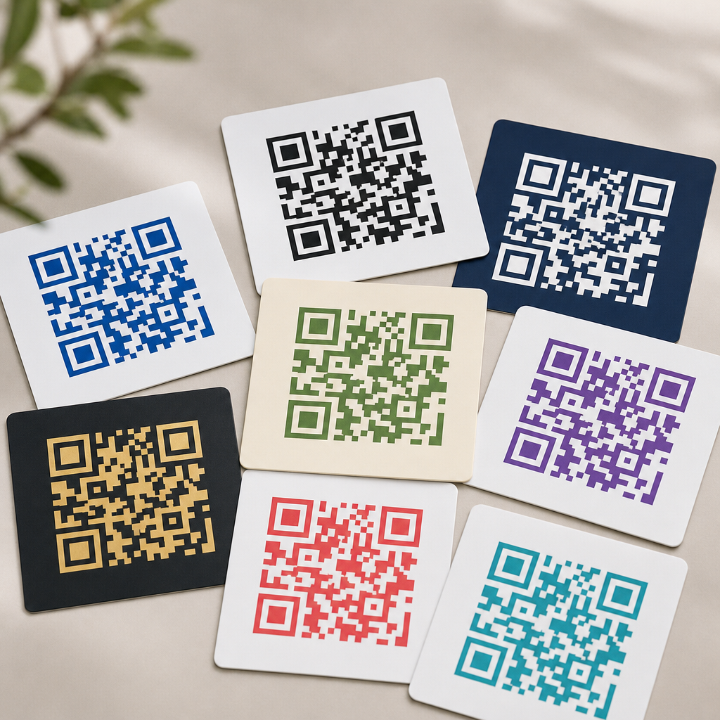
After reviewing hundreds of production QR codes across restaurant menus, shipping inserts, retail shelf talkers, and direct mail, one rule remains constant: dark code on a light background performs best. Black on white is still the benchmark because it maximizes optical distinction for nearly every camera and decoding engine. However, effective combinations go far beyond black and white. Navy on white, dark green on cream, deep plum on pale blush, and charcoal on light gray can all scan reliably when the luminance difference is high and the design preserves the code’s core geometry. The goal is not merely to make a code attractive. The goal is to maintain dependable scanning while supporting brand identity.
This article serves as the hub for color, contrast, and readability within QR code design and branding. It explains which color combinations are safest, why certain gradients and inversions fail, how print and screen environments change results, and what standards professionals use before deployment. If you need a practical answer, start here: choose a dark foreground, keep the background very light, preserve a clean quiet zone, test in real lighting, and avoid low-contrast or reflective finishes. Those principles are the foundation behind every high-performing branded QR code.
Why Contrast Matters More Than Hue
Scanning software does not care whether a QR code is fashionable. It cares whether the image sensor can distinguish patterned modules from the surrounding field. That is why luminance contrast matters more than hue itself. A dark red code on a pale beige background often scans better than a bright blue code on a slightly darker teal background, even if the blue-teal pairing looks more vibrant to the human eye. Smartphone cameras reduce scenes into tonal information before decoding, so the strength of light-dark separation is usually the deciding factor.
In field testing, the strongest performers are combinations where the foreground is clearly darker than the background by a wide margin. Black on white is ideal, but dark navy on white also works well because navy preserves low reflectance. Deep forest green on matte cream can be excellent for natural or premium brands. Rich burgundy on pale pink may scan if the pink is sufficiently light, but it becomes less forgiving in dim restaurants or under warm indoor bulbs. By contrast, yellow on white, light gray on silver, or pastel lavender on blush routinely underperform because the camera sees too little difference between the modules and the background.
Contrast also interacts with size and distance. A low-contrast code on a large poster may still scan from close range, yet fail on a tiny cosmetic label where each module is already near the limit of print precision. In my experience, teams often compensate for weak contrast by increasing code size, but that is only a partial fix. Better contrast improves scan reliability without demanding more physical space, which is especially important on packaging and menus where layout constraints are tight.
Best Color Combinations for Reliable Scanning
The safest QR code color combinations all follow one pattern: dark foreground, light background, minimal visual noise. If you need combinations that work across print and digital environments, start with proven pairings rather than experimental palettes. The following options consistently perform well when printed clearly and tested across common phone models.
| Foreground | Background | Use Case | Reliability Notes |
|---|---|---|---|
| Black | White | Universal default | Highest contrast and broadest device compatibility |
| Charcoal | White or very light gray | Modern branded layouts | Excellent if the background stays clean and matte |
| Navy | White | Corporate, finance, healthcare | Very strong performance with premium visual tone |
| Dark green | Cream | Food, wellness, sustainability brands | Reliable when cream remains light and not textured |
| Burgundy | Pale blush or white | Beauty, hospitality, luxury print | Works if foreground stays dense and background stays pale |
| Deep purple | Soft lavender-gray | Lifestyle and creative brands | Good with high tonal separation and no glossy glare |
These combinations succeed because they preserve a strong tonal hierarchy. They also respect the quiet zone, the empty margin around the code that helps scanners isolate the symbol from nearby graphics. If the best colors are paired with a cluttered background, performance still drops. This is why a plain white knockout behind a branded code often outperforms a fully integrated design placed directly over photography or patterns.
If your brand palette is light overall, use color in surrounding design elements while keeping the QR code itself dark. That compromise protects scanability without diluting brand recognition. Many high-end packaging systems do this well: the code appears in dark ink inside a reserved light panel, while brand color dominates the label, carton, or sleeve around it.
Color Combinations That Commonly Fail
Poor QR code color combinations usually fail for predictable reasons: low contrast, reversed polarity, reflective materials, or backgrounds that interrupt the code edge. The most common mistake is using a light foreground on a dark background, such as white modules on black. Some modern phones can decode inverted codes, but support is inconsistent across devices, apps, and lighting conditions. For any campaign where reliability matters, do not treat inversion as safe.
Another frequent problem is pairing similar tones. Medium blue on dark green, orange on red, gold on beige, and pastel pink on white may look stylish in a brand presentation, yet they often collapse under camera exposure. Metallic inks create a different problem. Foil gold, holographic finishes, and glossy varnishes reflect light unevenly, washing out module edges or producing hotspots that confuse autofocus. The same issue appears on glossy product pouches, curved beverage cans, and laminated tabletop signage.
Gradients add risk because the code no longer has uniform density. If one area of the foreground fades from dark to light, some modules become harder to distinguish than others. Complex multi-color codes can work only if every module area remains dark enough relative to the background, but most decorative gradients are not controlled that carefully. When a gradient is required, keep it subtle, maintain dark minimum values throughout, and test under natural light, retail LEDs, and phone flash. Even then, a flat dark fill is more dependable.
How Print, Screens, and Materials Change Color Performance
A QR code that scans perfectly on a desktop mockup may fail when printed on uncoated stock or displayed on a bright digital sign. Material and production method change how color behaves. In print, ink spread can soften small modules, especially on porous paper. On flexible packaging, film distortion can alter module shape. On corrugated boxes, texture may break edges. For these reasons, deep solid inks on smooth, light backgrounds are safer than delicate tints or thin outlines.
Digital displays introduce different constraints. Screens emit light, which can help contrast, but brightness, pixel density, and reflections matter. A dark gray code on a pastel background may appear sufficient on a calibrated monitor, then become unreadable on a dim phone screen outdoors. LED billboards can also create moiré effects or edge shimmer if the code is too small relative to viewing distance. For digital deployment, use larger codes, avoid subtle color differences, and verify readability on both iPhone and Android devices at typical brightness settings.
Surface finish is often underestimated. Matte materials are generally better than glossy ones because they reduce glare. I have seen otherwise well-designed navy-on-white QR codes fail on laminated table tents simply because overhead spotlights created bright reflections over the finder patterns. The fix was not a new palette; it was switching to a matte finish and slightly increasing the quiet zone. Color decisions should always be evaluated together with substrate, finish, curvature, and lighting environment.
Branding Without Sacrificing Readability
Brand alignment matters, especially in premium retail, hospitality, and campaign creative, but it must not override core scanning requirements. The practical approach is to adapt the code to the brand, not force the brand palette into the code unchanged. Start by identifying the darkest brand color available. If that color holds strong density in print and on screen, it can often replace black. Then choose the lightest available neutral or tint for the background. This preserves brand feel while keeping a strong light-dark relationship.
Logo placement is another branding decision linked to readability. A center logo can work if the QR code has sufficient error correction, usually level Q or H, and the logo does not encroach on finder patterns or timing patterns. However, error correction is not a license for weak color contrast. It compensates for some obstruction, not for poor visibility across the full code. The best branded executions use modest logos, strong contrast, and generous clear space.
For hub-level design systems, it helps to define a simple rule set. For example: use only approved dark brand colors for the foreground, only approved light neutrals for the background, no inverted versions, no photographic backgrounds, and mandatory device testing before release. This kind of governance reduces ad hoc design choices and keeps QR performance consistent across campaigns, packaging lines, and retail environments.
Testing Standards and Practical Readability Checks
The only dependable way to approve a QR code color combination is to test it in the conditions where customers will scan it. Start with contrast evaluation, then move to functional tests. Scan from multiple devices, including older mid-range Android phones, because they are less forgiving than flagship cameras. Test under daylight, warm indoor light, shadow, and glare. Check close-range and realistic user distance. If the code appears on packaging, test on the actual material, not only on a digital proof.
Use a QR generator that allows error correction control and export in vector formats such as SVG, PDF, or EPS for print. Raster images can blur at small sizes. Print professionals should also verify quiet zone width, module sharpness, and minimum size relative to scan distance. A common working rule is at least 1 inch for close-range print applications, though larger is often better when surfaces curve or lighting is poor. If analytics matter, use dynamic QR codes so the destination can change without reprinting and scan data can reveal whether a color variant underperforms.
Readability checks should be simple and strict. Does it scan on the first attempt from an average user angle. Does it work when the screen is smudged or the package is slightly bent. Does it still scan when printed in a second production run from a different press. If the answer is inconsistent, the design is not ready. Reliable QR code color choices are not the ones that barely pass in studio conditions. They are the ones that keep working in the real world.
The best color combinations for QR codes are the ones that preserve strong contrast, clear structure, and dependable scanning across devices and environments. In most cases, that means a dark foreground on a very light background, with black on white as the standard and dark branded colors on pale neutrals as strong alternatives. Navy on white, charcoal on light gray, and dark green on cream work because they maintain tonal separation. Light-on-dark combinations, metallic finishes, weak pastels, and aggressive gradients fail because they reduce the camera’s ability to distinguish modules from background.
For brands, the lesson is simple: customize carefully. You do not need to choose between visual identity and usability, but readability must come first. Use the darkest brand color available, keep the background clean and light, protect the quiet zone, and avoid reflective or cluttered surfaces. Then test on real materials, in real lighting, with multiple phones. That process is what turns a good-looking QR code into a high-performing one.
If you are building a broader QR code design system, use this page as your starting point for every decision involving color, contrast, and readability. Set clear brand-safe combinations, document what is not allowed, and validate each code before launch. Better color choices lead to faster scans, fewer user drop-offs, and stronger campaign results. Review your current QR codes, update any low-contrast designs, and standardize the combinations that scan best.
Frequently Asked Questions
What color combination works best for a QR code?
The most reliable color combination for a QR code is a dark foreground on a light background, with black on white remaining the gold standard. This pairing gives scanning apps and smartphone cameras the strongest possible contrast, which helps them quickly distinguish the square modules from the empty spaces around them. In real-world use across packaging, menus, posters, product labels, mailers, event signage, and retail displays, high contrast is far more important than choosing trendy or highly branded colors.
If black and white feels too plain, other combinations can still work well as long as the contrast stays strong. Dark blue on white, dark green on cream, or deep charcoal on pale gray are often effective alternatives. The key is that the code itself should remain significantly darker than the background. A good rule of thumb is to avoid medium-on-medium pairings such as red on orange, light blue on white, or yellow on pastel gray, because these often look stylish in a design mockup but fail under normal lighting, glare, printing variation, or camera autofocus limitations.
For most brands, the safest approach is to begin with a standard black-on-white QR code, test it thoroughly, and then carefully adapt it into approved brand colors without sacrificing readability. If the code must appear in a custom palette, preserve a strong light-dark relationship and keep the surrounding area uncluttered so the scanner can identify the QR pattern immediately.
Can QR codes be colored and still scan correctly?
Yes, QR codes can absolutely be colored and still scan correctly, but color customization works only when readability comes first. A QR code does not need to be black and white in a strict sense; it needs enough tonal contrast for cameras and decoding software to interpret the pattern accurately. That means many branded color versions are perfectly usable, especially when a dark color is used for the code modules and a much lighter color is used for the background.
For example, a navy QR code on a white, beige, or pale gray background will usually perform well. A dark burgundy code on a cream label may also scan successfully if the print quality is sharp and the surrounding quiet zone is preserved. Problems typically begin when designers prioritize aesthetics over function, such as reversing the contrast too aggressively, applying similar-value colors, adding textured backgrounds, or layering the code over photography. Even if a QR code technically scans in ideal conditions, it may fail for customers using older phones, cracked screens, low lighting, glossy surfaces, or awkward viewing angles.
The best practice is to treat color as a controlled enhancement rather than a decorative free-for-all. Use brand colors selectively, maintain a dark-to-light relationship, and test the final file in the exact context where it will appear. A code that scans well on a desktop preview may behave very differently once printed on cardboard, plastic packaging, laminated menus, or outdoor signage.
Are inverted QR codes, such as white on black, a bad idea?
Inverted QR codes can sometimes scan, but they are generally less dependable than traditional dark-on-light designs. A white QR code on a black or very dark background may work in some cases because many modern scanning systems are more sophisticated than they used to be. However, inverted designs usually leave less margin for error, especially when the code is small, printed on reflective material, displayed in low light, or viewed through a camera that is adjusting exposure unevenly.
The issue is not simply that inversion is forbidden; it is that many practical conditions make inverted codes less stable. Dark backgrounds can absorb detail, create glare, or make finder patterns less distinct. If the code is placed on event signage, storefront windows, menu boards, or product packaging, environmental variables like shadows, fingerprints, shine, and distance can further reduce scan reliability. In marketing situations where every missed scan can mean a lost customer action, reduced dependability is a significant risk.
If a reversed code is required for branding reasons, it should be tested far more aggressively than a standard version. Increase the size, preserve a generous quiet zone, simplify the background completely, and verify performance across multiple devices and lighting scenarios. In most cases, though, a dark code on a light background remains the more practical and conversion-friendly choice.
Which color combinations should be avoided for QR codes?
The combinations most likely to cause problems are those with weak contrast, bright foregrounds, busy backgrounds, or reflective and inconsistent surfaces. Common examples include yellow on white, light gray on pastel tones, red on orange, green on blue, and metallic colors on glossy packaging. These pairings may look attractive in a brand presentation, but they often make it difficult for a camera to separate the QR modules from the background quickly and accurately.
Another risky category includes gradients, shadows, patterns, and photo overlays. Even when the center of the code appears readable, uneven color transitions can distort the edges of the modules or interfere with the finder patterns in the corners. Similarly, placing a QR code over wood grain, fabric texture, food photography, or illustrated artwork can confuse detection. The code should always sit on a clean, stable background with a clear quiet zone around it.
Designers should also be cautious with neon shades, low-opacity treatments, and print finishes that shift appearance under different lighting. A color that looks dark enough on a calibrated monitor may print much lighter on corrugated boxes, thermal labels, or matte paper stock. The most dependable strategy is to avoid combinations that are close in brightness, avoid decorative interference, and choose clarity over novelty whenever scan success matters.
How can you choose brand-friendly QR code colors without hurting scan performance?
The smartest approach is to start with functionality, then introduce branding within safe limits. Begin by selecting a very dark brand color for the QR modules, such as deep blue, forest green, dark plum, or charcoal, and pair it with a very light background such as white, cream, pale gray, or a soft brand tint. This keeps the code visually aligned with the brand while preserving the contrast needed for fast scanning. In many cases, a subtle brand adaptation is more effective than a dramatic color treatment that weakens performance.
It also helps to think about where the QR code will live. On packaging, ink spread, material texture, and curved surfaces can affect edge definition. On menus and posters, viewing distance and ambient lighting matter. On retail signage or event displays, glare, shadows, and scanning angles become more important. A color combination that works on a flat digital mockup may need adjustments when applied to real production materials. For that reason, testing should be part of the design process, not an afterthought.
To protect scan reliability, keep the background plain, preserve the required quiet zone, avoid shrinking the code too much, and test across multiple phones and camera apps. If a logo or design embellishment is added, make sure it does not overwhelm key QR structures. The best brand-friendly QR codes do not just look polished; they perform consistently in the environments where customers actually encounter them. That balance between visual identity and machine readability is what makes a QR code truly effective.


