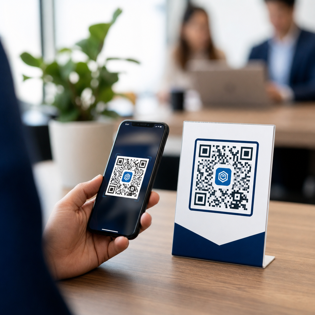
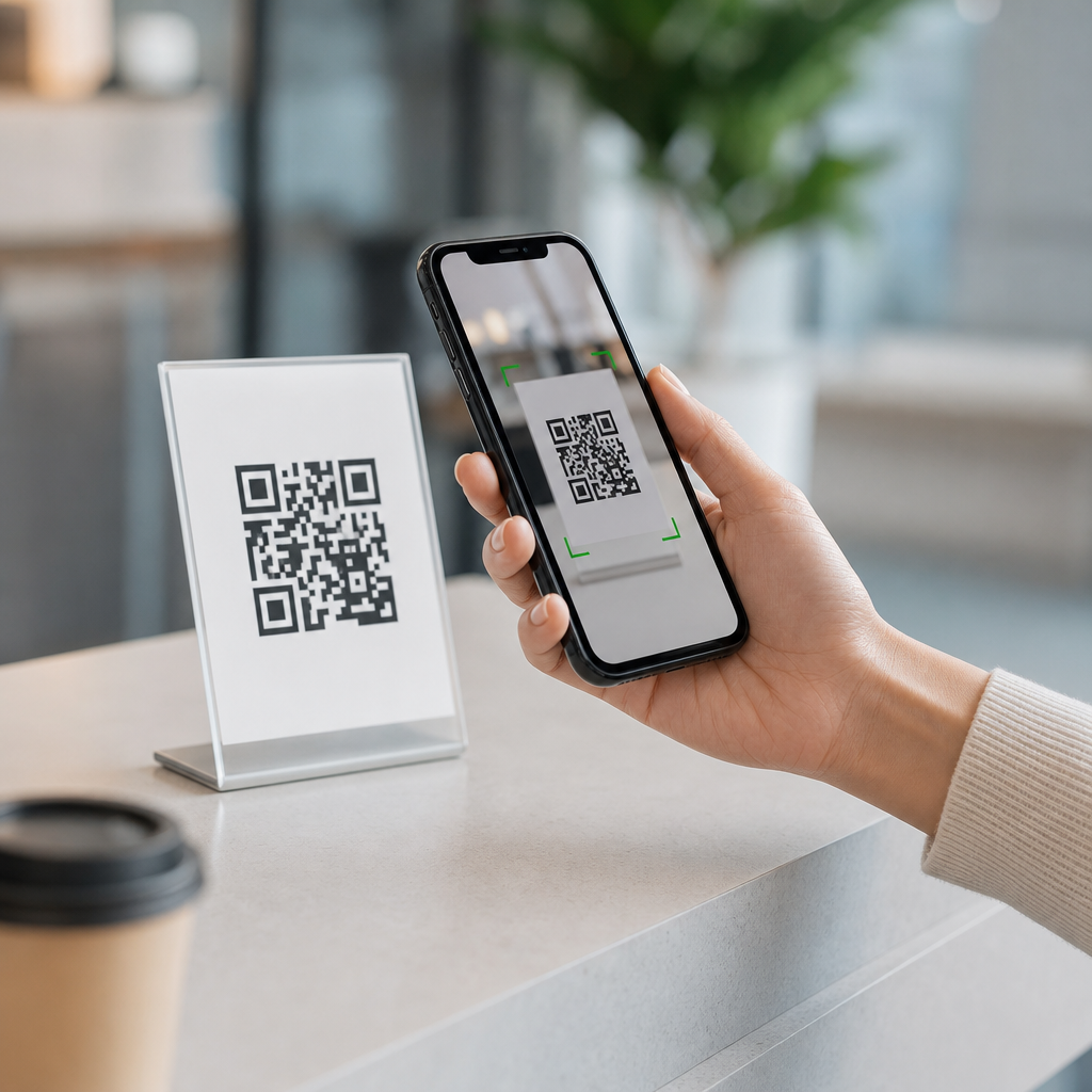
QR code UX is the practice of designing scannable codes, surrounding instructions, and landing experiences so people can move from physical object to digital task with minimal effort. In the context of QR Code Design Best Practices, user experience is not a cosmetic concern; it directly affects scan rate, task completion, and trust. I have tested QR codes on packaging, posters, menus, retail displays, and event signage, and the same pattern appears every time: a technically valid code can still fail if the design ignores distance, lighting, context, or user intent.
A QR code stores machine-readable data, usually a URL, though it can also encode contact details, Wi-Fi credentials, app links, payments, and authentication tokens. UX design for QR codes includes the code itself, the call to action beside it, the material it is printed on, the contrast ratio, the quiet zone, and the page that opens after the scan. Good QR code UX reduces friction at every step. Bad QR code UX creates uncertainty: users wonder what will happen, whether the code is safe, and whether the effort is worth it.
This matters because QR codes now sit at the intersection of offline and digital behavior. Restaurants use them for menus, manufacturers for product registration, healthcare providers for patient forms, retailers for offers, and transit systems for tickets. Smartphone camera apps have made scanning nearly universal, but ubiquity does not guarantee usability. A code can be too small, placed too high, branded too aggressively, or linked to a slow mobile page. When that happens, the problem is rarely the scanner. It is the design system around the code.
As a hub page for QR Code Design Best Practices, this article explains the principles that consistently improve simplicity and speed. It covers scannability, visual hierarchy, placement, branding, instruction design, accessibility, testing, analytics, and security. It also addresses common questions directly: How big should a QR code be? How much customization is safe? Where should it be placed? What should the landing page do first? The answers are practical because effective QR code UX is measurable. If scans increase and users complete the intended action faster, the design worked.
Start with scannability before styling
The first rule of QR code UX is simple: if the code is not instantly scannable, nothing else matters. A QR code works through three core structural elements: finder patterns in three corners, alignment patterns that help the camera correct distortion, and a quiet zone around the symbol. The quiet zone is essential. ISO/IEC 18004, the recognized standard for QR codes, specifies a clear margin around the code equal to at least four modules. When designers crop too tightly to fit a layout, scan reliability drops sharply.
Size should match scanning distance. A dependable field rule is a 10:1 ratio: for every 10 units of viewing distance, provide at least 1 unit of code width. In practical terms, a code scanned from 20 inches away should be about 2 inches wide. On packaging held in the hand, 0.8 to 1.2 inches can work well. On posters viewed from several feet away, 2 to 4 inches is safer. For billboards, much larger is necessary, and in many cases QR use from a moving vehicle is unrealistic regardless of size.
Contrast should be high, with dark modules on a light background. Black on white remains the benchmark because cameras detect luminance contrast more reliably than subtle brand color pairings. In my own tests, navy on cream often scans well, while pale gray on pastel backgrounds fails under indoor lighting. Inverted codes, such as white modules on black, can work on modern phones, but they introduce risk and should be validated across devices. Glossy materials, metallic inks, embossed surfaces, and curved bottles also reduce scan consistency because they distort edges or create glare.
Error correction is useful but often misunderstood. QR codes support four levels: L, M, Q, and H, allowing roughly 7 percent, 15 percent, 25 percent, and 30 percent data recovery. Higher correction can preserve scanning when part of the code is obscured or when a logo is placed in the center, but it also increases symbol density. Dense codes become harder to scan at small sizes. The best practice is to keep the encoded URL short, use dynamic links when possible, and choose the lowest error correction level that still fits the real-world use case.
Design visual hierarchy that tells users what to do
People do not scan a QR code because it exists. They scan because the surrounding design answers three questions immediately: What is this? Why should I scan it? What happens next? Strong visual hierarchy does that work. The code should be visually prominent, but the call to action is equally important. Labels such as “Scan to view the menu,” “Scan to register your warranty,” or “Scan for assembly video” consistently outperform generic prompts like “Scan me” because they define the reward.
Placement of copy matters. The most effective layouts pair a short headline, a supporting line, and the code in one unified block. I prefer placing the headline above the code and a concise reassurance below it, such as “No app required” or “Takes 30 seconds.” This lowers uncertainty. On event signage, adding a recognizable icon or small phone illustration can help less confident users identify the action. On premium packaging, restraint is fine, but the code still needs context. A naked code with no explanation looks like a production artifact, not a user pathway.
Trust cues improve scan behavior. Users hesitate when they suspect spam, tracking, or malware. Brand ownership reduces that friction. Putting the company name near the code, using a branded short domain, and linking to a secure HTTPS page all help. If the destination includes sensitive steps such as payment or account access, say so clearly and direct users to verify the domain after the scan. In retail, I have seen return rates improve when inserts say “Scan for official setup guide at brandname.com” instead of using an anonymous URL shortener.
Consistency across touchpoints also matters. If every product line uses a different QR style, label, and destination pattern, users have to relearn the interaction. A scalable design system defines module color rules, minimum sizes, approved logo treatments, CTA templates, and mobile landing patterns. That system becomes the internal link structure of the subtopic itself: packaging QR standards connect to print production guidance, campaign analytics, mobile page optimization, and accessibility requirements. Treat QR Code Design Best Practices as a repeatable framework, not a one-off graphic task.
Choose placement and context for real-world scanning conditions
QR code placement should match the moment of use. On a shipping box, the code should sit where the customer naturally looks during unboxing, not underneath a flap or near shipping labels that create visual noise. On restaurant tables, the code should remain visible when plates and glasses arrive. On posters, it should be between waist and eye level so people can scan without awkward camera angles. On shelf talkers, leave room for a shopper to stand close enough without blocking traffic.
Environmental factors affect scan speed more than many teams expect. Low light, direct sunlight, reflective laminate, textured paper, and motion all reduce camera confidence. A transit poster in a dim station needs larger size and stronger contrast than the same artwork in a bright store. A QR code on a bus shelter must still scan when the glass has fingerprints and the viewer is wearing polarized sunglasses. These constraints are why proofs on a designer’s monitor are not enough. Print the piece at final size and test it in the intended setting.
The table below summarizes practical placement decisions I rely on during reviews.
| Use case | Recommended size | Best placement | Key UX note |
|---|---|---|---|
| Product packaging | 0.8–1.2 in | Side or back panel near instructions | Keep away from seams, curves, and glossy folds |
| Table menu | 1.2–1.5 in | Center table tent or top-right menu area | Add “No app required” and menu language cue |
| Retail poster | 2–3 in | Chest to eye level | State benefit, not just action |
| Trade show sign | 3–4 in | Near lead capture message | Offer instant value such as brochure or demo booking |
| Direct mail | 1–1.5 in | Next to personalized offer copy | Match destination to campaign segment |
Context also changes user intent. Someone scanning a museum label wants quick interpretation. Someone scanning a machine label may need safety documentation, maintenance logs, or spare part numbers. Someone scanning a coupon expects redemption instructions immediately. Design the entire interaction around that intent. The faster users can predict the outcome, the faster they commit to scanning.
Balance branding with readability
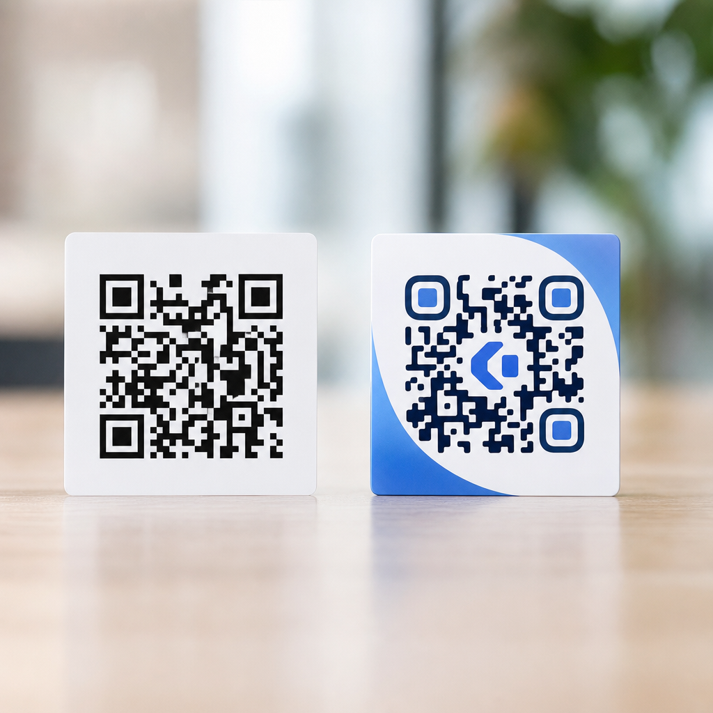
Brand customization is valuable because it can increase recognition and make a QR code look intentional rather than generic. The problem starts when aesthetics override readability. Safe customization usually includes modest color changes, a small centered logo, and frame treatments that do not invade the quiet zone. Risky customization includes low-contrast palettes, decorative module shapes that blur together, heavy gradients, transparent backgrounds over busy imagery, and oversized logos that cover core data areas.
When teams ask how far they can push a branded QR code, my answer is always the same: test the exact file, at final size, on target devices, under realistic light. A code that scans on a flagship iPhone in a bright studio may fail on a midrange Android in a restaurant at night. Tools such as QR Code Generator, Bitly, Beaconstac, and Adobe Express make customization easy, but convenience can hide structural problems. Before approval, run scans on both operating systems, multiple camera apps, and at varied distances.
Remember that brand expression is broader than the code artwork. A plain black-and-white code can still feel premium when placed inside a strong brand system with clean typography, confident copy, and a polished landing page. Conversely, an ornate code cannot rescue a poor destination. If the scan opens a cluttered mobile page full of pop-ups, the brand loses credibility immediately. In practice, the highest-performing branded QR executions are usually the least flashy. They look deliberate, readable, and trustworthy.
Optimize the destination for mobile speed and task completion
The QR scan is only the handoff. The real user experience begins on the landing page. Because most scans occur on mobile devices, the page should load quickly, match the promise of the call to action, and present one primary task. If the code says “Scan for setup video,” the page should open directly to the video, not to a generic homepage. If it says “Scan to claim 10% off,” the coupon or redemption flow should appear immediately. Mismatched expectations are one of the fastest ways to waste scans.
Performance matters. Google’s Core Web Vitals offer a useful lens here: users benefit when the largest content appears fast, the page responds promptly, and layout does not jump around. Compress images, reduce scripts, and avoid autoplay elements that delay interaction. Keep forms short. Use autofill where appropriate. If login is necessary, explain why before users hit a wall. On multilingual products, detect locale carefully or offer a clear language selector first. The destination should never feel like a detour.
Accessibility belongs at this stage as well. Color contrast, readable type, focus order, alt text for supporting imagery, and clear button labels all support completion. If the QR code leads to a PDF, make sure the PDF is mobile readable and properly tagged. If it leads to video, include captions. Accessibility is not separate from speed; when content is easier to parse, users move through it faster. For regulated sectors such as healthcare, finance, or public services, this is both a UX requirement and a compliance consideration.
Measure, test, and improve continuously
Effective QR code UX is iterative. Static codes are fine for permanent information, but dynamic QR codes are often better for campaigns because they allow destination changes, scan analytics, and A/B testing without reprinting. Track scans by location, date, device type, and conversion event. UTM parameters, analytics platforms such as Google Analytics 4, and dashboard tools in providers like Bitly or Beaconstac can show where the funnel breaks. High scans with low completion usually indicate a landing-page issue. Low scans often point to placement, copy, or trust problems.
Testing should include more than whether the code scans once. Measure time to first successful scan, distance tolerance, low-light performance, and task completion rate after the page loads. Compare CTA variants. For example, “Scan for care instructions” may underperform “Scan for washing guide and stain tips” because the second promise is more concrete. In one packaging project, increasing code size by 20 percent and adding a one-line benefit statement improved scan volume materially without changing the destination at all.
Security and governance complete the picture. QR phishing is real, especially in public spaces where malicious stickers can replace legitimate codes. Use tamper-evident placement when possible, audit destinations regularly, maintain HTTPS, and avoid opaque shorteners that hide brand identity. Internally, document ownership, version control, redirect policies, and retirement rules for expired campaigns. A QR code is not just a graphic asset. It is a live access point into your digital ecosystem. Managing it carefully protects users and preserves performance over time.
QR code UX succeeds when every layer of the experience is designed for clarity, trust, and speed. The code must be easy to scan, the message must explain the value, the placement must fit the real environment, the branding must support readability, and the landing page must complete the promise without friction. Those are the foundations of QR Code Design Best Practices, and they apply whether you are building packaging flows, in-store campaigns, event materials, or service documentation.
The biggest takeaway is that simplicity is engineered, not improvised. Teams get better results when they use clear size rules, maintain strong contrast, protect the quiet zone, write specific calls to action, and test on actual devices in actual conditions. They also improve outcomes when they treat the post-scan page as part of the same journey rather than a separate web project. Users do not distinguish between print design and mobile UX. They experience one continuous interaction, and any weak point can break it.
If you are building a QR Code Design & Branding program, use this page as the hub standard for every implementation. Audit your current codes, document a reusable design system, and test the full path from first glance to final conversion. Small adjustments often produce meaningful gains in scan rate and completion. Start with one high-value use case, measure the results, and refine from there.
Frequently Asked Questions
What does QR code UX actually include beyond the code itself?
QR code UX includes every part of the scanning journey, not just the square pattern. A good experience starts with whether people notice the code, understand what it is for, trust it enough to scan, and can physically scan it without awkward positioning or poor lighting. It also includes the instructions around the code, the call to action, the placement on the object, the size of the code, the contrast, the available scanning distance, and the environment where the code appears. If a code is printed on glossy packaging, mounted too high on event signage, or placed where shadows or reflections interfere, the experience breaks down before the user even reaches the digital step.
Just as important is what happens after the scan. The destination page, app flow, form, menu, coupon, or product detail page must load quickly and match the user’s expectation. If someone scans a code on a restaurant table, they expect a mobile-friendly menu immediately, not a slow homepage or a confusing navigation path. In practice, QR code UX is the design of a complete transition from physical context to digital action. That is why it directly affects scan rate, completion rate, and trust. A technically readable code can still fail if the surrounding experience creates hesitation, confusion, or extra work.
Why do some QR codes scan poorly even when they are technically valid?
Technical validity only means the encoded information can be read under suitable conditions. In real-world settings, users rarely scan under ideal conditions. A code may scan poorly because it is too small for the expected viewing distance, printed with low contrast, distorted by design customization, placed on a curved surface, or affected by glare, wrinkles, or low light. In retail, packaging, posters, and menus, these issues show up constantly. The code may be “correct” in a file, but once it is printed and used in context, performance can drop sharply.
Another common reason is poor placement and weak guidance. If users have to hunt for the code, tilt their phone at an odd angle, or guess what the scan will do, the friction increases immediately. Even a fraction of uncertainty can stop people from trying. Some failures also happen after the scan, which users often interpret as a bad QR code. If the landing page is slow, not mobile-optimized, blocked by pop-ups, or asks for too much information too soon, users abandon the task and remember the scan as unsuccessful. That is why testing a QR code should never stop at “the camera recognizes it.” It should include the real printing method, real placement, real lighting conditions, and the full mobile experience from scan to completion.
What are the most important design best practices for making QR codes simple and fast to use?
The strongest best practices are clarity, visibility, and minimal effort. Start with a high-contrast code, ideally dark on a light background, with enough quiet space around it so phone cameras can detect it easily. Make the code large enough for the distance at which it will be scanned. A code on packaging held in the hand can be smaller than a code on a wall, window, or overhead sign. Avoid excessive visual customization that interferes with readability, and be careful with gradients, busy backgrounds, or logo treatments that reduce scanning reliability. The goal is not to make the code look clever; the goal is to make it work instantly.
Next, pair the code with a clear call to action that tells users exactly what they will get, such as “Scan to view the menu,” “Scan for setup instructions,” or “Scan to claim your discount.” This reduces hesitation and builds trust. Place the code where it is easy to approach and scan naturally, without requiring users to bend, reach, rotate an object, or block other people. Then make sure the destination is fast, mobile-first, and closely aligned with the promise on the sign or packaging. Remove unnecessary steps, keep forms short, and avoid dumping users onto a generic homepage. The simplest QR experiences feel almost invisible because the user moves from intent to task completion in seconds.
How can businesses improve trust so more people feel comfortable scanning a QR code?
Trust is one of the biggest drivers of QR code performance. People are far more likely to scan when they understand who is offering the code, what will happen next, and why the action is worth their time. The first step is to make the source obvious. Put the code next to recognizable branding, product context, or venue information so it does not feel random or suspicious. A clear call to action also helps because it answers the user’s first question: “What do I get if I scan this?” When that value is stated plainly, users feel more in control.
The post-scan experience matters just as much. Send users to a secure, branded, mobile-friendly destination that loads quickly and delivers exactly what was promised. Avoid bait-and-switch experiences, aggressive pop-ups, excessive permissions, or long lead forms at the start. If users scan for a menu, show the menu. If they scan for product details, show those details immediately. Consistency between the physical message and the landing page reassures users that the interaction is legitimate. Businesses can also strengthen trust by keeping URLs clean, using known domains, and avoiding cluttered designs that make the code look promotional or dubious. Over time, reliable experiences train users to scan with confidence, while one misleading or frustrating interaction can reduce willingness to scan again.
How should QR code UX be tested before launching on packaging, signage, or printed materials?
Testing should reflect the actual environment, not just a quick check on a designer’s screen. Start by printing the code at final size and placing it on the real material whenever possible. Test from the expected scanning distance, at different times of day, and under different lighting conditions. Check whether glare, shadows, surface texture, or curvature affect readability. Test with multiple phone models and camera apps because performance can vary across devices. If the code will appear in a crowded or fast-moving environment, such as retail displays or event signage, test whether people can notice it, understand it, and scan it without blocking traffic or stopping awkwardly.
You should also test the complete user flow after the scan. Measure load time, page stability, readability on mobile, form completion effort, and whether users can finish the intended task without confusion. Watch where they hesitate. Do they ask what the code does? Do they reposition their phone several times? Do they abandon after landing on the page? These are UX failures even if the code itself scans. The best testing combines technical checks with behavioral observation. A successful QR code is not one that merely decodes; it is one that helps real people move from physical object to digital outcome quickly, confidently, and with almost no friction.