Bad QR code campaigns fail for predictable reasons, and the patterns are useful because every mistake points to a better way to plan, test, and measure the next launch. A QR code campaign is any marketing, service, or engagement effort that asks people to scan a code with a phone to reach content, unlock an offer, complete a transaction, or continue an offline experience online. The format looks simple, but execution is not. In practice, performance depends on placement, contrast, destination speed, mobile usability, tracking, incentive design, and trust. I have reviewed campaigns on packaging, retail signage, out of home media, direct mail, events, restaurant tables, product manuals, and field-service decals, and the same issues surface again and again. Teams focus on generating the code itself, then underestimate everything around it. That gap is where most failures begin.
Why does this matter? Because QR codes compress a full user journey into one tiny square. If the scan fails, the landing page loads slowly, the form is too long, or the offer feels unclear, the entire campaign breaks in seconds. Consumer familiarity with scanning is high, but patience is low. A strong QR code campaign reduces friction and creates continuity between physical context and digital action. A weak one wastes paid media, burns print budgets, frustrates users, and produces misleading data. This hub explains the most common failures and the lessons they teach, so future campaign ideas are built on evidence rather than assumption.
The most common causes of QR code campaign failure
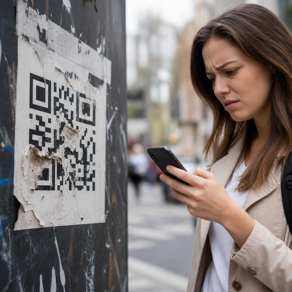
The first lesson from bad QR code campaigns is that technical readability is nonnegotiable. Codes fail when they are too small, distorted, placed on curved surfaces, printed with low contrast, covered by glare, or positioned where people cannot safely stop and scan. Industry guidance varies by environment, but practical field testing matters more than generic rules. A code on a moving bus, for example, needs a different size and placement strategy than a code on a tabletop tent card. I have seen teams approve beautiful designs with inverted colors, branded patterns, and oversized logos in the center, only to discover that older phone cameras or low-light conditions cut scan rates dramatically. Decoration is not harmless when it compromises error correction and contrast.
The second major cause is a mismatch between context and destination. People scan because they expect immediate relevance. If a QR code on product packaging sends users to a generic home page instead of assembly instructions, registration, ingredients, warranty support, or a product-specific offer, the experience feels lazy. The same applies in restaurants, where table codes often lead to bloated PDF menus not optimized for mobile screens. In retail, a shelf tag code that opens a desktop category page instead of product comparison information usually gets abandoned. A QR code should continue the exact moment the customer is in, not restart the journey from scratch.
The third cause is weak value exchange. Many failed campaigns ask users to scan without explaining what they will get. “Scan me” is not a call to action; it is a design placeholder. Strong campaigns state the benefit in plain language: watch a 30-second demo, claim 15% off today, see setup steps, check live inventory, enter the giveaway, or verify authenticity. In postmortems, low-performing codes often had acceptable placement and decent scanability, but almost no motivation. The code was visible, yet the benefit was invisible.
The fourth cause is poor measurement. Static QR codes linked directly to final URLs without campaign parameters make attribution difficult. Some teams count scans but do not distinguish unique users, repeat scans, bounce rate, completion rate, or downstream revenue. Others never compare placement versions, CTA wording, or destination formats. Without clean measurement, a bad campaign can look good because scans occurred, or a promising test can be canceled because success was defined too narrowly. Effective QR reporting tracks the full funnel from scan to desired action.
What real campaign failures usually look like
Most failed QR code campaigns are not dramatic disasters; they are quiet underperformers. A poster in a transit station gets thousands of impressions but only a handful of scans because the code is mounted too high and commuters keep moving. A direct mail piece generates scans, but half the visitors drop because the page demands account creation before showing the promised offer. An event booth prints a code to capture leads, then the venue Wi-Fi collapses and prospects walk away. A consumer packaged goods brand adds a code for recipe ideas, but the destination is geoblocked in some markets, creating a dead end for legitimate buyers. Each case seems different on the surface, yet the root issue is the same: the campaign was designed from the brand’s perspective instead of the user’s moment.
I have also seen failures caused by governance issues. Large organizations often route QR production through multiple teams: brand, legal, packaging, media, analytics, web, and local operators. When ownership is unclear, old URLs remain live, redirects stack up, and no one checks whether the code still points to current content months later. This is especially common in franchise and field marketing environments. A code placed in stores can outlive the campaign landing page, creating 404 errors long after materials are printed. Dynamic QR code management helps, but only when someone maintains the destination inventory and review calendar.
| Failure pattern | What users experience | Primary lesson |
|---|---|---|
| Code is hard to scan | Camera cannot lock, glare blocks reading, distance is wrong | Test print size, contrast, angle, and environment before launch |
| Generic destination page | User lands on home page and must search manually | Match destination to the exact physical context |
| No clear CTA | User sees a code but no reason to scan | State the benefit beside the code in specific language |
| Slow or broken mobile page | Long load time, PDF pinch-zoom, form abandonment | Optimize for mobile speed and one-task completion |
| Weak analytics setup | Team knows scan volume but not business impact | Track unique scans, conversion, and revenue outcomes |
Design and placement mistakes that ruin scan rates
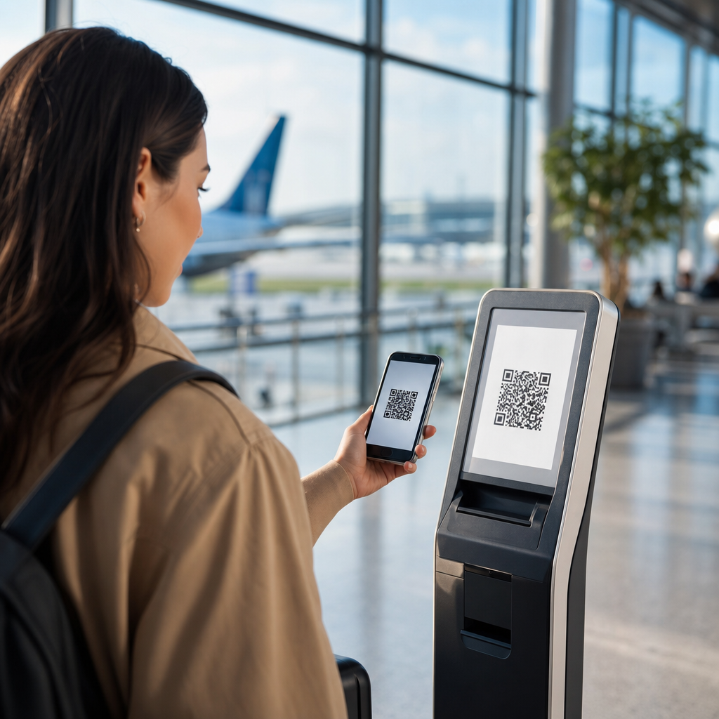
Design mistakes are the easiest failures to prevent and the most common to ignore. The code must be large enough for expected scanning distance, surrounded by quiet space, and printed with strong contrast against the background. Glossy surfaces, window glare, wrinkled labels, and folds across the symbol regularly reduce readability. On packaging, seams and curves are frequent problems. On out of home placements, height and dwell time matter more than visual novelty. A code on a roadside billboard is usually a poor idea because drivers should not scan while moving, and passengers often cannot focus long enough. In contrast, airport lounges, waiting rooms, point-of-sale counters, museum labels, and trade show booths often work well because people are stationary.
Branded QR code styling needs restraint. Error correction levels can absorb some customization, but not unlimited visual experimentation. The safest approach is to validate codes across multiple devices, lighting conditions, and camera apps. Test with older Android phones, not only the latest iPhone. Test from real angles, not flat on a designer’s monitor. Print samples at production quality, because exported artwork may scan perfectly on screen and fail after ink spread, laminate, or substrate changes. A design approval process that includes scan testing in the final environment prevents expensive reprints.
Destination experience failures after the scan
A successful scan only earns the right to keep the user for a few more seconds. Many bad QR code campaigns lose people immediately after the landing page opens. The biggest problem is mobile friction. Pages should load quickly on cellular connections, avoid intrusive pop-ups, and present one primary action. If the user scanned for setup instructions, show the instructions first. If the user scanned for a coupon, show the coupon without forcing unnecessary navigation. If the user scanned from packaging, the page should acknowledge the product and context they came from. Relevance is not a nice extra; it is the core of conversion.
Forms are another frequent failure point. Long lead forms kill response rates, especially in field environments. Asking for full address details, job title, company size, and marketing permissions before delivering basic promised value is a common mistake. Progressive profiling works better. Capture the minimum needed for the first conversion, then ask for more later if the relationship continues. Payment flows, app-download walls, mandatory logins, and autoplay video can also depress performance. The best destination experience feels like a continuation of the scan, not an obstacle course added by internal stakeholders.
Trust, privacy, and security lessons brands often miss
People know QR codes can be abused, so trust signals matter. A code without surrounding brand context, domain clarity, or benefit explanation can feel suspicious. This problem grows in public places where malicious sticker overlays are possible. Brands should inspect physical placements regularly, use secure domains, and avoid unnecessary URL shorteners that hide the destination. If personal data is collected, disclose why, what happens next, and how the information will be used. Where consent is required, the page must present it clearly. For regulated sectors such as healthcare, finance, alcohol, and promotions involving minors, compliance review is not optional.
There is also a practical trust issue: expectation setting. If a code opens WhatsApp, a payment screen, a map app, or a file download, say so beside the code. Users resent surprises, especially when mobile data, permissions, or third-party apps are involved. Transparency increases scan confidence and filters out low-intent traffic. In my experience, simple labels like “Opens menu,” “Starts chat,” or “View installation guide” often improve qualified engagement because they reduce ambiguity.
Measurement, testing, and operational discipline
The most valuable lesson from failed QR code campaigns is that success comes from process, not from the code image itself. Use dynamic codes when possible so destinations can be updated without reprinting. Add campaign parameters consistently. Separate placements by audience, creative, location, or partner so performance can be compared honestly. Monitor not just scans, but unique visitors, engaged sessions, completion events, assisted conversions, and revenue. In retail and out of home, compare scan data with footfall, sales lift, and location timing to avoid reading too much into raw volume.
Testing should happen before and during the campaign. Before launch, verify scanability, page speed, redirect health, analytics firing, and device compatibility. During launch, audit real placements, watch user behavior, and refine the destination based on drop-off points. Tools such as Google Analytics 4, Adobe Analytics, Bitly, and enterprise QR management platforms can support this, but tools do not replace ownership. One team needs responsibility for inventory, uptime, redirect hygiene, archival rules, and periodic review. That is how organizations avoid the slow decay that turns a decent campaign into a bad long-tail experience.
As a hub for failures and lessons learned, this topic should shape every future QR code campaign idea and case study you review. The main takeaways are straightforward: make codes easy to scan, place them where people can actually use them, explain the benefit clearly, send users to a fast mobile destination matched to context, and measure the complete journey. Most bad QR code campaigns are not caused by lack of creativity. They are caused by avoidable friction, unclear ownership, and weak empathy for the person holding the phone.
The benefit of learning from failed QR code campaigns is simple: you can improve results before spending more on print, media, packaging, or event production. Every bad example leaves a checklist for the next launch. Use that checklist. Audit existing codes, fix broken destinations, tighten CTAs, retest placements, and build reporting that connects scans to business outcomes. Then apply those lessons across the rest of your QR Code Campaign Ideas & Case Studies content so each new campaign starts smarter than the last one.
Frequently Asked Questions
What are the most common reasons QR code campaigns fail?
The biggest failures in QR code campaigns usually come down to planning gaps, not the technology itself. Teams often assume that if a code scans, the campaign is ready. In reality, a successful campaign depends on several connected factors: where the code appears, how easy it is to notice, whether the design preserves enough contrast for reliable scanning, what happens after the scan, and how the campaign is tracked and measured. A code placed too high on a wall, printed too small on packaging, or shown briefly in a fast-moving video may be technically functional but practically unusable.
Another common issue is sending users to a poor destination experience. If the landing page loads slowly, is not mobile-friendly, asks for too much information, or does not match the promise made near the code, people drop off immediately. Bad campaigns also fail when there is no clear value exchange. Users need an obvious reason to scan, such as accessing a menu, unlocking a discount, viewing product details, registering for an event, or continuing an offline interaction online. Without a compelling incentive, the code becomes visual clutter instead of a meaningful call to action.
Measurement problems are also a major source of failure. Many campaigns launch without proper tracking parameters, scan analytics, or conversion goals. That makes it difficult to know whether poor performance is caused by low visibility, weak messaging, technical friction, or a disappointing offer. The lesson is simple: bad QR code campaigns are rarely random. They usually fail because teams overlook the real-world conditions around scanning and the full user journey that follows.
How does QR code placement affect campaign performance?
Placement is one of the most important and most underestimated variables in QR code marketing. A well-designed code can still underperform if it is positioned in a location that makes scanning awkward, unsafe, or inconvenient. People need enough time, space, and physical access to hold up a phone, open a camera, and complete the scan. That means a code on a billboard along a highway, a sign behind reflective glass, a poster in a crowded walkway, or packaging displayed on a high retail shelf may all create unnecessary friction. If the environment does not support an easy scan, response rates fall quickly.
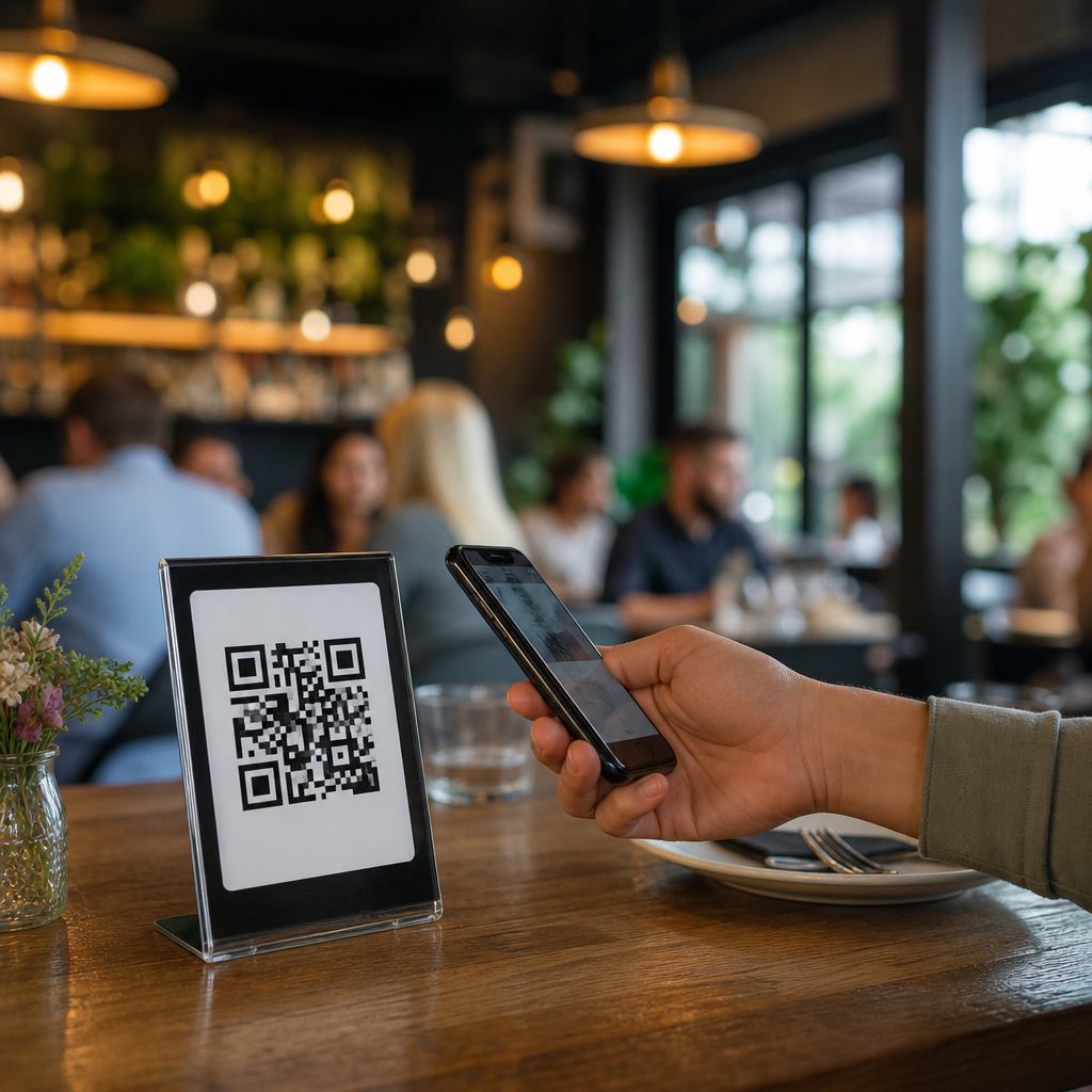
Effective placement also depends on the user’s context. In a restaurant, a table tent or menu insert can work well because people are stationary and already expecting to interact. At an event, a code near an entrance may perform differently from one near a booth where staff can explain the benefit. In direct mail, the code should appear where it is easy to spot and accompanied by a short explanation of what happens next. In outdoor advertising, scan distance, lighting conditions, and the amount of time someone has to react are critical considerations. The right placement is always tied to how the audience is expected to behave in that moment.
The best lesson from weak placements is that visibility alone is not enough. A QR code must be scannable in the real environment where it appears. That means testing the code at actual size, in actual lighting, from realistic viewing angles, and with different phone models. Good campaigns do not treat placement as a design decision only. They treat it as a usability decision that directly affects conversion.
Why is the landing page or destination experience so important after someone scans?
The scan is only the beginning of the interaction. If the destination experience is weak, the campaign fails even if the code itself performs well. People scan because they expect speed, convenience, and relevance. When they reach a page that loads slowly, displays poorly on mobile, requires extra clicks, or feels disconnected from the message that prompted the scan, trust drops immediately. Every second of delay and every extra step increases abandonment, especially because most QR interactions happen on phones in environments where attention is limited.
A strong destination experience should feel like a natural continuation of the scan prompt. If the code promises a coupon, the user should land directly on the offer. If it promises product information, the content should be immediately accessible without forcing a generic homepage visit. If the goal is registration, payment, or form completion, the process should be short, mobile-optimized, and easy to understand. This is where many bad QR code campaigns reveal their biggest flaw: the team focuses on getting the scan but does not map the post-scan experience with the same care.
There is also a measurement advantage to a well-built destination. When landing pages are structured properly, marketers can track scan sources, user behavior, drop-off points, and conversion outcomes. That makes future improvements far easier. In practical terms, the lesson from bad campaigns is that a QR code should never point somewhere vague, broken, or generic. It should connect users to a fast, mobile-first, purpose-built destination that fulfills the promise made before the scan.
What testing should be done before launching a QR code campaign?
Thorough testing should cover much more than whether the code opens a link. First, teams should test scan reliability across multiple devices, camera apps, and operating systems. A code may scan perfectly on one newer phone but struggle on older devices or under less ideal lighting. The printed or displayed version should be tested at final size, with final colors, on the real material it will appear on, whether that is paper, packaging, signage, digital screens, or product labels. Contrast, quiet zone spacing, image distortion, glossy surfaces, and curved materials can all affect results.
Second, the full user journey should be tested from the audience perspective. How quickly can someone understand why they should scan? Is there a clear call to action next to the code? Does the destination load quickly on mobile data, not just office Wi-Fi? Are forms easy to complete on a small screen? Does the page display correctly in portrait and landscape modes? If the campaign includes location-specific offers, time-sensitive content, payments, or app deep links, those pathways should be tested repeatedly under realistic conditions.
Third, analytics and fallback planning should be validated before launch. Tracking parameters should be confirmed, dashboards should be ready, and conversion events should be firing correctly. Teams should also check what happens if a user cannot scan the code. Providing a short URL or simple alternative path can reduce lost opportunities. One of the clearest lessons from bad QR code campaigns is that many failures could have been prevented by disciplined pre-launch testing. The more a campaign relies on people acting quickly and independently, the more important it is to remove every avoidable point of friction before it goes live.
How can marketers measure and improve QR code campaigns after launch?
Improvement starts with tracking the right metrics, not just counting scans. Scan volume is useful, but it is only the top of the funnel. Marketers should also measure scan rate relative to exposure, landing page engagement, bounce rate, time on page, form starts, purchases, sign-ups, downloads, or whatever conversion action defines success for the campaign. If possible, data should be segmented by placement, location, format, audience, and creative variation. A code on product packaging may behave very differently from the same code on a poster or event badge, and that difference is where optimization opportunities appear.
It is also important to connect performance back to campaign variables. Low scans may point to weak placement, poor visibility, or unclear messaging. High scans but low conversions often indicate a bad destination experience or a mismatch between the call to action and what users find after scanning. Time-based patterns can reveal whether certain environments or moments drive stronger intent. Geographic performance can help identify store-level, venue-level, or market-level differences. Dynamic QR codes are especially useful because they allow destination updates and tracking refinement without reprinting the code.
The most effective teams treat each campaign as a feedback loop. They review what worked, what created friction, and what can be changed quickly. That may mean adjusting the offer, rewriting the nearby instructions, improving page speed, changing placement height, simplifying the form, or tailoring content to the context of the scan. The core lesson from bad QR code campaigns is not simply that mistakes happen. It is that those mistakes are often highly diagnosable. When marketers measure the complete journey and respond to the data, each underperforming campaign becomes a practical guide for building a stronger next launch.