Failed QR code campaign examples reveal a simple truth: the technology rarely fails on its own, but planning, context, and execution often do. A QR code campaign is any marketing, service, or engagement effort that uses a scannable matrix barcode to move someone from a physical touchpoint to a digital action, such as visiting a landing page, downloading an app, claiming an offer, or viewing product information. Failure, in this context, does not always mean a public disaster. More often, it means poor scan rates, abandoned sessions, broken links, inaccessible experiences, weak attribution, or customer frustration that quietly erodes trust.
This topic matters because QR codes now sit at the intersection of offline media, mobile behavior, payments, retail operations, events, packaging, and customer support. Since smartphone cameras began recognizing QR codes natively on iOS and Android, adoption barriers dropped sharply. Brands responded by placing codes on posters, direct mail, restaurant tables, in-store displays, product packaging, TV ads, and even moving vehicles. I have audited campaigns where the printed creative looked polished, yet the code led to a non-mobile page, a generic homepage, or an expired promotion. In every case, the organization assumed the code itself created engagement. It did not.
Failed QR code campaign examples are especially useful because they show where cross-channel marketing breaks down. A person scanning a code is usually acting in the moment: standing in a store aisle, waiting at a transit stop, watching a commercial, or opening a package. That is high-intent behavior. If the destination is slow, irrelevant, confusing, or unsecured, the opportunity is gone. Unlike many digital mistakes, QR errors are costly because physical materials are difficult to fix after distribution. A typo in paid search can be edited in minutes. A broken QR code on 200,000 printed mailers becomes an expensive lesson in quality control.
Understanding these failures helps marketers, retailers, event teams, and operators design campaigns that are measurable and usable. It also helps teams build stronger subtopic strategies around testing, accessibility, landing page design, analytics, dynamic codes, compliance, and post-campaign review. The core lesson is consistent: a successful QR code campaign depends less on novelty and more on operational discipline, user experience, and contextual relevance.
Why QR code campaigns fail even when the code scans correctly
The most common failure pattern is not an unreadable code. It is a readable code attached to a weak customer journey. Teams often celebrate that the code “works” because a scanner opens a URL, but that is only the first technical checkpoint. A campaign succeeds when the user completes the intended action with minimal friction. If the code opens a desktop page with tiny text, requires too many taps, asks for unnecessary form fields, or sends users to a generic homepage, the campaign underperforms despite perfect scan functionality.
I have seen this repeatedly in retail displays. A shelf talker invites shoppers to “scan to learn more,” but the destination page gives no immediate product details, no pricing context, and no clear call to action. The user expected ingredient information, comparison charts, or customer reviews. Instead, they land on a broad brand site and abandon. This is a relevance failure, not a scanning failure. The same applies to event signage that sends attendees to an app store rather than deep-linking to the registration page, venue map, or session schedule they actually need.
Another issue is environmental mismatch. A code placed on a subway platform may technically scan, but if mobile connectivity is weak and the landing page is heavy with scripts, autoplay video, or large images, the experience collapses. Marketers must design for the context of use, not for ideal conditions in an office conference room. QR code campaigns live in real spaces with glare, movement, distance, poor signal, limited time, and varied user confidence.
Measurement mistakes also hide failure. Some teams use static codes linked directly to final URLs with no UTM parameters, redirect management, or event tracking. They cannot distinguish scans by placement, creative variant, geography, or time period. Without clean attribution, they may misread a weak campaign as acceptable because downstream traffic blends into other channels. A QR initiative without measurement discipline is a black box.
Common failed QR code campaign examples and the lesson behind each one
Across audits, postmortems, and public examples, most failures cluster into a handful of repeatable categories. The examples below capture the patterns that matter most.
| Failure example | What went wrong | Practical lesson |
|---|---|---|
| Poster code leads to homepage | User intent is ignored; no message match | Send scanners to a dedicated landing page that continues the exact offer or promise |
| Restaurant menu QR opens a PDF | Slow load, poor mobile readability, no accessibility controls | Use responsive menu pages with live text, searchable sections, and optimized images |
| TV commercial flashes a code briefly | Insufficient scan time and motion-related difficulty | Keep the code on screen long enough, enlarge it, and pair it with a short URL |
| Packaging code links to expired promotion | Campaign life cycle outlasts the printed asset | Use dynamic QR codes and redirect governance for evergreen packaging |
| In-store code requires app download first | Too much friction before value appears | Deliver immediate value in the browser, then invite app installation later |
| Billboard code placed too high or too small | Physical scanning distance makes use unrealistic | Design for expected viewing distance, speed, and safety constraints |
| Direct mail code opens unsecured or broken page | Trust collapses when security warnings appear | Maintain HTTPS, test redirects, and monitor links continuously after launch |
Each example reflects a broader lesson. QR codes magnify weak planning because they compress user patience. A person who scans is giving permission for one next step, not an obstacle course. When marketers fail to respect that moment, scan intent turns into drop-off.
Print, outdoor, and packaging mistakes that sabotage response
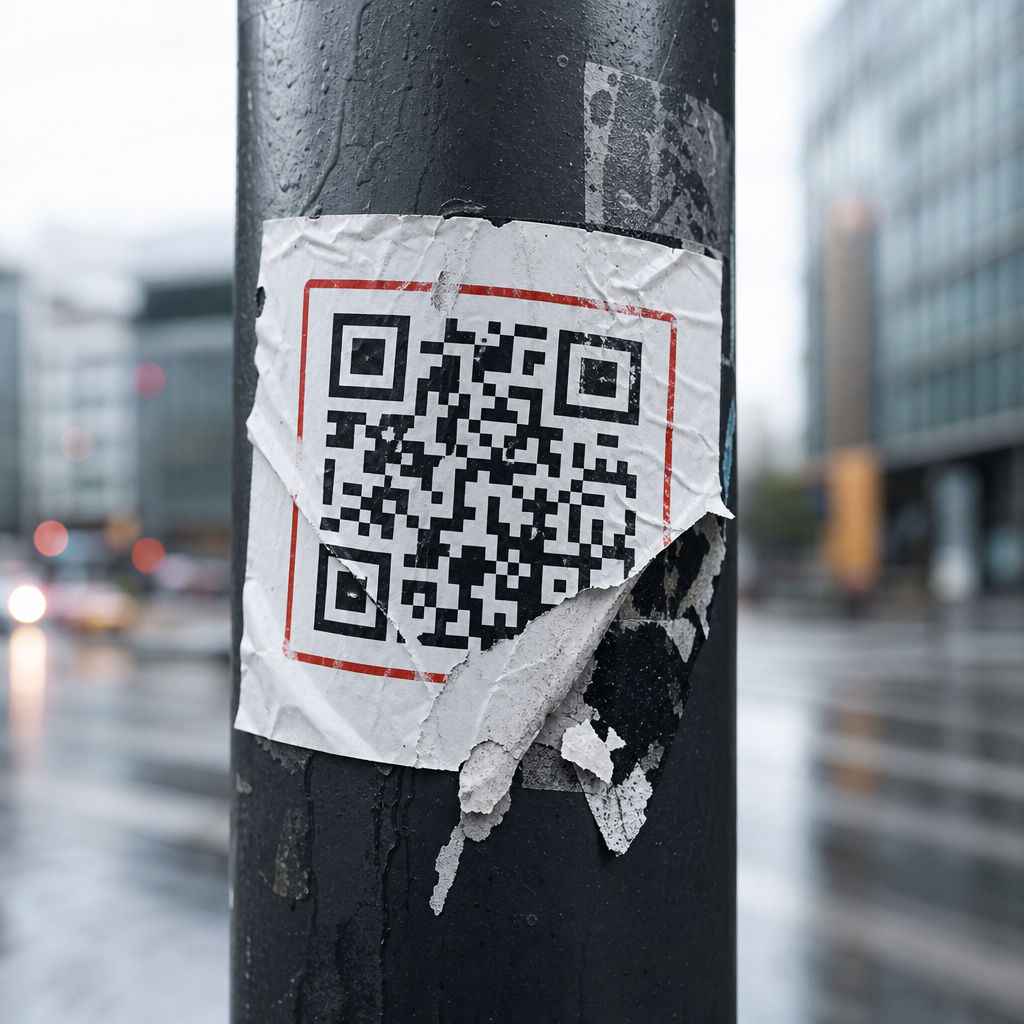
Physical production errors account for many failed QR code campaign examples. Quiet zones are a classic issue. Every QR code needs adequate blank space around the symbol so scanners can isolate it from surrounding design elements. Designers sometimes embed codes into busy artwork, place them over gradients, or decorate them until contrast and readability suffer. Brand customization is possible, but only within tolerance. Error correction can help, yet it does not excuse poor design decisions.
Size and distance are equally important. A practical rule used in production is roughly one inch of code width for every ten inches of scanning distance, though environmental factors matter. A code on a product label can be small because the user holds it close. A code on a window poster, bus shelter, or trade show banner must be larger. On billboards, many codes fail because they ask for a behavior that is physically unsafe or impossible. If the viewer is driving or too far away to scan comfortably, the placement is strategically unsound regardless of visual appeal.
Packaging creates another trap: shelf life. A seasonal campaign may be printed on cartons or labels that remain in distribution for months. If the destination page expires, scanners encounter 404 errors, irrelevant content, or outdated legal terms. I have seen consumer packaged goods brands print codes for contests that ended long before the inventory cleared store shelves. Dynamic QR platforms prevent this by allowing destination updates after printing. Adobe Express, Bitly, Scanova, QR Code Generator Pro, and Beaconstac all support managed redirects, but governance matters more than tool choice. Someone must own the redirect map.
Material finish also affects performance. Glossy laminates, curved bottles, and fold seams can make scanning difficult. The fix is practical: test on the actual substrate, not just a flat proof. Scan in store lighting, outdoors, and from typical user angles. Production testing should include multiple phone models and native camera apps, because scanner sensitivity varies across devices.
Landing page, accessibility, and trust failures after the scan
The destination experience determines whether a scan becomes a result. Yet many campaigns invest heavily in print and almost nothing in post-scan usability. Restaurant QR menu failures during the pandemic made this obvious. Some venues replaced physical menus with image-heavy PDFs that loaded slowly, forced pinch-zooming, and excluded users relying on screen readers. A responsive page with proper semantic structure, alt text where needed, readable contrast, and live text is simply better. It also improves maintenance because prices and items can be updated without replacing the file.
Accessibility is not optional. If a QR code is the only path to information, organizations risk excluding users with visual impairments, limited dexterity, older devices, or low digital confidence. Best practice is to pair the code with a short plain-language instruction and an alternative access method, such as a short URL, NFC tap point, or staffed assistance. In regulated contexts like healthcare, transportation, or public services, exclusive reliance on QR access is especially risky.
Trust can break instantly after the scan. Consumers are more aware of phishing and malicious redirects than they were a few years ago. If the landing page domain looks unfamiliar, the certificate is invalid, or the redirect chain is excessive, users hesitate. Branded short domains help, but only if they are clearly associated with the organization. Secure HTTPS delivery, transparent branding, and predictable page behavior reduce abandonment. Asking for camera permissions, location data, or account creation before delivering basic value is another trust failure. Show the content first. Request more only when it is necessary and clearly justified.
Speed matters as much as trust. Google’s Core Web Vitals are not a complete proxy for campaign quality, but they capture an important reality: mobile users abandon slow pages. On QR traffic, impatience is even higher because the interaction began offline. Compress images, reduce unnecessary scripts, and prioritize above-the-fold clarity. If the first screen does not confirm the promise of the scan, the session is already at risk.
Operational lessons: testing, analytics, governance, and recovery
The strongest teams treat QR campaigns like products, not print add-ons. That means pre-launch QA, analytics planning, ownership, and contingency procedures. Before approving any asset, test the exact printed code from realistic distances, under varied lighting, on current iPhone and Android devices, using both native cameras and common scanner apps. Validate redirects, UTM tagging, consent banners, app deep links, and localization logic. If the campaign spans markets, verify language routing and legal disclosures by region.
Analytics should answer practical questions: Which placement drove the most scans? Which creative converted best? What was the drop-off rate after the landing page loaded? Did scans occur during store hours, during the TV spot, or days later? Dynamic QR systems make this easier because they centralize redirects and reporting. Still, platform dashboards are not enough. Connect scan events to web analytics, CRM flows, and conversion tracking so the team can evaluate business impact, not just curiosity.
Governance is where many organizations struggle. Marketing creates the code, design places it, web teams build the page, IT manages redirects, legal approves disclaimers, and operations handles in-market materials. When ownership is fragmented, no one notices that a page was unpublished or that a domain changed. A simple QR governance checklist prevents most of these failures: assign an owner, maintain an inventory of live codes, document destination URLs, record campaign end dates, set uptime alerts, and schedule periodic rescans of all active placements.
Recovery plans matter because some failure is inevitable. If a code is dynamic, teams can redirect traffic to a live fallback page with an apology, current offer, or service information. If the code is static, the mitigation options are narrower: stickers, reprints, in-location signage, or customer service scripts. That is why dynamic infrastructure is usually worth the added cost for anything beyond a short-lived internal use case. The campaign that avoids embarrassment is often the one with the best rollback path, not the fanciest creative.
Failed QR code campaign examples teach a disciplined form of marketing. The lesson is not that QR codes are unreliable. It is that they expose weak assumptions about user intent, physical context, mobile experience, and campaign ownership. The most expensive failures usually begin with small preventable decisions: placing a code where nobody can scan safely, linking to a generic homepage, skipping accessibility, using static destinations on long-life packaging, or launching without attribution.
For teams building out a broader “Failures & Lessons Learned” resource hub, this page should anchor related guidance on testing, landing page optimization, dynamic versus static codes, analytics setup, packaging governance, event execution, and accessibility standards. Every one of those topics exists because the same pattern repeats: offline interest is easy to generate, but hard to convert without operational rigor. In my experience, the highest-performing QR campaigns are not the most experimental. They are the clearest, fastest, easiest to trust, and easiest to measure.
The practical takeaway is straightforward. Treat every QR code as a full customer journey, not a design element. Build a dedicated destination, test it in the real world, monitor it after launch, and always provide a fallback path. If you are auditing existing campaigns, start with the failures first. They will show you where revenue, trust, and usability are leaking—and where the next improvement will matter most.
Frequently Asked Questions
What makes a QR code campaign fail in the first place?
A failed QR code campaign usually is not the result of the code itself being broken. In most cases, the real problem is poor campaign design. A QR code is only a bridge between a physical touchpoint and a digital experience, so if either side of that bridge is weak, the campaign underperforms. Common issues include placing codes where people cannot realistically scan them, linking to pages that are slow or not mobile-friendly, offering no clear reason to scan, or sending users to generic content that does not match the promise of the ad, package, sign, or display. Even something as simple as weak contrast, small sizing, or bad placement on curved or reflective surfaces can reduce scan success.
Failure also often comes from missing context. People need to know what they will get, why it matters, and what to do next. When a campaign simply says “Scan me” without any explanation, many users ignore it. Likewise, if the audience is in a hurry, offline, in poor lighting, or in a low-trust environment, scan rates may drop sharply. In that sense, failed QR code campaign examples teach an important lesson: the technology is easy to generate, but successful use requires thoughtful planning around user intent, environment, device behavior, message clarity, and landing page relevance.
What are some common real-world QR code campaign mistakes brands make?
Some of the most common mistakes are surprisingly basic. One major error is placing QR codes where users cannot scan them comfortably, such as on moving vehicles, across transit tracks, too high on walls, behind glass glare, or in locations with weak mobile signal. Another frequent problem is linking to a homepage instead of a dedicated mobile landing page. If users scan a code expecting a coupon, menu, product demo, or event check-in and instead land on a broad website with no obvious next step, the campaign loses momentum immediately.
Brands also fail when they treat QR codes as decorative add-ons rather than conversion tools. A code without a call to action, incentive, or explanation gives users no reason to engage. Other examples include printing codes too small, using colors with low contrast, adding excessive design customization that harms scannability, or forgetting to test the code across multiple devices and camera apps. There are also strategic mistakes, such as not tracking scans, not using campaign-specific URLs, and not measuring what happens after the scan. In those cases, the campaign may not visibly crash, but it still fails because the brand cannot prove impact, optimize performance, or understand where friction occurred.
Why do QR code campaigns fail even when people actually scan the code?
A scan is not the same thing as a successful campaign outcome. Many QR campaigns fail after the initial scan because the post-scan experience is poorly designed. For example, users may reach a page that loads slowly, is not optimized for mobile, requires too many steps, or asks for excessive information upfront. If the campaign goal is to drive signups, purchases, downloads, bookings, or redemptions, every unnecessary second and every extra click reduces conversion rates. In practical terms, a campaign can generate curiosity but still fail commercially if the landing page does not convert that interest into action.
There is also the issue of expectation mismatch. If a poster promises an exclusive offer but the scanned page looks generic or unclear, users feel misled. If a restaurant QR code opens a PDF that is hard to read on a phone, or a retail display leads to an app download before showing product details, users abandon the experience. Another common problem is trust. If the destination URL looks suspicious, requests strange permissions, or does not reflect the brand clearly, people hesitate. Strong QR campaigns succeed because the entire journey is seamless, fast, relevant, and aligned with the user’s original motivation. Failed examples remind marketers that optimization must happen both before and after the scan.
How can businesses avoid creating a failed QR code campaign?
The best way to avoid failure is to design the campaign around user behavior rather than around the novelty of the code. Start by asking practical questions: Who is scanning, where are they scanning, what do they want in that moment, and what is the simplest valuable action they can take next? From there, create a landing experience tailored to that exact context. A QR code on product packaging should lead to product-specific information, setup help, reviews, or replenishment options. A QR code in a store might lead to inventory details, loyalty rewards, or a limited-time offer. Relevance is what turns a scan into a measurable result.
Execution discipline matters just as much. Use high-contrast, properly sized codes. Place them where people can stop and scan comfortably. Include a clear call to action that tells users what they will get, such as “Scan to view the demo,” “Scan for 15% off,” or “Scan to book instantly.” Test the full flow on multiple phones, browsers, and connection speeds before launch. Use trackable URLs and analytics to monitor scans, bounce rates, conversion paths, and technical issues. Most importantly, keep the destination fast, simple, and mobile-first. The strongest campaigns remove friction at every step, while failed QR code campaign examples usually show what happens when brands assume the scan itself is enough.
What lessons can marketers learn from failed QR code campaign examples?
The biggest lesson is that convenience must be real, not assumed. Marketers often use QR codes because they seem like a shortcut between offline attention and online action, but that shortcut only works when the user experience is truly easier than the alternatives. If scanning feels awkward, confusing, unrewarding, or risky, people will ignore it. Failed campaigns show that a QR code should never be included just because it is trendy or available. It needs a clear functional role in the customer journey and a compelling reason for the audience to engage.
Another key lesson is that small mistakes can have outsized consequences. A campaign may look polished from a creative standpoint and still fail because of technical oversights, environmental factors, weak messaging, or poor alignment between audience intent and destination content. Marketers should treat QR campaigns as end-to-end systems involving print design, placement strategy, mobile UX, analytics, and trust signals. The most useful failed QR code campaign examples are not just cautionary tales; they are planning tools. They reveal where assumptions break down, where friction enters the experience, and where stronger testing and user-centered design could have changed the outcome. In that way, studying failure is one of the fastest ways to build better QR campaigns.