Contrast is one of the biggest factors in whether a QR code scans instantly or fails in front of a customer, and it affects far more than aesthetics. In QR code design, contrast means the difference in luminance and perceived separation between the dark modules, the light background, and any surrounding design elements. Scannability is the practical outcome: how reliably a phone camera, kiosk scanner, warehouse imager, or payment terminal can detect finder patterns, identify timing lines, correct distortion, and decode the embedded data under real conditions. When contrast drops, every downstream step becomes harder. The camera struggles to distinguish the symbol from its background, autofocus can drift, image processing introduces noise, and decoding software may reject the symbol entirely.
I have tested branded QR codes on glossy packaging, restaurant menus, direct mail, retail shelf talkers, and mobile screens, and contrast is usually the hidden reason behind inconsistent scan performance. A code may work under office lighting on a designer’s monitor but fail on a curved bottle, a window decal at noon, or a low-brightness phone at night. That gap exists because human-visible design approval is not the same as machine-readable performance. QR code readers do not judge whether a palette looks elegant; they evaluate edge definition, quiet zone integrity, module separation, and signal clarity. Strong contrast gives the decoder a clean map. Weak contrast forces software to guess, and guessing is where friction begins.
This matters because QR codes now sit inside high-intent moments: payments, tickets, menus, app downloads, product authentication, onboarding, and omnichannel attribution. A failed scan is not a minor inconvenience; it can mean lost revenue, lower campaign response, abandoned checkout, or support volume. Color, contrast, and readability therefore belong to performance design, not decoration alone. The most reliable rule is simple: a dark foreground on a light background is best, but the full picture includes color choice, material finish, print method, display brightness, viewing distance, error correction level, and logo placement. Understanding how contrast affects QR code scannability lets brands preserve visual identity without sacrificing the one job the code must do: scan fast the first time.
Why contrast is the foundation of QR code readability
QR code readability starts with how computer vision systems segment an image. Most scanners first convert the camera frame into a simplified representation where the code can be isolated from its background. High contrast makes that segmentation easy because the modules appear as distinct dark shapes against a consistently lighter field. The finder patterns in three corners become obvious, perspective correction works cleanly, and the decoder can sample the grid with confidence. Low contrast weakens this pipeline. If the difference between modules and background is too subtle, thresholding errors merge edges, wash out timing patterns, or create false positives from surrounding artwork.
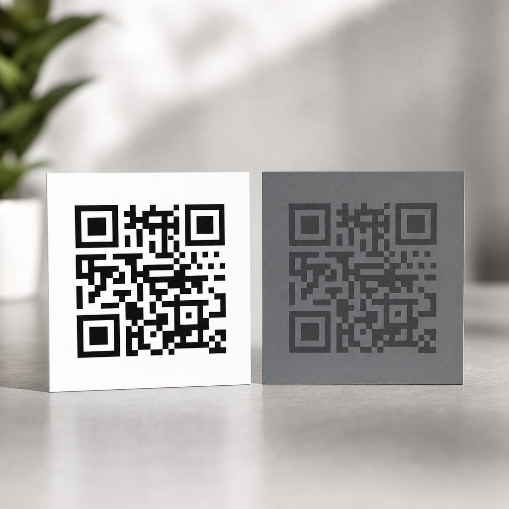
In practice, luminance contrast matters more than hue difference. Two colors can look different to people yet perform poorly for scanners if they have similar brightness values. For example, deep red on black may feel visually striking in a branding mockup, but many cameras interpret both as similarly dark, especially in low light. Likewise, pastel yellow modules on white packaging often disappear once exposure compensation brightens the scene. This is why the safest combinations are black on white, navy on white, or dark green on cream, provided the light background remains genuinely light. The scanner needs contrast in tonal value, not just color variety.
Readability also depends on preserving the quiet zone, the blank margin around the QR code. Even if the modules themselves have adequate contrast, nearby textures, gradients, or typography can erode visual separation and reduce detection speed. I often see branded layouts place a code over patterned packaging or a photo backdrop with a thin stroke around it. That may satisfy a style guide, but it creates competing edges. A clear light border gives scanners room to detect the symbol boundaries before decoding begins. When brands treat the quiet zone as optional, scan rates usually drop.
How cameras and scanners interpret color in the real world
Most modern smartphones use computational photography, which means the camera does not simply capture raw contrast as the eye sees it. It applies sharpening, denoising, white balance, high dynamic range blending, and local contrast adjustments. Dedicated barcode imagers use different pipelines but face similar environmental constraints. Because of this, QR code color choices must survive not only design review but also machine interpretation after processing. A code that looks crisp on screen can become muddy once reflections, motion blur, or automatic exposure intervene.
Different wavelengths complicate performance. Blue and black generally hold detail well because they remain dark after conversion to grayscale. Reds are less reliable, especially darker reds on black or orange backgrounds, because the red channel can clip or flatten depending on lighting and sensor behavior. Metallic inks introduce another issue: they reflect directional light, producing hotspots that erase module edges. Transparent overlays, varnishes, and laminates can create glare that turns a high-contrast print into a low-contrast capture from certain angles. On digital displays, very thin modules in saturated colors may suffer from subpixel rendering and moiré, especially on lower-resolution screens.
Context matters as much as the code itself. A QR code on corrugated cardboard behaves differently from the same file on coated stock. A window cling faces backlighting. A poster in a transit station competes with shadows and distance. A tabletop tent card may pick up warm restaurant lighting that pushes cream backgrounds toward gray. Testing with actual devices is essential because scanner apps vary. Apple’s native camera, Google Lens, Zebra warehouse imagers, and point-of-sale readers all have different tolerances. Good contrast is the common denominator that protects performance across that variability.
Best color combinations for reliable scanning
The strongest principle is straightforward: use dark modules on a light, matte, uncluttered background. Black on white remains the benchmark because it delivers maximum luminance separation and works across print and digital environments. Dark blue on white is usually excellent and often easier to align with brand systems. Forest green, charcoal, and deep plum can also work well when the background stays pale and even. Problems begin when designers reverse the relationship, compress tonal range, or add decorative effects like gradients, shadows, bevels, or transparency inside the code area.
Light-on-dark QR codes can scan, but they are inherently riskier because many decoders expect the conventional dark-on-light structure and rely on clear finder pattern contrast. Some modern readers handle inverted symbols, yet support is inconsistent across older apps, embedded camera software, and industrial devices. Similarly, gradient QR codes are possible only when the darkest parts remain sufficiently dark, the lightest background remains sufficiently light, and transitions do not cut across finder patterns or timing lines. In production, subtle branding wins over dramatic styling every time.
| Combination | Typical performance | Main risk | Best use case |
|---|---|---|---|
| Black on white | Excellent | Few if printed cleanly | Universal default for print and screen |
| Navy on white | Excellent | Low if navy is truly dark | Branded marketing materials |
| Dark green on cream | Good to excellent | Warm lighting can reduce separation | Packaging and menus |
| Red on white | Fair to good | Can lose depth in poor lighting | Only after device testing |
| Light gray on white | Poor | Insufficient luminance contrast | Avoid |
| White on black | Variable | Inconsistent reader support and glare | Use only with extensive testing |
When selecting brand colors, evaluate them in grayscale, not just in RGB or CMYK swatches. If the foreground and background collapse into similar midtones, scan reliability will suffer. A practical design workflow is to choose the brand-approved dark tone first, pair it with the lightest acceptable background, print samples at final size, then test under dim, bright, angled, and reflective conditions. That process catches most contrast-related failures before launch.
Print, packaging, and environmental factors that reduce contrast
Even a well-designed QR code can lose contrast during production. Ink gain can thicken modules and tighten white gaps, while low-resolution printing can soften edges. On porous substrates, dark ink may feather into adjacent cells. On flexible packaging, film stretch can distort the grid. Spot colors may shift between proof and press run, and recycled paper can introduce a duller base tone than expected. Each of these changes reduces the clean separation scanners need.
Surface finish is a major variable. Gloss coatings and lamination often look premium but create specular reflection that masks modules under overhead lighting. Matte finishes generally scan better because they preserve visible edges from more angles. Curved surfaces are another classic failure point. On bottles, tubes, or cans, perspective distortion compresses one side of the code and can make the quiet zone uneven. If placement on a curve is unavoidable, increase physical size, preserve generous margins, and test at realistic viewing angles rather than flat proofs.
Outdoor use adds weathering and exposure issues. Sunlight can fade inks, especially reds and lighter brand colors, lowering contrast over time. Condensation on cold packaging, fingerprints on kiosks, and scratches on acrylic signs all add visual noise. For long-lived installations, contrast should be designed with a margin of safety rather than tuned to the minimum that works on day one. ISO/IEC 18004 defines QR code symbology requirements, and verifier-based grading used in broader barcode quality programs can help manufacturers validate print consistency. In consumer campaigns, however, live field testing is still the best reality check because it reveals how people actually scan.
Branding without hurting scannability
Brand teams often want custom colors, embedded logos, rounded modules, or decorative frames, and those elements can work if contrast remains intact. The safest customization strategy is to preserve standard finder patterns, keep the body modules dark, and place logos only within the tolerance allowed by the selected error correction level. Error correction can recover missing data, but it does not compensate for poor detection. If a scanner cannot cleanly identify the symbol because contrast is weak, the extra redundancy never gets a chance to help.
In projects I have led, the most successful branded QR codes treat customization as secondary to decoding geometry. We start with a plain, high-contrast master, confirm fast scans across several devices, then introduce one variable at a time: color, logo, eye shape, frame text, or background treatment. This sequential method makes it obvious which change causes failure. It also helps stakeholders see that a slightly darker brand color or wider quiet zone is not a compromise in principle; it is the difference between a code that performs in the wild and one that only looks good in a deck.
This page should anchor related guidance across QR Code Design & Branding, especially topics like logo placement, quiet zone sizing, print specifications, dynamic QR code tracking, and packaging implementation. Contrast sits at the center of all of them because every customization choice either preserves or weakens readability. If a team must prioritize, prioritize contrast first, size second, and decorative treatment third.
Contrast affects QR code scannability by determining whether cameras and decoders can reliably separate dark modules from a light background under real conditions. Strong luminance contrast improves detection speed, reduces failed scans, and makes branded codes more dependable across phones, print methods, and lighting environments. The safest approach is consistent: use a dark foreground, a light matte background, a protected quiet zone, and real-world device testing before release.
For marketers, designers, and packaging teams, the practical lesson is simple. Attractive QR codes are valuable only when they scan immediately. Choose colors by brightness difference, not taste alone. Avoid low-contrast palettes, glare-heavy finishes, and busy backgrounds. Test on the actual surface where the code will live, with the devices your audience uses, at the distance and angle they will encounter it. That discipline prevents avoidable failures and protects campaign performance.
If you are building out a QR Code Design & Branding system, use this article as the hub for every decision related to color, contrast, and readability. Start by auditing existing codes, identify any weak-contrast combinations, and replace them with proven pairings. A small design adjustment can turn a frustrating scan experience into a seamless one, and that improvement compounds everywhere your QR codes appear.
Frequently Asked Questions
Why is contrast so important for QR code scannability?
Contrast is essential because scanners do not interpret a QR code the way people do. A person may still recognize a stylish code with soft colors or decorative elements, but a camera or imaging system must quickly separate dark modules from the lighter background in order to detect the code structure. That structure includes the finder patterns in the corners, the timing patterns, the alignment information, and the data modules that contain the encoded content. If the contrast is weak, the scanner may struggle to determine where the code begins and ends, especially under real-world conditions like glare, motion, shadows, fingerprints, poor focus, or low light.
In practical terms, high contrast improves detection speed, decoding reliability, and first-scan success. This matters in every environment where a user expects instant performance, such as retail checkout, packaging, restaurant menus, warehouse labels, event ticketing, and mobile payments. Even when a code is technically valid, low contrast can make it behave unpredictably across different devices. A high-end phone in ideal lighting might scan it, while an older smartphone, kiosk scanner, or industrial imager might fail completely. That is why contrast is not just a visual design preference. It is a core functional requirement that directly affects usability, customer trust, and conversion.
What level of contrast works best in a QR code?
The safest approach is strong luminance contrast: dark modules on a very light background. Black on white remains the most reliable standard because it creates the clearest separation for virtually all scanning systems. In many cases, dark navy, deep green, or charcoal can also work well if the background stays very light and clean. The key point is not merely color difference but brightness difference. Two colors can look distinct to the human eye yet still appear too similar to a scanner once lighting, camera exposure, reflections, and image compression are involved.
As a best practice, avoid mid-tone combinations such as gray on pastel, yellow on white, red on orange, or metallic ink on glossy surfaces unless they have been heavily tested in real conditions. Also avoid reversing the code to light modules on a dark background unless there is a strong technical reason and you have confirmed compatibility, because some scanners handle traditional dark-on-light patterns more consistently. If brand colors must be used, prioritize the darkest brand tone for the modules and the lightest possible background. Then test on multiple devices, at multiple distances, and in multiple lighting conditions. The ideal contrast is the one that produces fast, repeatable scans across the widest range of real-world use cases, not just on a designer’s screen.
Can a QR code still scan if it uses brand colors instead of black and white?
Yes, a QR code can often scan successfully with brand colors, but only if those colors preserve strong contrast. Many companies want the code to feel integrated into packaging, signage, or campaign creative, and that is completely possible when function comes first. The safest method is to use a dark brand color for the modules and a very light, non-textured background behind the code. This preserves the scanner’s ability to distinguish the code pattern while still supporting brand consistency.
The risk comes when branding pushes the design into low-contrast territory. For example, light blue on white may look elegant, but it can be difficult for scanners to detect. The same applies to gradients, soft neutrals, metallic finishes, patterned backdrops, transparent overlays, or colored shadows around the code. These design choices can reduce perceived separation and interfere with finder pattern recognition. If a branded QR code is important, treat testing as mandatory. Test it on iPhones and Android devices, with different camera qualities, in bright daylight, indoor lighting, and at the expected scanning distance. If the branded version performs inconsistently, simplify the palette. A QR code should support the brand by working instantly, not by looking customized and failing when customers try to use it.
How do backgrounds, surrounding graphics, and print materials affect QR code contrast?
Contrast is influenced by more than the code itself. The background, nearby design elements, and production materials all affect how easily a scanner can isolate the symbol. A QR code placed over a busy image, textured surface, reflective coating, or patterned brand artwork may lose edge clarity even if the module color seems dark enough. Similarly, if the quiet zone, the clear margin around the code, is interrupted by text, icons, borders, or graphics, scanners may have trouble identifying the code boundary correctly. In those situations, the issue is not only insufficient color contrast but reduced visual separation from the surrounding layout.
Print and material choices also matter. Matte surfaces usually perform better than glossy ones because they reduce glare and specular highlights. On curved packaging, crinkled labels, low-quality cardboard, or transparent film, contrast can shift depending on angle and lighting. Ink gain, fading, low-resolution printing, and color variation between production runs can further weaken a code that looked fine in the original design proof. For digital displays, brightness settings, screen reflections, and compression artifacts can have a similar effect. The best practice is to give the QR code a stable, light background area, preserve a clean quiet zone, avoid visual clutter nearby, and test the finished output in the exact medium where it will appear. A code that scans on a flat PDF mockup may behave very differently once printed, laminated, or displayed in a real environment.
What are the most common contrast mistakes that cause QR codes to fail?
The most common mistake is using insufficient difference between the dark modules and the background. This often happens when designers prioritize aesthetics and choose subtle, on-brand color combinations that look polished but scan poorly. Light modules on slightly darker backgrounds, pastel-on-pastel pairings, faded grays, and low-saturation palettes frequently create decoding problems. Another common issue is placing the code on top of a photograph or illustration without a solid backing area, which makes it harder for the scanner to distinguish the pattern from the surrounding image.
Other frequent mistakes include adding gradients across the modules, using transparent effects, applying glossy finishes that create glare, shrinking the code too small, or surrounding it with competing visual elements that disrupt the quiet zone. Some teams also assume that error correction will compensate for weak contrast, but error correction is not a substitute for basic scan visibility. It can help recover missing or damaged data, yet it cannot fully solve a code that the scanner cannot reliably detect in the first place. The most effective way to avoid failure is to keep the design simple, maintain strong dark-on-light contrast, preserve a clean margin around the code, and validate the final asset under actual usage conditions. If scanning must work quickly in front of customers or in operational workflows, conservative contrast choices are almost always the smartest choice.


