Choosing the best colors for QR codes is not just a branding decision; it directly affects scan speed, reliability, accessibility, print performance, and campaign results. A QR code works because a scanner can clearly distinguish dark modules from a lighter background, detect three finder patterns, interpret timing patterns, and recover data through error correction. When color choices weaken that visual separation, scans fail, especially on lower quality phone cameras, glossy packaging, dimly lit menus, outdoor signage, and wrinkled labels. In practice, the most successful QR code color palettes are simple: a dark foreground, a light background, and enough contrast to survive real-world conditions. That basic rule matters whether you are placing a code on retail packaging, restaurant tables, direct mail, trade show banners, invoices, or app onboarding screens.
Color, contrast, and readability form the foundation of QR code design. Color refers to the foreground modules and background fill. Contrast is the luminance difference between those two areas, which matters more than hue alone. Readability is the scanner’s ability to detect the code consistently across devices, distances, lighting conditions, and materials. I have tested branded QR codes on everything from matte corrugated boxes to laminated menus and backlit kiosk displays, and the same lesson repeats: visually attractive colors only work when they preserve strong contrast. A beautiful gradient that scans in the studio but fails under store lighting is a bad design. This article explains what works, what does not, and how to choose QR code colors that support both brand identity and dependable performance.
Why QR code color matters more than most teams expect
Many teams assume any color combination will work if the pattern remains visible to the human eye. Scanners do not interpret the design the way people do. Camera apps compress images, auto-adjust exposure, add noise reduction, and process glare unevenly. A color pair that looks distinct on a designer’s monitor may collapse into similar brightness values once printed or photographed. That is why color choice has a direct effect on scan rate. If the foreground is not sufficiently darker than the background, the code may blur into a low-contrast field and fail before error correction can help. Error correction restores missing data, but it cannot rescue a code the scanner never properly detected.
The practical implication is clear: prioritize luminance contrast first, then branding. Black on white remains the most reliable standard because it creates maximum separation and works across nearly every camera system. Dark blue on white, dark green on cream, and deep burgundy on pale beige can also perform well. Problems start when brands reverse the balance, such as using pastel modules on a dark background, metallic inks, bright red on orange, or low-opacity colors over photography. These combinations often reduce edge definition, and edge definition is exactly what a scanner needs. If your campaign depends on scans, color is not a decorative afterthought. It is part of the code’s functional architecture.
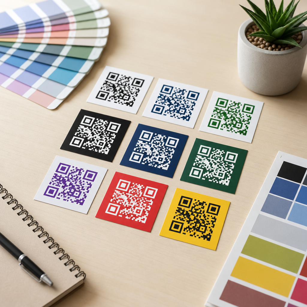
Best colors for QR codes: combinations that scan reliably
The best QR code colors share one trait: the modules are substantially darker than the background. Black on white is the benchmark because it offers the highest readability in print and on screens. Dark navy on white is a common branded alternative and usually scans just as well. Forest green on a light cream background can work beautifully for food, sustainability, or hospitality brands if the green remains deep enough. Dark charcoal on pale gray also performs well in modern minimalist layouts, provided the gray background stays very light. These options preserve the scanner’s ability to isolate finder patterns quickly and decode the matrix without hesitation.
A useful way to judge color is to ignore hue and think in brightness values. If you convert the design to grayscale and the code still looks obviously dark on obviously light, you are usually on safe ground. In production, I recommend testing at least three capture environments: bright daylight, warm indoor light, and a midrange Android phone with an average camera. Reliable combinations stay scannable in all three. If a color only works on flagship phones under ideal light, it is not a strong choice. Brands that want custom color should begin with a dark corporate color and place it on a plain, uncluttered light background rather than trying to force a full palette into the code itself.
| Color combination | Typical performance | Why it works or fails |
|---|---|---|
| Black on white | Excellent | Maximum contrast, strongest edge detection, reliable in print and on screens |
| Dark navy on white | Excellent | High luminance contrast with branded appearance |
| Forest green on cream | Good | Works when green is dark and background remains very light |
| Charcoal on pale gray | Good | Subtle but readable if gray is light enough |
| Red on white | Mixed | Can scan, but some reds reproduce lighter than expected in print |
| Yellow on white | Poor | Insufficient contrast; modules appear too light |
| White on black | Mixed to poor | Some scanners handle reversed codes, many fail in real conditions |
| Metallic silver on gloss | Poor | Reflections distort module edges and finder patterns |
What colors do not work well for QR codes
The worst QR code colors are light-on-light combinations, low-contrast brand pairings, and reflective finishes that destroy visual consistency. Yellow, pastel pink, mint, light orange, and pale gray commonly fail when used as foreground module colors because they are simply not dark enough. A second high-risk category is inverted design, such as white modules on black. While some modern scanners can decode reversed codes, real-world reliability drops sharply once you add glare, print bleed, shadows, or camera motion. For broad audience campaigns, relying on inversion is unnecessary risk. A third failure point is transparency. Semi-transparent modules placed over photos, textures, or patterned packaging often create micro-contrast changes that confuse detection.
Gradients also deserve caution. A gradient can work if the entire foreground remains dark and the background remains uniformly light, but many designer-made gradients drift from dark to medium tones and introduce weak areas across the matrix. The same problem appears with neon colors on bright substrates, holographic labels, foil stamping, and UV gloss coatings. These finishes may look premium, yet scanners care about stable contrast, not visual flair. Even a technically valid code can underperform if the print process spreads ink into small modules or if reflective stock causes hotspots. When a code is mission critical, avoid any color effect that changes appearance depending on viewing angle, light source, or material texture.
How contrast affects readability on phones, in print, and at distance
Contrast is the single most important variable in QR code readability. Scanners detect differences in lightness, not just differences in hue. Blue and red may look distinct to people, but if they sit close together in brightness, the scanner may interpret both as similar tones. This is why contrast checks should happen in grayscale as well as color. A strong rule is simple: dark foreground, light background, no exceptions unless you have tested extensively. The Web Content Accessibility Guidelines are not written specifically for QR codes, yet the same principle applies: sufficient luminance contrast improves machine readability just as it improves human readability in interfaces and signage.
Distance and output size amplify contrast problems. A code on a billboard, a poster in a shop window, or a product shelf tag must remain legible after camera zoom, motion blur, and compression. If contrast is marginal, the first thing users experience is hesitation: they move closer, tilt the phone, and retry. Every extra second lowers scan completion. Print adds more variables. Uncoated paper can soften edges; glossy lamination can add reflections; thermal labels can render dark colors inconsistently. On digital screens, auto-brightness and moiré patterns can interfere. That is why the safest design approach is conservative. High contrast gives you buffer against imperfect lighting, weaker cameras, and low-quality reproduction methods.
Branding a QR code without hurting scan performance
Branding and readability are compatible when the code is treated as a functional asset first and a decorative asset second. The best approach is to keep the QR code itself high contrast and express the brand around it through frame design, call-to-action text, surrounding layout, and supporting colors. If the brand requires color inside the code, use a dark core brand color for the modules and a very light neutral or tinted background. This preserves the scanner’s assumptions while still making the code feel integrated. I have seen strong results from brands using dark indigo, espresso brown, and deep emerald as foreground colors with clean white or ivory backgrounds.
Logo placement needs similar discipline. A centered logo can work because QR codes include Reed-Solomon error correction, but the more visual complexity you introduce, the more important color contrast becomes. If the logo overlaps modules, maintain strong separation between the remaining modules and the background and increase quiet zone discipline around the code. The quiet zone, the blank margin around the QR code, should remain clear and unbroken. Do not flood it with brand patterns. For teams building a design system, create a short approved palette list with tested combinations rather than allowing every campaign designer to improvise. Standardization reduces failures and speeds production review.
Testing methods that reveal color problems before launch
The fastest way to validate QR code color is to test under realistic conditions, not just in design software. Print the code at final size on the actual substrate if possible. Scan it with iPhone and Android devices from multiple generations, using the native camera and at least one third-party scanner. Test under daylight, office lighting, and low light. Then test the code after it has been photographed from a slight angle, because many real scans happen with one hand, not perfectly head-on. If the code appears slower or less stable in any condition, increase contrast before changing anything else. Most scan issues trace back to color, size, quiet zone, or print quality.
Use objective checks too. Convert the design to grayscale and verify that the modules remain distinctly darker than the background. View the printed code from the intended scan distance. If finder patterns stop popping visually, scanners will struggle as well. Avoid making judgments from a high-resolution desktop monitor alone, because phones process images differently. If you use custom printing, ask for a proof from the exact press, stock, and finish. Pantone matches can shift once applied to coated surfaces, and digital presses can render deep colors flatter than expected. A disciplined testing workflow costs little compared with a campaign reprint or missed scans on packaging already in distribution.
Practical guidelines for different use cases
Different placements create different color risks. Restaurant menus and table tents often face warm interior lighting and laminated glare, so dark modules on a matte white field are safest. Retail packaging must survive curved surfaces, folds, and shelf lighting, which makes high-contrast dark-on-light designs essential. Outdoor signs face shadows and reflections; here, black or deep navy on white performs best. Direct mail pieces can support more subtle palettes, but only when the paper stock is consistent and the code is large enough. On screens, avoid saturated reds on dark mode interfaces because phone cameras may clip detail. A white card behind the code often improves digital scan speed dramatically.
For internal linking across a broader QR code design and branding content hub, this page should point readers toward related topics such as QR code size guidelines, logo usage rules, print placement best practices, quiet zone requirements, and testing workflows for campaigns. Those subjects connect directly to color decisions because a marginal color choice may still work at a larger size, while a tiny code with the same colors may fail. The central takeaway is straightforward: the best colors for QR codes are the ones that preserve strong contrast in the exact environment where people will scan them. If you are choosing between visual novelty and dependable readability, choose readability, test early, and standardize the combinations that consistently work.
Color decisions can improve QR code performance or quietly sabotage it. The most reliable formula is still a dark foreground on a light background, with black on white as the proven standard. Strong alternatives include dark navy, charcoal, forest green, and other deep brand colors used against white, cream, or very pale gray. Weak choices include yellow, pastel tones, reflective inks, transparent overlays, and most inverted designs. Contrast matters more than hue, and real-world conditions such as glare, print quality, viewing angle, and camera limitations magnify every weakness. When teams understand that color is part of the code’s function, not just its style, scan rates usually improve.
This hub page should guide every future decision about QR code color, contrast, and readability. Start with a tested high-contrast palette, protect the quiet zone, keep backgrounds clean, and validate the final design on real devices and real materials. Use branding around the code when possible, and inside the code only when darkness and clarity remain intact. If you are building or refreshing a QR code design system, document approved color combinations and reject anything that looks clever but scans inconsistently. The benefit is simple: faster scans, fewer failures, and a better user experience at every touchpoint. Review your current QR codes today and test whether their colors truly work.
Frequently Asked Questions
What are the best color combinations for QR codes?
The most reliable QR code color combinations are dark foreground modules on a light background. In practical terms, black on white remains the gold standard because it gives scanners the strongest possible contrast and makes it easy for phone cameras to identify the code’s finder patterns, timing patterns, and data cells. That does not mean you are limited to plain black and white, though. Dark navy on white, deep green on cream, dark charcoal on pale gray, and burgundy on a very light background can all work well when the contrast is high enough. The key principle is simple: scanners need to clearly separate the “dark” data modules from the “light” empty space around them.
If you want to match brand colors, prioritize luminance contrast over style. A code can be “on brand” and still scan quickly if the foreground is meaningfully darker than the background. In many cases, rich, saturated dark tones perform better than medium tones because they hold their shape more clearly in print and on screens. It is also wise to keep the quiet zone—the blank margin around the QR code—clean and light so the scanner can isolate the symbol from surrounding design elements. The best-performing combinations are usually the ones that look visually obvious at a glance: dark code, light field, minimal distractions, and clear edges.
What color choices should be avoided because they make QR codes hard to scan?
The worst color choices are combinations with weak contrast, especially light-on-light or dark-on-dark pairings. For example, yellow on white, light gray on pastel, red on black, or metallic silver on white often create scanning problems because cameras cannot easily distinguish the modules from the background. Neon colors can also be unreliable, particularly if they are bright enough to reduce visual separation. Similarly, heavily textured or patterned backgrounds interfere with the scanner’s ability to read the shape and alignment of the code, even if the colors technically differ.
Another common mistake is reversing the code into light modules on a dark background. Some modern scanners can read reversed QR codes, but they are generally less dependable across devices, lighting conditions, and camera quality levels. Transparent overlays, gradients that shift from dark to light, glossy finishes that create glare, and low-opacity designs are also risky. What looks stylish in a mockup may fail in the real world when placed on curved packaging, viewed in dim light, or scanned by older smartphones. If reliability matters, avoid color treatments that reduce edge clarity, flatten contrast, or make the three corner finder patterns less obvious.
Do branded or colored QR codes scan as well as black-and-white ones?
They can, but only when they are designed with scanning performance as the top priority. A branded QR code does not automatically scan worse than a black-and-white code; the problem arises when branding decisions override the technical basics that make QR reading possible. If your brand palette includes a dark anchor color and a very light secondary tone, you can often create a custom code that performs nearly as well as a traditional black-on-white version. The scanner does not care whether the foreground is black, navy, forest green, or dark plum. It cares whether there is enough contrast to recognize the code structure quickly and accurately.
Where branded QR codes often fail is in over-customization. Adding complex gradients, embedding oversized logos, stylizing the module shapes too aggressively, or using background artwork too close to the symbol can reduce readability. Error correction helps recover some data loss, but it is not a license to push the design too far. A good branded QR code should still look unmistakably like a QR code from a distance. The safest approach is to use conservative styling, preserve strong contrast, test across multiple phones and lighting conditions, and keep a plain black-and-white fallback available for mission-critical uses such as payments, tickets, packaging, or compliance labeling.
How do print materials, packaging, and lighting affect QR code color performance?
Color choices that seem fine on a computer screen can behave very differently once printed. Ink absorption, paper finish, packaging curvature, surface texture, and ambient lighting all influence whether a QR code scans smoothly. On matte paper, dark colors often remain crisp and readable. On glossy labels or laminated packaging, however, glare can wash out lighter elements or create bright reflections across the code, making even a reasonably high-contrast design harder to read. Metallic inks, varnishes, foil stamping, and transparent substrates add another layer of risk because they can distort the clean visual boundaries scanners rely on.
Lighting matters just as much. In dim environments, low-contrast color combinations become much harder for phone cameras to interpret, particularly on lower-end devices. In bright sunlight, glare and shadow can interfere with finder pattern detection. That is why conservative color choices usually outperform trendy ones in real campaigns. If the code will appear on posters, menus, cartons, bottles, direct mail, shelf tags, or outdoor signage, test the actual printed piece instead of relying on a digital proof. Scan it at different distances, angles, and times of day. A QR code that survives real-world lighting and print conditions will nearly always be one with stronger contrast and simpler color treatment.
How can you test whether a colored QR code will scan reliably before launch?
The best way to test a colored QR code is to evaluate it under the same conditions your audience will face. Start by checking the basic design: dark foreground, light background, clean quiet zone, no visual clutter, and enough size for the intended placement. Then scan it with multiple devices, including both newer and older smartphones, because camera quality and QR reader behavior vary widely. Test native camera apps as well as common third-party scanners if your audience may use them. A code that scans instantly on a flagship phone but struggles on a mid-range device is not fully optimized.
After device testing, move into environmental testing. Print the code at its final size and on its final material. Scan it in bright light, low light, and from realistic user angles. Test it on glossy surfaces, curved packaging, signage behind glass, or any other real deployment context. Also verify that any logo, color treatment, or customization has not obscured the finder patterns or reduced module definition. If scans feel inconsistent, simplify the design before launch. In most cases, improving contrast and removing decorative complexity solves the problem quickly. The goal is not just “scannable in perfect conditions,” but fast, dependable scanning in the messy real world where campaign performance is won or lost.


