QR code marketing promised a clean bridge between physical media and digital action, yet some of the biggest campaigns in the field became cautionary tales instead of success stories. A QR code is a machine-readable matrix barcode that sends a smartphone user to a digital destination, usually a landing page, app store listing, payment flow, video, or coupon. In marketing, the value is straightforward: remove friction, track response, and turn a poster, package, flyer, display, or product into a measurable touchpoint. The problem is that marketers often treat the code itself as strategy when it is only a delivery mechanism. I have audited underperforming QR campaigns for retailers, event brands, restaurants, and B2B teams, and the same pattern appears again and again: the creative gets attention, but the scan experience breaks trust.
That matters because QR codes sit at the exact moment of intent. A user sees an offer, takes out a phone, opens the camera, and decides within seconds whether the interaction was worth it. If the code is hard to scan, links to a generic homepage, loads a non-mobile page, asks for too much information, or gives no clear reason to act, the campaign wastes paid media, print costs, and customer attention. Failures are expensive not just because scans are lost, but because disappointment in a high-intent moment damages brand perception. This hub article on QR code campaign failures and lessons learned explains the biggest QR code marketing fails of all time, why they happened, what brands should have done instead, and which practical standards prevent repeat mistakes.
The best way to evaluate any QR campaign is to ask five direct questions. First, is there a clear value exchange for scanning? Second, can the code be scanned quickly under real conditions, including distance, glare, movement, and weak connectivity? Third, does the destination match the promise on the creative? Fourth, is the experience mobile-first from load speed to form length? Fifth, can the campaign be measured with unique URLs, UTM parameters, redirect logic, and post-scan conversion tracking? When one of these pieces fails, performance drops. When several fail at once, the campaign becomes memorable for the wrong reasons. The examples below show how these breakdowns happen in the wild and what lessons every marketer should carry into future QR code campaign ideas and case studies.
When the code is impossible to scan
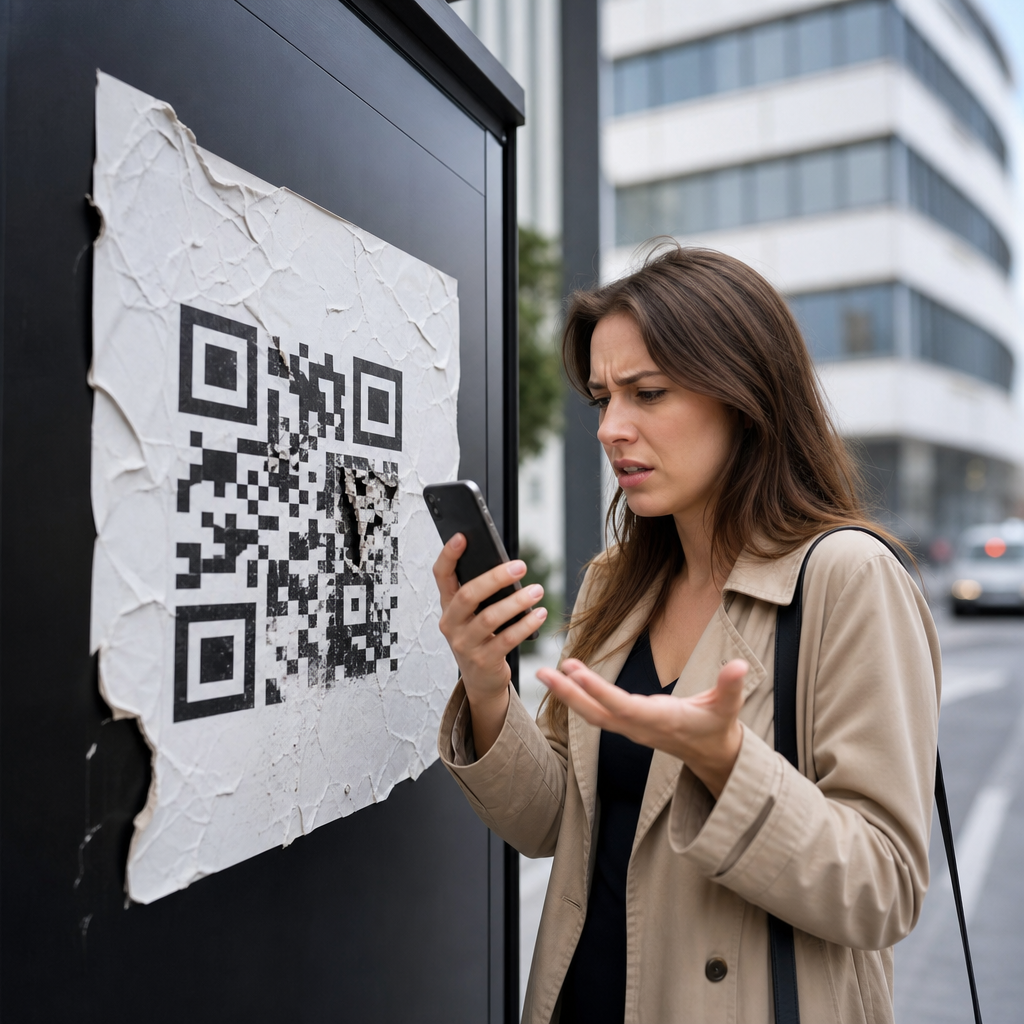
The most notorious QR code failures start before the user ever reaches a webpage: the code cannot be scanned reliably. Marketers place codes on moving buses, high billboards, glossy windows in direct sun, tiny product labels, curved bottles, dark packaging, or low-resolution print assets that distort the modules. Years ago, a retailer famously placed a code on subway signage where commuters had only a second or two to react as trains arrived; scans were predictably weak because the environment made engagement impractical. The lesson is simple. A QR code must be designed for the context in which it is used, not for a mockup viewed on a desktop monitor.
In practice, that means testing scan distance, minimum print size, contrast ratio, error correction, and quiet zone. ISO/IEC 18004 sets the technical basis for QR symbols, but marketers need operational rules. A code on a poster seen from six feet away needs a much larger footprint than one on table signage. A matte finish generally outperforms gloss because glare obscures edges that phone cameras need. Dark code on a light background remains the safest choice. Brand customization can work, but logos, gradients, and artistic overlays frequently reduce readability. I have seen expensive out-of-home placements fail because a designer inverted the color scheme and rounded too many data cells. It looked premium in presentation slides and performed terribly on the street.
When there is no compelling reason to scan
Another classic failure is asking for a scan without explaining the payoff. “Scan me” is not a value proposition. Users need an immediate answer to a basic question: what do I get? Too many campaigns place QR codes on packaging, menus, print ads, direct mail, trade show booths, or storefronts with no incentive beyond curiosity. Curiosity is weak when the user is busy, in public, or uncertain about where the link goes. The strongest campaigns spell out the benefit next to the code: get 20% off today, watch the demo, see sizes in stock, enter to win, view ingredients, check wait times, or start a reorder.
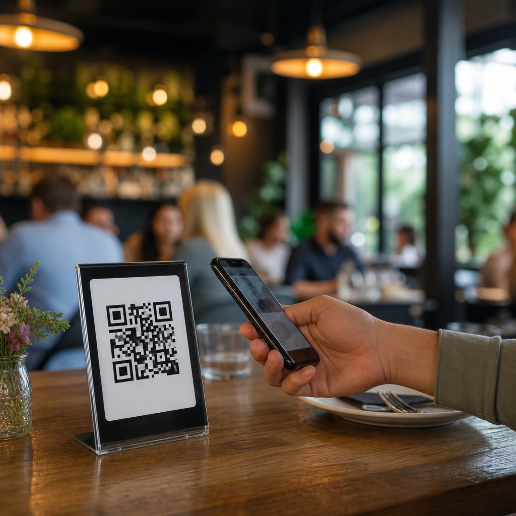
This is where many early QR activations underperformed. Brands assumed the novelty of scanning was enough. It was not. Even now, I regularly see restaurant table tents with codes that simply open the same website available through a quick search. The result is low scan rates and low repeat behavior. A useful benchmark is that every code should reduce friction or increase value compared with the next best alternative. If scanning does not save time, unlock exclusive content, personalize the experience, or simplify purchase, the interaction feels pointless. Strong copy around the code is not optional; it is the trigger that turns a barcode into an offer.
When the destination experience breaks the promise
A huge share of QR code marketing fails happen after a successful scan. The user lands on a generic homepage, a desktop page that pinches and zooms on mobile, an expired promotion, a broken deep link, or a slow site blocked by pop-ups and cookie banners. This is one of the most avoidable errors in the category. If a poster advertises a limited-time discount, the code must open the exact offer page, with inventory visibility, redemption details, and a prominent next step. If the code on packaging says “how-to video,” the user should not have to navigate a menu to find the tutorial.
I have worked on recovery projects where scan volume looked healthy in analytics, but conversion was weak because the post-scan page had mismatched messaging. One consumer goods campaign printed codes on endcap displays promising recipes, then sent users to the brand homepage. Bounce rates spiked, session duration collapsed, and store teams concluded that customers “didn’t like QR.” The real problem was destination alignment. Campaign success depends on message match: the wording on the physical asset, the URL redirect, the page headline, and the call to action should all reflect the same intent. That alignment is what turns scans into measurable business outcomes.
When mobile usability and speed are ignored
QR scans are overwhelmingly mobile interactions, so poor mobile UX is fatal. The destination page must load quickly on cellular networks, fit small screens, use large tap targets, and ask for minimal effort. Yet many failed campaigns still route traffic to bloated pages with heavy scripts, autoplay video, multiple modal interruptions, and forms better suited to desktop lead generation. According to Google research on mobile behavior, rising load time sharply increases abandonment; marketers do not need perfect precision on every campaign to know that each extra second costs users. In field testing, I have watched users abandon a QR landing page in under five seconds when they saw a cluttered form or slow render.
The fix is disciplined mobile-first design. Use lightweight landing pages, compressed media, clear headings, one primary action, and autofill where possible. If data capture is necessary, ask only for what is essential. Apple Pay, Google Pay, Shop Pay, and wallet-ready coupon formats often outperform traditional forms because they reduce typing and decision fatigue. If app download is the goal, smart routing should detect device type and send users to the correct store without extra clicks. The best QR campaigns feel immediate. The worst ones reveal that the team optimized the print asset and ignored the user journey that starts after the scan.
When measurement, governance, and testing are missing
Some of the biggest QR code marketing fails are less visible to consumers but devastating to marketers: the campaign cannot be measured, updated, or controlled. Teams print static codes linked directly to final URLs, then discover a page changed, a promo ended, or a domain migrated. Others launch national campaigns without unique tracking parameters by store, channel, creative variant, or date range, making it impossible to learn what worked. In larger organizations, one department prints a code while another owns the landing page, and no one establishes redirect ownership, expiry rules, analytics standards, or compliance review.
The operational difference between weak and strong QR programs is dramatic.
| Failure point | What goes wrong | Better practice |
|---|---|---|
| Static code only | Printed link cannot be changed after launch | Use dynamic redirects with governed destination updates |
| No segmented tracking | Scans are visible, but channel performance is unclear | Add UTM parameters and unique codes by placement |
| No preflight testing | Broken links, poor scans, wrong pages reach market | Test devices, lighting, distances, networks, and redirects |
| No ownership model | Expired offers and compliance issues linger | Assign page owner, analytics owner, and review cadence |
Dynamic QR code platforms such as Bitly, QR Code Generator Pro, Flowcode, Beaconstac, and enterprise campaign tools make redirection and tracking easier, but tools do not solve governance by themselves. Teams need launch checklists, naming conventions, QA signoff, and reporting tied to business goals such as purchases, redemptions, bookings, or qualified leads. A scan count is not success. Success is the downstream action the scan was meant to produce.
Lessons from famous and everyday QR code mistakes
The highest-profile failures get headlines, but the everyday mistakes are often more instructive because they happen constantly. A TV commercial flashes a QR code for two seconds, then asks viewers to complete a multi-step signup. A conference badge includes a code linking to a profile page that requires login, defeating the point of easy networking. A product package sends users to a recipe page unavailable in their region. A window decal works in daylight but becomes unreadable at night because reflections overpower contrast. During the pandemic, many restaurants switched to QR menus quickly; the best created fast, accessible, updateable menus, while the worst uploaded tiny PDF scans that forced endless zooming and frustrated diners.
Across these examples, the lesson is consistent: QR code marketing succeeds when the campaign is built backward from user intent. Start with the desired action, remove steps, match the environment, and test with real people using ordinary phones under ordinary conditions. If the user is standing on a sidewalk, keep the interaction brief. If they are seated at a table, richer content may be appropriate. If they are on packaging in a store aisle, prioritize speed, product clarity, and proof points that support purchase. For brands building a broader library of QR code campaign ideas and case studies, failure analysis is not negative content. It is the operating manual for better performance. Audit your live codes, rewrite weak calls to action, fix destinations, and put measurement in place before the next print run.
The biggest QR code marketing fails of all time were rarely caused by the technology itself. They were caused by weak incentives, poor environmental fit, broken destination experiences, mobile friction, and missing operational discipline. A QR code is only effective when every step around it is intentional. Marketers who define the offer clearly, design for real scanning conditions, send users to the exact promised page, simplify mobile conversion, and govern links with dynamic tracking consistently outperform brands that treat the code as decoration.
For teams responsible for failures and lessons learned content, that is the central takeaway: most QR mistakes are preventable. The practical standards are well known, the tools are mature, and the user expectations are clear. When campaigns fail, they usually fail in familiar ways, which means future campaigns can improve quickly through audit, testing, and tighter alignment between creative, channel, and landing experience.
If you are planning new QR code campaign ideas, start by reviewing your current placements as a customer would. Scan every code, time every load, verify every promise, and track every outcome. Then use those findings to build smarter case studies, stronger campaigns, and fewer expensive surprises.
Frequently Asked Questions
What are the biggest reasons QR code marketing campaigns fail?
The biggest QR code marketing failures usually come down to a simple problem: the code is treated like the strategy instead of a tool inside a larger customer journey. A QR code by itself does not create interest, trust, or action. Campaigns fail when brands place codes where people cannot realistically scan them, such as moving vehicles, distant billboards, poorly lit displays, or surfaces with glare and distortion. They also fail when there is no clear reason to scan. If a consumer sees a code with no explanation, no offer, and no obvious value, there is little motivation to pull out a phone and engage.
Another common issue is sending users to a bad destination. Some of the most memorable QR code marketing mistakes happened because the scan led to a non-mobile-friendly website, a broken link, a generic homepage, or content that had nothing to do with the ad that prompted the scan. That creates friction at the exact moment the campaign is supposed to reduce it. Slow load times, confusing forms, forced app downloads, and pages that are difficult to navigate on a smartphone can quickly destroy response rates and make the brand look careless.
Measurement failures also play a major role. Many marketers launch QR campaigns without setting up proper tracking, unique URLs, event tagging, or conversion goals. As a result, they cannot tell whether the campaign worked, which placements performed best, or where users dropped off. In addition, poor creative execution hurts performance. Tiny codes, low contrast, overcrowded design, or over-customized QR graphics can make scanning unreliable. The biggest lesson is that QR code marketing fails when marketers ignore context, user intent, mobile experience, and follow-through. The code has to be easy to scan, supported by a compelling call to action, and connected to a fast, relevant, measurable landing experience.
Why did some famous billboard and out-of-home QR code campaigns become cautionary tales?
Out-of-home advertising has produced some of the most talked-about QR code mistakes because it often exposes a mismatch between the medium and the required user behavior. A billboard, transit ad, or street display may look visually impressive, but if the audience is walking quickly, standing far away, or moving in traffic, scanning becomes inconvenient or impossible. One of the classic failures in QR code marketing involved placing codes on billboards where drivers were expected to scan while moving, which is both unrealistic and unsafe. Even when the billboard is intended for pedestrians, distance, angle, weather, screen brightness, and crowd flow can reduce scanability.
These campaigns also fail when marketers assume attention equals engagement. A person may notice a QR code, but that does not mean they are ready to stop, unlock their phone, open the camera, and scan. In a busy out-of-home environment, every extra step matters. If the code is small, hard to reach, or not paired with a strong message like “Scan for 20% off today” or “Scan to see the full collection,” the ad asks too much for too little reward. The best-performing out-of-home QR campaigns understand that physical context shapes behavior. Placement must be close enough for reliable scanning, and the value exchange must be immediate and obvious.
Another reason these campaigns become cautionary tales is that brands sometimes treat the QR code as a novelty rather than a conversion tool. They focus on the visual idea but neglect landing page quality, page speed, and mobile relevance. If someone makes the effort to scan from a poster or billboard and lands on a generic desktop site or a page that does not match the ad’s promise, the campaign creates disappointment instead of momentum. The takeaway is clear: successful out-of-home QR marketing requires thoughtful placement, safe and practical scan conditions, and a destination designed specifically for mobile users in that exact moment.
How important is the landing page in preventing a QR code marketing disaster?
The landing page is absolutely critical, because it is where the campaign either delivers on its promise or collapses. A QR code is only the bridge. The real marketing outcome happens after the scan. Many of the biggest QR code marketing fails were not caused by the code itself, but by what happened next. If users scan and arrive at a slow, unoptimized, confusing, or irrelevant page, the brand loses trust instantly. A landing page that is not built for mobile is especially damaging because QR scans almost always happen on smartphones. Tiny text, awkward menus, pop-ups, and forms that are difficult to complete can turn a high-intent user into a fast bounce.
Message match is another essential factor. The landing page should clearly reflect the offer, product, or promise from the physical ad. If a code on product packaging says “Scan for setup instructions,” the user should land directly on setup help, not the homepage. If a poster promises an exclusive discount, the page should immediately display that offer without requiring the user to search for it. The more steps between scan and value, the more likely the campaign is to fail. Good QR campaigns remove ambiguity and reduce effort, while bad ones create extra navigation and force users to figure things out on their own.
Strong landing pages also support measurement and optimization. They should include campaign-specific tracking, clear calls to action, and a structure designed around the goal, whether that is purchase, signup, video view, coupon redemption, app install, or lead capture. Testing is essential before launch. Marketers should scan from multiple devices, under real-world conditions, and confirm that pages load quickly, analytics fire correctly, and conversion paths work from start to finish. In practice, the landing page is where brands prove that scanning was worth it. If that experience is not fast, relevant, and friction-free, even a beautifully designed QR code campaign can become a very public failure.
What can marketers do to make sure a QR code is actually worth scanning?
To make a QR code worth scanning, marketers need to answer the user’s silent question immediately: “What do I get if I do this?” The most effective campaigns never assume curiosity is enough. They give a clear, concrete incentive tied to the moment and medium. That might be a discount, exclusive content, a how-to video, instant payment access, event check-in, product verification, menu access, giveaway entry, or a personalized digital experience. The value should be specific and visible right next to the code. Vague prompts like “Scan me” are weak because they do not tell the user why the action matters.
Practical usability matters just as much as the offer. The code should be large enough to scan easily, printed with strong contrast, and placed where a user can physically access it without rushing or struggling. Quiet zones around the code should be preserved, and over-designed custom styling should never interfere with readability. Marketers should test the code across different phones, camera apps, lighting conditions, and distances. Dynamic QR codes are often the better choice because they allow the destination URL to be updated without reprinting the asset, which can prevent long-term campaign problems if a page changes or an error is discovered after launch.
Most importantly, the scan should lead to an immediate, relevant next step. If a customer is standing in a store aisle, the destination should help them compare features, redeem an offer, read reviews, or complete a purchase. If they are viewing a package at home, the code might unlock tutorials, warranty registration, or reorder options. The strongest QR code marketing feels natural to the environment and respectful of user time. When the incentive is meaningful, the placement is sensible, and the post-scan journey is seamless, the code stops feeling like a gimmick and starts functioning like a genuinely useful conversion device.
What are the best lessons brands can learn from the biggest QR code marketing fails of all time?
The biggest lesson is that convenience must be real, not assumed. QR codes were adopted because they can connect offline attention to online action with very little friction, but only if every part of the experience is designed around actual user behavior. Brands should think in terms of context first: where is the code being seen, how much time does the person have, what device are they using, and what do they need at that moment? When campaigns fail, it is often because those practical questions were never fully addressed. Great QR marketing starts with user conditions, not just creative ambition.
A second major lesson is that every scan should have a purpose tied to a measurable business goal. QR codes should not be added just because they seem modern or interactive. They should exist to solve a marketing problem: driving purchases, capturing leads, improving attribution, delivering support content, simplifying payments, or moving customers deeper into a funnel. That means the campaign needs a dedicated destination, tracking structure, and clear success metrics. Without those pieces, even a campaign that generates scans may not generate value. Brands should know what counts as a conversion and how they will evaluate performance by placement, audience segment, and creative execution.
The final lesson is that trust and relevance determine long-term success. A QR code is an invitation. If the brand wastes the user’s time with poor pages, irrelevant offers, or broken experiences, people become less likely to scan future codes from that brand. On the other hand, when the experience is fast, secure, useful, and aligned with the original message, QR codes can be extremely effective across packaging, retail, events, print, direct mail, and out-of-home media. The most famous failures are valuable because they remind marketers