QR code campaigns fail far more often from design errors than from bad offers, weak channels, or limited budgets. I have audited retail displays, restaurant menus, event signage, direct mail pieces, and packaging inserts where the marketing team blamed low scans on audience apathy, yet the real problem was the code itself: too small, too low contrast, poorly placed, visually distorted, or disconnected from a clear next step. Understanding QR code design mistakes matters because a code is not just a graphic. It is a machine-readable gateway, and small visual decisions can break the user journey before the landing page ever loads.
A QR code, short for Quick Response code, stores data in a two-dimensional matrix of dark and light modules. Smartphone cameras interpret that matrix, correct for minor damage, and trigger an action such as opening a URL, downloading an app, saving contact information, or joining Wi-Fi. Effective QR code design balances brand presentation with technical readability. Campaign performance depends on scanability, context, message match, environmental conditions, and post-scan experience. When one part fails, the whole campaign suffers, which is why failures and lessons learned deserve their own hub within QR Code Campaign Ideas & Case Studies.
The stakes are higher than many teams realize. A printed ad may get one chance in a commuter’s hand. A shelf talker competes with glare, distance, and motion. A restaurant table tent may be scanned under dim lighting through a cracked phone lens. In those settings, a QR code must work instantly. If people need to reposition, zoom, ask for help, or wonder what happens next, completion rates drop sharply. The lesson from years of campaign reviews is simple: the best QR code design is not the prettiest version. It is the version that scans reliably, explains the benefit clearly, and fits the physical environment where real people encounter it.
Ignoring scanability fundamentals
The most common QR code design mistake that kills campaigns is treating the code as decorative art instead of a functional entry point. Scanability starts with size, contrast, quiet zone, error correction, and data density. A code that looks fine on a designer’s monitor can fail on a subway poster, product label, or glossy brochure because the camera cannot resolve the modules cleanly. As a practical rule, the scanning distance should be roughly ten times the code width. If a user scans from 20 inches away, a 2 inch code is generally workable; for larger viewing distances, the code must scale accordingly.
Quiet zone errors are especially damaging. Every QR code needs a clear margin around it, ideally four modules wide, so the scanner can distinguish the code from surrounding graphics. I often see campaigns place borders, icons, or busy patterns right against the code edges, which causes inconsistent recognition across devices. Contrast matters just as much. Dark modules on a light background remain the safest choice. Reverse codes, gradients, metallic inks, and low-contrast brand palettes can look premium while reducing scan success, especially in low light or with lower-end phone cameras.
Data density creates another hidden failure. Teams sometimes encode long tracked URLs with multiple parameters, which increases module complexity and shrinks each square within the same overall footprint. The result is a code that technically works but becomes fragile in print. The better approach is to use a short redirect URL from a dynamic QR code platform, then manage tracking and destination changes server-side. Tools such as Bitly, QR Code Generator Pro, Beaconstac, and Flowcode make this easy while preserving cleaner code structure. Simpler encoding nearly always produces more resilient scans.
Over-branding the code until it breaks
Branding a QR code is not inherently a mistake. Adding a logo, custom frame, or brand color can improve recognition and trust when done carefully. The problem starts when visual customization overrides the geometry that scanners expect. I have seen campaign assets with rounded modules, altered finder patterns, embedded mascots, textured fills, and heavy drop shadows that looked impressive in a presentation deck but failed in stores. QR codes include error correction, but that feature is not a license to redesign core structural elements beyond recognition.
The safest branded approach keeps the three position markers intact, preserves strong contrast, leaves the quiet zone untouched, and uses moderate logo sizing. In practice, central logos should occupy a limited area and be tested on multiple devices, including older Android phones. High error correction levels can help offset small visual obstructions, but they also increase density, so there is a tradeoff. Designers often assume higher error correction always improves performance. In reality, if the code becomes too intricate for its print size, the gain disappears.
Frames and callout text can improve campaign response when they clarify action, but they should sit outside the quiet zone and not crowd the symbol. The best-performing branded codes I have tested followed a simple principle: customize the supporting container more than the code itself. Use a headline, a border, and a CTA like “Scan to watch the demo” rather than rebuilding the modules into abstract brand shapes. The code should feel branded by association, not by distortion.
Poor placement and environmental mismatch
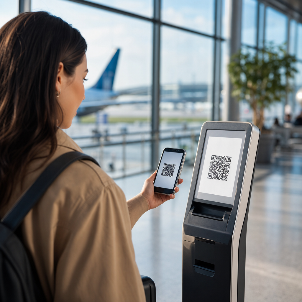
Even a technically perfect QR code will underperform if placement ignores how people move, hold phones, and notice prompts in real environments. Placement mistakes kill campaigns because they create friction before the scan begins. A code mounted behind reflective glass, placed too high on a poster, printed near a fold on direct mail, or wrapped around curved packaging can become difficult or impossible to capture. The design review must include the installation context, not just the artwork file.
Retail provides a clear example. Shelf-edge QR codes often fail because they sit below eye line in shadow, close to price labels and product clutter. Shoppers have carts, baskets, and limited patience. A better location is an endcap sign or header card where the code is visible from a natural stopping point. Event signage has a different issue: distance. A code on a stage screen may appear large to organizers but remain too dense for attendees sitting halfway back. In those cases, a short URL shown alongside the code is essential.
Restaurants learned similar lessons during contactless menu rollouts. Codes printed under lamination glare or placed on unstable tabletop displays produced fewer successful scans than matte, flat, well-lit placements. Outdoor campaigns face weather, sun washout, and movement. Vehicle wraps are notorious for useless QR codes because the audience is in motion. If the target user cannot safely and realistically scan in the intended moment, the design is wrong regardless of how attractive it looks.
| Mistake | Why It Hurts | Better Practice |
|---|---|---|
| Code too small | Camera cannot resolve modules at normal viewing distance | Scale size to expected scan distance |
| Low contrast colors | Recognition drops under glare or dim light | Use dark-on-light combinations with strong tonal separation |
| No quiet zone | Scanner cannot isolate code from surrounding artwork | Keep a clear margin of at least four modules |
| Overstyled branding | Position markers and modules become ambiguous | Customize frame and CTA more than the symbol |
| Bad physical placement | Users cannot comfortably access or notice the code | Test in the real environment before launch |
Weak calls to action and unclear value exchange
Many teams assume the presence of a QR code explains itself. It does not. Users need a reason to scan and confidence about what happens next. A code without a call to action typically underperforms because it asks for effort without stating the reward. “Scan here” is better than nothing, but it still leaves motivation vague. The strongest campaign language ties the scan to a concrete outcome: “Scan for 15% off today,” “Scan to see installation instructions,” or “Scan to enter the giveaway before midnight.”
Clarity also reduces perceived risk. People hesitate when a code could lead anywhere, especially on public signage or printed handouts. Naming the destination builds trust: “Scan to open the official event schedule” outperforms a generic prompt because it removes ambiguity. In regulated categories such as healthcare, finance, and alcohol marketing, precision matters even more. The CTA should accurately describe the next step and avoid misleading incentives that create compliance or customer service issues later.
I have repeatedly seen campaigns improve simply by pairing a code with three small pieces of supporting copy: the benefit, the destination type, and the time required. For example, “Scan to compare plans in 60 seconds” tells the user why to act, what they will see, and how much effort is involved. That combination lifts scan intent because it answers the silent questions people ask before using their camera. Good QR code design is persuasive communication as much as visual production.
Breaking the post-scan journey
Some QR code campaigns appear to fail because of design, but the deeper issue is that design and destination were never planned together. A scan is only the midpoint. If the landing page is slow, non-mobile, mismatched to the message, or blocked by app-store redirects, users abandon quickly. From an attribution perspective, the campaign may show scans without conversions. From the customer’s perspective, the code simply wasted time. That is still a design failure because the code promised an interaction the experience did not fulfill.
Destination matching is critical. If the printed CTA says “Scan for the menu,” the code should open the menu directly, not a homepage with multiple navigation layers. If a flyer promotes a local event, the landing page should detect geography or at minimum present the relevant city first. Dynamic QR codes are valuable here because they allow teams to update destinations, fix broken links, and route traffic by device, location, or time. Static codes are acceptable for permanent, simple use cases, but they create avoidable risk for campaigns with changing offers.
Measurement should also be designed upfront. Use UTM parameters, analytics events, and platform-level redirects to track scans, sessions, bounce rates, and downstream conversions. However, do not stuff tracking into the visible URL. Keep the encoded string short and maintainable. Test with iPhone and Android native camera apps, popular social in-app browsers, and poor connectivity conditions. In campaign postmortems, the lesson is consistent: the code did not fail alone; the journey after the scan either confirmed or destroyed intent.
Skipping testing, governance, and maintenance
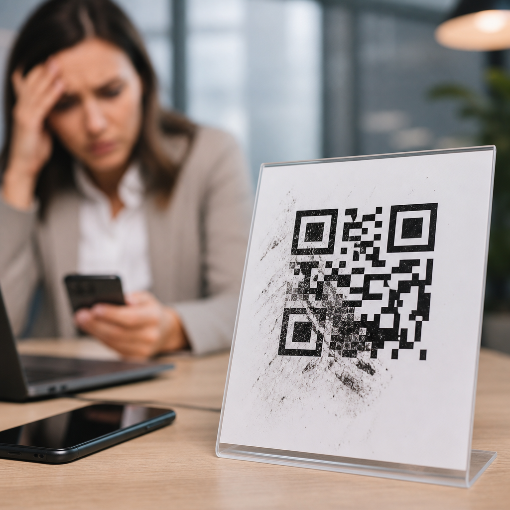
The final category of QR code design mistakes is operational, and it is responsible for some of the most expensive campaign failures. Teams rush artwork approvals, assume one successful scan means universal readiness, and forget that printed assets can live for months or years. A QR code needs prelaunch testing, ownership, and maintenance. Without that discipline, campaigns end up pointing to expired promotions, broken pages, outdated PDFs, or domains that were never renewed. Nothing undermines trust faster than a code that opens an error page.
My standard review process includes print proofs, distance checks, angle checks, glare checks, low-light testing, and device testing across current and older phones. I also verify redirect chains, SSL certificates, page speed, and analytics firing before signoff. For high-volume deployments, create a naming convention and inventory so each code can be traced to an owner, destination, and retirement date. Enterprise teams often manage this through digital asset management systems or campaign ops software, but even a disciplined spreadsheet is better than no governance.
Maintenance matters after launch too. Monitor scan rates by placement, watch for unusual drop-offs, and update destinations when offers end. If a QR code appears on packaging or signage with a long shelf life, route it to evergreen content or a controlled redirect rather than a seasonal page. The core lesson across all QR Code Campaign Ideas & Case Studies in this failures hub is that design is not isolated from operations. Winning campaigns treat the code as a living customer touchpoint, not a one-time graphic export.
QR code design mistakes kill campaigns because they interrupt trust, usability, and momentum at the exact moment a customer shows intent. The biggest failures are predictable: codes that are too small, low contrast, overdesigned, poorly placed, weakly explained, or connected to a broken destination. Each problem is preventable with disciplined design choices, realistic environmental testing, and a post-scan experience that matches the promise made on the printed asset. When teams stop treating QR codes as decorative add-ons and start treating them as functional interfaces, scan rates and conversion rates improve together.
This hub on Failures & Lessons Learned exists to help marketers, designers, and operators avoid repeating expensive errors. The practical takeaway is straightforward: preserve scanability first, communicate value clearly, test in the real world, and maintain every code after launch. Those four habits outperform flashy customization every time. If you are planning a new activation under the broader QR Code Campaign Ideas & Case Studies topic, audit your current assets against these mistakes first, then build from proven fundamentals before scaling the campaign.
Frequently Asked Questions
What are the most common QR code design mistakes that cause campaigns to fail?
The most common QR code design mistakes are surprisingly basic, but they have a huge impact on scan performance. The first is making the code too small for the environment. A QR code that looks fine on a desktop proof may become nearly impossible to scan on a retail shelf tag, restaurant table tent, mailer, or event sign once viewed from real-world distances. Another major issue is poor contrast. Dark code on a light background is still the safest approach, and when brands reverse colors, use low-contrast palettes, add gradients, or place codes over busy images, scan reliability drops fast.
Placement is another campaign killer. If the code is tucked into a corner, wrapped around curved packaging, placed behind glare, or positioned where people cannot comfortably pause and scan, response rates suffer no matter how strong the offer is. Distortion is equally damaging. Stretching a QR code, rounding it too aggressively, adding decorative elements without respecting scan patterns, or obscuring quiet zones can make the code unreadable. Finally, many campaigns fail because the code is disconnected from a clear next step. Even a perfectly functional code will underperform if users do not know what they will get, why they should scan, or what happens afterward. In practice, low scans are often blamed on audience behavior when the real issue is that the code was difficult to notice, difficult to scan, or not compelling enough to act on.
How big should a QR code be to ensure people can scan it easily?
Size should always be determined by scanning distance, not by how much space is left in the design. A common rule of thumb is that for every 10 inches of scanning distance, the QR code should be at least 1 inch wide. That means a code on a product package viewed from a few inches away can be relatively small, while a poster, window sign, or trade show display viewed from several feet away needs a much larger code. If people must scan from across a counter, through a store aisle, or while walking past signage, the code should be sized generously rather than minimally.
Just as important, the total scan area includes more than the code itself. The quiet zone, which is the empty margin around the QR code, must remain intact. Designers often shrink or crop this border to save space, but doing so reduces scan accuracy. You also need to consider environmental conditions such as glare, low light, print texture, motion, and viewing angle. A code that technically works in the studio can fail in the field because users are not holding still under perfect lighting. The best approach is to prototype at actual size, place it in the intended environment, and test with multiple phones and camera apps. If there is any doubt, make it bigger. In QR design, extra size is usually a benefit, while undersizing is one of the fastest ways to suppress campaign results.
Why does color and contrast matter so much in QR code design?
Color and contrast matter because scanners are reading visual data patterns, not admiring brand creativity. The highest-performing QR codes usually use a dark foreground on a light background because that gives smartphone cameras the clearest possible separation between code modules and background space. Problems start when marketers try to stylize the code to match a campaign palette without thinking about scan reliability. Light gray on white, pastel on cream, metallic ink, glossy finishes, gradients, transparency effects, and photographic backgrounds can all make the code harder for devices to interpret consistently.
Brand customization is possible, but it has to be done carefully. If you want a branded QR code, preserve strong contrast first, then test heavily. Avoid placing the code over patterned surfaces, textured packaging, or images that visually interfere with the shape. Be careful with reversed designs too, because a light code on a dark background may work in some situations but can become less dependable under uneven lighting or lower-quality printing. Also remember that contrast issues are not limited to color choices alone. Reflection, shadows, folds, lamination, and curved surfaces can reduce perceived contrast in real use. The safest mindset is to treat function as non-negotiable. If a brand treatment weakens readability even slightly, it is not good design for a performance-driven campaign.
Where should a QR code be placed so people actually notice and scan it?
Good placement means the QR code is easy to see, easy to reach visually, and easy to scan without awkwardness. It should appear where the user naturally looks when deciding what to do next. On a menu, that may be near ordering or payment prompts. On direct mail, it should support the primary call to action rather than being buried in the footer. On retail signage, it needs to be at a height and angle that allows quick scanning without blocking traffic or forcing the user to crouch, stretch, or step into glare. On packaging, avoid seams, corners, folds, caps, or curved panels that distort the code or make the camera struggle.
Equally important, the QR code should be placed in context. Users should immediately understand what the scan is for. A code floating alone with no explanation creates friction because people hesitate when they do not know the destination or benefit. Pair the code with a short, specific instruction such as “Scan to view ingredients,” “Scan for event check-in,” or “Scan to claim 15% off.” The surrounding layout should support discoverability rather than compete with it. If the code is crowded by dense copy, visual clutter, or multiple competing calls to action, it may be overlooked. Strong campaigns treat placement as part of the conversion path, not as a decorative afterthought. The code needs visibility, physical usability, and a clear reason to exist exactly where it appears.
How can you test a QR code before launch to avoid design mistakes that hurt performance?
Testing should happen in the real world, not just on a designer’s screen. Start by printing the QR code at final size and placing it on the actual substrate or a realistic mockup. Then test it under the same conditions your audience will experience: indoor lighting, outdoor sunlight, glare from windows, movement, distance, different viewing angles, and the physical context of the placement. Scan with multiple devices, including newer and older smartphones, both iPhone and Android, and use different camera apps if relevant. A code that scans instantly on one flagship device may struggle on a mid-range phone in low light.
You should also test speed and clarity of the full user journey. Does the code open immediately? Does the landing page load quickly on mobile? Is the destination clearly related to the promise next to the code? Are tracking parameters working? Can users complete the intended action without confusion? It is also wise to test edge cases such as partially wrinkled mail pieces, glossy packaging, signage behind glass, and codes viewed from farther away than expected. If you are using logo integration or custom styling, test even more aggressively because aesthetic modifications reduce margin for error. The goal is not simply to confirm that the code can scan once. The goal is to prove that ordinary people in ordinary conditions can notice it, trust it, scan it quickly, and complete the action without friction. That is what protects a campaign from avoidable design-driven failure.