A QR code is easy to scan when its structure, contrast, size, placement, and error correction work together to help a camera recognize the symbol instantly under real conditions. In practice, scanability is not a matter of style alone. It is a technical outcome shaped by module clarity, quiet zone spacing, print quality, lighting, distance, and the way modern smartphone cameras process an image before decoding it. For brands building campaigns, packaging, menus, posters, or product labels, understanding QR code design best practices is essential because even a beautiful code fails if people cannot scan it on the first try.
The term QR code refers to a two dimensional matrix barcode originally standardized under ISO/IEC 18004. It stores data in a grid of dark and light squares called modules, along with finder patterns, timing patterns, alignment patterns, format information, and error correction codewords. When a user points a phone camera at the symbol, the device identifies those patterns, corrects distortion, reads the data, and opens the linked destination. A code that is easy to scan reduces friction, increases response rates, and protects campaign performance. A code that is difficult to scan creates user frustration and directly lowers conversions.
I have tested QR codes across retail shelf tags, direct mail, event signage, restaurant tables, and outdoor posters, and the pattern is consistent: small design decisions create large differences in scan speed. Brands often focus on adding logos, changing colors, or reshaping modules before they validate the fundamentals. The hub topic of QR code design best practices starts with one principle: function first, branding second. Once the core requirements are secure, visual customization can strengthen recognition without harming usability.
This guide explains what makes a QR code easy to scan, why some custom codes fail, and how to design reliable codes for print and digital use. It covers contrast, sizing, error correction, logo placement, material choice, testing methods, and environmental factors. It also serves as a hub for deeper articles under QR Code Design & Branding, so each section highlights the decisions that most affect performance and where teams should standardize their process.
The technical features that determine scanability
A scannable QR code begins with a clean symbol structure. The three large squares in the corners, called finder patterns, let the scanner locate the code and determine orientation. Timing patterns help the device map the module grid, and alignment patterns improve decoding when the code is printed on curved or uneven surfaces. If any of these areas are blocked, distorted, or merged into a background graphic, scan reliability drops quickly. This is why heavy decoration near the corners causes more failures than a logo placed carefully in the center.
Module count also matters. A short URL produces a simpler code with fewer modules, while a long URL or extra tracking parameters create a denser code. Denser codes are harder to scan at small sizes because each module becomes physically smaller in print. In campaign work, I regularly shorten URLs or use dynamic QR platforms so the visible code stays less complex while the destination remains editable. Lower density almost always improves real world performance.
Error correction is another major factor. QR codes use Reed Solomon error correction with four common levels: L, M, Q, and H. Higher levels allow more damage or obstruction while still decoding, which is useful when adding a logo or printing on materials that may scratch. The tradeoff is increased data density. In most branded applications, level M or Q is a practical balance, while H is best reserved for designs with central logos or harsher environments. Choosing the highest setting by default is not always ideal if it makes the symbol too dense for the available print size.
Color, contrast, and background control
The fastest scanning codes maintain strong luminance contrast between foreground and background. Dark modules on a light background remain the safest standard because most scanners are optimized for that relationship. Black on white performs best, but deep navy, dark green, or dark purple on white can also work well if contrast is high. Problems begin when brands use light pastel modules, metallic inks, gradients, or transparent effects that look attractive on screen but reduce edge definition in a camera preview.
In production, contrast should be judged by brightness difference, not brand color names. A rich gold on cream may match a packaging system perfectly and still scan poorly under warm retail lighting. Reversed codes, such as white modules on a black background, can work with some apps but remain less reliable across devices, especially older phones or low light conditions. For broad compatibility, conventional dark on light designs are still the professional default.
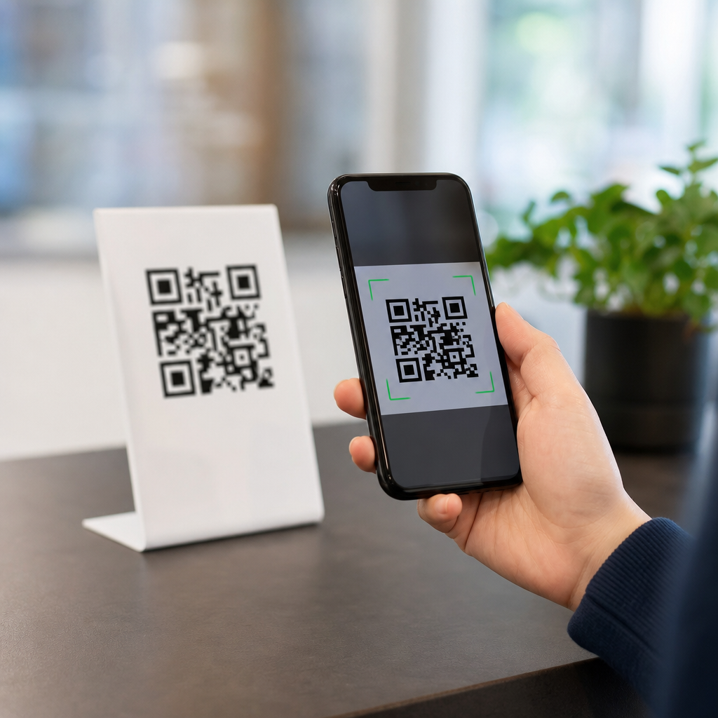
Background control is equally important. A QR code needs a quiet zone, the empty margin around the symbol, usually at least four modules wide. This blank border separates the code from surrounding text, photos, borders, and patterns. I have seen otherwise correct codes fail because a designer placed them tightly inside a decorative frame or over a textured image. The scanner reads nearby detail as part of the symbol and struggles to isolate the grid. The quiet zone is not optional design whitespace; it is a decoding requirement.
Size, distance, and placement rules for real environments
One of the most useful QR code design best practices is matching code size to expected scanning distance. A simple field rule is that the viewing distance should be about ten times the width of the code. A 2 centimeter code suits close hand scanning on packaging, while a poster viewed from 2 meters benefits from a code around 20 centimeters wide. This rule is not absolute, but it gives teams a dependable starting point before live testing.
Placement affects angle, glare, and user comfort. Codes should sit where people can point a phone without bending awkwardly, blocking traffic, or stepping into sunlight reflections. On product packaging, flat areas scan better than seams, folds, shrink wrap wrinkles, or curved bottle necks. On restaurant tables, matte tent cards usually outperform glossy laminated surfaces because glare interferes with module detection. On shop windows, interior lighting plus exterior reflections often create scanning issues unless the code is oversized and high contrast.
Environmental context matters more than many teams expect. An indoor flyer can support finer detail than a transit shelter ad exposed to rain, dirt, and variable daylight. Outdoor signage needs more generous sizing, stronger contrast, durable substrates, and more conservative customization. If the target audience may scan while walking, standing in line, or carrying bags, design for quick first pass recognition. Convenience is a scanability factor, not just a user experience detail.
Customization without breaking the code
Branding a QR code can improve trust and click through rate because users are more likely to scan a code that appears intentional and recognizable. However, safe customization follows strict boundaries. The finder patterns must stay visually distinct. The quiet zone must remain intact. Module shapes can be softened or rounded, but they still need clear separation and consistent geometry. Excessive stylization causes neighboring modules to blend, which reduces decoding accuracy.
Logo insertion works when the file uses suitable error correction, moderate central coverage, and enough clear contrast around the logo edge. As a rule, the logo should not dominate the symbol. In client reviews, I often reject concepts where the brand mark occupies so much space that the remaining modules become too fragmented. A smaller logo with a clean white knockout usually performs better than a large full color mark blended directly into the pattern.
Frames and calls to action can help, provided they sit outside the quiet zone or are designed with explicit clearance. A label such as “Scan to view menu” or “Scan for setup guide” improves scan intent because users understand the benefit immediately. Good QR code design best practices combine visual clarity with message clarity. People scan more when they know what they will get and trust the destination.
| Design factor | Best practice | Common mistake | Result |
|---|---|---|---|
| Contrast | Dark code on light background | Low contrast brand colors | Slow or failed scans |
| Quiet zone | At least four modules clear on all sides | Border graphics too close | Scanner cannot isolate code |
| Logo | Small centered mark with knockout | Large logo covering key modules | Reduced reliability |
| Size | Match width to viewing distance | Using one size for every medium | Poor long range performance |
| Surface | Matte, flat, high resolution output | Glossy, curved, pixelated print | Glare and distortion |
Print production and digital rendering considerations
A well designed QR code can still fail in production. Vector files such as SVG, EPS, or PDF preserve sharp module edges at any size and should be the standard for print. Raster files can work for digital placements, but low resolution PNGs often become blurry when resized by layout tools or compressed by ad platforms. Once module edges soften, camera software has less certainty about the grid boundaries.
Print method influences results. Offset and digital printing usually reproduce codes cleanly when ink spread is controlled, while thermal printing on shipping labels may produce feathered edges or voids if the printer is not calibrated. Small labels especially need test runs because dark modules can grow slightly through dot gain, shrinking the white gaps between them. On corrugated packaging or textured stock, that loss of definition can be enough to make a dense code unreliable.
Digital display introduces its own issues. Screen moire, low brightness, cracked displays, or animation behind the code can interfere with scanning. If a QR code appears on a website, presentation deck, kiosk, or event screen, keep it static, large, and surrounded by clear space. For responsive pages, confirm that mobile layouts do not shrink the code below practical size. A code users must pinch zoom is not easy to scan.
Testing methods, analytics, and governance for consistent results
The most dependable way to improve scanability is structured testing. I recommend checking every code on both iPhone and Android devices, across native camera apps and at least one third party scanner, under bright light and dim light, from the expected user distance. Test printed proofs, not just exported files. A code that scans on a designer’s monitor may fail once it is reduced, laminated, mounted on glass, or printed with a different substrate.
Dynamic QR codes support better governance because the destination URL can be updated without reprinting the symbol. They also simplify analytics by routing scans through a managed platform that records time, location, device type, and campaign source. Tools from Bitly, QR Code Generator, Beaconstac, and Flowcode are commonly used for this purpose. The design lesson is straightforward: shorter encoded data usually produces simpler symbols, and simpler symbols are easier to scan.
As a hub for QR Code Design & Branding, this page points to the broader process teams should own: set brand safe customization rules, define minimum sizes by channel, require contrast and quiet zone checks, specify vector output for print, and run real device tests before launch. When these standards are documented, scan performance becomes repeatable instead of accidental.
An easy to scan QR code is not the result of one trick. It comes from disciplined design choices that respect how cameras detect contrast, spacing, and pattern integrity in real environments. Keep the symbol simple, preserve the quiet zone, use strong contrast, size for distance, customize carefully, and test on the actual material and placement before release.
The main benefit of following QR code design best practices is reliability. Reliable codes reduce friction, protect campaign spend, and create smoother user journeys from package or sign to landing page, payment flow, menu, or app download. They also support stronger branding because users associate the scan experience with competence and trust, not frustration.
If you manage QR codes across packaging, retail, events, or marketing, use this hub as your starting point and turn these principles into production standards. Audit your current codes, fix the weak ones, and build a repeatable review checklist so every new QR code is easy to scan the first time.
Frequently Asked Questions
What factors make a QR code easy to scan?
A QR code is easiest to scan when several technical elements work together, not just when it looks clean or visually appealing. The most important factor is module clarity. Modules are the small square dots that make up the code, and they must be sharp, well-defined, and not blurred, distorted, or crowded together. A scanner needs to distinguish those squares quickly, so any loss of edge definition can reduce readability. Strong contrast also matters. In most cases, a dark code on a light background performs best because smartphone cameras and decoding software detect that separation more reliably. Low-contrast color combinations, gradients, shadows, or reflective finishes can make recognition slower or cause complete scan failure.
Size is another major factor. A QR code must be large enough for the camera to resolve the individual modules from the intended scanning distance. A tiny code on product packaging may work at close range, but that same size would fail on a poster meant to be scanned from several feet away. Quiet zone spacing is equally essential. This is the blank margin around the code, and it helps the camera identify where the symbol begins and ends. Without enough clear space, nearby text, graphics, or borders can interfere with detection. Print quality, lighting conditions, placement angle, and the phone camera’s ability to focus also affect scanability in real-world use. In short, an easy-to-scan QR code is the result of good structure, proper sizing, high contrast, sufficient spacing, and a realistic understanding of how people will scan it in everyday environments.
Why is contrast so important for QR code scanability?
Contrast is critical because a QR code scanner relies on clear visual separation between the dark and light areas of the symbol. The decoding process starts with image recognition, and if the camera cannot easily distinguish the foreground from the background, everything that follows becomes less reliable. High contrast, such as black on white, gives the camera and software the strongest chance of identifying the code instantly. When contrast drops, whether because of pale colors, glossy materials, poor lighting, or complicated backgrounds, the code may become harder to locate, focus on, and decode correctly.
This is especially important in real-world settings where ideal conditions rarely exist. A code printed on packaging might be scanned under store lighting. A restaurant menu might be used in dim indoor conditions. A poster may be viewed in bright sunlight with glare across the surface. In each case, reduced contrast makes the camera work harder and increases the chance of failure. Brand styling can also create problems when companies invert colors, place codes on patterns, use metallic inks, or add transparent overlays. While some customized QR codes can still scan well, they must preserve strong tonal distinction and avoid visual effects that obscure module edges. If the goal is fast, frustration-free scanning, contrast should be treated as a functional requirement, not a decorative choice.
How do size and scanning distance affect whether a QR code is easy to scan?
Size and scanning distance are directly connected. A QR code has to be large enough for a smartphone camera to capture the module pattern clearly at the distance where people are expected to scan it. If the code is too small, the camera may not resolve the individual squares accurately, especially if the user is not standing very close or if the phone has limited focus performance. This is why a code that works perfectly on a business card can fail on a sign, window display, or poster when viewed from farther away. The intended use case should always determine the final dimensions.
Complexity also matters. A QR code with more encoded data usually contains more modules, which makes each module smaller at any given print size. That means a dense code often needs to be printed larger than a simple one to remain readable. For example, a short URL will generally produce a cleaner, less dense code than a long string of text or tracking parameters. This is one reason many marketers use short links or dynamic QR codes. They help reduce data density and improve scanability. In practical terms, the best approach is to match the code size to real scanning behavior, test it on multiple phones, and account for less-than-perfect conditions such as motion, low light, or awkward viewing angles. A code that is technically scannable in ideal conditions may still perform poorly if it is undersized for its environment.
What is a quiet zone, and why does it matter so much?
The quiet zone is the empty margin surrounding a QR code, and it plays a much bigger role than many people realize. It gives the scanner visual separation between the code itself and any nearby design elements, text, borders, or images. When a camera detects a QR code, it first needs to identify the symbol’s boundaries. If surrounding content is too close, the software may struggle to determine where the code starts and ends, which can delay recognition or prevent decoding altogether. Even a perfectly printed QR code can become difficult to scan if its quiet zone is missing or too tight.
This issue often appears in branded layouts where designers want the code to feel integrated into packaging, flyers, menus, or advertisements. A logo frame, decorative border, background pattern, or tightly placed headline may seem harmless, but it can interfere with detection. The quiet zone is not wasted space. It is part of the code’s functional design. Preserving it improves reliability across different devices, camera qualities, and lighting conditions. It also helps when the code is viewed at an angle or from a distance, because the camera has a clearer target to isolate. For brands focused on performance, respecting quiet zone requirements is one of the simplest and most effective ways to improve scan success.
Can design customization and error correction improve a QR code without hurting scanability?
Yes, but only when customization is done carefully and with the technical structure of the QR code still intact. Error correction is one of the features that makes QR codes flexible. It allows part of the symbol to be damaged, obscured, or stylized while still remaining readable. This is why some brands can add a small logo in the center or make limited visual adjustments without breaking functionality. However, error correction is not a license to overdesign. If too many modules are altered, if the contrast becomes weak, or if decorative treatments blur the code’s geometry, scanability can decline quickly despite the built-in tolerance.
The safest approach is to treat customization as secondary to performance. Keep finder patterns clearly visible, maintain strong contrast, preserve the quiet zone, and avoid squeezing too much data into the code. Rounded shapes, brand colors, and logo placement can work if they are tested thoroughly across different phones and scanning apps. Error correction levels should be chosen based on actual needs, such as whether the code may be printed on curved packaging, exposed to wear, or partially covered by design elements. For campaigns, menus, labels, and product packaging, testing under real conditions is essential. A QR code may look polished on a screen and still fail when printed on textured material, viewed under glare, or scanned by an older smartphone. Good customization supports usability. Great customization protects usability first.


