QR codes can look identical at a glance, yet the difference between displaying one on a screen and printing one on paper changes how reliably it scans, how well it fits your brand, and how much data you can safely encode. In QR code design and branding work, this distinction matters because the camera, lighting, distance, material, and user context all shift between digital and physical environments. A code on a restaurant table tent competes with glare, folds, and stains; a code inside an app competes with brightness settings, low-resolution displays, and the practical problem that a user may be trying to scan a code on the same phone they are holding. Understanding QR codes on screens vs paper starts with a few key terms. Module size means the tiny square units that make up the pattern. Quiet zone means the blank margin around the code, typically at least four modules wide. Error correction refers to the built-in redundancy levels, commonly L, M, Q, and H, that allow partial damage or obstruction without failure. Contrast is the luminance difference between dark and light areas, which scanning software uses to separate data from background. These are not abstract rules; they are the variables that determine scan success in the field.
Why does this matter for print vs digital design considerations? Because the same branded QR code can perform very differently depending on whether it is embedded in a packaging label, displayed on a self-service kiosk, printed in a magazine, shown during a conference presentation, or included in an email footer. I have seen teams approve a beautifully styled code for a poster only to discover that the matte paper absorbed ink and softened edges, lowering readability from six feet away. I have also seen sharp digital codes fail because they were placed too small inside a mobile app, where the camera could not focus and the user could not open a second device. Good design decisions begin with the delivery medium. When you choose size, colors, error correction, placement, and destination flow based on the medium, scan rates improve and support issues drop. This hub article explains the practical differences, the technical constraints, and the branding decisions that separate successful screen-based QR codes from successful printed QR codes.
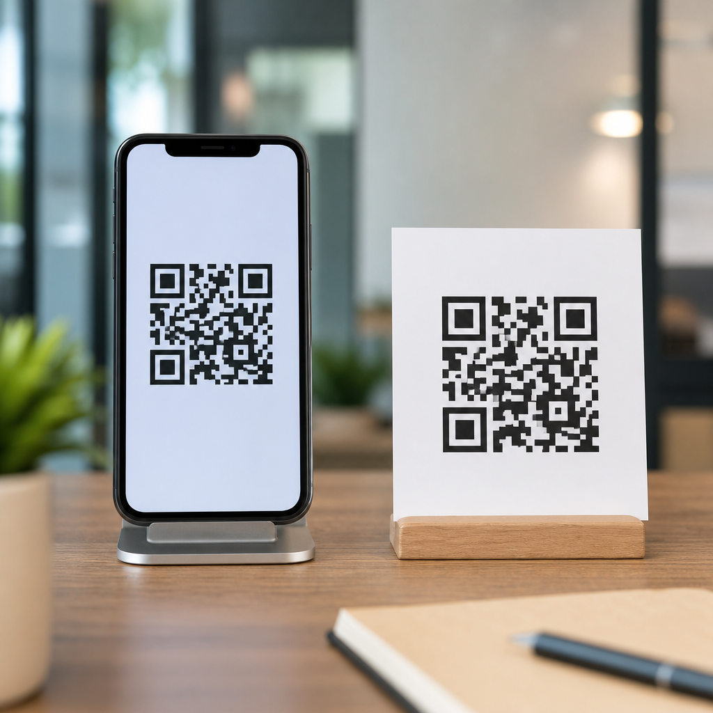
How Screen-Based QR Codes Behave in Real Use
A QR code on a screen is rendered by pixels, backlighting, and software scaling rather than ink on a surface. That gives digital codes important advantages. They remain crisp when exported correctly as SVG or high-resolution PNG, they can be updated instantly in a CMS or QR platform, and they are ideal for dynamic destinations such as app downloads, event check-ins, account logins, and payment prompts. However, screen-based codes introduce problems that do not exist in print. Brightness can be too low for the camera to distinguish dark modules from the background. Screens add glare under overhead lights. OLED displays can exaggerate contrast, while older LCD panels can wash it out. Compression artifacts in screenshots or messaging apps can deform edges. If the code is shown on a consumer phone, the user often cannot scan it with the same device unless you provide alternatives such as long-press recognition, a built-in scanner, or a short URL beneath the code.
Distance and scaling matter more on screens than many teams expect. A code projected onto a conference screen may appear large, but if the projector softens edges or the viewing angle is steep, scan reliability drops fast. For kiosk design, I usually start with high contrast, a generous quiet zone, and a minimum displayed size that assumes a user stands farther back than the design mockup suggests. For mobile UI, the opposite challenge applies: the code must remain large enough to scan on another device without dominating the screen. Native camera apps on iOS and Android are much better than they were five years ago, but they still perform best with clean edges, dark foregrounds, and simple backgrounds. Animated backgrounds behind a QR code, common in promotional landing pages, often hurt recognition because the detection algorithm struggles to isolate the finder patterns in the corners.
How Printed QR Codes Behave in Physical Environments
Printed QR codes are constrained by substrate, print method, finishing, and wear. A code that scans perfectly from a laser print on bright white stock may fail when reproduced through flexographic packaging, newsprint, corrugated cardboard, fabric, or etched acrylic. Ink spread, called dot gain, can make modules thicken and merge. Paper fibers can blur boundaries. Gloss coatings create reflections. Curved surfaces distort geometry. In the field, printed codes also suffer damage: folding, scratching, moisture, smudging, and UV fading. That is why print design usually demands a larger physical size, stronger contrast, and more testing on the final material rather than on office proofs.
Real-world examples show how medium changes the design brief. A direct-mail postcard can support a larger code with a clear instruction and ample white space, so it often scans well. A medicine label, by contrast, may force the code into a small area next to dense regulatory text, increasing the need for careful data minimization and perhaps dynamic routing instead of a long static URL. On packaging, I recommend testing the code after dielines, varnishes, and shrink wrapping are applied, not before. Even slight warping can matter. If the item will be scanned outdoors, consider sunlight, which can either improve contrast on matte stock or create strong glare on glossy labels. Printed QR codes generally reward conservatism: standard square modules, black on white, enough size for expected scanning distance, and a landing page that loads quickly on mobile data because many scans happen away from strong Wi-Fi.
Design Rules That Change Between Print and Digital
The core QR code standard does not change, but the design tolerances do. For digital use, vector formats are preferable because they avoid blurring when resized. PNG works if exported at sufficient resolution and displayed at whole-pixel dimensions. Avoid CSS scaling that lands on fractional pixels, because it can soften module edges. For print, resolution should be prepared at final output size, typically 300 DPI or higher for raster assets, although vector remains safest. Quiet zone discipline is nonnegotiable in both media, yet digital layouts often accidentally crop it when placing a code inside cards, banners, or social templates.
Color is another area where teams overestimate creative freedom. Scanners read luminance contrast, not brand intent. Dark foreground on light background is the safest choice in every medium. Reversed codes, such as white modules on black, can work but are less universally reliable, especially in poor lighting or when printed on textured stock. Gradient fills, photographic backgrounds, and transparent overlays are common failure points. If you add a logo in the center, raise error correction thoughtfully, but do not assume high error correction rescues weak contrast or a tiny code. Error correction compensates for obstruction and damage; it does not fix fundamental legibility problems. I have had better results using restrained branding around the code, with a strong callout panel and adjacent logo, than over-stylizing the code itself.
| Design factor | On screens | On paper |
|---|---|---|
| Size control | Flexible, but limited by viewport and device context | Fixed after printing; must account for scan distance |
| Edge clarity | Affected by pixel scaling, compression, display quality | Affected by ink spread, substrate texture, finishing |
| Lighting | Impacted by screen brightness and glare | Impacted by ambient light and reflective coatings |
| Updateability | Instant if the destination is dynamic | Requires reprint unless the QR destination is dynamic |
| User workflow | May need a second device or alternate interaction | Usually scanable from the same phone in hand |
Branding, Calls to Action, and User Intent by Medium
Branding strategy should follow user intent, and user intent differs sharply between paper and screens. Printed QR codes often serve discovery or bridge moments: a customer sees packaging on a shelf, a diner sits with a menu, a visitor walks past signage, or a trade show attendee picks up a brochure. In those cases, the code benefits from a direct call to action such as “Watch the setup video,” “See ingredients and sourcing,” or “Claim your event guide.” The user is not asking what the code is; the user is asking why scanning is worth the effort. Printed placements must answer that immediately because physical space is scarce and attention is short.
On screens, QR codes frequently support continuity between devices or channels. A streaming service uses a TV QR code for login. A desktop checkout page uses a QR code to open payment on a phone. A webinar slide uses a QR code to save resources without forcing a long URL. In these cases, the instruction should explain the destination and the device logic, for example, “Scan with your phone camera to complete payment.” That small phrase prevents confusion. It also reduces drop-off when the code appears on a phone screen where scanning is impossible without another device. From a branding perspective, consistency matters more than decoration. Use the same landing page styles, campaign naming, and analytics tagging across print and digital. The code itself should be recognizable as part of the brand ecosystem, but scanability must win every tradeoff.
Testing, Analytics, and Maintenance Across Both Formats
The best QR code design process is medium-specific testing, not guesswork. For screen-based codes, test on iPhone and Android using native camera apps, at different brightness levels, and on the actual displays where the code will appear, including kiosks, tablets, smart TVs, and presentation screens. Check portrait and landscape layouts. Test at realistic distances and under real lighting. For printed codes, proof on the final stock, not just a digital PDF. Scan after finishing, folding, labeling, or mounting. If a code appears on curved packaging, test several units from production because alignment variance matters. Include low-end device cameras in your test set; premium phones are more forgiving than the average installed base.
Analytics should also reflect the medium. Dynamic QR codes routed through platforms such as Bitly, QR Code Generator Pro, Beaconstac, or Flowcode allow destination changes, UTM tagging, and scan tracking by time, location, and device. That flexibility is especially valuable for print because the physical asset cannot be changed after distribution. For digital placements, dynamic routing still helps, but governance becomes the bigger issue: teams often paste codes into emails, social graphics, help docs, and in-product screens without version control. Maintain a naming convention, archive retired campaigns, and monitor broken destinations. A QR code that still scans but lands on a 404 page is operationally worse than one that never shipped, because it fails after earning user intent. Good maintenance includes link monitoring, HTTPS destinations, mobile-friendly landing pages, and a fallback short URL displayed near critical codes.
Choosing the Right Approach for Each Use Case
The right answer is rarely “print is better” or “digital is better.” The correct choice depends on context, audience, and the action you want the user to take. Use printed QR codes when the object, place, or package itself is the trigger for action and when the user is likely to have a phone available for scanning. Use screen-based QR codes when you need cross-device movement, instant content updates, or frictionless access from a distance, such as presentations, digital signage, and connected TV interfaces. In mixed campaigns, plan the asset family together so the printed code, the on-screen code, and the landing page all support the same promise while respecting different technical constraints.
For anyone building a QR code design and branding system, the central lesson is simple: medium-specific design increases reliability. Screen codes need crisp rendering, strong brightness and contrast control, and workflow clarity when a second device is involved. Printed codes need enough physical size, substrate-aware production choices, and testing after the final finish is applied. Both need quiet zones, restrained branding, mobile-first destinations, and ongoing analytics. If you treat print vs digital design considerations as a core planning step rather than a late-stage adjustment, your QR codes will scan more often, support your brand more cleanly, and create fewer customer dead ends. Audit your current QR placements by medium, test the weakest performers, and standardize the rules your team uses before the next campaign goes live.
Frequently Asked Questions
What is the main difference between a QR code shown on a screen and one printed on paper?
The biggest difference is the scanning environment. A QR code may contain the same destination URL whether it appears on a phone, kiosk, menu, poster, or product package, but the way people interact with it changes dramatically between digital and physical surfaces. On screens, brightness, pixel density, refresh behavior, and glare from glass can affect how easily a camera detects the code. On paper, print sharpness, ink spread, surface texture, folds, stains, fading, and viewing distance become the dominant factors. In other words, the code itself may be identical, but the medium changes the real-world scan reliability.
This matters because QR code performance is not just about whether the pattern exists; it is about whether a device camera can clearly separate the dark and light modules under typical conditions. A code inside an app may be viewed at close range in a controlled moment, while a printed code on a table tent or storefront sign may be scanned from farther away, under uneven lighting, and after the material has been handled repeatedly. Brands that treat screen and print QR codes as interchangeable often run into avoidable issues such as low scan rates, poor user experience, or visually inconsistent placements. The practical takeaway is simple: always design and test a QR code for the specific environment where it will appear.
Are QR codes on screens easier to scan than printed QR codes?
Not always. Many people assume screen-based QR codes are automatically easier because they are crisp, backlit, and not subject to physical wear, but that is only part of the story. A high-quality phone or tablet display can present a very clean code, especially if the code is large enough and the contrast is strong. However, screens also introduce their own problems, including glare on glossy glass, dim displays, automatic brightness changes, moiré effects, low-resolution rendering on some devices, and user interface clutter placed too close to the code. If the code is too small on a crowded mobile screen, or if it sits inside an interface with distracting motion or overlays, scan performance can drop quickly.
Printed QR codes can be extremely reliable when they are properly sized, printed sharply, and placed on suitable materials. In fact, a well-produced printed code on matte stock with strong contrast may scan more consistently than a poorly rendered code on a reflective screen. The key issue is not whether the code is digital or physical, but whether it is optimized for its medium. Screen QR codes usually benefit from close-range use and flexible resizing, while printed codes benefit from stability and permanence. The best approach is to evaluate expected scanning distance, ambient light, device quality, and user behavior before deciding which medium has the advantage in a given campaign.
How should QR code design change when creating one for paper versus a screen?
The design strategy should shift based on how much environmental control you have. For printed QR codes, it is generally smart to be more conservative. Use strong contrast, avoid tiny module sizes, preserve a generous quiet zone around the code, and be careful with heavily stylized shapes or branded color combinations that may reduce readability after printing. Printed materials can introduce ink gain, reduced sharpness, texture interference, and physical damage over time, so a paper-based QR code should usually have more scanning tolerance built into its design. This is especially important for items such as flyers, packaging, receipts, menus, event signage, and table displays that may be bent, smudged, or viewed at awkward angles.
For screen use, you can often take advantage of cleaner rendering and a controlled visual layout, but that does not mean every branded treatment is safe. You still need sufficient contrast, enough on-screen size, and space around the code so cameras can distinguish it from surrounding interface elements. Animated backgrounds, pop-ups, thin-line styling, and low-contrast brand palettes can all interfere with scanning. If you are embedding a QR code in an app, on a checkout screen, or in a digital presentation, make sure the code remains stable, fully visible, and large enough for the expected viewing distance. In both cases, branding should support functionality rather than compete with it. A beautifully customized QR code that fails to scan is not good design.
How much data can you safely encode on a screen QR code compared with a printed one?
Technically, a QR code standard allows the same broad data capacity regardless of whether the code appears on a screen or on paper. In practice, however, the usable amount of data is often lower than the technical maximum because more data creates a denser pattern with smaller individual modules. Smaller modules are harder for cameras to read when conditions are less than ideal. That means the safe amount of data depends heavily on the final display size, viewing distance, print quality, screen resolution, and environmental factors such as glare or motion.
For that reason, it is usually best to keep encoded data as minimal as possible in both mediums, especially for marketing and customer-facing use. A short URL or dynamic QR code is often safer than embedding long strings of data directly into the symbol. On paper, denser codes may become difficult to scan if the print size is small or the material degrades. On screens, dense codes may suffer if they are shown on small devices, compressed inside a layout, or displayed at insufficient brightness. If branding requires a smaller placement area, reducing encoded data becomes even more important. As a rule, do not aim for maximum capacity; aim for dependable scanning under realistic conditions.
What are the best practices for testing QR codes on screens and paper before launch?
Testing should reflect real use, not ideal studio conditions. For printed QR codes, test the code at its final production size, on the actual material if possible, and under the lighting conditions where customers will encounter it. Scan from expected distances and angles using multiple phones, both newer and older models. Check whether glossy coatings create glare, whether folds or curves distort the code, and whether nearby design elements reduce visibility. If the QR code will appear on packaging, signage, menus, or table tents, simulate wear and handling as well. A code that scans perfectly from a flat digital proof may fail once printed on textured stock or placed under restaurant lighting.
For screen-based QR codes, test across different devices, screen brightness levels, operating systems, and camera apps. Verify that the code still scans when a display dims, when the user holds one device in front of another at a slight angle, or when interface elements appear nearby. Make sure the code is not too small on mobile layouts and that it remains clear in both light and dark mode contexts if applicable. Also test the full experience after the scan: the destination should load quickly, match user expectations, and feel consistent with the brand promise that the QR code implies. The most effective QA process combines technical readability testing with user journey testing, because a QR code is not just a graphic element; it is a bridge between physical or digital touchpoints and the next action you want people to take.


