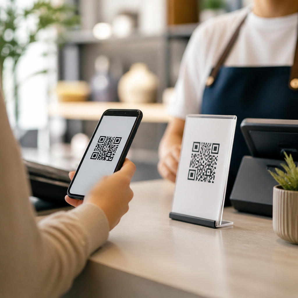
QR codes add value in marketing when they reduce effort, connect an offline moment to a useful digital action, and give people a clear reason to scan right now. A QR code is a two-dimensional barcode that stores a destination such as a URL, app deep link, payment flow, download, menu, form, or authentication prompt. Friction is any extra step, delay, confusion, or risk that makes the intended action harder than it needs to be. In practice, the difference between value and friction is simple: if scanning is faster and more relevant than typing, searching, or waiting, the code earns its place; if not, it becomes decoration that people ignore.
I have worked with QR code campaigns across retail stores, trade shows, direct mail, packaging, restaurants, and out-of-home placements, and the pattern is consistent. The best results come from matching context, intent, and destination. A customer standing in an aisle, holding a product, may want ingredients, reviews, how-to videos, or a coupon. An event attendee may want an agenda, speaker bios, or a lead capture form. A diner may want a menu, allergen details, and mobile payment. In each case, the code succeeds because it shortens the path to the next decision.
This matters because modern marketing is measured on conversion efficiency, not novelty. Attention is expensive, especially in physical environments where people are interrupted, moving, and using different devices under imperfect lighting or connectivity. QR codes can bridge the gap between physical media and digital analytics, but they only work when the exchange is obvious and worthwhile. People scan when the expected reward is immediate, the brand is credible, and the mobile experience is smooth. They stop scanning when the landing page loads slowly, asks for too much, or fails to match the promise nearby.
As a hub topic, this article explains why QR codes work in marketing, when they fail, which use cases consistently perform, how to measure impact, and what standards improve outcomes. The central idea is that QR codes are not inherently effective or ineffective. They are a delivery mechanism. Their performance depends on strategic fit, user intent, creative clarity, technical execution, and follow-through after the scan. Understanding those variables is what turns a black-and-white square into a reliable conversion asset instead of a pointless extra step.
Why QR codes work when they solve a real user job
QR codes work because they compress discovery and action into a single gesture. Instead of asking someone to remember a brand name, type a long URL, search through results, or download an app before seeing value, the code moves the person directly to the intended experience. In behavioral terms, that reduction in effort matters. Every extra click or second of delay lowers completion rates. The code can remove cognitive load, especially when the user is already in a decision moment.
The strongest use cases map to a clear job to be done. On product packaging, the job might be “help me decide” through product demos, social proof, certifications, or care instructions. In direct mail, it might be “let me respond” by opening a prefilled lead form or a personalized landing page. At a bus stop, it might be “occupy my wait time” with a sample, discount, or store locator. The common denominator is utility. People do not scan because the technology is interesting; they scan because the next step is easier than the alternatives.
Trust also explains why QR codes work. Smartphone cameras now recognize codes natively on iOS and Android, removing the old barrier of needing a separate scanning app. That shift changed behavior. During the pandemic, menus, check-ins, and contactless interactions normalized scanning across age groups. Adoption increased because the action became familiar and system-supported. Today, the barrier is rarely the act of scanning itself. The barrier is whether the surrounding message makes the value clear enough to justify attention.
When a QR code adds friction instead of value
A QR code creates friction when it interrupts a simpler path. If the destination is a homepage that users could reach by typing a short domain, the code adds little. If a printed ad expects a person driving past a billboard to scan while in motion, the context makes the action unrealistic and unsafe. If the code opens a non-mobile page, demands a login before showing basic information, or sends users into an app store without explanation, the promised convenience disappears.
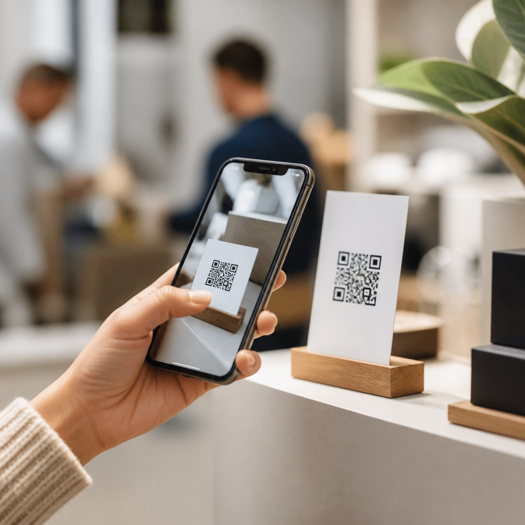
I often see this in retail displays where the code links to generic brand content rather than answering the shopper’s immediate question. A shelf talker that says “Scan to learn more” is weak because it forces the customer to guess the reward. “Scan for side-by-side model comparison and today’s rebate” is stronger because the next step is concrete. Precision matters. So does immediacy. A code that asks for six form fields before delivering a brochure is usually worse than placing the brochure directly on the page.
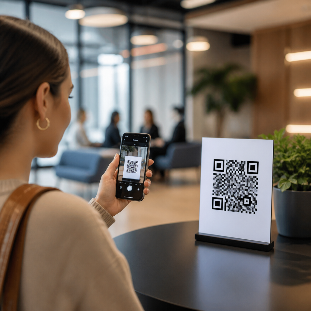
Friction also shows up in design and placement. Codes printed too small, wrapped around curved packaging, placed behind reflective glass, or shown in low contrast scan poorly. ISO/IEC 18004 governs QR code symbology, but practical readability depends on factors like module size, quiet zone, error correction level, and scanning distance. A common field rule is at least a 10:1 ratio between viewing distance and code size, with sufficient white space around the edges. If people must reposition repeatedly to get a scan, the marketing moment is already lost.
High-value marketing use cases that consistently perform
Some QR code applications outperform others because the user intent is obvious. Menus and payments are the clearest examples. The diner already wants information or transaction access, the phone is in hand, and the code removes waiting. Product packaging is another strong category, especially in food, beauty, consumer electronics, and regulated goods. Brands use codes for sourcing details, usage instructions, loyalty enrollment, subscription reorder, and authenticity checks. These work because the code sits directly on the object the customer is evaluating or using.
Events are equally effective. Conference badges, booth graphics, and session screens can route attendees to schedules, speaker slides, giveaway claims, or calendar bookings. The best event deployments connect scan data to CRM systems such as HubSpot, Salesforce, or Marketo so teams can segment by booth, session, or asset. Print media can also work well when the landing experience is purpose-built. A catalog code that opens a preselected product page or room bundle performs better than one that drops users on a category page with no continuity from the printed creative.
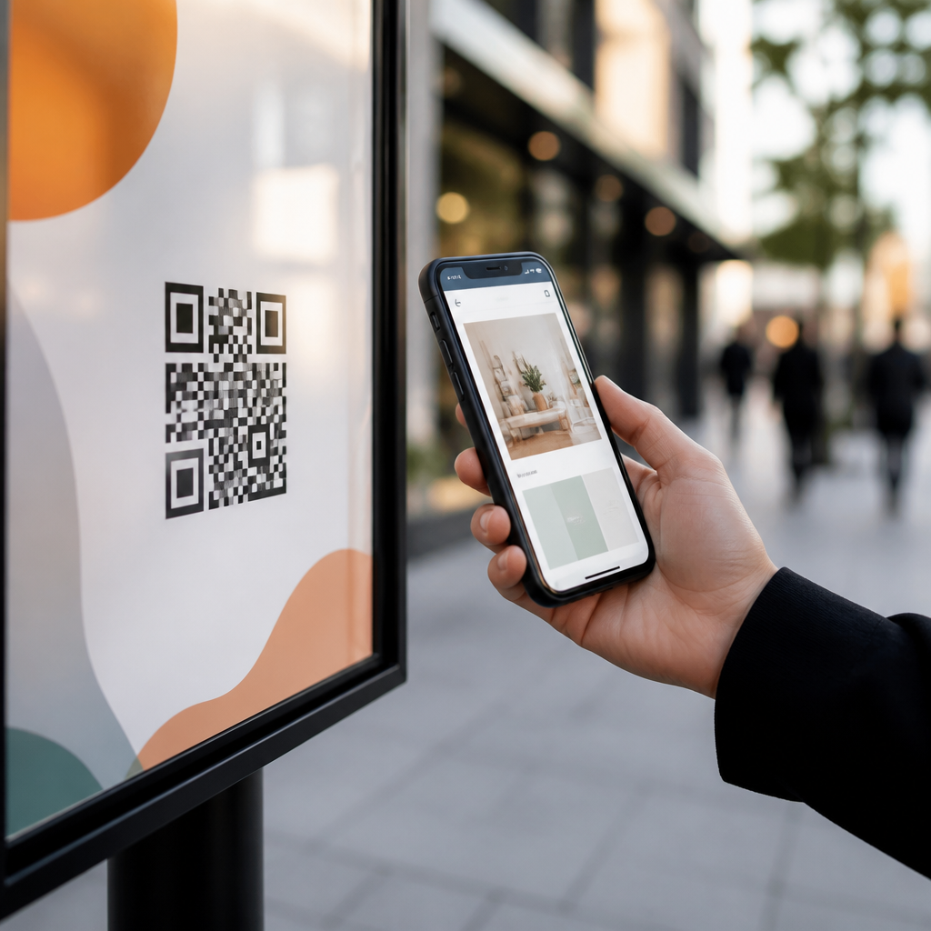
For local marketing, QR codes shine when they support intent already present in the environment: a window sign for after-hours ordering, a table tent for joining a loyalty program, a gym poster linking to class signup, or a real estate sign opening a property tour page with maps and financing options. In each example, the code is not inventing demand. It is capturing demand at the moment it appears.
| Use case | Why people scan | What the destination should do | Common mistake |
|---|---|---|---|
| Product packaging | Need proof, instructions, or reorder options | Open a mobile product hub with reviews, video, and purchase links | Sending users to the homepage |
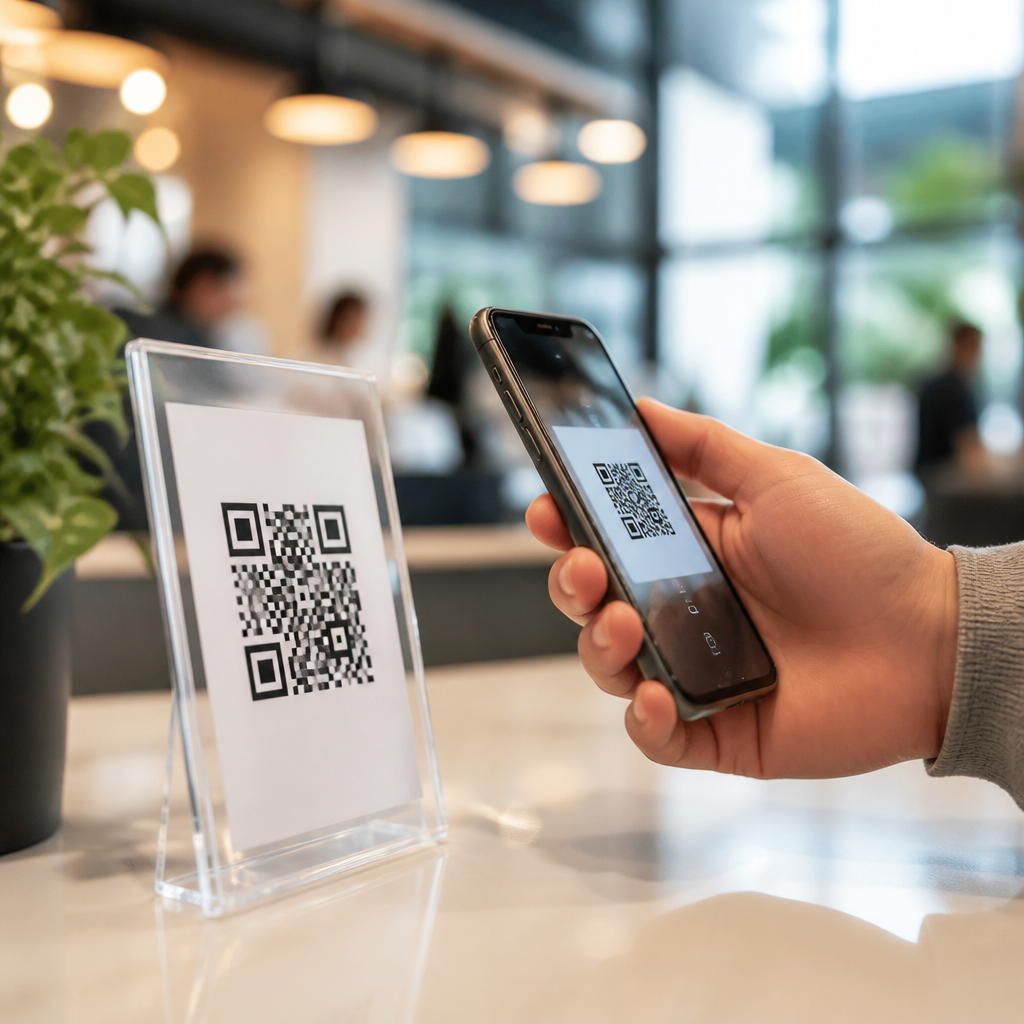
| Restaurant tables | Want menu, allergens, and payment fast | Load instantly with no download required | Using a PDF that is hard to read on phones |
| Direct mail | Need an easy response path | Open a personalized offer or short form | Asking for too much information upfront |
| Events and trade shows | Want schedules, assets, or follow-up | Connect to lead capture and CRM tagging | Using one generic code for everything |
| Retail signage | Need comparison, stock, or deals in aisle | Answer the exact product question quickly | Vague calls to action |
What makes people scan: clarity, trust, and immediate payoff
The most important creative element is the call to action. “Scan me” is not a strategy. People scan when the surrounding message states a direct benefit, a time frame, and a low-risk next step. Good examples include “Scan for a 15% first-order coupon,” “Scan to see assembly in 60 seconds,” or “Scan to check store inventory.” These phrases answer the silent questions every user asks: What will I get, how fast will I get it, and is this worth doing now?
Brand trust influences response rates more than many teams expect. Unknown short links, heavily disguised domains, or inconsistent branding suppress scans because users worry about spam, phishing, or malware. Native camera previews help by showing the domain before opening, which means branded link structure matters. A recognizable domain, visible privacy reassurance, and design consistency between the physical asset and landing page all reduce uncertainty. In regulated sectors such as healthcare and finance, the destination must also respect consent, accessibility, and disclosure requirements before asking for sensitive information.
Immediate payoff is the final trigger. If the scan reveals content that is richer, faster, or more personalized than what users could easily find through search, performance improves. Video tutorials, interactive fit tools, geolocated inventory, wallet passes, one-tap coupon saves, and event calendar inserts are effective because they produce an instant utility gain. Delayed rewards can still work, but only when the incentive is strong enough to justify the wait.
How to design the destination so the scan converts
The landing experience determines whether a scan becomes a conversion. I build QR destinations as mobile-first pages with compressed assets, visible headings, single-purpose layouts, and minimal form friction. Core Web Vitals matter because slow pages waste the very convenience the code promises. Large tap targets, concise copy, and one primary action outperform cluttered pages with competing offers. If a campaign has one goal, the page should behave like it has one goal.
Message match is essential. The headline on the landing page should restate the value promised near the code. If the sign says “Scan for installation video and warranty registration,” those two options should be immediately visible above the fold. Do not force users to hunt. If the code is tied to a product variant, region, or channel, pass parameters in the URL so content can adapt dynamically. Dynamic QR code platforms make this easy while preserving the printed asset.
Accessibility and analytics should be built in from the start. Use responsive design, readable contrast, alt text where appropriate, and forms that work with autofill and screen readers. Track scans and downstream actions with UTM parameters, analytics events, and CRM attribution. A scan is not the conversion. It is the entry point. Marketers need to know what percentage of scanners viewed, clicked, purchased, registered, or returned later.
Measurement, testing, and the business case for QR codes
QR code performance should be judged by business outcomes, not just scan volume. Useful metrics include scan-through rate by impression source, landing-page engagement, form completion, add-to-cart rate, redemption rate, assisted revenue, and lead quality. In physical environments, exact impression counts are imperfect, so teams often compare placements, stores, regions, or time periods rather than chasing false precision. What matters is whether the code improves the cost and speed of moving users into measurable digital journeys.
Testing is straightforward and often revealing. Change one variable at a time: call to action, incentive, placement height, code size, destination format, or form length. I have seen a simple shift from “Learn more” to “Scan for ingredient list and reviews” double scans on packaging because it matched shopper intent more precisely. Replacing a PDF menu with a lightweight web menu frequently increases engagement because the page loads faster, zooms cleanly, and supports analytics events that PDFs rarely provide well.
The business case is strongest where offline media needs attribution. Direct mail, print ads, packaging, in-store signage, and out-of-home often suffer from weak measurement compared with digital channels. QR codes help close that gap. They are not perfect, because some people still navigate later through search or direct traffic, but they provide a trackable bridge that can be segmented by asset, market, and audience. For many teams, that visibility is as valuable as the convenience offered to customers.
Standards, risks, and practical implementation rules
Several implementation rules consistently improve results. Use dynamic codes when campaigns may change, because they let teams update destinations without reprinting assets. Maintain a clear quiet zone around the code. Test across iPhone and Android devices, under real lighting conditions, and at the intended scanning distance. Avoid placing codes where users have poor signal unless the page is extremely lightweight. For physical durability, consider surface finish, curvature, and whether wear or condensation will affect readability.
Security deserves explicit attention. Because QR codes can obscure the destination, bad actors sometimes use them for phishing, known as quishing. Marketers should mitigate this by using branded domains, visible URL previews where possible, tamper-resistant placement, and regular audits of printed materials in public spaces. If a code initiates payment or account access, route users through secure pages with HTTPS, clear branding, and fraud controls. Convenience cannot come at the cost of trust.
The practical rule is simple: only use a QR code when it is the fastest believable path from context to value. If a short URL, NFC tap, printed instruction, or plain old search result serves the user better, choose that instead. But when the environment is physical, the intent is immediate, and the digital destination is truly useful, QR codes are one of the most efficient tools in marketing. Audit your current placements, rewrite weak calls to action, and test one high-intent use case this quarter.
Frequently Asked Questions
What makes a QR code genuinely useful instead of just another marketing gimmick?
A QR code adds real value when it removes effort from something a person already wants to do. The clearest test is simple: does scanning make the next step faster, easier, or more relevant than any obvious alternative? If the answer is yes, the code is likely helpful. If the scan merely sends someone to a generic homepage, repeats information already printed nearby, or asks them to work harder without an immediate payoff, it is creating friction instead of reducing it.
In practical terms, useful QR codes connect an offline moment to a high-intent digital action. That could mean opening a product setup guide at the exact step a customer needs, launching a restaurant menu without making someone type a long URL, starting a payment flow, downloading a ticket, opening a map, or taking a user directly into an app screen with a deep link. The value comes from relevance and immediacy. People scan when they understand what they will get and why it matters right now.
The best QR implementations also respect context. A person standing in a store aisle, walking through an event venue, opening a package, or waiting at a transit stop has limited time and attention. In those moments, the code should lead to one useful outcome with minimal delay. A good QR experience feels like a shortcut. A bad one feels like an extra chore.
How can you tell whether a QR code is reducing friction or adding it?
Start by evaluating the full path from seeing the code to completing the intended action. Friction can appear at every stage: noticing the code, understanding why it is worth scanning, opening the camera, waiting for the destination to load, and figuring out what to do next. If any step introduces confusion, delay, or distrust, the QR code may be hurting more than helping.
A few practical warning signs are easy to spot. If the code lacks a clear call to action, users have no reason to scan. If it opens a desktop-style webpage that is slow or hard to use on mobile, the experience breaks down immediately. If it asks for too much information too soon, routes through multiple redirects, or lands on content unrelated to the physical context, people will abandon it. The same is true if the destination duplicates what was already available in plain text with less effort.
By contrast, low-friction QR experiences are specific, fast, and mobile-first. The label near the code explains the benefit in plain language, such as “Scan to pay in 10 seconds,” “Scan for installation instructions,” or “Scan to see today’s menu.” The landing experience should load quickly, work cleanly on a phone, and make the next action obvious. Measuring scan-to-completion rates, bounce rates, and time to action can also reveal whether the code is doing useful work or simply inserting another step into the journey.
Where do QR codes usually perform best in marketing and customer experience?
QR codes are strongest where there is a natural gap between a physical interaction and a digital action. Packaging is a strong example because a customer already has the product in hand and may want setup help, warranty registration, refill ordering, product verification, or how-to content. Events are another effective environment because people often need schedules, tickets, maps, speaker details, lead capture, or follow-up materials immediately. Retail displays can also work well when the code unlocks inventory details, product comparisons, reviews, or limited-time offers that support a purchase decision in the moment.
They also perform well in service contexts where speed matters. Think table ordering, payment, appointment check-in, guest Wi-Fi access, transit information, authentication prompts, and contactless document access. In these use cases, the QR code acts as a shortcut to a task people already intend to complete. That is why adoption feels natural rather than forced.
Where QR codes tend to underperform is when they are used as decoration or habit rather than problem-solving. Placing a code on a billboard for a broad awareness campaign can work, but only if the audience can realistically scan it safely and the reward is immediate and compelling. Adding a code to a flyer, poster, or ad without a strong reason to scan often leads nowhere. The location matters less than the match between intent, timing, and the usefulness of the destination.
What should a business link to when using a QR code?
The destination should match the exact job the person is trying to accomplish at that moment. That could be a mobile landing page, app deep link, payment flow, digital menu, coupon, product tutorial, feedback form, support article, event registration page, authentication prompt, or download. The important principle is specificity. A QR code should not force users to hunt around after they scan. It should place them as close as possible to the final action.
For example, if someone scans a code on product packaging, sending them to the brand homepage is usually a weak choice. A better destination might be a setup walkthrough for that exact product model, a refill subscription page, a warranty registration form prefilled with product details, or a troubleshooting guide. If someone scans a code on a restaurant table, they should land directly on the menu or ordering flow, not on a general corporate site. If someone scans in a store aisle, the destination could be a comparison chart, reviews, stock availability, or a personalized offer tied to that product.
Businesses should also optimize the destination for mobile performance, trust, and continuity. That means fast load times, a secure and recognizable domain, clear branding, concise copy, and a page layout that is easy to use with one hand on a phone. In many cases, dynamic QR codes are especially useful because they allow the destination to be updated without reprinting the code, making it easier to test offers, fix broken links, and adapt content to changing campaigns or inventory.
What are the most common mistakes that make QR codes feel annoying or ineffective?
The biggest mistake is giving people no compelling reason to scan. A QR code by itself is not a benefit; it is just a mechanism. If the surrounding message does not explain the payoff, most people will ignore it. Another common error is linking to a generic or poorly optimized destination, especially a homepage or a cluttered page that does not continue the promise made next to the code. When users scan expecting one thing and get something broad, slow, or irrelevant, trust drops quickly.
Other frequent issues include bad placement, poor sizing, weak contrast, and environmental barriers. A code placed too high, too low, too far away, or on a reflective surface may be difficult to scan. A code shown where internet connectivity is unreliable, where people are moving quickly, or where scanning is physically awkward can also fail regardless of the offer. Timing matters too. Asking for a scan before a person has enough context can feel premature, while asking after they have already completed the task can feel unnecessary.
There are also strategic mistakes. Some brands use QR codes because they seem modern rather than because they solve a real user problem. Others layer on extra forms, redirects, or app-install requirements that overwhelm the convenience of the scan. To avoid these pitfalls, treat every QR code as part of a complete user journey. Define the exact value, communicate it clearly, make the destination immediate and mobile-friendly, and remove every avoidable step between scan and success. When that discipline is in place, QR codes can be highly effective. When it is missing, they become one more source of friction.