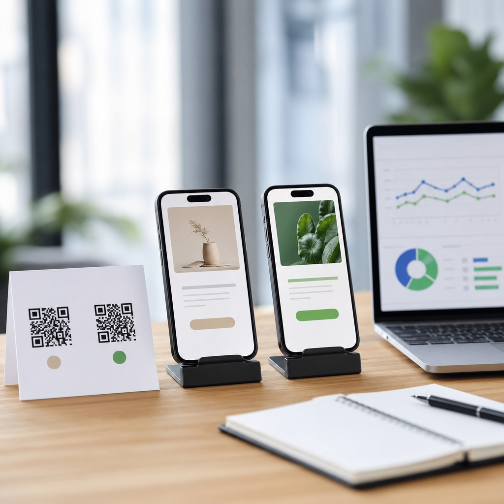
Using heatmaps to optimize QR code placement starts with a simple truth: where a code appears matters almost as much as the destination it opens. In QR Code Analytics, Tracking & Optimization, placement decisions affect scan rate, conversion rate, and attribution quality. A heatmap is a visual model that shows where people look, pause, move, or interact within a physical or digital environment. In practice, teams use heatmaps from eye-tracking studies, camera-based footfall analysis, click maps, scroll maps, and in-store observation to predict the highest-probability scan zones. Scan behavior describes the sequence behind a successful scan: noticing the code, understanding its value, approaching it, framing it in the camera, and completing the action after the scan. If any step fails, performance drops. I have seen strong offers underperform simply because the QR code sat below the natural line of sight on a poster, or too close to reflective packaging seams that made smartphone autofocus struggle. Heatmaps help remove that guesswork.
This matters because QR campaigns now bridge offline and online journeys across retail shelves, restaurant tables, direct mail, events, out-of-home advertising, product packaging, and connected TV. A scan is measurable, but the non-scan is usually invisible unless placement is studied. Heatmaps expose the context behind the metric. They reveal whether people missed the code entirely, saw it but did not trust it, or tried to scan but faced friction such as glare, distance, low contrast, or crowd flow. For marketers, designers, and operations teams, heatmaps turn QR placement from a creative preference into an optimization discipline. The result is better visibility, more reliable testing, and a clearer path from attention to action.
What heatmaps show in QR code campaigns
Heatmaps for QR code placement are not one thing. In digital environments, click maps and attention maps show which parts of a landing page or on-screen creative receive focus. In physical environments, eye-tracking studies reveal gaze patterns, while video analytics and footfall sensors show dwell time, approach angle, and congestion. Retail planogram software can add shelf-level visibility data, and event teams often combine badge scans, camera observations, and wayfinding maps to understand flow. When these sources are layered together, they show where a code should sit for maximum discoverability and minimum scanning friction.
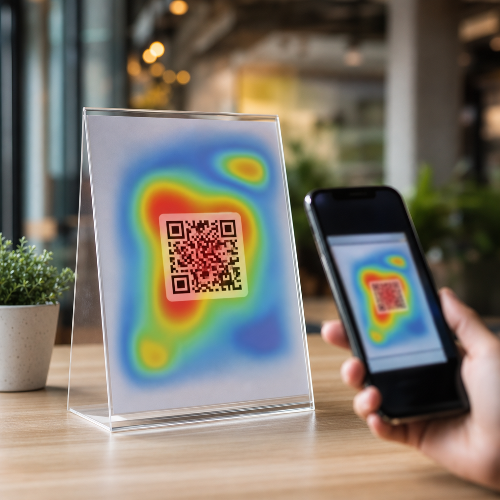
The most useful principle is that a QR code must live inside a high-attention zone and still preserve a comfortable scanning zone. High attention alone is not enough. A code placed near the top of a billboard may be seen but cannot be scanned safely from a moving vehicle. Likewise, a code embedded in a dense restaurant menu may receive visual attention but lose scans because it competes with prices, photos, and body text. In field tests, the winning position is usually where gaze naturally lands after the main message, with enough white space around the code, a short call to action, and a predictable physical distance that allows the phone camera to focus quickly.
Scan behavior also changes by environment. On packaging, shoppers often view products at arm’s length, then rotate them before scanning. On a tabletop tent card, the user is seated and has time, but lighting may be dim. In transit advertising, attention windows are brief and approach angles vary. In each case, heatmaps answer a practical question: where will the person first look, where will they pause long enough to act, and can they physically complete the scan from that position? The teams that answer those three questions consistently outperform teams that place codes wherever there is empty space.
How to read scan behavior across different environments
Physical context determines whether a QR code is merely visible or truly scannable. In stores, shoppers follow repeated visual patterns: brand block first, price second, pack information third. That means a code on the back panel may attract fewer exploratory scans unless the front panel clearly signals a reason to turn the pack. On endcaps, center-right placement often performs well because many shoppers approach from the aisle and visually sweep left to right, though this varies by store layout and language direction. In restaurants, tabletop placements beat wall placements for menu access because the device can be held parallel to the code with less motion. At trade shows, chest-height placements on booth graphics consistently beat floor decals because attendees are already processing signs at eye level while walking.
Digital environments have their own scan logic. If a QR code appears on a presentation slide or connected TV ad, users need enough on-screen dwell time, sufficient code size, and a low-clutter frame. Heatmaps from user testing typically show attention clustering around faces, headlines, and moving objects first. The code should therefore appear adjacent to the primary message, not isolated in a corner after the audience has mentally moved on. For webinar slides, I have found that placing the code near the final takeaway with a spoken prompt increases scan intent because visual attention and verbal reinforcement align.
| Environment | Best placement pattern | Main risk | Useful heatmap signal |
|---|---|---|---|
| Product packaging | Near benefit copy on a stable panel | Curved surfaces and glare | Hand position and gaze pause before rotation |
| Retail signage | Eye-level zone beside price or offer | Crowding and blocked sightlines | Dwell time in front of fixture |
| Restaurant tables | Top third of table tent or menu insert | Low light and spills | Seated gaze path and reach distance |
| Out-of-home ads | Lower central area for pedestrian access | Insufficient stopping time | Approach angle and viewing duration |
| Slides and TV | Adjacent to headline during final message | Short dwell time on screen | Attention shift after spoken prompt |
These patterns are not universal rules. They are starting points for testing. The strongest teams validate assumptions with scan-through rate by location, unique scans by creative variant, and post-scan conversion behavior. Heatmaps tell you where attention goes; analytics confirm whether that attention becomes action.
Design factors that make a high-heat zone actually perform
Once a heatmap identifies the right area, execution determines whether the QR code can capitalize on that visibility. Size is the first variable. A common production guideline is a minimum of about 2 x 2 centimeters for close-range use, but practical sizing should follow scan distance. A useful rule is roughly a 10:1 ratio between distance and code width, so a code meant to scan from one meter away should be around 10 centimeters wide. Smaller can work with modern cameras, yet margin for error disappears quickly when lighting, motion, or print quality is imperfect.
Contrast is the second variable. Dark code on a light background remains the most reliable option because smartphone decoders need clean edge detection. Reversed codes, gradients, and heavy branding overlays may pass studio tests and fail in the field. Quiet zone is equally important. ISO/IEC 18004 defines the technical basis for QR code symbol structure, and one field lesson stands out: preserve sufficient blank space around the symbol. When designers crowd the code with borders, icons, or textured imagery, scan reliability falls. Heatmaps may show the right placement, but if the code itself is hard to parse, the opportunity is wasted.
The call to action matters more than many teams expect. People scan when the immediate value is obvious. “Scan to view ingredients” works better than “Learn more” on food packaging. “Scan for the menu” beats “Open digital experience” at a restaurant. The prompt should sit close enough to the code that the eye treats both as one unit. In tests on retail displays, moving the call to action from above the headline to directly beneath the code improved scan rate because the intent became explicit at the moment of attention. Supporting trust cues also help, especially in public settings. Brand logos, HTTPS destinations, recognizable app deep links, and concise privacy language reduce hesitation.
Building a heatmap-driven testing process
A strong optimization program combines observational data, controlled experiments, and QR analytics. Start by defining the scan objective: product education, coupon redemption, app install, registration, payment, review request, or authentication. Then map the user journey before the scan. Where does the person stand, what are they doing, how much time do they have, and what competes for their attention? This context determines which heatmap method to use. Eye tracking is useful for packaging and posters. Video analytics works well for stores and events. Scroll and click maps matter when codes appear on web pages, receipts, or digital displays.
Next, create placement variants with one variable changed at a time. Test height, lateral position, surrounding copy, code size, and visual isolation. Use dynamic QR codes so the destination remains consistent while each placement version has distinct tracking parameters. UTM parameters can support web analytics attribution, but use short, clean redirect structures managed in a QR platform so printed assets remain unchanged while destinations evolve. In my experience, teams that mix placement changes with offer changes cannot tell what caused the lift. Isolating variables is slower at first and far more efficient over multiple campaign cycles.
Measurement should include more than scans. Scan rate per impression is useful, but completion rate after the scan tells you whether placement attracts qualified intent or accidental curiosity. Time-of-day patterns reveal whether glare or crowding affects usability. Device breakdowns can expose camera compatibility issues. Location-level reporting is essential for multi-site rollouts because one successful pilot placement may fail in another store with different lighting or traffic flow. Statistical significance matters as well. Small sample sizes often produce misleading winners, especially when scans are infrequent events.
Finally, document findings as reusable placement rules. A hub page on Heatmaps & Scan Behavior should connect those rules to related work on QR code analytics dashboards, A/B testing, campaign attribution, landing page optimization, and error correction choices. That internal structure helps teams move from isolated experiments to a repeatable optimization system.
Common mistakes and what high-performing teams do differently
The most common mistake is placing the QR code wherever production space remains after the layout is finished. That treats scanning as a decorative add-on rather than a behavior to engineer. Another frequent error is assuming visibility equals usability. A code may be visible on a glossy window cling at noon and become nearly unscannable because of reflections. Teams also underestimate angle. On curved bottles, flexible pouches, or hanging signs, distortion can break recognition even when the code appears large enough. I have seen campaigns blamed on “low audience interest” when the real issue was a code mounted below waist height where customers never naturally looked.
High-performing teams walk the environment before approving artwork. They test with multiple phones, in real lighting, at realistic distances, and during busy periods. They check not only whether the code scans, but how long it takes and whether the user feels confident doing it. They use QR code generators and analytics platforms that support dynamic redirects, expiration controls, location filters, and scan logs. They also coordinate with merchandising, store operations, and print vendors, because a placement that works in a design mockup can fail once a shelf talker bends, a laminate changes reflectivity, or a fixture blocks sightlines.
Another difference is that strong teams think beyond the first scan. Heatmaps can guide where to place the code, but the landing experience must match the promise made at the point of attention. If the sign says “Scan for today’s offer,” the destination should load fast, work on mobile, and show the offer immediately. Misalignment between message and destination suppresses repeat behavior and distorts test results, because people remember friction. Optimization therefore requires a full-chain view: attention, scanability, destination relevance, and conversion.
Heatmaps turn QR code placement from intuition into evidence. They show where attention forms, where movement slows, and where a person can comfortably complete a scan. When that insight is paired with sound QR design, controlled testing, and clear analytics, teams stop guessing and start improving measurable outcomes. The core lessons are straightforward: place the code in a genuine attention zone, protect scanability with size and contrast, pair it with an explicit call to action, and validate every assumption in the real environment. Whether the code lives on packaging, signage, menus, direct mail, or screens, scan behavior follows context-specific patterns that can be observed and optimized.
For a sub-pillar hub under QR Code Analytics, Tracking & Optimization, this topic connects naturally to deeper articles on eye-tracking methods, scan rate benchmarking, multi-location attribution, packaging tests, digital display timing, and post-scan landing page performance. The advantage of mastering Heatmaps & Scan Behavior is practical: better placement improves discoverability without increasing media spend. More of the audience that already sees your asset will act on it. Review your current QR placements, identify the highest-friction environments, and run one heatmap-informed test this week.
Frequently Asked Questions
What does a heatmap actually show when optimizing QR code placement?
A heatmap shows where attention and interaction are concentrated, which makes it extremely useful when deciding where a QR code should appear. Depending on the environment, a heatmap can represent eye movement, dwell time, foot traffic, cursor movement, taps, clicks, or areas where people naturally pause before taking action. In a retail aisle, for example, a heatmap may reveal that shoppers consistently look at shelf-edge signage but ignore upper-corner posters. On a product page, it may show that users focus heavily on the main image and pricing section while skipping content placed too far below the fold. Those visibility patterns matter because a QR code that sits in a low-attention zone often underperforms regardless of how good the offer behind it may be.
For QR code analytics, heatmaps help bridge the gap between visibility and measurable performance. They do not just answer whether a code was scanned; they help explain why scan rates differ by location, format, or context. If one printed flyer produces significantly more scans than another with the same design and destination, the heatmap may reveal that the winning version placed the code near a natural focal point while the weaker version buried it in a visually cold area. This makes heatmaps valuable not only for initial placement decisions, but also for diagnosing poor campaign performance, improving conversion paths, and strengthening attribution quality across physical and digital touchpoints.
How do heatmaps improve QR code scan rate and conversion rate?
Heatmaps improve scan rate by helping teams place QR codes where people are most likely to notice them, understand them, and act on them. Attention is the first barrier. If a code is not seen, it cannot be scanned. Heatmaps identify the parts of a poster, package, storefront, kiosk, email, or landing page that naturally attract the eye or receive the most interaction. Once those high-attention zones are known, marketers can position the QR code where it fits the user’s visual path instead of forcing people to hunt for it. That simple change often produces a meaningful lift in scans because it reduces friction and aligns the code with existing behavior.
Conversion rate improves when the QR code appears in a place that matches user intent. A code positioned next to a product benefit, pricing message, event detail, or clear call to action usually performs better than a code placed in isolation. Heatmaps reveal where users are mentally engaged and ready to decide. In a restaurant menu, for instance, a code placed near featured items may outperform one placed at the bottom corner because customers are already in a decision-making moment. In a digital environment, a click map might show that users are highly engaged around comparison tables or FAQ sections, making those areas better candidates for a QR code linked to a demo, coupon, or order flow.
There is also an attribution benefit. When placement is informed by heatmap data and paired with QR code tracking, teams can more confidently connect visibility, scans, and downstream outcomes. That means better testing, cleaner campaign comparisons, and more accurate conclusions about which placements truly drive value rather than simply generating impressions.
What types of heatmaps are most useful for physical versus digital QR code placement?
For physical QR code placement, the most useful heatmaps are usually built from eye-tracking studies, camera-based footfall analysis, dwell-time mapping, and observational behavior data. Eye-tracking helps identify where people look first and how long they focus on specific elements within signage, packaging, displays, or print layouts. Footfall and dwell analysis add another layer by showing where people physically move, stop, queue, or linger. That is important because a QR code may be visible but still ineffective if it appears in a location where people are walking too quickly to scan comfortably. In a store window, trade show booth, or transit ad, physical behavior data often matters just as much as visual attention data.
For digital placement, click maps, scroll maps, hover maps, and session interaction data are especially useful. Click maps show where users attempt to interact. Scroll maps reveal how far down a page they actually go. Hover maps can indicate curiosity or hesitation, and session recordings provide context around how users move through a page before taking action. If a QR code is embedded on a landing page, these tools can reveal whether users even reach the section where the code appears, whether surrounding content distracts from it, and whether a nearby call to action should be repositioned.
The strongest optimization programs often combine multiple heatmap types rather than relying on just one. For example, a brand placing QR codes on in-store displays might use footfall heatmaps to identify high-traffic zones, eye-tracking to refine exact placement within the creative, and scan analytics to validate performance. In digital channels, teams may combine scroll maps with conversion tracking and A/B testing to confirm whether a more visible position actually produces more scans and better post-scan outcomes.
Where should a QR code usually be placed based on heatmap insights?
There is no single universal best location, but heatmap insights consistently point toward one principle: place the QR code where visibility, readability, and action readiness overlap. In practice, that often means positioning the code near a primary focal point, close to supporting copy, and in an area where people have enough time and space to scan. For printed materials, a QR code generally performs better when it is integrated into the main reading flow rather than tucked into a corner as an afterthought. On posters and flyers, mid-to-lower visual zones often work well if they follow a headline and supporting benefit statement, because users can quickly understand what the code offers before deciding to scan.
In packaging, the best placement depends on how the product is held, displayed, and viewed on shelf. Heatmap analysis may show that the front panel gets the most attention, but side or back panels can sometimes convert better if they provide a calmer scanning moment with less visual clutter. In stores and public environments, placement should also account for approach angle, lighting, crowd movement, and distance. A code can fail even in a high-attention area if it is too small, distorted, or hard to access from where people stand.
On websites or digital signage, heatmaps often support placing QR codes near high-interest content blocks, product highlights, event details, or strong calls to action. The key is context. A QR code should not interrupt the experience; it should extend it. When users can immediately understand why they should scan and what they will get, performance usually improves. Heatmaps help identify those intent-rich moments with much more precision than guesswork alone.
What are the biggest mistakes to avoid when using heatmaps for QR code placement?
One of the biggest mistakes is treating heatmaps as absolute truth instead of directional evidence. A heatmap shows patterns of attention or interaction, but it does not automatically explain motivation, environmental constraints, or conversion quality. A visually hot area may not be the best place for a QR code if users are distracted, in motion, or not yet ready to act. That is why heatmap findings should be validated with actual QR scan data, conversion tracking, and real-world testing. Relying on attention alone can lead teams to optimize for visibility while missing what really drives outcomes.
Another common mistake is ignoring context around the code itself. Even perfect placement cannot compensate for poor execution. If the QR code is too small, lacks contrast, has no clear call to action, points to a slow or irrelevant landing page, or appears in an area with glare or awkward scanning angles, performance will suffer. Teams also frequently overlook environmental factors such as line of sight, user distance, crowd flow, and device readiness. A code placed in a “hot” zone on a heatmap may still underperform if people do not have enough time to stop and scan.
A third mistake is failing to segment by audience, channel, or use case. The same heatmap-driven placement strategy may not work equally well for commuters, shoppers, event attendees, or desktop users. Behavior changes based on intent, location, and device context. The most effective QR optimization programs compare placements across specific scenarios, then use unique tracking parameters, campaign-level analytics, and iterative testing to refine results over time. In other words, heatmaps are most powerful when they are part of a broader optimization framework, not when they are used in isolation.