QR code design directly affects scan rates, and small choices in contrast, size, quiet zone, error correction, and placement often determine whether a code works instantly or fails in the moment that matters. In this hub article for QR Code Tutorials, Guides & Resources, I will break down a practical QR code design checklist built for marketers, designers, print teams, restaurant operators, event managers, and product manufacturers who need dependable performance, not guesswork. A QR code is a two-dimensional matrix barcode that stores data such as a URL, contact card, payment request, app deep link, or Wi-Fi credential. High scan rates mean more successful first-attempt scans, fewer abandoned interactions, and better campaign results across print and digital environments. Templates and checklists matter because QR projects usually involve several stakeholders, and failures rarely come from the generator alone. They come from compressed artwork, low contrast branding, bad placement, weak mobile landing pages, or a printed code that looked fine on a desktop proof but became unscannable on packaging. The checklist below reflects standards I rely on in production: preserve technical readability first, apply brand styling second, test in realistic conditions, and match the code type to the use case. When teams follow a repeatable process, scan performance improves and reprints, support issues, and missed conversions drop quickly.
Start with the right QR code type and destination
The first item in any QR code design checklist is choosing the correct code type. Static QR codes encode fixed information directly into the symbol. They are useful for permanent destinations such as a public homepage, a vCard that will not change, or a plain text message. Dynamic QR codes use a short redirect URL, allowing you to update the final destination later without replacing the printed code. In most business campaigns, dynamic codes are the better choice because they support analytics, A/B testing, and destination updates when a page changes. If you expect edits, tracking, or multiple markets, use dynamic from the beginning.
Destination quality is just as important as symbol quality. A perfect code that opens a slow, broken, or non-mobile page will still underperform. I treat the landing page as part of the design checklist because users scan with phones, often on cellular data, in bright light, and while distracted. The destination should load fast, use responsive design, and continue the promise made by the call to action near the code. If the poster says “View the menu,” the code should open the menu immediately, not a homepage with five navigation choices. Friction kills scan completion.
Match the encoded action to the context. On packaging, codes often work best for product details, support, authenticity checks, or how-to videos. On event signage, they are ideal for ticket retrieval, schedules, and lead capture. In restaurants, menu access and table ordering are common. For business cards, a digital contact save page works better than a raw vCard file on some devices. The practical rule is simple: one code, one clear action, one obvious benefit. When the intent is narrow and the destination is direct, scan rates rise.
Core design rules that protect scannability
Most QR code failures come from violating a short list of technical rules. Contrast must be strong, with a dark foreground and light background. Black on white remains the safest combination because phone cameras and scanning libraries detect it reliably under varied lighting. A dark navy code on a pale cream background can work, but light gray modules on a pastel background often fail, especially when printed small or viewed in glare. Reversing the code to white on black may scan in some apps, but it is less dependable and should be treated cautiously.
Maintain the quiet zone, the blank margin around the symbol. This border helps scanners detect the edges of the code. A common standard is at least four modules on all sides. Designers often break this rule by pushing text, icons, crop marks, or background graphics too close. When I review poor-performing print files, missing quiet zones are one of the most frequent problems. Keep the area clear in the final exported artwork, not just in the generator preview.
Size depends on viewing distance and medium. For printed materials handled at close range, 2 x 2 centimeters is often a minimum starting point, though larger is safer. On posters or window decals viewed from farther away, scale up aggressively. A practical field rule is roughly one inch of code width for every ten inches of scanning distance. If a user stands thirty inches away, aim for about a three-inch code. This is not a law, but it is a reliable planning benchmark for signage and point-of-sale displays.
Error correction matters when adding a logo or modest styling. QR codes offer levels L, M, Q, and H, with H providing the greatest redundancy. Higher error correction can help maintain readability when part of the symbol is obscured, but it also increases complexity and density. That means you should not use H as a license for extreme customization. Keep the data payload short, use dynamic URLs to reduce density, and reserve styling for controlled amounts. Dense codes with tiny modules scan worse, especially on low-quality print or older phones.
Branding, styling, and logo use without hurting performance
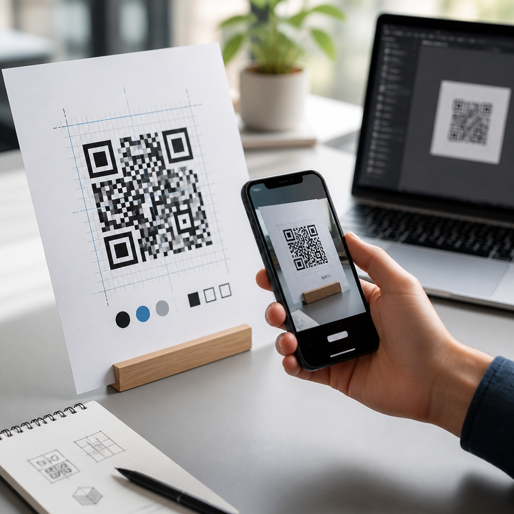
Branded QR codes can improve trust and visual fit, but only if the underlying symbol stays easy to read. The safest customization sequence is: shorten the payload through a dynamic code, choose high contrast colors, increase overall size, raise error correction if needed, then add minimal branding. Rounded modules, custom eyes, gradients, and embedded logos are all possible, yet every modification adds risk. In practice, the best-performing branded codes usually look restrained rather than decorative.
Logo placement deserves special care. The center area is the least risky location because redundancy can absorb some obstruction there, but the logo still must be small relative to the symbol. Avoid covering finder patterns, alignment patterns, or timing patterns. If your generator lets you drop in a large logo automatically, do not assume it is safe. Print a physical sample and test multiple devices before approval. I have seen beautifully branded codes pass one scanner app and fail on the native camera app that most users actually use.
Gradients and transparent backgrounds should be approached conservatively. Subtle gradients with strong contrast may scan, but weak transitions often confuse detection. Transparent PNG files placed over busy artwork are especially risky because the effective contrast changes with whatever sits behind the code in the final layout. If you need the code to float over a photo, place it inside a solid light container with a preserved quiet zone. This simple design move protects readability while still fitting the composition.
Typography near the code influences scans indirectly by shaping user confidence. Pair the symbol with a clear call to action such as “Scan to see setup steps” or “Scan for 10% off today.” Explain the benefit, not the technology. If there is a requirement such as an app install, account login, or location permission, disclose it before the scan. Honest context reduces drop-off and builds trust, particularly in public spaces where users are cautious about unknown links.
Print, packaging, and environmental checklist
Physical production introduces variables that screen previews hide. Print resolution, material finish, curvature, and placement can all reduce scan success. Codes should be exported as vector files such as SVG, EPS, or PDF for print whenever possible. Raster images can work if they are high resolution, but they degrade more easily when resized or passed between teams. Never copy a small PNG from a web preview into a press file. That shortcut causes soft module edges and avoidable failures.
Material choice matters. Glossy lamination and reflective surfaces create glare that interferes with phone cameras. Curved bottles and flexible pouches distort the square grid, especially near edges. On corrugated boxes or textured labels, ink spread can close small gaps between modules. In these cases, increase code size, simplify styling, and run substrate-specific proofs. For industrial use, ISO/IEC 18004 defines the QR Code specification, while print verification can be supplemented by ISO/IEC 15415 methodologies through specialist equipment when reliability is mission critical.
Placement should support natural scanning posture. On a tabletop tent card, the code should face the seated user and sit above folds or shadows. On product packaging, avoid seams, corners, and tear strips. On storefront windows, account for reflections from daylight and passing traffic. On outdoor posters, place the code where a person can safely stop and scan without blocking others or stepping into a roadway. Good placement removes physical friction before the phone camera even opens.
| Checklist Item | Best Practice | Common Failure |
|---|---|---|
| Contrast | Dark code on light background | Low-contrast brand colors |
| Quiet zone | At least 4 modules clear on all sides | Text or graphics crowding the border |
| Size | Scale to viewing distance | Using a tiny code on posters |
| File format | Use SVG, EPS, or PDF for print | Placing a small web PNG in press art |
| Surface | Test on actual material and finish | Ignoring glare, curvature, or texture |
| Destination | Mobile-first page with one clear action | Sending users to a generic homepage |
Testing should include real-world environmental conditions. Scan under bright light, dim light, and glare. Test at the intended distance and angle. Use both iPhone and Android native camera apps, plus at least one common third-party scanner if your audience includes older devices. If the code appears in a moving environment such as transit advertising, the acceptable margin is smaller and the code should be larger. Testing only on the designer’s monitor is not testing.
Digital use cases, analytics, and hub templates for repeatable results
QR codes displayed on screens have a different set of constraints. Screen moiré, low brightness, cracked protectors, and app overlays can affect scans. Avoid placing a QR code where users would need to scan the same device that is displaying it unless a cross-device use case is obvious, such as scanning a desktop checkout code with a phone. In presentations, webinar slides, and digital signage, keep the code on screen long enough to be scanned comfortably, usually several seconds more than presenters expect.
Analytics turn a QR code from a static asset into a measurable channel. With dynamic codes, track total scans, unique scans, timestamp, rough location, device type, and conversion events on the destination page. UTM parameters remain useful for web analytics platforms such as Google Analytics 4. When I audit campaigns, I look for three numbers: scan-through rate relative to impressions, landing-page engagement, and completion rate for the intended action. A strong scan count with weak completion usually signals a destination mismatch, not a code design problem.
As a hub page for Templates & Checklists, this article should guide readers into repeatable assets. The most useful companion resources are a print-ready QR approval checklist, a packaging placement checklist, a branded QR style template, an event signage template, and a scan testing log. Each template should include owner, version, code type, destination URL, file format, size, contrast approval, quiet zone check, print substrate, test devices, and sign-off date. Standardization reduces preventable errors when multiple departments touch the asset.
Different industries should adapt the checklist rather than copy it blindly. Healthcare organizations need privacy review and clear patient instructions. Retail packaging teams need stronger proofing controls and multilingual landing pages. Real estate signage needs larger codes because scan distance is longer. Museums and galleries can use QR codes for layered interpretation, but they must avoid placing them where visitors create traffic bottlenecks. The principle stays the same across sectors: optimize for the user’s environment first, then for visual style.
One final operational recommendation is governance. Store master vector files, redirect ownership, campaign naming conventions, and archived destinations in a shared system. I have seen high-performing codes fail months later because a short-link domain expired, a landing page was unpublished, or no one knew who owned the redirect. A QR code checklist is not only a design tool; it is a lifecycle management tool. That is why the best teams treat QR assets like product components, with documented standards and routine review.
A high-scan QR code is not the product of a clever generator setting. It is the result of disciplined choices made from strategy through production: the right code type, a fast mobile destination, strong contrast, a preserved quiet zone, sufficient size, careful branding, suitable materials, and realistic testing. When these fundamentals are handled well, scan rates improve because the code works on the first try in the conditions where people actually use it. That reliability matters whether your goal is menu access, lead capture, onboarding, payments, support, or packaging engagement.
The core benefit of using a checklist is consistency. Teams stop debating basics on every project and start catching issues before launch. Designers know the safe styling limits. marketers know how to align the call to action with the destination. Print vendors receive the right file formats and sizing guidance. Operations teams know who owns redirects and analytics. The outcome is fewer failed scans, fewer reprints, and stronger conversion from every physical or digital touchpoint where a QR code appears.
Use this hub as your starting point for every Templates & Checklists workflow under QR Code Tutorials, Guides & Resources. Build a standard approval sheet, create scenario-specific templates for packaging, signage, and events, and require real-device testing before anything goes live. If you want higher scan rates, do not start with decoration. Start with the checklist, follow it every time, and let performance guide the final design.
Frequently Asked Questions
What are the most important QR code design factors that affect scan rates?
The biggest factors are contrast, size, quiet zone, data density, error correction, and placement. If you get these right, most QR codes will scan quickly and consistently across different phones and lighting conditions. Contrast is usually the first priority. A dark code on a light background performs best because camera software needs clear separation between the modules and the surrounding area. Low-contrast color combinations, gradients, metallic inks, patterned backgrounds, or reversed light-on-dark designs may look attractive, but they often reduce readability in real-world conditions.
Size matters just as much. A code that is too small for the expected scanning distance forces users to move closer or retry, which increases drop-off. The quiet zone, which is the empty margin around the QR code, is another essential requirement. Without that clear border, scanners can struggle to distinguish the code from nearby graphics, text, or packaging elements. Data density also plays a major role. The more information you encode directly into the symbol, the more complex and tightly packed the pattern becomes. That makes the code less forgiving when printed small, viewed at an angle, or partially obscured.
Error correction helps improve resilience, especially when a code includes a logo, may be exposed to wear, or could be printed on imperfect materials. However, higher error correction also increases pattern complexity, so it should be used strategically rather than automatically pushed to the maximum. Finally, placement determines whether people can scan the code comfortably in the moment. A perfectly generated QR code can still fail if it is wrapped around a bottle seam, placed behind reflective glass, printed too close to a fold, or mounted where users cannot easily align their phone camera. In practice, high scan rates usually come from treating the QR code as a functional access point first and a visual asset second.
How large should a QR code be for reliable scanning in print and physical environments?
There is no single universal size, because the right dimensions depend on viewing distance, print quality, surface type, and how much data is encoded. That said, a practical rule is to make the QR code large enough for the expected scan distance and user behavior. A commonly used guideline is a 10:1 distance-to-size ratio. For example, if users will scan from 10 inches away, the code should be about 1 inch wide. If it will be scanned from farther away, such as on signage, menus mounted behind a counter, posters, or event displays, the code must scale up accordingly.
For many printed marketing pieces, business cards, table tents, and product inserts, a minimum of around 0.8 to 1 inch square is often a workable baseline, assuming the code is not overly dense and the print quality is solid. On packaging, labels, and small-format collateral, going larger is usually safer when space allows. Small codes become much riskier when you add a logo, stylized shapes, high error correction, or a longer encoded destination. If the code contains a lot of data or points to a complex dynamic URL structure, the modules shrink, and small print sizes become less dependable.
Material and context also matter. A QR code on corrugated cardboard, textured labels, curved bottles, glossy menus, or outdoor signage needs more margin for error than one on a flat, matte, high-resolution print surface. The best approach is to size for reality, not for the design mockup. Print prototypes at actual scale, place them in the real environment, and test with multiple devices under normal lighting conditions. If users may be in a hurry, standing, moving, or scanning one-handed, larger is almost always better. Reliable scanning is rarely harmed by making a code slightly bigger, but it is often damaged by making it too small.
Why is the quiet zone so important, and how much space should be left around a QR code?
The quiet zone is the blank space around the outer edge of a QR code, and it is critical because scanning software uses that empty area to detect where the code begins and ends. Without a clear separation between the code and nearby design elements, the camera may have trouble identifying the symbol correctly. This is one of the most common causes of scan failure in otherwise well-designed pieces. Teams often focus on the code itself and forget that the white space around it is part of the functional design.
As a general standard, the quiet zone should be at least four modules wide on all sides. A module is one of the small squares that make up the QR code. That means the required margin scales with the code itself rather than being a fixed measurement in inches or millimeters. If you crop too tightly, place text too close, add borders that crowd the symbol, or overlay the code onto a busy image, you increase the chance of failed scans. Decorative frames, callouts, and labels can be used, but they should not intrude on that clear perimeter.
This becomes even more important in print production, where trimming, bleed, packaging folds, or label placement can unintentionally eat into the quiet zone. On product packaging, a code may look fine in a digital proof but become compromised once it is wrapped around a curved surface or positioned next to legal copy, nutritional panels, or patterned branding. In restaurant menus, event signage, and tabletop displays, surrounding clutter can have the same effect. If scan performance matters, treat the quiet zone as non-negotiable functional space. It is not wasted room; it is part of what makes the QR code readable in the first place.
Should you use custom colors, logos, and branded QR code designs, or do they reduce performance?
Branded QR codes can work very well, but only when customization stays within functional limits. The safest design remains a dark foreground on a light background with strong contrast and a clean quiet zone. Logos, custom colors, rounded modules, and other visual treatments can improve brand recognition and make a code feel more intentional, but each design change slightly reduces tolerance. The goal is to customize without interfering with how scanner software reads the core structure of the code.
Logos are one of the most common brand additions. They can be effective if kept modest in size and supported by appropriate error correction. However, a larger logo blocks more of the code pattern, which increases dependency on error correction and decreases flexibility in smaller print sizes or lower-quality production environments. Color changes can also be safe if contrast remains high. Deep blue on white, dark green on cream, or black on a pale brand color may work well. Pale foregrounds, reflective inks, transparent overlays, gradients, and dark backgrounds behind a light code are far more likely to cause problems.
Shape modifications should also be approached carefully. Rounded dots and softened corners can still scan, but extreme stylization may confuse lower-end cameras or older scanning apps. A branded QR code should never be approved based only on how it looks in design software. It should be tested at final size, on final materials, in the actual environment where people will use it. If a campaign depends on speed and convenience, such as restaurant ordering, event check-in, payments, or packaging activation, function should outweigh visual experimentation. Strong branding is valuable, but a beautiful QR code that fails to scan is a branding problem, not a branding win.
How can you test a QR code properly before printing or launching a campaign?
Effective QR code testing goes far beyond confirming that the destination link opens once on your own phone. A proper test checks whether the code scans quickly, consistently, and comfortably for different users under realistic conditions. Start by verifying the encoded destination itself. Make sure the URL is correct, secure, mobile-friendly, and free of unnecessary redirects or broken tracking parameters. Then test the code across multiple devices, including both iPhone and Android models, because camera behavior and scanning sensitivity can vary.
Next, test the code at its final production size and on the actual surface or material whenever possible. A QR code that scans perfectly on a desktop monitor may behave differently once printed on textured stock, glossy packaging, window vinyl, cardboard, fabric signage, or laminated menus. Check performance in different lighting conditions, including bright overhead light, low indoor light, and any environment where glare or shadows may occur. If the code will be used outdoors, test in daylight and from expected scanning angles. If it will be placed on a curved object, wrapped label, or moving surface, simulate those conditions before sign-off.
You should also evaluate ease of use, not just technical readability. Can people spot the code quickly? Is there enough context telling them what happens when they scan? Can they physically approach it and hold their phone steady? Is the landing page fast and optimized for mobile? In many campaigns, the failure point is not the code alone but the entire scan experience. A good checklist includes scan speed, first-attempt success, visibility, placement, device compatibility, and landing-page performance. For high-stakes applications such as product packaging, restaurant ordering, events, or in-store displays, it is worth running a small pilot or proof before committing to a full print run. Testing in context is what turns QR code design from guesswork into dependable performance.