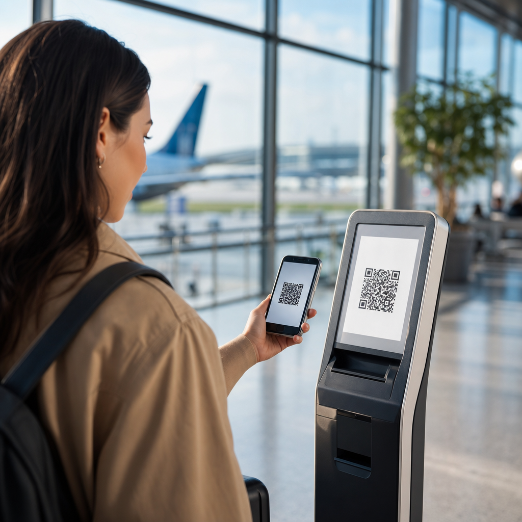
QR codes can connect print, packaging, storefronts, events, and screens to digital experiences, but poor execution turns that bridge into a dead end. In marketing, a QR code is a machine-readable matrix barcode that sends a smartphone user to a URL, app action, payment flow, file, form, coupon, map, or other destination. The technology is simple; the campaign design is not. I have audited QR programs on retail shelves, direct mail, trade show booths, restaurant menus, product boxes, and transit ads, and the same pattern appears repeatedly: teams focus on generating the code, not on the customer journey after the scan.
That mistake matters because scanning is a micro-conversion. A person pauses, opens a camera, trusts the brand enough to interact, and expects immediate value. If the page loads slowly, the offer is unclear, the code is too small, or the landing page is not mobile friendly, the moment is lost. Unlike many digital clicks, a QR scan often happens in the physical world under time pressure, poor lighting, weak connectivity, or social distraction. Every friction point compounds. A flawed QR code campaign does more than underperform; it can waste media spend, damage confidence, and produce misleading attribution that makes future decisions worse.
Understanding what not to do with QR codes in marketing is therefore as important as learning creative QR code campaign ideas. Failures usually stem from a few preventable sources: bad placement, weak calls to action, inaccessible design, broken tracking, privacy blind spots, and mismatch between context and destination. This hub page on failures and lessons learned explains those pitfalls in plain terms, shows how they happen in real campaigns, and outlines the practical standards that separate useful QR code marketing from gimmicks. If you manage packaging, out of home, print, events, retail, hospitality, or B2B demand generation, these lessons will save budget and improve conversion.
Do Not Use a QR Code Without a Clear Reason to Scan
The most common failure is deploying a QR code because it looks modern rather than because it solves a user need. A code without a visible benefit asks people to do work for no obvious reward. “Scan me” is not a value proposition. Strong campaigns answer the immediate customer question: what happens after the scan, and why is it worth my time right now?
I have seen flyers that linked to a generic homepage, shelf talkers that opened a cluttered category page, and conference signage that sent visitors to a desktop PDF. Those are not experiences; they are handoffs. A successful destination should match context with intent. On packaging, the scan may unlock setup instructions, ingredient sourcing, warranty registration, or a replenishment discount. In a restaurant, it may open a menu, allergen guide, loyalty offer, or pay-at-table flow. At an event, it may deliver speaker slides, calendar adds, booth demos, or lead capture. If the code does not remove friction or increase relevance, leave it out.
A practical rule is simple: if the destination could be typed, searched, or remembered just as easily, the QR code is adding little value. The stronger use cases compress a complicated action into one scan and one tap. Marketers who define that utility before creative development avoid the biggest category of QR code campaign mistakes.
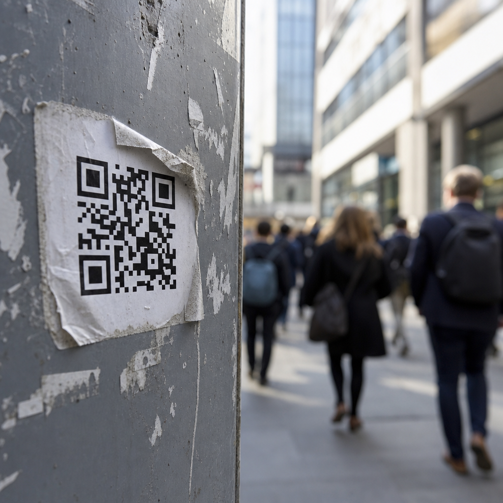
Do Not Ignore Physical Context, Distance, and Scanability
QR codes fail in the field when design teams treat them like decorative graphics rather than functional interface elements. Size, contrast, quiet zone, surface material, lighting, and viewing distance determine whether a code scans. A beautiful poster with an unscannable code is not a campaign asset; it is a production error.
Industry guidance from generators and print vendors commonly recommends a minimum size around 2 x 2 centimeters for short-distance use, with larger sizing as scan distance increases. A working rule many printers use is roughly one inch of code width for every ten inches of scan distance. On a tabletop tent card, a small code may work. On a bus shelter or billboard, that same code becomes useless. Curved bottles, reflective foil, textured packaging, and glossy laminates also create failure conditions by distorting modules or reflecting light into the camera.
Color choices cause another avoidable problem. Dark code on a light background is the safest option. Inverted styles, low contrast brand colors, and overdesigned codes with embedded logos often reduce readability, especially on older phones or in dim environments. I routinely advise teams to test with multiple camera apps, both iPhone and Android devices, and weak signal conditions before approving production.
| Mistake | What Happens | Better Practice |
|---|---|---|
| Code too small for placement | Users cannot scan from natural viewing distance | Scale size to distance and test on site |
| Low contrast or decorative styling | Scan reliability drops across devices | Use dark-on-light contrast and preserve quiet zone |
| Placed on reflective or curved surfaces | Glare and distortion interrupt recognition | Move to flat matte areas or add alternate access path |
| Installed where users are moving | People cannot safely pause to scan | Use only in environments with safe dwell time |
Placement also has a human factor. Putting a code in a subway corridor, on the side of a moving vehicle, or behind a checkout queue assumes a user can stop and scan comfortably. Often they cannot. Scanability is not just technical readability; it is the combination of readability and realistic behavior in the environment.
Do Not Send Traffic to a Poor Mobile Experience
Every QR code campaign is, by default, a mobile marketing campaign. Sending scanners to a nonresponsive page is one of the fastest ways to waste attention. The destination must load quickly, render correctly on common screen sizes, and present the primary action above the fold. Core Web Vitals matter here because QR sessions are often impatient sessions. Slow Largest Contentful Paint, layout shifts, cookie popups, and heavy scripts can erase intent before the first interaction.
In practice, the destination should minimize choices. A code on product packaging should not open a homepage with eight navigation options when the user wants assembly guidance or reordering. A code in direct mail should not force visitors to browse around to find the promised offer. Matching the landing page headline to the on-page call to action improves confirmation and reduces bounce. If the printed piece says “Scan for 15% off your first refill,” the landing page should repeat that exact promise immediately.
Forms deserve special caution. Asking mobile users to complete long fields, create accounts, or verify emails before receiving the value promised by the code is a conversion killer. Progressive profiling, autofill, Apple Pay or Google Pay, and deferred registration perform better. Marketers often assume QR code traffic is high intent, which is sometimes true, but intent does not excuse poor UX. The right lesson is the opposite: because a scan is an intentional action, the post-scan experience should feel exceptionally direct.
Do Not Hide the Call to Action or the Destination
People are understandably cautious about scanning unknown codes. Phishing attacks and scam stickers have trained users to hesitate, especially in public spaces. Brands reduce that friction by explaining the destination in plain language. “Scan to see the summer lookbook,” “Scan for setup video,” or “Scan to join the waitlist” gives a user enough context to decide. Generic prompts create uncertainty. Strong prompts also set expectations for time, reward, and next step.
There is a measurable difference between codes with and without supporting copy. In retail tests I have run, adding one line of benefit-focused text often improved scan rate more than changing the artwork around the code. That result makes sense. Consumers do not scan because the code exists; they scan because the offer, utility, or curiosity is strong enough.
Visibility into the destination URL also builds trust. Using branded short links, custom domains, and recognizable page titles reassures users that the experience is legitimate. If your QR platform supports dynamic redirects, configure them under a domain your audience associates with your brand. This is especially important on packaging, direct mail, and in-store signage, where a code may be encountered without a salesperson present to explain it.
Do Not Treat Measurement as an Afterthought
Many QR code marketing failures are invisible because teams never instrument campaigns properly. They count scans but do not track sessions, conversions, assisted revenue, repeat scans, or downstream behavior. A scan is not the goal. The goal might be coupon redemption, lead capture, product registration, app installation, content consumption, or store visit uplift. Without a measurement plan, marketers cannot tell whether low performance came from weak creative, poor placement, bad targeting, technical problems, or simple lack of offer-market fit.
At minimum, use campaign-tagged URLs, event tracking, and analytics dashboards tied to the business outcome. Google Analytics 4, Adobe Analytics, or product analytics tools such as Mixpanel and Amplitude can all work if naming conventions are disciplined. Separate static placement identifiers by asset, location, date, and audience segment. A code on aisle signage should not share the exact same destination parameters as the code on endcap displays if you want placement-level insight.
Dynamic QR codes are usually the better option for live campaigns because they allow destination changes, outage recovery, and better reporting without reprinting materials. Static codes have their place for permanent destinations, but they create risk when URLs change. I have seen durable packaging point to discontinued pages months after a site migration because no redirect governance existed. That is not only a bad customer experience; it pollutes attribution and hides revenue loss in plain sight.
Do Not Overlook Accessibility, Privacy, and Compliance
QR code marketing is not exempt from accessibility expectations or privacy obligations. If the only way to access essential information is via QR code, some users will be excluded due to device limitations, disability, connectivity, or simple preference. Menus, medication instructions, event details, and support content should have a visible fallback such as a short URL, NFC alternative, printed text, or staff assistance. Inclusive design is practical risk management, not just policy language.
The destination must also be accessible. Use readable typography, adequate color contrast, descriptive headings, and forms that work with screen readers and keyboards. If the code launches a PDF, ensure the file is tagged and usable on mobile. Better yet, provide HTML content first and offer a downloadable file as a secondary option.
Privacy deserves equal attention. If a QR code leads to lead capture, payments, app downloads, or location-aware experiences, disclose what data is being collected and why. Consent banners, privacy notices, and SMS or email opt-in language should reflect local regulations and channel rules. In the United States, promotions involving text messaging may trigger Telephone Consumer Protection Act considerations. In Europe and the United Kingdom, personal data processing must align with GDPR principles. The lesson is straightforward: the convenience of a scan does not reduce compliance duties.
Do Not Launch and Forget: Test, Monitor, and Learn
QR code campaigns often fail after launch because nobody owns ongoing quality control. Links break, promo codes expire, stock runs out, pages get redesigned, and redirects disappear during migrations. Physical assets can stay in market for weeks, months, or years, so the post-launch checklist matters as much as the pre-launch checklist.
Before launch, test under real conditions: low light, crowded Wi-Fi, varying devices, and actual viewing distance. After launch, monitor scan volume, page speed, error rates, and conversion by placement. If a location gets scans but no conversions, investigate the destination. If impressions are high but scans are low, revisit CTA, size, and placement. If one store or city outperforms others, study the local context rather than assuming creative alone drove results.
The strongest teams treat each QR campaign as a learning loop. They archive screenshots of the printed asset, keep a destination inventory, document redirect ownership, and review performance against hypotheses. Those habits turn failures into reusable playbooks. In a subtopic focused on failures and lessons learned, that is the central pattern: bad QR outcomes are usually not random. They are traceable to design decisions, operational gaps, and weak assumptions that can be corrected before the next print run, event, or product launch.
The simplest way to improve QR code marketing is to stop thinking about the code itself and start thinking about the complete scan journey. A QR code should promise clear value, work reliably in its physical environment, load a fast mobile destination, explain what happens next, and feed data back into measurable business outcomes. When any of those elements is missing, the campaign may still generate scans, but it will underdeliver where it matters: conversion, trust, and repeat engagement.
The failures covered here form the core lessons for any team working on QR code campaign ideas and case studies. Do not use a code without a specific customer benefit. Do not ignore sizing, contrast, surface, or viewing distance. Do not send traffic to generic or slow pages. Do not hide the destination or rely on vague calls to action. Do not skip analytics, redirects, accessibility, or privacy review. And do not assume launch day is the end of the job. The best-performing programs are operationally disciplined, not just creatively clever.
If you are building or auditing a campaign, use this article as your hub for failures and lessons learned, then apply its standards to every asset before it goes live. Review each code in context, test the full path from scan to conversion, and fix weak links early. That one habit will prevent most QR code mistakes and make every future campaign more effective.
Frequently Asked Questions
What are the biggest QR code mistakes marketers make?
The biggest mistakes usually have nothing to do with the QR code itself and everything to do with campaign planning. One of the most common errors is sending people to a generic homepage instead of a specific, mobile-friendly landing page that matches the context of the scan. If someone scans a code on product packaging, a poster, a shelf talker, or a trade show sign, they expect an immediate continuation of that exact message, offer, or product story. Another major mistake is failing to explain why someone should scan at all. A QR code without a clear call to action feels like a gamble, and most people will not bother unless the benefit is obvious. Marketers also regularly place codes where they are difficult to scan, print them too small, distort them to fit a design, reduce contrast, or surround them with visual clutter that interferes with usability.
Other damaging mistakes happen after the scan. Slow-loading pages, non-mobile experiences, broken links, expired promotions, and forced app downloads create friction that kills response. Using static codes for campaigns that may need to change is another avoidable problem, because once print materials are distributed, the destination cannot be updated. Brands also neglect tracking, which means they collect scans without learning what happened next. That makes it impossible to evaluate performance across channels such as direct mail, retail packaging, storefront displays, restaurant menus, events, or out-of-home signage. In practice, the worst QR code marketing programs are the ones that treat the code as the strategy. The code is only a bridge. If the offer is weak, the context is unclear, the destination is poor, or the follow-through is missing, the experience becomes a dead end instead of a conversion path.
Why is sending users to a homepage such a bad idea after a QR scan?
Sending users to a homepage wastes the intent that made them scan in the first place. A QR code is a high-intent interaction because the user has already taken out a phone, opened a camera, and engaged with your marketing in a specific physical moment. That moment could be in a store aisle, on a product box at home, at a conference booth, on a transit ad, or at a restaurant table. When that user lands on a broad homepage, they are forced to hunt for the promised information, product, coupon, menu, registration form, instructions, or offer. Every extra tap increases drop-off. In marketing terms, that is a failure of message match. The destination should continue the exact story the physical placement started.
A much better approach is to create a dedicated landing page tied to the scan context. If the code appears on packaging, the landing page might deliver setup instructions, product education, warranty registration, refill options, or reviews. If it appears in direct mail, the page should reflect the exact campaign headline and offer. If the code is used at an event, the destination could be a lead form, scheduling page, demo request, or downloadable resource. This targeted approach improves conversion rates, supports better attribution, and makes the experience feel intentional rather than careless. Homepages can still play a role, but they are usually too broad for QR traffic. Scanners need relevance, speed, and clarity, not another navigation challenge.
How important are placement, size, and design when using QR codes in marketing?
They are critical. Marketers often underestimate how much physical execution affects scan performance. A well-designed campaign can fail simply because the code is placed in a bad location or printed in a way that makes scanning unreliable. If a QR code is too small, wrapped around curved packaging, placed behind reflective glass, mounted too high, positioned in low light, or shown on a moving screen with too little dwell time, the user experience breaks down immediately. The same is true when brands stylize the code so heavily that readability suffers. Adding logos, brand colors, frames, or custom shapes is fine only if scanning remains fast and dependable across common devices and camera conditions.
Good QR execution means thinking like a user in the real environment where the code appears. A shelf tag in a retail store has different scanning conditions than a trade show banner, menu board, product carton, or billboard. There should be enough quiet space around the code, strong contrast between foreground and background, and a size appropriate to the expected scanning distance. The placement should be comfortable for the user, not an afterthought buried in a corner. It also helps to avoid putting codes where connectivity is poor unless the destination is lightweight and reliable. In short, marketers should not treat QR design as purely visual. It is functional design. If users cannot scan it quickly and confidently, the campaign has already lost before the landing page ever loads.
Should every QR code campaign include a call to action and a value proposition?
Yes, absolutely. One of the worst things you can do with a QR code in marketing is present it without any explanation. A plain code with no supporting text forces people to guess what will happen next, and uncertainty reduces scans. People want to know what they will get, how long it will take, and whether it is worth their attention. A strong call to action removes that hesitation by clearly stating the next step, such as “Scan to view the menu,” “Scan for 20% off,” “Scan to watch the demo,” “Scan to register your product,” or “Scan to book a consultation.” That simple framing turns the code from a mysterious graphic into a useful invitation.
The value proposition matters just as much as the command. Telling people to scan is not enough if the reward is vague or unimpressive. The best QR campaigns communicate a concrete benefit tied to the context: faster ordering, exclusive content, setup help, event entry, warranty activation, loyalty enrollment, product authentication, digital payments, or personalized offers. It is also smart to set expectations if needed, such as noting that the code opens a form, starts a download, or launches a payment flow. In physical environments where attention is limited, concise copy around the code can dramatically improve response. Without a clear reason to act, even a perfectly printed, technically functional QR code will underperform. In marketing, curiosity helps, but clarity converts.
How should marketers measure QR code performance and avoid wasted campaigns?
Marketers should measure QR code performance beyond simple scan volume. A scan is only the first interaction, not the final outcome. If you want to know whether a QR program is working, you need to connect scans to business results such as purchases, form completions, coupon redemptions, app actions, reservations, sign-ups, downloads, or qualified leads. That starts with using trackable destinations, campaign parameters, analytics platforms, and conversion events that align with the objective of the placement. A code on packaging should not necessarily be judged by the same metrics as a code on a trade show booth or a direct mail piece. Each environment creates different user intent, and your reporting should reflect that.
To avoid wasted campaigns, marketers should also test before launch and monitor after distribution. Verify that codes scan across multiple devices, that redirects work properly, that destination pages load quickly on mobile networks, and that any forms or payment flows function smoothly. Use dynamic QR codes when flexibility is needed so you can update the destination without reprinting materials. Segment performance by channel, location, creative version, offer, and audience where possible. This helps identify whether the issue is the placement, the message, the incentive, the landing page, or the post-scan experience. The most successful teams treat QR codes as measurable customer journey tools, not decorative add-ons. When tracking is weak, marketers cannot diagnose failure, improve future campaigns, or justify spend. When tracking is strong, QR codes become one of the clearest ways to connect offline attention with digital action.