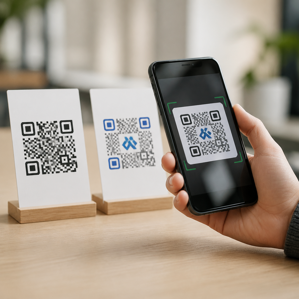
Branded QR codes do not inherently scan worse than plain black-and-white codes, but design changes can reduce reliability when they violate the technical rules that scanners depend on. That distinction matters because many teams still treat QR code branding as a tradeoff between appearance and performance, when the real issue is not branding itself but how the code is engineered. In practice, I have seen well-branded codes outperform generic ones simply because they were sized correctly, tested across devices, and printed with better contrast. I have also seen plain codes fail because they were too small, glossy, low resolution, or linked to broken destinations. The myth persists because people blame visible styling while overlooking the fundamentals.
A QR code is a two-dimensional matrix barcode defined by ISO/IEC 18004. It stores data in a pattern of dark and light modules that cameras interpret using finder patterns, alignment patterns, timing patterns, format information, and encoded data areas. Branded QR codes are standard QR codes that include customized colors, logos, frames, calls to action, or altered shapes while preserving the underlying structure. Plain black-and-white QR codes use the default high-contrast presentation most people recognize. The question is not whether one category always scans better. The better question is which variables most influence first-pass readability, error tolerance, and real-world user success.
This matters for marketers, retailers, event teams, restaurants, packaging designers, and product managers because QR performance directly affects conversion. If a customer cannot scan a code on a shelf tag, mailer, poster, menu, or box, the campaign loses traffic and trust immediately. Scan failure is expensive: it wastes print spend, breaks attribution, and creates friction at the exact moment a user shows intent. As a hub for QR code myths and misconceptions, this article explains what actually affects scanability, where branding helps or hurts, and how to evaluate claims with evidence instead of assumption. It also sets context for related questions about size, color, error correction, placement, and analytics.
Why the Myth Exists and What Actually Controls Scanning
The belief that branded QR codes scan worse usually comes from bad examples. Many customized codes are generated quickly in online tools, decorated aggressively, then exported at low resolution and placed into layouts without testing. When those codes fail, observers conclude that customization caused the problem. Sometimes it did, but usually because the custom treatment broke one of the known requirements for reliable decoding. Smartphone cameras and scanning libraries such as ZXing, ZBar, ML Kit, Apple VisionKit, and OEM camera software do not care about branding as an aesthetic concept. They care about signal clarity.
The biggest drivers of scan performance are contrast ratio, quiet zone integrity, module size, print quality, lighting, viewing angle, motion blur, surface distortion, and symbol damage. The quiet zone is the empty margin around the code, typically four modules wide, and it is one of the most commonly violated rules in branded layouts. If a logo, border, background pattern, or adjacent text intrudes into that margin, the scanner may struggle to isolate the symbol. Likewise, if the module edges become soft because of compression, bad resizing, or absorbent material, detection becomes slower or fails entirely. These are engineering faults, not proof that branding is incompatible with scanning.
Error correction also explains much of the confusion. QR codes support four levels: L, M, Q, and H. Higher levels allow more damage or occlusion to be recovered, at the cost of denser symbols. Designers often insert a centered logo and rely on H-level correction so the code still decodes. That can work well, but only if the encoded payload is kept short enough that module density does not become too fine for the intended print size and scan distance. I regularly advise teams to use dynamic URLs with short redirect domains for this reason. Shorter payloads create simpler symbols, which gives branding more room without sacrificing reliability.
Do Branded QR Codes Scan Worse Than Plain Ones? The Direct Answer
In controlled conditions, a well-made branded QR code can scan just as fast and as accurately as a plain black-and-white code. The technical reason is simple: scanners detect structure, contrast, and recoverable data patterns, not visual minimalism. A branded code that preserves finder patterns, maintains strong luminance contrast, keeps a proper quiet zone, uses sufficient module size, and avoids excessive distortion remains a standards-compliant QR symbol. When those conditions hold, branding is largely irrelevant to machine readability. In many campaigns, the user notices the branded code faster, understands the purpose sooner, and is therefore more likely to attempt the scan.
There are limits, and they are practical rather than ideological. If you invert colors without enough contrast, round modules so heavily that grid definition is lost, insert a logo that blocks too much data, or apply gradients that confuse edge detection, performance drops. If you print metallic ink on reflective packaging, add a code over a busy image, or use dark colors against dark backgrounds, scan success falls further. The plain code often appears more reliable only because its default design naturally avoids these mistakes. In other words, plain black-and-white is forgiving. Branded execution requires more discipline.
The most accurate position is this: plain codes have a lower risk of design-induced errors, but branded codes do not inherently scan worse. Reliability depends on implementation quality. That distinction is essential for teams deciding whether to include a logo, campaign color, or callout frame. If brand alignment increases trust and scan intent, and the code is built within technical tolerances, branding can improve total performance by lifting scan attempts without meaningfully reducing decode success. Looking only at raw machine readability misses the human factor that drives actual campaign outcomes.
The Technical Factors That Matter More Than Branding
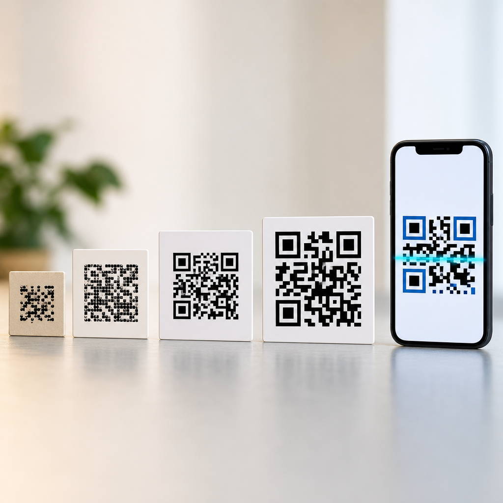
When diagnosing QR code performance, I prioritize measurable variables before debating aesthetics. First is contrast. Black on white remains the safest baseline because cameras separate luminance values easily, especially in mixed lighting. Dark blue on white often performs well too. Problems begin when both foreground and background are midtone, when transparency allows the background to show through, or when gradients vary across the symbol. Second is size. A common field rule is at least one inch square for close scanning, though the right size depends on viewing distance. On posters and signage, size should scale with how far away people stand.
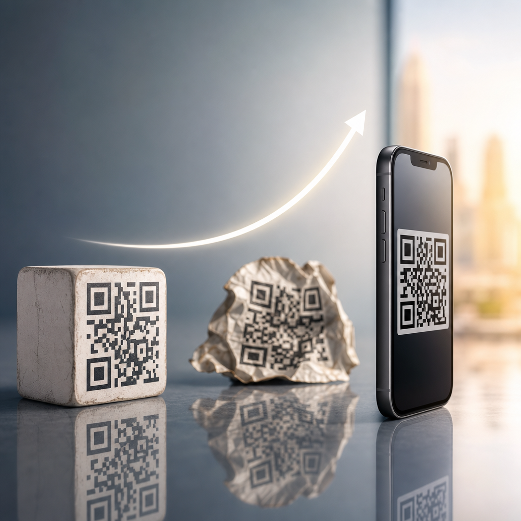
Third is data density. A QR code carrying a long URL, UTM parameters, vCard, or Wi-Fi credentials may require many modules. Dense codes need more print area and higher reproduction quality. Using a short dynamic URL reduces complexity and improves resilience. Fourth is output quality. Vector formats such as SVG, EPS, or PDF preserve sharp edges for print, while low-resolution raster exports often soften modules. Fifth is substrate and finish. Curved bottles, crinkled labels, glossy menus, and window glare create scan barriers even for plain codes. Sixth is environment. Bright backlight, low light, or awkward placement above eye level can matter more than logo insertion.
| Factor | Why It Affects Scanning | Best Practice |
|---|---|---|
| Contrast | Scanners need clear separation between dark and light modules | Use dark foreground on a light background; avoid low-contrast gradients |
| Quiet zone | Helps the camera isolate the symbol from surrounding graphics | Keep at least a four-module clear margin on all sides |
| Module size | Tiny modules blur or merge at distance or in poor print conditions | Match physical size to scan distance and printing method |
| Error correction | Allows recovery from partial obstruction or damage | Use M or Q by default; H when adding a logo after testing |
| File quality | Compression and resizing can distort module edges | Export vector for print and high-resolution PNG for digital use |
| Surface conditions | Glare, curvature, and texture interfere with detection | Test on the final material under real lighting |
These variables also explain adjacent myths in QR Code Myths and Misconceptions. People ask whether colored QR codes fail, whether small codes are fine if the phone camera is good, whether more error correction always helps, or whether any generator output is equal. The answer across all of these is the same: scanability is governed by constraints. Cameras and decoding libraries are more capable than they were five years ago, but physics, print, and standards still decide results. The best-performing codes are the ones designed with those constraints in mind from the start.
When Branding Helps Performance Instead of Hurting It
Branding can improve outcomes in ways that a lab test focused only on decode speed would miss. In stores, on packaging, and in direct mail, a customized code can signal legitimacy and intent. Users are more likely to scan when they recognize the brand, understand the destination, and see a prompt such as “Scan for setup,” “View menu,” or “Redeem offer.” That matters because a technically perfect code has no value if nobody tries to scan it. I have repeatedly seen scan rate rise after adding a branded frame and a concise call to action, even when the underlying symbol remained unchanged.
There is also a trust component. Consumers have learned that QR codes can lead anywhere. A plain anonymous square on a flyer or product insert may look suspicious or low effort. A branded code integrated into packaging design, supported by matching URL copy or iconography, reduces uncertainty. This is especially relevant in healthcare, finance, and enterprise settings where users are cautious about opening unknown links. Branding alone does not solve trust, but coherent presentation increases perceived authenticity, which raises engagement.
The strongest use case is dynamic QR code infrastructure paired with disciplined design. A short branded redirect domain, a logo that does not cover critical patterns, and analytics tied to campaign variants create both usability and measurement. Teams can A/B test frame copy, placement, and color while keeping the destination flexible. This is where branding stops being decoration and becomes part of conversion design. The key is to improve human response without degrading machine readability.
Common Design Mistakes That Cause Scan Failure
The failures I encounter most often are avoidable. One is shrinking the code to fit a layout after generation. That reduces module size below the threshold needed for the intended distance and camera quality. Another is placing the code over a patterned background or photo. Even if the code itself is dark, background noise near the edges can interfere with detection. A third is removing or crowding the quiet zone because the designer wants a tighter composition. This is especially common on packaging and restaurant collateral.
Logo treatment is another frequent issue. A centered logo can work, but oversized logos consume too much recoverable area, especially in dense symbols. Teams sometimes assume H-level correction makes any logo safe. It does not. Error correction is not a license for arbitrary obstruction, and higher density can create new problems on small prints. Rounded modules, artistic cutouts, and decorative finder patterns can also become risky when pushed too far. Some generators allow dramatic styling that looks good in a mockup but performs poorly on older phones or under dim light.
Operational mistakes matter too. Static URLs become obsolete, landing pages break, and app deep links fail on unsupported devices. Users then report that the QR code “didn’t work,” even though the scan decoded correctly. This misconception appears constantly in audits. A QR initiative should be tested end to end: detection, redirect, page speed, mobile rendering, and analytics. Scanability is only one part of the user journey.
How to Test Branded QR Codes Properly
Testing should mirror actual use, not ideal conditions at a designer’s desk. Start with multiple devices: recent iPhones, older Android phones, flagship models, and budget models. Native camera apps should be tested first because that is how most users scan. Check first-pass success rate, time to detection, and distance tolerance. Then test in the real environment: under store lighting, on the final stock, behind any laminate, on the curved package, or at the installed height on signage. A code that works on a monitor may fail on matte cardboard with ink spread or on glossy acrylic with overhead glare.
Run variant comparisons methodically. Test plain black-and-white against branded versions that change only one variable at a time, such as logo size, color pair, or frame addition. If the branded version underperforms, identify whether the issue is contrast, quiet zone, density, or placement. Tools from QR code platforms, print proofing workflows, and analytics dashboards help, but simple observational testing remains indispensable. I also recommend validating with a minimum sample of real users, because hesitation and confusion often surface problems that technical tests miss.
For this sub-pillar hub, the broader lesson is that many QR myths collapse under structured testing. Assumptions about color, logo use, size, or scanner compatibility are rarely useful without context. The practical standard is straightforward: build within specification, design for the environment, and verify with real devices before launch.
Best Practices for Reliable, Brand-Safe QR Codes
Use dark-on-light contrast, preserve a four-module quiet zone, keep payloads short through dynamic URLs, and export vector artwork for print. If adding a logo, start small and use moderate error correction rather than defaulting blindly to the highest level. Maintain recognizable finder patterns and avoid decorative effects that blur the grid. Match physical size to expected scan distance, and do not place codes where glare, folds, or curvature will interfere. Pair the code with a clear call to action so users know what they will get.
Most important, treat QR codes as conversion assets rather than ornaments. The best implementations balance brand presentation with standards-based construction and field testing. If you are building out a QR Code Myths and Misconceptions content cluster, use this principle as the anchor: branded QR codes can scan as well as plain black-and-white codes when they respect the technical rules that make QR decoding possible. Audit your current codes, test them under real conditions, and update weak designs before the next print run.
Frequently Asked Questions
Do branded QR codes scan worse than plain black-and-white QR codes?
No. Branded QR codes do not automatically scan worse than plain black-and-white codes. The more accurate answer is that QR code performance depends on whether the design still respects the technical requirements that make the code readable. A standard black-and-white QR code is usually the safest starting point because it naturally provides strong contrast and a familiar structure for scanners. But branding alone is not the problem. A well-designed branded QR code can scan just as reliably, and in some cases even better in real-world use, if it is sized properly, printed clearly, placed in the right environment, and tested across multiple devices.
The confusion comes from the fact that many branded codes fail because designers push customization too far. Problems usually appear when the quiet zone is reduced, contrast is weakened, the code becomes too dense for its display size, or a logo covers more of the pattern than error correction can support. In other words, the issue is not that branding hurts scanning by definition. The issue is that some branded implementations ignore the rules scanners depend on. If those rules are respected, a branded QR code can look polished and still perform at a high level.
What design changes are most likely to reduce QR code scanning reliability?
The biggest reliability issues usually come from a short list of preventable design mistakes. Low contrast is one of the most common. Scanners need a clear difference between the dark modules and the lighter background. If a brand palette uses soft grays, metallic inks, gradients, or colors that are too similar in brightness, scanners may struggle to distinguish the code pattern. Another common issue is removing or shrinking the quiet zone, which is the empty margin around the code. That border helps scanners detect where the QR code begins and ends, so when it gets crowded by text, graphics, or background elements, recognition becomes less dependable.
Over-customization is another major cause of poor performance. Rounded modules, decorative patterns, embedded logos, and stylized finder eyes can all work, but each change reduces the amount of visual tolerance available to the scanner. If several of those changes are combined at once, the reliability margin can disappear quickly. Size also matters. A code that looks fine on a desktop monitor may become difficult to scan when printed on packaging, signage, business cards, or labels if the module size becomes too small. Finally, poor production conditions can ruin even a technically valid design. Blurry printing, glossy reflections, curved surfaces, low light, dirty displays, and awkward scan angles all affect results. The safest approach is to customize conservatively and then test under the actual conditions where people will use the code.
Can a branded QR code ever perform better than a generic one?
Yes, absolutely. From a purely technical standpoint, a generic black-and-white code is often a solid baseline, but in practice performance is not only about machine readability. It is also about whether people notice the code, trust it, and decide to scan it. A branded QR code can outperform a generic one when it is engineered correctly because it often attracts more attention and feels more legitimate to the user. If a code clearly matches the company, campaign, or product it belongs to, people may be more willing to engage with it. Higher scan rates in the real world can matter just as much as raw scan speed in controlled tests.
There is also a practical quality factor. Teams that invest in branding often spend more time on placement, sizing, printing, and validation. As a result, a branded code may end up working better than a plain one that was generated quickly and deployed without testing. For example, a carefully branded code on a poster with strong contrast, proper white space, and a clear call to action can easily outperform a small generic code printed in a poor location. So while branding itself does not create a technical advantage, a professionally designed and tested branded QR code can absolutely deliver better overall results than a generic code that is treated as an afterthought.
How can you brand a QR code without hurting its scanability?
The safest approach is to start with a technically strong code and treat branding as a controlled layer of customization rather than a complete redesign. Keep contrast high, preserve the quiet zone, and make sure the code remains large enough for the intended scanning distance. In most cases, dark modules on a light background still provide the best reliability, even when you swap pure black for a brand color. If you want to add a logo in the center, use a reasonable size and pair it with an appropriate error correction level, but do not assume error correction can compensate for every design choice. It provides tolerance, not unlimited freedom.
It also helps to simplify the encoded data where possible. Shorter URLs or dynamic QR codes typically produce less dense patterns, which gives you more flexibility for visual customization. Be cautious with gradients, patterned backgrounds, transparent effects, and heavily stylized module shapes. These can work in some cases, but they narrow your safety margin. Most importantly, test the code on multiple phones, in different lighting conditions, at realistic distances, and on the actual material where it will appear. A code that scans on one flagship phone in ideal office lighting may still fail on older devices, under glare, or when printed at smaller sizes. Good branding does not come from making the code look dramatic. It comes from making it recognizable without compromising the structure scanners need.
What is the best way to test whether a branded QR code is reliable enough to use?
The best testing process is practical, not theoretical. Start by checking the code across a range of devices, including both iPhone and Android models, newer and older cameras, and if possible a few third-party scanning apps. Then test in the environments where the code will actually appear. If it will be printed on packaging, test a physical print at final size. If it will appear on a storefront window, test in daylight, at night, and from different angles. If it will be used on screens, test on different display sizes and brightness levels. Reliability should be evaluated under real-world friction, not just ideal lab conditions.
You should also test distance, speed, and user behavior. Can someone scan it quickly without carefully centering the camera? Does it still work if the phone shakes slightly, if the surface has glare, or if the code is partially obscured by curvature or texture? Measure more than whether it scans at all. Pay attention to how long it takes, how often users need to reposition their phones, and whether certain devices struggle more than others. If any design variation causes hesitation or repeated scan attempts, it is worth simplifying the code before launch. In most cases, the best-performing branded QR code is not the most visually aggressive version. It is the version that balances brand identity with a comfortable technical margin, then proves itself through thorough testing.