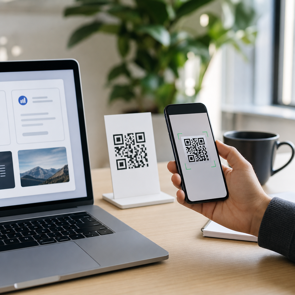
Adding a logo to a QR code is one of the fastest ways to make a functional code look like a branded marketing asset instead of a generic black square. In practice, a logo QR code combines machine-readable data with visual identity, usually by placing a small icon or brand mark in the center while preserving enough contrast, quiet space, and error correction for reliable scanning. For businesses, creators, nonprofits, and event teams, that balance matters because QR codes now appear on packaging, menus, storefronts, print ads, invoices, posters, product inserts, and social media graphics.
When clients ask me how to add a logo to a QR code, they are usually asking two questions at once: how to do it technically, and how to do it without breaking scan performance. The technical side is simple with modern custom QR code design tools. The performance side requires better judgment. A logo can improve recognition and click-through rates because people trust a code that clearly belongs to a known brand, but only if the code still scans quickly on average phone cameras, under uneven lighting, on curved surfaces, and at small print sizes.
Three terms define the process. A static QR code stores the final destination directly in the pattern, so changing the link later requires generating a new code. A dynamic QR code points to a short redirect URL controlled in a dashboard, allowing edits, campaign tracking, and device-level analytics after printing. Error correction is the built-in redundancy that lets scanners recover data even when part of the code is obstructed or stylized. Most logo QR codes rely on high error correction, typically level H, because the center logo intentionally covers modules that would otherwise carry data.
This topic matters because custom QR code design tools now sit at the intersection of branding, usability, and measurement. Teams want codes that match packaging systems, campaign art, and retail signage, yet they also need dependable scans across iPhone and Android cameras, native camera apps, and third-party readers. A good hub page should therefore explain not just where to click in a generator, but how to choose tools, prepare artwork, test output, and connect design choices to business goals. That is what follows: a practical guide to adding a logo to a QR code and evaluating the broader toolset used for custom QR code design.
How logo QR codes work and why design choices affect scanning
A QR code is built from modules, the small squares that encode data, plus structural patterns that help scanners orient and decode the symbol. The three large finder patterns in the corners are not decorative; they are essential reference points. Timing patterns, alignment patterns, and the quiet zone around the code are equally important. When you place a logo over the middle, you are replacing some encoded modules with artwork, so the generator must compensate by increasing redundancy and preserving critical structures.
The safest rule is that the logo should remain modest relative to the total code area. In most production work, I keep the logo near 15 to 20 percent of the code width, then test aggressively. Pushing larger can work, especially with short dynamic URLs that require fewer modules, but reliability drops fast when combined with gradients, low contrast, or poor printing. This is why serious tools expose error correction settings, SVG export, padding controls, and preview modes rather than offering only a decorative sticker effect.
Color also changes performance. Dark foreground on a light background remains the standard because scanners detect contrast first, not branding intent. Inverted schemes, metallic inks, soft pastels, and transparent overlays often fail in real environments even when they look acceptable on a designer’s monitor. If your brand palette is light or low-contrast, use it in the frame, call to action, or landing page instead of forcing it into the data modules. The best custom QR code design tools allow brand expression while protecting the decoding fundamentals.
Step-by-step: how to add a logo to a QR code correctly
Start by choosing the destination and deciding whether the code should be static or dynamic. For print campaigns, product packaging, restaurant materials, or anything with a long shelf life, dynamic is usually the right choice because you can update the URL without reprinting. It also gives you scan analytics, UTM support, expiration controls, and sometimes retargeting integrations. Static codes are fine for permanent destinations such as Wi-Fi credentials, vCards, or links that will never change.
Next, prepare the logo file. Use a clean PNG with transparent background or, better, an SVG if the tool supports vector uploads. Avoid complex taglines, tiny text, and busy icon sets. At the size a phone sees inside a QR code, only the primary mark survives. If your logo has multiple color variants, pick the one with the strongest edge contrast. Square or compact circular marks generally fit better than horizontal lockups because they cover less data area.
Generate the base code, select high error correction, and upload the logo. Center placement is standard because many tools reserve the middle area automatically and keep clear of finder patterns. Add a white knockout or padding ring around the logo if the generator does not create one by default. That small buffer helps separate the mark from surrounding modules, improving readability. Then choose the output format. SVG is best for print because it scales without blur; PNG is acceptable for digital use when exported at sufficient resolution.
Finally, test before publishing. Scan from multiple phones, under bright and dim light, on glossy and matte mockups, and at realistic distances. Print at final size, not just on office paper. I also test codes through common messaging apps and social camera apps because users often scan from those environments, not only with the native camera. If scanning hesitates, simplify the code: shorten the URL, reduce logo size, increase contrast, restore square modules, or remove decorative frames that crowd the quiet zone.
What to look for in custom QR code design tools
Not all generators are equal. Basic free tools can create a logo QR code, but hub-level evaluation means looking deeper at the design and operational features that matter over time. The first criterion is dynamic code support with editable destinations. The second is export quality, especially SVG, EPS, or high-resolution PNG. The third is control over error correction, quiet zone, colors, eyes, module shapes, and logo padding. If a tool hides these controls, you are left guessing when a branded code fails in production.
Dashboard capabilities matter just as much. Strong custom QR code design tools provide campaign folders, scan analytics by date and geography, bulk creation, password protection, expiration rules, and team permissions. For agencies and multi-location brands, white labeling and API access are often decisive. If you manage hundreds of codes across packaging SKUs, events, or franchise locations, manual generation becomes a bottleneck. Platforms such as QR Code Generator Pro, Beaconstac, Flowcode, Uniqode, Bitly, and Canva each address parts of this workflow, but they vary widely in analytics depth and print-ready output.
Landing page support is another useful differentiator. Some platforms let you create a mobile landing page, app download page, PDF host, menu page, or link-in-bio style destination directly inside the tool. That can reduce dependence on web development for simple campaigns. However, if measurement accuracy and brand control are priorities, linking to your own domain with UTM parameters is usually stronger. I recommend custom domains whenever possible because they increase trust and preserve continuity if you migrate providers later.
| Feature | Why it matters | Best use case |
|---|---|---|
| Dynamic destination editing | Change links after printing without replacing the code | Packaging, posters, long-running campaigns |
| Logo upload with padding controls | Protects scanability when placing a mark in the center | Brand campaigns and retail signage |
| SVG or EPS export | Keeps edges sharp at any print size | Packaging, trade show displays, large posters |
| Scan analytics | Shows volume, location, device trends, and timing | Campaign optimization and reporting |
| Custom domain support | Improves trust and reduces platform lock-in | Enterprise and agency workflows |
Best practices for branded QR code design
Use branding as a layer, not as a substitute for readability. The most reliable branded codes keep the core matrix simple, then add identity through the logo, surrounding frame, and clear call to action such as “Scan to view menu” or “Scan for setup guide.” Users scan more confidently when they know what happens next. That instruction also improves accessibility because it gives context before someone points a camera at the code.
Protect the quiet zone. This empty margin around the QR code is not wasted space; it helps scanners distinguish the symbol from nearby graphics. I frequently see failed print pieces where a designer added a logo successfully but then placed text, borders, or background textures too close to the edges. Even a technically perfect code can struggle when crowded into a poster layout. Leave breathing room, especially on packaging with dense regulatory copy or promotional bursts.
Match design to context. A menu code on a restaurant table may face dim light, grease, reflections, and steep viewing angles, so high contrast and a larger printed size are mandatory. A code on a shipping insert can be smaller because the user holds it close. A billboard code needs extremely large modules, short scanning distance assumptions, and often a companion short URL because roadside scanning is unrealistic. Good custom QR code design tools help, but context determines the final specification.
Common mistakes when adding a logo to a QR code
The biggest mistake is making the logo too large. Designers often assume that because level H error correction can recover substantial damage, the center can be dominated by branding. In reality, the safe threshold depends on data density, print quality, contrast, and scanning conditions. A short dynamic URL may tolerate more obstruction than a long static URL. The right approach is empirical: start conservatively, then test at final size and material.
Another common problem is over-styling the modules and eyes. Rounded dots, custom corner eyes, gradients, shadows, and decorative frames can all work, but each reduces margin for error. Combining several effects at once with a logo is risky. If the logo is the priority, keep modules square or only lightly rounded. If visual flair is essential, reduce data density through a dynamic short link and preserve black-on-white contrast. Fancy is optional; fast scanning is not.
Teams also forget about production variables. A code that scans on a laptop screen may fail after being printed on textured cardboard, laminated with glare, or reduced by a print vendor. Low-resolution exports are especially damaging because edge blur softens module boundaries. Always provide vector files when possible and review physical proofs. I have seen otherwise strong campaigns underperform simply because the final artwork used a compressed PNG dragged into a layout file.
Testing, analytics, and governance for long-term use
Testing should be systematic, not informal. Scan on current iPhone and Android devices, at minimum and maximum expected distances, and in poor lighting. If the code appears in stores, test under retail LEDs and through display glass. If it appears outdoors, test in direct sun and shade. Use both native camera apps and at least one third-party scanner. Document pass and fail conditions so future brand teams can reproduce the standard rather than redesigning by preference alone.
Once live, analytics tell you whether the design is helping. Dynamic QR platforms can show scan volume by day, city, operating system, and sometimes unique versus repeat scans. Pair that with web analytics from Google Analytics 4 using UTM parameters to connect scans to sessions, conversions, and revenue. If a branded code gets fewer scans than expected, investigate placement, call to action, destination quality, and load speed before blaming the logo alone. User friction often sits on the landing page.
Governance matters for organizations with many codes. Maintain a naming convention, archive source files, record the destination owner, and review codes quarterly. Broken redirects, expired campaign pages, and staff turnover create silent failures that no amount of design polish can fix. Treat QR codes as managed digital assets. When you do, adding a logo becomes part of a repeatable system rather than a one-off design request.
Adding a logo to a QR code works best when branding supports usability instead of competing with it. The central principles are straightforward: use a dynamic code when flexibility matters, keep the logo compact, choose high contrast, preserve the quiet zone, export in vector format for print, and test in the real environments where people will scan. Custom QR code design tools make the process accessible, but the strongest results come from understanding the underlying constraints and using the software deliberately.
As a hub within QR Code Creation & Tools, this topic connects directly to related decisions about static versus dynamic codes, QR code sizing, print specifications, scan analytics, landing page optimization, and campaign governance. The logo itself is only one part of a complete system. The winning workflow starts with the destination, continues through generator settings and artwork preparation, and ends with testing, analytics, and ongoing maintenance. That end-to-end view is what separates a code that merely looks branded from one that reliably drives action.
If you are building or refreshing your branded QR workflow, review your current generator against the features outlined here, create a test matrix for print and mobile environments, and standardize logo placement rules before the next campaign launches. A well-designed logo QR code does more than carry a link; it signals trust, improves recognition, and turns every scan opportunity into a measurable brand interaction.
Frequently Asked Questions
How do you add a logo to a QR code without making it hard to scan?
To add a logo to a QR code successfully, the key is balancing branding with scan reliability. A QR code works because scanners can clearly detect its data modules, finder patterns, contrast, and surrounding quiet zone. When you place a logo in the center, you are intentionally covering part of that data, so the code must be designed to tolerate that interruption. The safest approach is to use a QR code generator that supports logo placement and higher error correction, typically level H, which allows the code to remain readable even when a portion of it is obscured.
In practical terms, keep the logo relatively small, usually around 15% to 25% of the total code area depending on the complexity of the data and the final print size. Make sure the logo does not interfere with the three large corner finder patterns or the alignment areas that scanners rely on. It also helps to place the logo inside a white or light-colored padding area so it does not visually merge with the QR modules. Strong contrast is essential too, with a dark foreground and light background still being the most dependable choice. Before publishing, test the code on multiple devices, from different distances, and under realistic lighting conditions. That testing step is what turns a visually attractive logo QR code into a functional branded asset.
What size should the logo be in the center of a QR code?
There is no single perfect logo size for every QR code, but a good rule is to keep the logo modest enough that it enhances recognition without overwhelming the scannable pattern. In most cases, the logo should occupy only a small central portion of the code. If it is too large, scanners may struggle to reconstruct the missing data, especially if the code contains a long URL, a vCard, event details, or other dense information. The more data packed into the code, the less flexibility you have for a large central graphic.
As a practical guideline, many designers aim for a logo that covers roughly one-fifth of the QR code area or less. Simpler codes that contain a short URL can often tolerate a bit more coverage, while denser codes should use a smaller mark. It is also smart to use a clean, simplified version of the brand logo rather than a highly detailed one with tiny text or thin lines. A compact icon, symbol, or monogram usually performs better than a full horizontal logo lockup. If the code will appear on packaging, posters, signage, or event materials, always test it at its final production size. A logo that looks fine on screen may create scan issues when reduced for a label or viewed from several feet away on a wall display.
Do you need high error correction when creating a logo QR code?
Yes, in most cases high error correction is strongly recommended when adding a logo to a QR code. Error correction is the feature that allows a QR code to remain readable even if part of it is damaged, covered, or stylized. Since a centered logo physically blocks some of the machine-readable pattern, the code needs enough built-in redundancy to compensate. That is why many branded QR codes use error correction level H, which offers the greatest recovery capacity among standard levels.
That said, higher error correction is not a free pass to ignore good design practices. It helps the code survive logo placement, but the code still needs proper contrast, an intact quiet zone, and a reasonable amount of uncovered data modules. If you increase error correction while also using a very large logo, decorative colors, gradients, or low-contrast backgrounds, scan performance can still drop. Another point to keep in mind is that higher error correction can make the QR code denser, especially if it stores a lot of information directly. For that reason, many marketers prefer to encode a short URL instead of a long string of data. This reduces complexity and leaves more room for branding while maintaining reliability. In short, high error correction is one of the best safeguards for logo QR codes, but it works best as part of a complete, scan-first design strategy.
What design mistakes should you avoid when putting a logo on a QR code?
The most common mistake is treating the QR code like a purely decorative graphic instead of a functional scanning tool. A logo QR code can look polished and on-brand, but if style choices interfere with readability, it fails at its main job. Oversized logos are one of the biggest problems because they cover too much data. Poor contrast is another major issue, such as using light gray modules on a white background or placing the code over a patterned image. Removing the required quiet zone, the clear space around the code, is also a frequent error because scanners need that border to distinguish the code from surrounding design elements.
Other avoidable mistakes include altering the corner finder patterns, stretching the code out of proportion, using busy gradients that blur the module edges, or exporting the image at low resolution for print. Some brands also try to insert highly detailed logos with text inside the center, but small lettering usually becomes unreadable and adds visual noise. If the code will be printed on packaging, flyers, menus, nonprofit materials, or event signage, consider how surface finish, lighting, and viewing distance affect performance. Glossy materials can create glare, and tiny placements can make scanning frustrating. The safest workflow is to generate the code, add the logo using a tool built for QR customization, preserve the core structure, and then test the final version repeatedly. If it scans quickly and consistently in real-world conditions, the design is doing its job.
Where should a branded QR code with a logo be used for the best marketing results?
A branded QR code with a logo works best anywhere you want immediate recognition, trust, and a clear next step. Because the logo reinforces brand identity, it can improve confidence compared with a generic QR code, especially in places where users have only a few seconds to decide whether to scan. Common high-value placements include product packaging, direct mail pieces, brochures, retail displays, restaurant tables, business cards, trade show materials, event signage, nonprofit campaign collateral, and social media graphics. In each of these settings, the QR code becomes more than a utility element; it acts as a bridge between offline attention and digital action.
For the strongest results, pair the code with a clear call to action that tells people exactly what they will get by scanning, such as viewing a menu, claiming an offer, registering for an event, donating, downloading an app, or learning more about a product. Placement matters too. The code should be easy to spot, large enough to scan comfortably, and not buried among cluttered layout elements. If the environment involves movement or distance, such as a window sign, poster, or expo banner, increase the physical size accordingly. A logo helps attract attention and signal legitimacy, but performance still depends on context, visibility, and mobile-friendly landing pages. When used thoughtfully, a logo QR code can turn routine scanning into a more polished brand interaction that supports awareness, engagement, and conversion.