
QR codes can shorten the path from attention to action, but many brands still create friction because they place codes into campaigns without mapping the customer journey first. Customer journey mapping with QR codes means identifying every stage a buyer moves through, from initial awareness to post-purchase loyalty, then designing each scan to answer the next question, remove the next obstacle, and move the person toward a clear outcome. I have worked on retail, event, packaging, and field marketing programs where the code itself performed well, yet conversion stalled because the destination, context, timing, or measurement plan did not match user intent. That gap is where most expensive mistakes happen.
A QR code is simply a scannable bridge between a physical touchpoint and a digital experience. The customer journey is the sequence of interactions a person has with a brand before, during, and after a transaction. Put together, customer journey mapping with QR codes is the discipline of deciding why someone would scan in a specific moment, what they expect to see immediately after scanning, and how that interaction connects to the broader marketing strategy. This matters because QR codes appear deceptively simple. Teams often treat them as interchangeable links, when in practice a code on shelf packaging, an in-store sign, a direct mail piece, or a product manual each serves a different intent. One code can drive product education, another can capture a lead, and another can reduce support calls. If those purposes blur, customer confusion rises fast.
The stakes are practical, not theoretical. Smartphone cameras now read QR codes natively, making scanning behavior mainstream across shopping, payments, ticketing, onboarding, and customer support. Yet ease of scanning does not guarantee useful journeys. A shopper who scans from a bus shelter needs a fast mobile page and a low-commitment next step. A customer who scans after purchase may need setup instructions, warranty registration, or replenishment reminders. A prospect at a trade show may want product specs, price guidance, and a simple follow-up form. When brands send all of these audiences to the same homepage, they waste intent. The result is lower conversion, poor attribution, fragmented analytics, and a weaker customer experience.
This hub article explains the most common customer journey mistakes with QR codes and shows how to avoid them. It covers planning, placement, content design, technical execution, measurement, privacy, and lifecycle optimization so you can use QR codes as deliberate journey tools rather than decorative campaign assets.
Starting with the code instead of the journey
The first and most common mistake is beginning with the code rather than the customer need. Teams often ask, “Where can we add a QR code?” when the better question is, “What problem should this scan solve at this stage?” In workshops, I map scans against four core journey stages: awareness, consideration, conversion, and retention. Each stage requires different information density, calls to action, and success metrics. Awareness scans usually need lightweight education, such as a short explainer, offer preview, or store locator. Consideration scans should answer product questions, compare options, surface reviews, or show demonstrations. Conversion scans need checkout readiness, price clarity, stock availability, or booking tools. Retention scans should support setup, usage, reorder, referrals, or service.
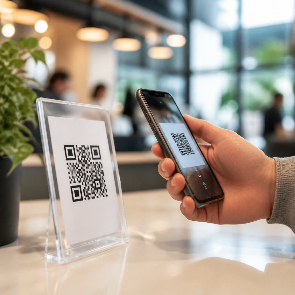
When a code has no stage-specific purpose, the destination becomes generic. Generic destinations underperform because they ask users to do extra navigation on small screens in time-sensitive contexts. A shopper standing in an aisle will not hunt through a complex site to find nutritional details or compatibility information. A diner scanning a table tent expects a menu, loyalty offer, or feedback prompt, not a corporate homepage. Good customer journey mapping with QR codes starts by documenting the user’s moment, intent, likely objections, and desired next action. That document should include trigger, context, destination, CTA, data capture logic, and fallback paths. Brands that do this consistently produce scans that feel useful instead of promotional.
Ignoring context at the moment of scan
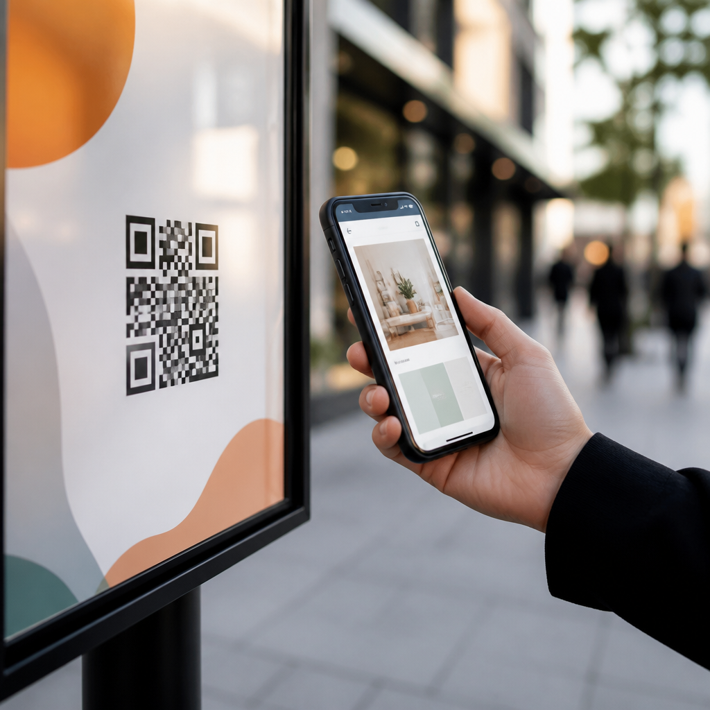
A QR code does not live in isolation; it lives in an environment. Context includes physical distance, lighting, movement, audience mindset, device conditions, and time pressure. Marketers frequently ignore these variables and create journeys that work only in conference room reviews. For example, a code on outdoor signage may be impossible to scan from the sidewalk because it is too small, too high, or visually cluttered. A code on product packaging may be technically scannable, but if the accompanying copy does not explain the benefit, many customers simply will not bother. “Scan to learn more” is weak because it hides the value exchange. “Scan for ingredient sourcing,” “Scan for installation video,” or “Scan for 15% off refill packs” gives a concrete reason.
Context also shapes post-scan expectations. Someone scanning at a live event may tolerate a short form if the payoff is immediate access to slides, a giveaway, or a demo booking. Someone scanning in transit probably will not. This is why journey mapping must include environmental constraints and user motivation. I recommend documenting scan context with three questions: where is the person, what are they trying to accomplish right now, and how much effort will they accept? The answers determine page length, media type, form fields, and CTA strength. Brands that respect these realities see better engagement because the experience fits the moment.
Sending every scan to the same destination
One-size-fits-all landing pages are among the biggest QR code mistakes. Different placements signal different intent, and your destination should reflect that signal. A code on packaging might open care instructions or recipe ideas. A code on a window poster could surface store hours, local inventory, or appointment booking. A code on a print ad may need campaign storytelling and a clear offer. Dynamic QR platforms make this segmentation straightforward because you can route by campaign, location, date, or audience without reprinting the code itself.
The practical rule is simple: one meaningful use case per code. If multiple audiences must use the same printed asset, build a landing page that immediately branches based on intent. This approach is better than sending everyone to a dense page with competing actions. It also improves measurement because each route can have distinct conversion events. Recognized tools such as Bitly, QR Code Generator PRO, Beaconstac, and Adobe Analytics can support campaign-level routing and reporting. The technology is not the barrier. The barrier is unclear journey design. When you tailor destinations to the scan source, you respect intent and preserve momentum.
Failing to align the landing experience with mobile behavior
Most QR interactions happen on mobile devices, yet many landing pages still behave like desktop pages squeezed onto smaller screens. Common failures include slow load times, intrusive pop-ups, tiny tap targets, autoplay media, and forms that request too much too soon. Google’s Core Web Vitals remain relevant here because loading performance influences bounce rates and user satisfaction. A QR scan is a high-intent action, but it is also fragile. If a page stalls for several seconds on mobile data, the user often abandons before seeing the offer.
Mobile alignment means reducing friction aggressively. Keep the first screen focused on one purpose. Use concise headlines, readable type, and obvious buttons. Pre-fill location when permission makes sense. Offer Apple Wallet or Google Wallet passes where relevant. Use click-to-call, maps, SMS, or one-tap email capture if they match the context. For post-purchase journeys, embed short instructional video near the top and provide transcripts for accessibility and silent viewing. If commerce is the goal, route directly to a mobile-ready product detail or checkout flow, not a navigation hub. In my experience, shortening the path by even one unnecessary tap can materially improve conversion rates, especially in store aisles and event environments.
| Journey stage | Typical scan context | Best QR destination | Common mistake |
|---|---|---|---|
| Awareness | Poster, packaging teaser, out-of-home | Short explainer, offer preview, locator | Sending to homepage |
| Consideration | Shelf talker, brochure, trade show booth | Comparison guide, demo, reviews, specs | Hiding proof and details behind extra clicks |
| Conversion | Menu, catalog, direct mail, event CTA | Checkout, booking, coupon redemption | Long forms before purchase intent is validated |
| Retention | Packaging insert, receipt, product label | Setup help, warranty, reorder, referral | Stopping communication after the first sale |
Overcomplicating the call to action and value exchange
Another frequent mistake is vague or overloaded messaging around the code. The scan prompt should answer three questions immediately: why scan, what happens next, and what value will I get? Marketers sometimes surround QR codes with several offers at once, such as discounts, downloads, contests, and social prompts. That overload increases hesitation because users cannot predict the outcome. A stronger pattern is one code, one promise, one next step. If the goal is lead generation, say exactly what the lead receives. If the goal is education, name the content clearly. If the goal is support, state the task plainly, such as activation, assembly, troubleshooting, or refill ordering.
The value exchange also needs proportionality. Asking for eight form fields in exchange for a basic brochure is rarely justified. Requiring app installation to access a simple coupon creates unnecessary abandonment. Better journeys match effort to reward. For example, a cosmetics brand can place a QR code on packaging that opens shade tutorials without a form, then offer optional email signup for replenishment reminders after the user engages. A B2B manufacturer can provide spec sheets instantly, then invite engineers to request CAD files or a consultation. This sequencing respects user intent and builds trust before capture.
Neglecting analytics, attribution, and testing
Customer journey mapping with QR codes fails when teams cannot prove what happened after the scan. Too many campaigns stop at scan counts, which is like judging an email by opens alone. Scans are only the top of the interaction. You need downstream metrics tied to business outcomes: engaged visits, button clicks, form starts, purchases, registrations, support deflection, reorder rates, or repeat scans. Use UTM parameters, event tracking, and conversion goals in tools such as Google Analytics 4, Adobe Analytics, HubSpot, or Salesforce Marketing Cloud. If you operate multiple physical placements, distinguish them with unique dynamic URLs so performance can be compared by location, creative, and audience.
Testing is equally important. Run A/B tests on CTA language, landing layout, incentive type, and form length. Compare static versus dynamic content updates. Measure whether product-page scans convert better with video first or specs first. For support journeys, track whether QR-linked guides reduce call center volume or average handle time. For store environments, compare codes placed at shelf edge versus endcap signage. Small operational decisions often have large effects. In one packaging program I worked on, changing the CTA from a generic learning prompt to a setup-specific promise increased engaged sessions because users finally understood the benefit before scanning. What gets measured gets improved, and QR journeys are no exception.
Missing compliance, accessibility, and trust signals
Trust can break a QR journey before the page even loads. Consumers have learned to be cautious about unfamiliar codes because phishing and spoofing exist. Brands should reduce uncertainty by using recognizable domains, clear branding, and transparent explanations of what the scan does. Secure destinations with HTTPS are nonnegotiable. If data collection occurs, disclose it clearly and comply with relevant standards such as GDPR or CCPA where applicable. Consent language should be understandable, not buried in dense legal text. If geolocation, SMS, or email follow-up is involved, explain the purpose and frequency.
Accessibility is another area where brands make avoidable mistakes. The printed code needs sufficient contrast and size, quiet zone spacing, and placement that does not force awkward scanning angles. The destination should support screen readers, keyboard navigation where relevant, captions for video, and readable color contrast. If the content is essential, provide a fallback short URL so users who cannot scan still have access. This is especially important on packaging, instructions, and public signage. A QR program that excludes users or creates suspicion will underperform regardless of creative quality.
Treating QR codes as campaign tactics instead of lifecycle infrastructure
The most mature brands do not treat QR codes as isolated campaign add-ons. They treat them as a durable layer of customer journey infrastructure across channels. That means the same strategic framework applies whether the code appears in direct mail, packaging, retail displays, menus, manuals, event booths, receipts, or loyalty materials. Each scan should fit into a documented system of intents, destinations, tracking rules, and optimization cycles. Over time, this creates a map of where physical interactions generate digital value.
As a hub within QR codes in marketing strategy, customer journey mapping with QR codes should connect to related topics such as QR code landing page design, dynamic versus static QR implementation, packaging QR codes, in-store QR analytics, event lead capture, post-purchase onboarding, and QR code compliance. The advantage of this hub approach is consistency. When teams share naming conventions, governance, creative standards, and measurement plans, they avoid duplicated effort and conflicting user experiences. The final goal is not more scans. It is smoother journeys, better conversion, stronger retention, and clearer insight into how offline touchpoints influence digital outcomes.
The biggest customer journey mistakes with QR codes are predictable: starting with the code, ignoring scan context, using generic destinations, neglecting mobile behavior, muddling the value exchange, skipping analytics, and overlooking trust and accessibility. Every one of these mistakes adds friction at the exact moment a customer signals intent. The fix is equally clear. Map the journey stage first, define the user’s question, build a destination that answers it immediately, and measure what happens after the scan.
When you approach customer journey mapping with QR codes as an operational discipline, not a design accessory, QR programs become more useful and more profitable. They can educate shoppers, accelerate purchases, improve support, and extend post-sale relationships, all from physical touchpoints you already own. Audit your current QR placements, rewrite each CTA around a single promise, and align every landing page to the moment of scan. That simple review will reveal where customers are dropping off and where better journey design can lift results.
Frequently Asked Questions
What is the biggest customer journey mistake brands make with QR codes?
The most common mistake is treating the QR code as the strategy instead of treating it as one touchpoint inside a larger customer journey. A QR code by itself does not create results. It simply moves someone from a physical or visual moment into a digital experience. When brands skip journey mapping, they often send every scanner to the same generic homepage, campaign page, or app download screen without considering what the person actually needs at that moment. That creates friction because the user has to figure out the next step on their own.
A better approach is to ask what question the customer has at the exact moment they scan. Someone scanning a code on product packaging may want usage instructions, reviews, ingredients, warranty details, or reorder options. Someone scanning at an event may want schedules, speaker details, booth offers, or lead capture. Someone scanning in a retail aisle may need proof that the product is worth buying right now. If the landing experience does not match that intent, the scan becomes a dead end instead of a conversion point.
In practice, the biggest mistake is a lack of context. Brands focus on getting the scan, but not on what happens after the scan. Strong QR campaigns are designed stage by stage: awareness, consideration, purchase, onboarding, retention, and advocacy. Each scan should answer the next question, remove the next obstacle, and present one clear action. When brands think this way, QR codes stop being novelty tools and start functioning as practical conversion tools.
Why do QR code campaigns create friction even when people are scanning them?
A scan is not the same as progress. Many campaigns celebrate scan volume while ignoring what happens next. Friction shows up when the destination is slow, confusing, irrelevant, or asks too much too soon. For example, a customer scans a code on a shelf talker expecting quick product information but lands on a cluttered homepage. Or they scan packaging for setup help and get sent to a general support portal with dozens of menu options. In both cases, the customer took action, but the brand failed to reward that action with clarity.
Another major source of friction is a mismatch between physical context and digital experience. The environment matters. A person in a store is likely standing, distracted, and making a quick decision. A person at a live event may be moving between sessions. A person scanning after purchase may be more willing to spend time learning, registering, or exploring accessories. If brands ignore those conditions and use the same destination for every use case, they introduce unnecessary steps that slow momentum.
Friction also increases when brands do not define a single primary outcome for each QR placement. If one scan experience tries to educate, collect leads, push app downloads, promote social channels, and close a sale all at once, users often do none of those things. The best-performing QR experiences are focused. They are mobile-friendly, load quickly, clearly explain value, and make the next step obvious. Reducing friction is usually less about adding more content and more about making the path simpler, faster, and more relevant to the scanning moment.
How should brands map the customer journey before placing QR codes in campaigns?
Brands should start by identifying the stages customers move through before and after purchase, then defining the role a QR code can play at each stage. A useful framework is to map awareness, consideration, conversion, onboarding, retention, and loyalty. At each stage, ask four practical questions: where is the customer encountering the code, what are they likely trying to accomplish, what concern or obstacle might stop them, and what is the most useful next action you want them to take? This shifts planning away from “Where can we put a QR code?” and toward “What job should this scan do?”
For awareness, a QR code might need to deliver a short brand story, local activation details, or a limited-time offer. In consideration, it may need to support comparison, answer objections, or provide reviews and product proof. Near purchase, it may need to unlock pricing, stock details, coupons, financing, or a fast add-to-cart path. After purchase, it can help with setup, registration, tutorials, care instructions, or cross-sell recommendations. In retention and loyalty, it can connect customers to replenishment, referral programs, support, or community content.
It is also important to map by channel and environment, not just by funnel stage. Packaging, retail displays, event signage, field marketing materials, direct mail, and in-store handouts all create different expectations. A QR code on shipping inserts should not lead to the same experience as one on an outdoor poster. Once the journey is mapped, brands should build unique landing paths, use trackable links, and test each step on mobile devices in real-world conditions. The result is a QR program that feels intentional rather than improvised.
What should happen after someone scans a QR code to keep them moving forward?
After the scan, the user should land in an experience that immediately confirms they are in the right place, explains the value of staying, and presents one logical next step. That means the first screen should align with the promise made before the scan. If the code offered setup help, the page should open with setup help. If it promised a discount, the discount should be visible right away. If it was placed at an event booth, the page should clearly relate to that booth, activation, or offer. Relevance in the first few seconds is what keeps momentum alive.
The next step should be specific and easy. Good examples include “Watch the 30-second demo,” “Compare sizes,” “Register your product,” “Claim your show offer,” or “Reorder in one tap.” Weak examples include generic menus, broad navigation choices, or pages that force users to hunt for the reason they scanned. The best post-scan experiences remove decision fatigue. They guide rather than overwhelm.
Brands should also think beyond the immediate conversion. A smart QR destination can support the current action while opening the door to the next stage of the relationship. For instance, a packaging scan may begin with setup instructions, then invite product registration, then recommend accessories, then offer replenishment reminders. A retail scan may answer product questions, then provide social proof, then drive store locator, cart, or pickup actions. The key is sequencing. Do not ask for everything at once. Deliver what matters now, then introduce the next best action once the first need has been satisfied.
How can brands measure whether their QR code journey is working or failing?
Measurement should go far beyond total scans. Scan count only tells you that the code attracted attention. It does not tell you whether the customer journey was smooth or whether the scan contributed to a meaningful business result. To evaluate performance properly, brands should track metrics across the entire path: scan rate by placement, landing page engagement, bounce rate, time to action, click-through to the next step, form completion, coupon redemption, purchases, registrations, repeat visits, and downstream retention behaviors.
It is especially useful to compare performance by context. A code on product packaging may generate fewer scans than an event sign but produce stronger post-scan engagement and more repeat purchases. A retail aisle code may have a lower completion rate if the page is too heavy or if the offer is unclear. Segmenting by location, campaign, audience, device type, and journey stage helps reveal where friction is occurring. If people scan but leave quickly, the landing experience may not match intent. If they engage but do not convert, the next step may be too demanding or poorly timed.
Brands should also combine quantitative and qualitative feedback. Test the scan experience in real conditions, watch how quickly pages load, and ask frontline staff or customers what they expected to find. Small details often explain major performance problems: weak calls to action, unclear signage, bad connectivity, too many form fields, or landing pages not designed for mobile use. The strongest QR programs improve continuously. They use data to diagnose drop-off points, refine each destination, and make sure every scan helps move the customer forward rather than forcing them to start over.