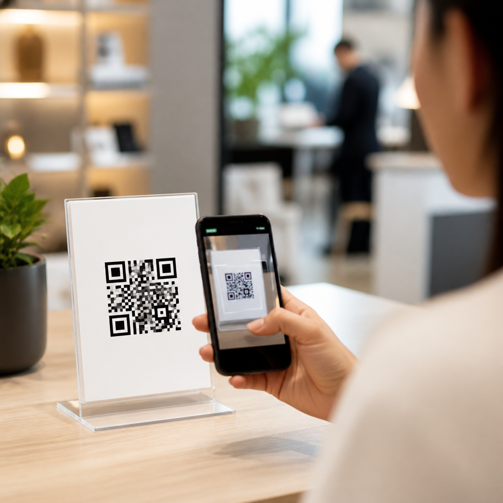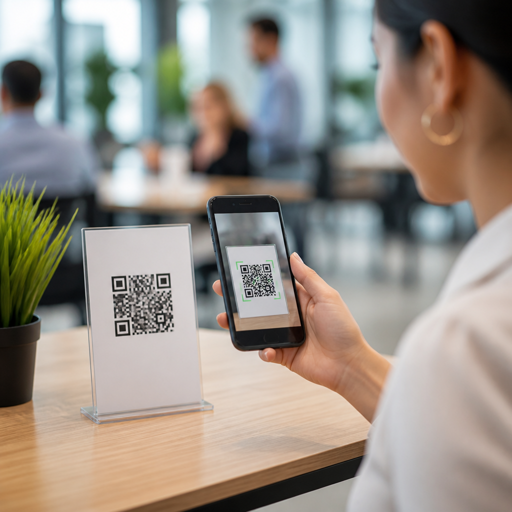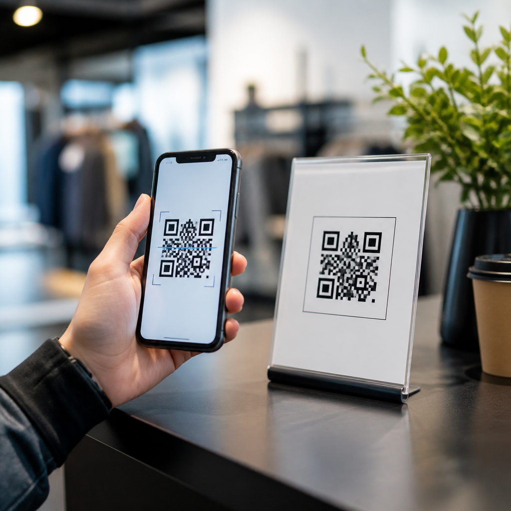

A QR code landing page is a mobile-first page designed specifically for people who arrive by scanning a code with their phone camera, and building one that converts requires different decisions than building a standard desktop-first campaign page. In practice, the scan is only the beginning. The real performance driver is what happens in the first few seconds after the page loads: whether the visitor understands the offer, trusts the brand, and can complete the next step without friction. I have built QR-driven pages for retail promotions, restaurant menus, event check-ins, packaging inserts, and field sales campaigns, and the highest-converting pages all share the same traits: fast load speed, one clear action, tightly matched messaging, and measurable analytics. This matters because QR traffic usually comes from high-intent offline moments. Someone scanning a product label, poster, direct mail piece, or table tent is already curious enough to act. If the destination is confusing, slow, or misaligned with the promise on the code, that intent disappears quickly. A high-converting QR code landing page connects offline context to a simple mobile action, turning scans into signups, purchases, bookings, app installs, coupon saves, or support requests.
Before building, define the core terms. A QR code is a machine-readable square barcode that opens a digital destination, most often a URL. A landing page is a standalone page focused on a single campaign goal rather than general site browsing. Conversion means the completion of that goal, such as submitting a form or redeeming an offer. Scan-to-conversion rate measures how many scanners complete the desired action. Dynamic QR codes matter here because they let you change the destination URL, add tracking parameters, and monitor scans by device, time, and location without reprinting the code. For a sub-pillar hub on step-by-step tutorials, the goal is broader than one build checklist. You need a repeatable framework that works across use cases and supports deeper guides on page speed, analytics setup, form design, copywriting, coupon pages, PDF alternatives, and A/B testing. Think of this article as the master workflow. If you can align scan intent, mobile UX, tracking, and trust signals on one page, you can adapt the model to almost any QR campaign.
Start with scan intent and one conversion goal
The first step is to identify why someone is scanning and what single action you want next. This sounds obvious, but it is where most QR campaigns fail. Teams often use one code to send visitors to a homepage, a social profile hub, or a cluttered page with too many choices. QR traffic behaves differently from search traffic. The visitor did not type a query and compare ten results. They responded to a physical prompt in a specific environment. On a product package, they may want instructions, ingredients, warranty registration, or a discount. On event signage, they may want the schedule, speaker bios, or instant registration. On a restaurant table card, they may want the menu, loyalty program, or payment flow. Match the landing page to that exact moment.
I recommend writing a simple intent statement before opening any builder or CMS: “When people scan this code from [placement], they want [outcome], and we want them to [conversion].” For example, a cosmetics brand may place a code on packaging with the message “See how to use this serum.” The right page is not a generic product catalog. It is a short mobile page with a demo video thumbnail, three usage steps, skin-type notes, social proof, and a prominent “Buy full size” or “Subscribe and save” button. That one-sentence intent statement keeps the page focused. If multiple outcomes are equally valid, create separate codes and separate pages. Distinct campaigns nearly always outperform one-size-fits-all destinations because the copy, call to action, and analytics stay clean.
Build the page structure for mobile speed and clarity
A QR code landing page should be designed from the thumb upward. Most visits come from phones, often on variable cellular connections, sometimes in poor lighting, crowded stores, or outdoor environments. That means your above-the-fold area must do four things immediately: confirm the visitor is in the right place, state the benefit, show the primary action, and load fast. Use a concise headline that mirrors the code’s callout text. If the poster says “Claim your free sample,” the page headline should repeat that offer, not switch to a broad brand slogan. Add a brief supporting line, one primary button, and if needed one visual that proves relevance, such as the product image or event logo. Keep navigation minimal or remove it entirely on campaign pages.
Technically, speed is nonnegotiable. Google’s Core Web Vitals remain useful benchmarks for QR destinations because delay destroys conversion. Compress images to modern formats such as WebP, lazy-load below-the-fold media, minimize third-party scripts, and host on reliable infrastructure. If you use a page builder, audit what it adds. I have seen QR campaigns lose momentum because a simple coupon page loaded a chat widget, heatmap script, retargeting stack, font library, and video embed before the main button appeared. On mobile, every extra request matters. Use responsive layouts, large tap targets, 16px or larger body text, high contrast, and enough spacing that users can tap without zooming. If forms are required, ask only for essential fields. Fewer fields almost always increase completion rates, especially when people are standing in a store aisle or walking between sessions at a conference.
Create copy and offers that continue the offline message
Conversion improves when the physical trigger and the digital destination feel like one uninterrupted experience. This is message match. The words on the package, flyer, shelf talker, badge, or postcard should continue on the page with the same promise, tone, and timing. If the QR code says “Download the installation guide,” the landing page should not force a newsletter signup before showing the guide. If the code says “Vote now,” the page should open directly to the voting interface. People scan with an expectation already formed. Meeting it is the fastest route to trust.
Your offer should also fit the friction level of the environment. Low-commitment contexts convert well with quick wins: coupon reveals, recipe access, care instructions, map directions, waitlist joins, or wallet pass downloads. Higher-commitment offers such as financing applications or long quote forms usually work better when the page first offers a smaller action, like “Get pricing by text” or “Book a 10-minute call.” Social proof helps, but it must be selective. Add concise review snippets, star ratings, user counts, security badges, or partner logos near the call to action. For regulated industries, include the necessary disclosures without burying the main action. Strong copy is specific. “Save 15% today” beats “Learn more.” “See the two-minute setup guide” beats “Get started.” Precision reduces hesitation.
Set up analytics so every scan can be measured and improved
A QR code landing page cannot be optimized without clean data. At minimum, track scans, page sessions, conversion events, and the gap between them. The basic stack usually includes a dynamic QR platform, web analytics, and event tracking through a tag manager. Google Analytics 4 is the standard analytics layer for many teams, while Google Tag Manager simplifies event deployment. If the campaign runs across many placements, append UTM parameters to the destination URL so you can distinguish scans from packaging, in-store displays, direct mail, receipts, or outdoor signage. Dynamic code platforms such as Bitly, QR Code Generator Pro, Beaconstac, and Flowcode can also report scan counts and device patterns. Compare platform scan data with on-page session data; discrepancies often reveal redirects, app intercepts, or loading issues.
| Campaign element | What to track | Why it matters | Recommended tool |
|---|---|---|---|
| QR code placement | UTM source, medium, campaign, content | Shows which offline asset drives qualified traffic | Dynamic QR platform plus GA4 |
| Landing page engagement | Sessions, engaged sessions, scroll depth, button taps | Reveals whether visitors understand the page | GA4 with Tag Manager |
| Primary conversion | Form submit, purchase, booking, coupon save, download | Measures actual business outcome | GA4 conversions, CRM, ecommerce platform |
| Technical performance | Load time, Core Web Vitals, redirect chains | Identifies friction that blocks mobile users | PageSpeed Insights, Lighthouse |
Once tracking is installed, define success metrics before launch. For a coupon page, you may care about scan-to-save rate and in-store redemption rate. For lead generation, track form completion rate and qualified lead rate in the CRM, not just raw submissions. For product education, track video starts, PDF opens, and downstream purchases within an attribution window. I have found that QR campaigns often expose a hidden problem: the code gets plenty of scans, but the landing page underperforms because it asks for too much too soon. Data makes that visible. Heatmaps from tools like Hotjar or Microsoft Clarity can help diagnose drop-off, but use them sparingly to protect performance. The most useful habit is weekly review by placement, not only by total campaign. A shelf tag near checkout may convert very differently from the same code on a shipping insert because the user mindset is different.
Test, refine, and build reusable templates for future campaigns
Once the page is live, optimization should be continuous and practical. Start with the highest-leverage variables: headline, hero image, call-to-action text, number of form fields, and page length. In QR campaigns, even small changes can move conversion sharply because the audience is narrow and context-specific. For example, replacing a generic button label like “Submit” with “Get my coupon” regularly improves tap-through because the outcome is clearer. Moving trust signals above the form can increase completion when the offer involves personal data. Reducing redirects from the QR code to the final page can improve both load speed and attribution accuracy. A/B testing platforms can help, but simple sequential tests are often enough if traffic volume is modest.
Build reusable templates around common QR goals so each new campaign starts from a proven structure. Typical templates include coupon claim pages, product education pages, event registration pages, menu pages, app download pages, feedback forms, support pages, and review request pages. Each template should include a mobile-first layout, a predefined event schema, a CTA hierarchy, and a checklist for message match between print asset and page. Over time, this turns one-off QR projects into an efficient operating system for offline-to-online conversion. The hub value of a page like this is that it anchors all step-by-step tutorials beneath it: how to create dynamic codes, how to connect UTMs, how to design forms for mobile, how to use GA4 events, how to test CTA buttons, and how to troubleshoot scan failures on different devices. When teams document these patterns, results improve faster because every new page benefits from the last campaign’s evidence.
The best QR code landing pages convert because they respect context, reduce friction, and make the next step obvious. Start by defining scan intent and a single conversion goal. Build a mobile-first page that loads quickly, confirms the promise immediately, and presents one clear action. Keep copy tightly aligned with the message on the physical asset, and tailor the offer to the environment in which the scan happens. Then install clean tracking with dynamic QR codes, UTM parameters, analytics events, and conversion reporting so performance can be measured by placement, not just in aggregate. Finally, test systematically and turn winning patterns into templates you can reuse across campaigns.
For brands investing in packaging, print, retail signage, direct mail, events, or field marketing, this approach creates a measurable bridge between offline attention and online action. That is the central benefit: instead of treating QR codes as simple links, you use them as entry points into a purpose-built conversion path. Review your current QR destinations, identify pages that send scanners to generic content, and rebuild them around one intent, one action, and one measurement plan. Then expand from this hub into your next step-by-step tutorial and improve each campaign with evidence, not guesswork.
Frequently Asked Questions
What makes a QR code landing page different from a standard landing page?
A QR code landing page is built for a very specific moment: someone has already taken action in the real world, scanned a code with their phone, and expects an immediate, relevant experience on mobile. That is very different from a traditional landing page, which may be designed for desktop traffic, colder audiences, or users arriving from search ads, email, or social media. With QR traffic, the transition from offline to online has to feel seamless. The visitor should instantly understand why they are on the page, what they are supposed to do next, and what value they will get by continuing.
Because of that, the page structure usually needs to be simpler, faster, and more focused. Mobile-first design is not optional. Headlines must be clear within seconds, calls to action need to be easy to tap, forms should be short, and the page should avoid unnecessary distractions. A QR code landing page also has to reflect the context of the scan. If the code was placed on product packaging, a flyer, a restaurant table, an event sign, or a direct mail piece, the landing page should continue that same message and intent. High-converting pages reduce the mental gap between what the person scanned and what they see after the page loads.
In other words, the scan itself does not create conversion. It only creates opportunity. The landing page is where trust, clarity, and momentum are either preserved or lost. The best QR code landing pages are designed around speed, message match, and frictionless action, not around desktop layout conventions or generic campaign templates.
What should appear above the fold on a high-converting QR code landing page?
Above the fold is where most QR code landing pages win or lose the visitor. Since the user has just scanned on a phone, attention is limited and patience is even more limited. The first screen should communicate three things immediately: what the offer is, why it matters, and what action to take next. A strong mobile headline is essential. It should be specific and easy to understand at a glance, not clever at the expense of clarity. Supporting text should reinforce the benefit, answer the obvious “What do I get?” question, and remove uncertainty.
A visible call to action should also appear right away. Depending on the goal, that might be “Shop Now,” “Claim Offer,” “Book a Demo,” “Download Menu,” “Register Today,” or another action tied directly to the scan context. The button should be large, thumb-friendly, and visually distinct. If trust is important to the decision, include a compact trust signal near the top, such as star ratings, customer count, secure checkout messaging, recognizable brand logos, or a brief proof point. These elements can reduce hesitation without forcing the visitor to scroll for reassurance.
Visual hierarchy matters as much as content. Avoid cluttered hero sections, oversized graphics that push the call to action too far down, or long blocks of text that require work before the user understands the page. If there is an image, it should support the offer rather than compete with it. If there is a form, keep it short and only ask for essential information. The ideal above-the-fold experience is one where the visitor can understand the value and complete the first meaningful action in seconds.
How can I improve conversion rates on a QR code landing page?
Improving conversion rates starts with reducing friction at every step after the scan. One of the biggest mistakes is sending QR code traffic to a generic homepage or a page that requires too much navigation. A dedicated landing page almost always performs better because it preserves intent. The user scanned for a reason, and your job is to make the next step obvious. That means removing unnecessary menu links, limiting competing actions, and centering the page around a single primary conversion goal.
Page speed is another major factor. QR scans happen in real-world environments where people may be standing, walking, shopping, attending an event, or dealing with uneven mobile connections. If the page loads slowly, confidence drops quickly. Compress images, simplify scripts, use responsive design, and test performance on actual phones, not just desktop previews. Fast loading helps both conversion and user trust, especially when someone is interacting with your brand in a brief attention window.
Beyond speed and focus, conversion often improves when the page reflects context and intent more precisely. Personalize based on campaign, location, product, or audience when possible. A QR code on a product package should land on a page that speaks directly to that product. A code on an in-store display should continue the same promotional message. Small improvements in message match can have an outsized effect because they reassure users they are in the right place. Add concise social proof, make forms shorter, clarify benefits, and test your CTA wording. Often, the highest lifts come not from redesigning everything, but from making the page feel more immediate, relevant, and effortless to use.
How important is trust on a QR code landing page, and how do I build it quickly?
Trust is critical because QR code traffic can create a moment of uncertainty. Even if the user chose to scan, they are still making a snap judgment once the page opens: Is this legitimate? Is this safe? Is this what I expected? Since that decision happens in seconds, trust cannot be treated as a secondary design element. It needs to be built into the first screen and reinforced throughout the page. If visitors feel unsure, they will leave before they ever evaluate the offer.
The fastest way to build trust is with message consistency and brand continuity. The landing page should visually and verbally match the source of the QR code. Use the same brand name, colors, tone, product references, or campaign language so the transition feels intentional. A confusing mismatch between the printed asset and the landing page can create hesitation immediately. Beyond that, include trust markers that are easy to verify at a glance: testimonials, review counts, secure payment badges, privacy assurances, satisfaction guarantees, media mentions, or partner logos. These signals help reduce anxiety without forcing the user to do extra research.
Transparency also plays a major role. Be clear about what happens after the click or form submission. If the user is signing up, explain what they will receive. If they are booking, say how long it takes. If they are making a purchase, show pricing clearly and avoid surprise steps. Trust grows when the page feels honest, predictable, and easy to navigate. On a QR code landing page, people are not looking for complexity. They want confirmation that they made a good decision by scanning and that the next action is safe and worthwhile.
How do I measure whether a QR code landing page is actually converting well?
To measure performance accurately, you need to track more than just scans. A scan tells you the code was noticed and activated, but it does not tell you whether the landing page did its job. The more meaningful metrics begin after the page loads: bounce rate, engagement rate, scroll depth, CTA click-through rate, form completion rate, purchase rate, booking rate, or whatever action defines success for the campaign. These conversion metrics reveal whether the page is turning curiosity into action or losing people in the first few seconds.
It is also important to connect performance data to specific QR placements and traffic sources. Use unique URLs, campaign parameters, or dynamic QR code tracking so you can compare results by channel, location, audience, or creative variation. For example, the same landing page may perform differently for a QR code on packaging versus a poster or direct mail piece. Without segmented tracking, it is hard to know whether a weak result comes from the code placement, the message, the page design, or the offer itself.
The best analysis combines quantitative and practical testing. Review analytics to spot drop-off points, then test the page on real mobile devices under realistic conditions. Check how quickly it loads, how easy the CTA is to tap, whether the headline makes sense instantly, and whether any step feels confusing. A good QR code landing page conversion rate is not just about numbers in a dashboard. It reflects how well the page performs in the exact moment the visitor experiences it. When measurement is tied to both campaign context and on-page behavior, it becomes much easier to make improvements that actually increase conversions.