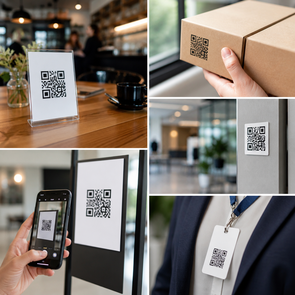
Where you place QR codes determines whether they become a measurable growth tool or a forgotten square that nobody scans. In marketing strategy, placement is not a design afterthought; it is the point where customer intent, physical context, and digital experience meet. A QR code is simply a machine-readable link, but in practice it functions as a bridge between channels, moving a person from packaging, print, signage, events, direct mail, or product displays into a targeted digital destination. Customer journey mapping with QR codes means identifying each stage a buyer moves through, from awareness to consideration, purchase, onboarding, retention, and advocacy, then assigning a code placement that matches the person’s immediate question and level of motivation.
I have seen the same campaign succeed in one location and fail in another with identical creative, because the scanning moment was wrong. A code on a trade show banner can drive qualified leads when paired with a fast demo signup page, while that same code on a moving vehicle may produce weak results because the user has no safe chance to scan. Maximum impact comes from relevance, visibility, timing, and friction reduction. The best QR code placements answer a practical question: what does the customer need right here, right now, and what is the easiest next action? When that answer is clear, scan rates rise, attribution improves, and the marketing team can connect offline touchpoints to online behavior with unusual precision.
This article serves as a hub for customer journey mapping with QR codes under a broader QR codes in marketing strategy program. It covers how to choose placements for each journey stage, what technical and design factors affect performance, where teams commonly make mistakes, and how to measure outcomes. It also points naturally toward deeper supporting articles on packaging, retail signage, events, direct mail, menus, and post-purchase experiences. If you need one framework for deciding where QR codes belong across campaigns, channels, and physical environments, start here and use it to map every scan opportunity to a clear customer intent.
Map placement to the customer journey, not just the asset
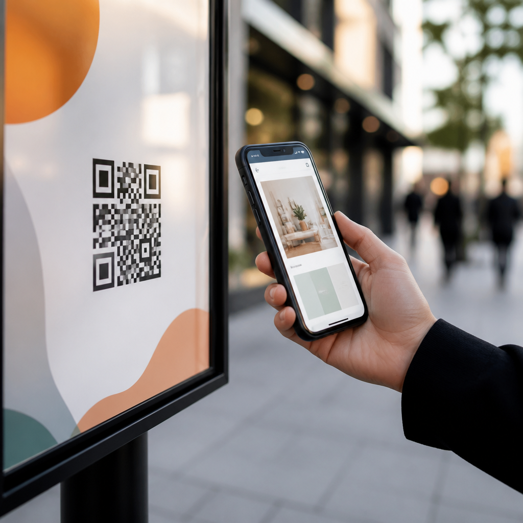
The most effective way to decide where to place QR codes is to map them against the customer journey instead of asking where empty space exists on a design. At the awareness stage, placements should appear in high-visibility environments where people can discover your brand without commitment: storefront windows, out-of-home posters, product packaging on shelves, event booths, and print ads. Here, the destination should be lightweight and fast, such as a landing page, short explainer video, giveaway entry, store locator, or introductory offer. At the consideration stage, people need proof and specifics, so codes belong beside comparison charts, brochures, shelf talkers, catalogs, case studies, and sales collateral that connect directly to product details, reviews, FAQs, or interactive demos.
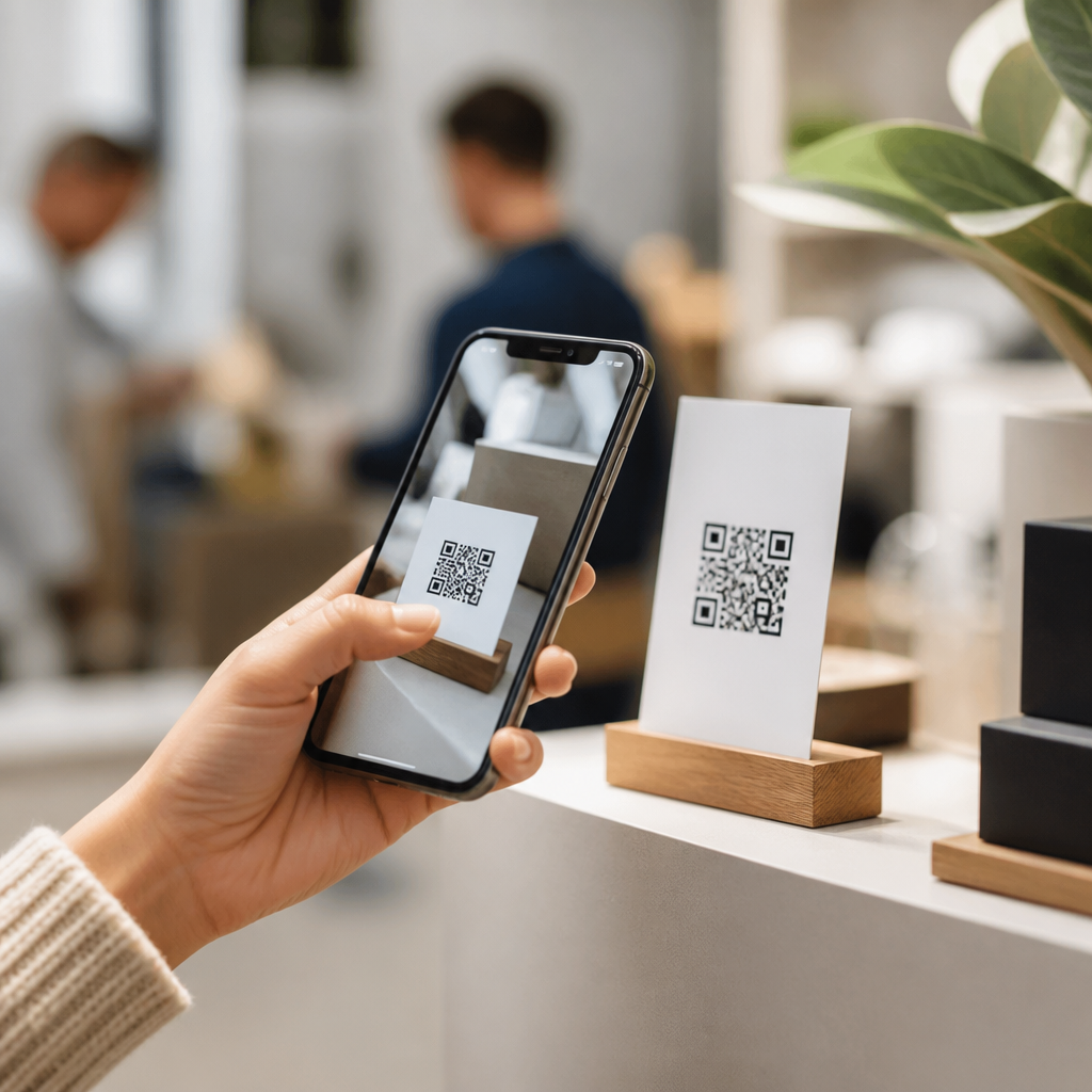
Purchase-stage QR code placement works best where hesitation appears. In retail, that may be on shelf labels, endcaps, fitting room signage, tabletop displays, or packaging that helps someone confirm sizes, ingredients, compatibility, or warranty terms before buying. For service businesses, it may be in-office signage, proposal documents, or menus that simplify booking, payment, or plan selection. After purchase, placement shifts from persuasion to support. Include QR codes on receipts, thank-you cards, inserts, delivery boxes, appliance stickers, and welcome emails to route buyers into setup guides, registration flows, care instructions, loyalty enrollment, or cross-sell recommendations. In retention and advocacy, place codes on reorder reminders, membership materials, event follow-ups, and referral cards so satisfied customers can renew, review, and recommend.
A simple placement rule I use is this: every code should match a micro-intent. If the person is curious, show brand education. If they are comparing, show evidence. If they are ready to buy, remove obstacles. If they already purchased, reduce support effort and encourage the next valuable action. This is why customer journey mapping with QR codes outperforms random deployment. It forces marketers to think in moments, not media. The code is not the strategy. The code is the handoff between one moment of intent and the next.
Choose high-impact physical locations based on scan conditions
Good QR code placement depends on environmental conditions as much as marketing logic. A code can only perform if people can notice it, approach it, and scan it comfortably. Distance matters. Codes intended for close-range scanning, such as on packaging, menus, business cards, or product tags, can be smaller because users hold the item in hand. Codes on window clings, aisle signs, transit ads, or event backdrops need larger dimensions and stronger contrast because the user is farther away. A practical rule many printers follow is about one inch of code size for every ten feet of scanning distance, though testing on actual devices is always necessary.
Motion, lighting, and dwell time also shape placement decisions. A code on a subway platform poster may work because commuters have idle time. A code on a roadside billboard often underperforms because scanning from a moving car is unsafe and unrealistic. Restaurant table tents perform well because customers are seated and waiting. Museum labels work because visitors pause to learn more. Gym equipment decals can perform if they lead to short form videos, but only if sweat, glare, and curved surfaces do not distort the print. Retail window codes can generate after-hours traffic when paired with store hours, directions, and a shopping page. In every case, the question is not just whether people will see the code, but whether the environment supports a smooth scan-to-action sequence.
Placement must also respect ergonomics and competing visual elements. Do not bury QR codes near legal copy, fold lines, seams, glossy reflections, or cluttered artwork. Keep enough white space around the code, use a clear call to action, and position it where the eye naturally lands after reading the primary message. On packaging, side panels often beat the bottom panel because they are accessible before purchase and after opening. On direct mail, the back panel often works well because it can carry a focused offer without visual overload. On in-store displays, codes near price and product benefit messaging usually outperform codes placed only at the brand logo level because the customer already understands why scanning might help.
Use placement patterns that fit common marketing channels
Different channels create different scan behaviors, so the strongest QR code placements follow proven patterns. In direct mail, place the code near the main offer and repeat it near the response area. I have seen response rates improve when the code appears both above the fold and beside a short URL, giving recipients options. For product packaging, the front can support awareness content while the side or insert supports onboarding, recipes, tutorials, authenticity verification, or loyalty programs. Consumer packaged goods brands often place one code for shoppers and another for owners, because pre-purchase and post-purchase questions are different.
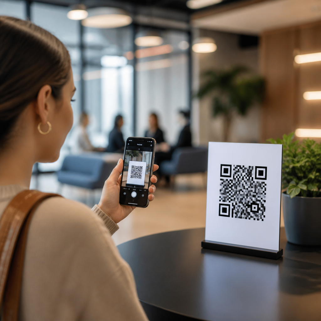
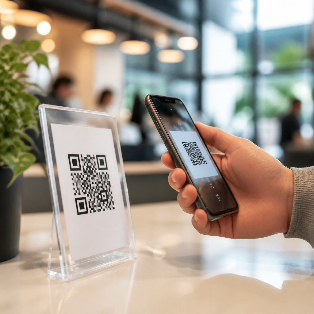
At events and trade shows, place QR codes at three levels: booth entry for broad discovery, demo stations for product-specific content, and staff badges or handouts for lead capture after conversation. This layered model mirrors how attendees move from curiosity to qualification. In restaurants and hospitality, table, menu, takeaway packaging, and room materials should each point to a distinct destination rather than the same homepage. A menu code might support ordering, while a takeout bag code requests a review or offers a reorder shortcut. In retail, shelf-edge labels, fitting rooms, display stands, and receipts should each serve one role in the journey. Shelf labels answer questions, fitting rooms provide style guidance, displays collect interest, and receipts drive retention.
| Channel | Best Placement | Customer Intent | Recommended Destination |
|---|---|---|---|
| Product Packaging | Side panel or insert | Learn, verify, set up | Tutorial, ingredients, warranty, loyalty signup |
| Retail Store | Shelf tag or display | Compare before buying | Reviews, specs, stock, coupons |
| Direct Mail | Near offer and CTA | Respond quickly | Landing page, booking form, limited-time offer |
| Events | Booth entrance and demo area | Discover and qualify | Demo signup, brochure, lead form |
| Post-Purchase Materials | Receipt, insert, thank-you card | Get help and return | Setup guide, support, reorder, referral program |
These patterns matter because they reduce guesswork and support internal linking across your broader content program. A hub article like this should connect to detailed playbooks for each channel, but the strategic principle remains constant: place the code where the customer naturally pauses and where the linked action resolves the next decision.
Design for scan rate, trust, and conversion after the scan
Placement alone cannot rescue a poor experience. The highest-performing QR codes combine physical visibility with technical reliability and a landing page that fulfills the promise of the call to action. Start with scanability. Use high contrast, sufficient quiet zone, and print quality that survives production, shipping, moisture, and handling. Dynamic QR codes are usually preferable in marketing because they allow destination changes, UTM tracking, and performance analysis without reprinting the asset. They also support segmentation by placement, so a code on shelf signage can route differently from a code on the package insert even within the same campaign.
Trust is equally important. People scan more readily when the CTA states exactly what they will get: “See ingredients,” “Watch setup video,” “Claim 15% off,” or “Book a demo in 30 seconds.” Vague prompts such as “Scan me” consistently underperform because they ask for effort without explaining value. Brand cues help, too. A code placed next to a logo, product image, or short benefit statement feels intentional rather than suspicious. For regulated categories such as healthcare, alcohol, supplements, and financial services, placement should also account for disclosure requirements and destination compliance. The easiest way to lose trust is to route users to a generic homepage, intrusive app install, or non-mobile page that ignores the context of the scan.
After the scan, conversion depends on continuity. If a customer scans a code beside a skincare product in a store, the landing page should open directly to that product, not your full catalog. If they scan from a trade show demo station, prefill the form with campaign context and keep the page short. Mobile page speed, clear navigation, and concise copy matter because many scans happen in distracting environments. Google’s Core Web Vitals are not abstract here; slow load times directly cut completions. The full pathway from seeing the code to completing the action should feel like one uninterrupted experience.
Measure performance and refine placement with real data
Maximum impact comes from testing, not assumptions. Every meaningful QR code placement should be tracked with campaign parameters, unique destination logic, or both. At minimum, separate codes by channel, location, and journey stage so you can compare scan volume, click-through behavior, bounce rate, conversion rate, assisted revenue, and repeat visits. Tools such as Google Analytics 4, Adobe Analytics, Bitly, QR Code Generator Pro, Beaconstac, and marketing automation platforms can capture this data when configured correctly. For physical environments, pair digital metrics with operational observations such as foot traffic, dwell time, shelf position, sales lift, and staff feedback.
In practice, I recommend treating placements as experiments. Test one variable at a time: location on the asset, CTA wording, destination type, incentive, or code size. For example, a home improvement retailer might compare a shelf-tag code offering “installation video” versus “compare models” and find that higher scan rates do not always produce more sales. A B2B software company at an expo may learn that scanning a booth wall drives many low-intent visits, while scanning a one-page solution brief handed over after conversation produces fewer scans but far better lead quality. These findings improve future placements because they connect the physical touchpoint with business outcomes, not vanity metrics.
Also measure what does not happen. Low scans can indicate poor visibility, weak motivation, bad timing, technical failure, or staff behavior that bypasses the code entirely. Conduct simple field audits with multiple phones, under real lighting, at real distances. Watch users if possible. Teams are often surprised to learn that the code technically works but the surrounding context does not explain why scanning is worth it. That is why customer journey mapping with QR codes should be a recurring optimization process rather than a one-time design decision.
A practical framework for building a QR code journey hub
If this page is your hub for customer journey mapping with QR codes, organize supporting content around the moments that matter most. Create cluster articles for pre-purchase placements such as retail signage, print advertising, direct mail, and packaging. Add consideration-stage guides covering product comparisons, case studies, event lead capture, and showroom experiences. Build post-purchase resources on onboarding inserts, receipts, loyalty materials, support labels, and reorder prompts. This structure helps marketing teams plan campaigns consistently and gives readers a clear path from strategy to execution.
The central lesson is straightforward. Place QR codes where customer intent is strongest, where scanning is physically easy, and where the destination answers the immediate need created by that moment. A code on the right surface with the wrong offer will fail. A code with the right offer in the wrong environment will also fail. Maximum impact comes from aligning journey stage, placement condition, creative message, and landing-page experience, then improving each with measurement. Start by mapping one campaign from awareness through retention, assign one distinct QR code purpose to each step, and review the data after launch. Done well, QR codes turn physical touchpoints into trackable, helpful, high-converting steps in the customer journey.
Frequently Asked Questions
Where should QR codes be placed to get the highest scan rates?
The best placement is wherever audience attention, physical accessibility, and immediate intent overlap. In practical terms, that usually means putting QR codes in locations where people naturally pause, have a clear line of sight, and can comfortably use their phones without friction. On product packaging, that may be the side panel or back panel near key product information rather than underneath folds, seams, or reflective wrapping. In retail displays, it often means placing the code at eye level or slightly below, where shoppers can notice it while already evaluating the product. On posters, signage, and event materials, the code should sit where it can be scanned from a realistic standing distance, not in a corner that requires people to walk too close or crouch down.
High-performing placement also depends on context. A QR code on direct mail tends to work better near the main call to action, especially after the value proposition has been established. On restaurant tables, menus, and in-store displays, placement should match the moment of decision, such as when someone is choosing an item, looking for details, or ready to redeem an offer. The key principle is simple: place the QR code where the customer already has a reason to act. If the code appears disconnected from the surrounding message or requires extra effort to find, scan rates usually drop. Strong placement supports the user journey instead of interrupting it.
What factors make a QR code easy or difficult to scan in a real-world setting?
Scanability is influenced by much more than the code itself. Size, distance, lighting, surface material, surrounding clutter, and placement height all affect whether someone can successfully scan on the first try. A code printed too small on a poster across a hallway may be technically correct but practically unusable. A code placed on a curved bottle, glossy package, tinted window, or wrinkled flyer may distort the image enough to reduce reliability. Even a well-designed code can fail if it is positioned where shadows, glare, reflections, or motion make phone cameras struggle to focus.
Placement should account for how people actually interact with the environment. If someone is walking past a storefront, the code must be visible and scannable quickly. If the audience is seated, such as at a conference table or restaurant booth, the code can support a more deliberate interaction. You also want enough white space around the code so it stands apart from nearby graphics and text. Avoid placing it too close to folds, edges, perforations, barcodes, or visual noise that competes for attention. Testing is essential: print the QR code at actual size, place it in the real environment, and scan it from expected angles and distances using multiple devices. Effective placement is validated in context, not assumed from a design file.
Should QR codes be placed above the fold, at eye level, or next to a call to action?
Ideally, yes, but the right choice depends on the format and user journey. On printed materials and landing-page-style layouts, placing a QR code above the fold can improve visibility because it appears before attention drops off. On signage and displays, eye-level placement is often effective because it aligns with natural viewing behavior and reduces physical effort. Next to a strong call to action, a QR code becomes more compelling because the user instantly understands why scanning matters. In many cases, the highest-performing placement combines all three principles: visible early, physically accessible, and clearly tied to a specific benefit.
What matters most is not following a rule mechanically, but matching placement to intent. For example, a trade show booth may benefit from a QR code positioned near product demonstrations or lead capture messaging, not just generically at eye level. A direct mail piece may perform better with the code near an offer deadline or personalized message. A shelf talker in retail should place the code close to the product claim or comparison point that triggers curiosity. A QR code without context asks the user to do interpretive work. A QR code placed beside a precise prompt such as “See pricing,” “Watch the demo,” “Get setup instructions,” or “Claim your discount” removes uncertainty and increases action. Placement and messaging should work together as one conversion path.
Which surfaces and locations should be avoided when placing QR codes?
QR codes should be avoided on surfaces that distort the image, reduce visibility, or create awkward scanning conditions. Common problem areas include curved packaging, metallic or highly reflective materials, transparent glass without contrast backing, textured labels, tiny promotional items, low-lit corners, and moving objects such as vehicles unless the code is intended for stationary interaction. Codes placed too high on walls, too low near the floor, behind counters, or on unstable hanging materials often underperform because people either cannot comfortably scan them or do not notice them in time.
You should also avoid placements where the digital destination does not match the user’s context. For example, placing a QR code on outdoor signage that leads to a long form requiring immediate completion may create friction if the user is standing, walking, or using limited connectivity. Likewise, a code on packaging that sends users to a generic homepage wastes the placement opportunity. Another mistake is putting the code in visually busy areas where logos, disclaimers, and promotional copy crowd it out. The objective is not merely to include a QR code, but to make it usable, relevant, and worth the effort. Poor placement can make even a strong campaign feel broken because the bridge between offline and digital was not thoughtfully engineered.
How can businesses measure whether their QR code placement is actually working?
The most reliable way to evaluate placement is to treat each location as a measurable distribution channel. Use dynamic QR codes so you can track scan volume, time, device type, and destination performance without reprinting the code. If the same campaign appears across packaging, posters, direct mail, event signage, and point-of-sale displays, assign unique codes or tagged URLs to each placement. That allows you to compare not just total scans, but conversion quality. A placement with fewer scans may still outperform if it produces higher purchase intent, better lead quality, or stronger downstream engagement.
Measurement should go beyond scan counts. Look at what happens after the scan: bounce rate, time on page, form completion, coupon redemption, product page views, video plays, app installs, or revenue attribution. This helps distinguish curiosity from actual business impact. It is also smart to run placement tests. Try eye-level versus countertop placement, front-of-package versus side panel, or poster center versus bottom corner. Small physical changes can produce meaningful differences in performance. Over time, the strongest QR code strategy is not based on assumptions about what looks good, but on evidence about what people notice, scan, and act on. When businesses connect placement decisions to analytics, QR codes become a serious optimization channel rather than a decorative add-on.