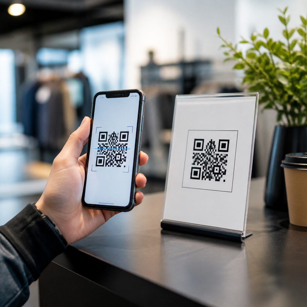

A QR code analytics dashboard template gives teams a structured way to track scans, compare campaigns, and turn raw interaction data into decisions. In practice, it is more than a spreadsheet or a pretty report. It is a repeatable framework for measuring how QR codes perform across packaging, print ads, retail displays, events, direct mail, restaurant menus, and product inserts. When I build reporting systems for QR campaigns, the difference between “we generated scans” and “we learned what worked” almost always comes down to the dashboard design.
For a sub-pillar focused on downloadable resources, this topic matters because templates reduce setup time and standardize reporting across marketers, agencies, franchise locations, and operations teams. A useful QR code analytics dashboard template should define the metrics, pull from dependable data sources, and present results in a way that non-analysts can understand quickly. Core terms matter here. A scan is the event of someone reading the code with a device. A unique scan usually means a distinct user or device within a set attribution window. A conversion is the downstream action you care about, such as a purchase, form fill, app install, coupon redemption, reservation, or file download. Attribution connects the scan to that outcome.
Teams often underestimate how many questions a dashboard must answer. Which placements drive the highest scan rate? Which landing pages convert best after the scan? What times, locations, and devices produce the most valuable traffic? Are dynamic QR codes outperforming static ones because they can be edited and tracked centrally? A strong template helps answer those questions consistently. It also creates internal linking value for a broader resource hub, since readers looking for QR code analytics, QR code tracking spreadsheets, campaign reporting examples, or downloadable marketing dashboard resources usually need adjacent guidance on UTM parameters, dynamic code management, and reporting cadence.
This hub article explains what a QR code analytics dashboard template should include, who should use one, how to adapt it to different campaign types, and what downloadable resources are most practical. If you need a reusable reporting format that can support weekly optimization and executive summaries, start here.
What a QR Code Analytics Dashboard Template Should Include
The best QR code analytics dashboard template balances simplicity with diagnostic depth. At minimum, include total scans, unique scans, scan-to-visit rate, landing page sessions, bounce rate, conversion rate, revenue or lead value, and cost per conversion. If the campaign is offline-to-online, add placement identifiers so each code maps to a physical asset such as poster A, shelf talker B, or package insert C. Without that naming structure, reports become anecdotal very quickly.
In most implementations, I recommend organizing the dashboard into four levels. First, an executive summary with KPIs, trend lines, and exceptions. Second, a campaign view that compares individual QR assets. Third, an audience view covering device type, operating system, geography, and time of scan. Fourth, a conversion view tying scan activity to business outcomes. This layered structure works whether you build the file in Google Sheets, Excel, Looker Studio, Tableau, Power BI, or Airtable.
Templates should also define metric logic. For example, if your analytics platform counts repeated scans from the same device differently than your QR generator, note the rule directly in the template. If conversions are imported from Shopify, HubSpot, Salesforce, or Google Analytics 4, clarify the attribution window. These details prevent the common executive question: “Why do scan totals not match session totals?”
A practical downloadable resource usually includes a tab for assumptions, a data dictionary, a raw data import sheet, a cleaned data model, and a presentation layer. That separation is not cosmetic. It protects formulas, reduces accidental edits, and makes handoffs easier when multiple stakeholders use the same file.
Core Metrics That Make QR Reporting Useful
Not every metric belongs on the first screen. The goal is to highlight what changes decisions. Total scans tell you reach, but unique scans reveal audience breadth more accurately. Repeat scans can indicate strong purchase intent in some contexts, such as restaurant menus or event agendas, but they may also signal friction if users need to scan multiple times to complete a task.
Scan-through rate matters when you know the estimated audience exposure. For example, if 10,000 brochures were distributed and 450 unique scans occurred, the response rate is 4.5 percent. Post-scan engagement metrics matter next: sessions, engaged sessions, average engagement time, bounce rate, and page depth. Then conversion metrics should close the loop: leads, purchases, coupon redemptions, registrations, or support actions completed.
Revenue-linked fields are especially valuable. A dashboard becomes far more credible when it shows that retail packaging code X drove 380 scans, 74 product page visits, 19 add-to-cart actions, and $2,460 in attributable revenue. Marketing leaders fund what they can measure. If direct revenue is unavailable, proxy value works too. For recruiting campaigns, use completed applications. For healthcare, use appointment requests. For manufacturing, use specification-sheet downloads followed by sales inquiries.
| Metric | What It Measures | Why It Matters | Typical Source |
|---|---|---|---|
| Total scans | All scan events | Shows overall volume and reach | QR platform |
| Unique scans | Distinct users or devices | Reduces inflation from repeat activity | QR platform |
| Sessions | Visits after scan | Confirms successful landings | GA4 or Adobe Analytics |
| Conversion rate | Completed actions per session or scan | Connects traffic to outcomes | GA4, CRM, ecommerce platform |
| Revenue or lead value | Business impact | Supports budget and optimization decisions | Shopify, Salesforce, HubSpot |
When you download or build a template, make sure each KPI has a business owner. Operations may own scan deployment, marketing may own landing pages, and sales may own lead disposition. The template should reflect that reality.
Best Downloadable Resources for Different Teams
A hub page on downloadable resources should help readers choose the right format rather than forcing one model on everyone. Small businesses often need a lightweight QR code analytics dashboard template in Google Sheets. It should include manual import fields, simple charts, and room for UTM-tagged URLs. Agencies usually need a client-facing report template with white-label sections, monthly trend comparisons, and commentary blocks. Enterprise teams often need a BI-ready version with connectors, permission controls, and automated refresh.
For event teams, the template should prioritize time-based patterns, venue zones, and rapid follow-up actions. A conference organizer may track scans by booth, session signage, sponsor banner, and attendee badge. For retail teams, the template should compare store locations, product categories, endcap displays, and seasonal promotions. For restaurants, popular fields include menu section scans, table-tent performance, dwell time, and ordering completion rate.
Useful downloadable resources also include supporting files. A naming convention worksheet prevents inconsistent code labels. A UTM builder sheet ensures campaign tagging remains standardized. A KPI glossary helps stakeholders interpret fields without improvising definitions. A presentation summary slide lets a marketer lift results from the dashboard into a leadership readout without rebuilding charts every week.
As a hub, this page should point readers toward related resources such as QR code tracking spreadsheet templates, QR campaign reporting examples, dynamic QR code management checklists, and landing page optimization guides. Those companion assets help users move from reporting to improvement, which is where the dashboard creates real value.
How to Customize a Template by Campaign Type
Different campaigns produce different data signatures, so a strong template must be adaptable. For product packaging, track scan volume by SKU, batch, region, retailer, and language version. Brands often use packaging QR codes for recipes, authenticity checks, warranty registration, or how-to videos. In those cases, repeat scans may be normal because customers revisit instructions after purchase.
For direct mail, response speed is critical. I usually add median time-to-scan from delivery date, because mail performance often peaks within days. For in-store signage, location normalization matters. A code in a flagship store should not be compared directly with one in a low-footfall branch unless the dashboard includes estimated impressions or traffic counts.
B2B trade show campaigns need lead quality fields, not just scan totals. Add company name capture rate, booked meeting rate, and pipeline contribution. Hospitality campaigns may care more about menu opens, reservation clicks, or review submissions. Education campaigns often need downloads of brochures, campus tour registrations, and application starts.
The safest approach is to keep a master dashboard template and create campaign-specific views. That preserves shared logic while giving each team the fields they actually use. It also makes cross-campaign benchmarking possible at the portfolio level.
Data Sources, Tools, and Setup Standards
Most QR dashboards rely on at least two systems: the QR code management platform and the web analytics or CRM platform. Common QR tools include Bitly Codes, QR Code Generator PRO, Beaconstac, Flowcode, and Scanova. Web and conversion data often come from Google Analytics 4, Adobe Analytics, HubSpot, Salesforce, Shopify, or custom APIs. If you only use the QR platform’s native scan count, you will miss post-scan behavior, which is usually the most important part.
Use dynamic QR codes whenever ongoing measurement matters. Dynamic codes allow destination updates without reprinting assets and usually provide better analytics controls. Static codes still have a place for permanent, low-risk URLs, but they limit flexibility. I have seen expensive packaging runs saved because a dynamic code destination was corrected after launch. That operational advantage alone often justifies the tool cost.
Setup standards should include UTM conventions, consistent time zones, bot filtering where possible, campaign naming rules, and a version log for dashboard changes. If location data is used, explain whether it is GPS-derived, IP-based, or estimated by the QR platform. If privacy regulations apply, align the template with consent requirements and data retention policies. Accuracy builds adoption.
Common Mistakes and How a Good Template Prevents Them
The most common mistake is treating scans as the final success metric. A code can attract curiosity but fail commercially if the landing page is slow, irrelevant, or hard to use on mobile. Another mistake is mixing data from multiple campaigns without a clear taxonomy. When names like “spring promo final” and “springpromo2” appear in the same file, trend analysis breaks down fast.
Teams also forget denominator metrics. Comparing raw scan counts without impressions, circulation, store traffic, or distribution volume leads to false conclusions. A smaller placement may outperform a larger one proportionally. Good templates solve this by separating absolute metrics from rate-based metrics and labeling each clearly.
Finally, many dashboards are built for analysts, not decision-makers. Too many tabs, unexplained acronyms, and unclear charts create friction. A strong downloadable resource avoids that by including instructions, definitions, and a clean executive summary.
How to Use This Resource Hub Going Forward
The value of a QR code analytics dashboard template is not just reporting efficiency. It creates a shared language for campaign performance, helps teams compare offline placements with digital outcomes, and turns isolated scans into evidence-based decisions. When the template includes clear metrics, attribution rules, data sources, and campaign-specific views, it becomes a practical operating tool rather than a static report.
For most teams, the best next step is to choose a downloadable format that matches current maturity. Start with a spreadsheet template if reporting is manual, then move to a BI dashboard when scan volume, campaign variety, or stakeholder count increases. Pair the template with standardized UTM tags, dynamic QR governance, and a weekly review cadence. That combination consistently improves performance because it surfaces what to scale, what to fix, and what to retire.
Use this hub as your starting point for related downloadable resources across QR Code Tutorials, Guides & Resources. Build the dashboard, connect the data, and review one live campaign this week. The faster you move from scans to insight, the more valuable every QR code becomes.
Frequently Asked Questions
What is a QR code analytics dashboard template, and why is it useful?
A QR code analytics dashboard template is a structured reporting framework designed to help teams measure, compare, and improve QR code performance across different campaigns and channels. Instead of looking at isolated scan counts in a basic spreadsheet, the template organizes data into a consistent view so marketers, operators, and analysts can understand what happened, why it happened, and what to do next. It usually brings together core metrics such as total scans, unique scans, scan location, device type, time trends, conversion actions, campaign source, and landing page performance. That structure is what turns raw activity into practical decision-making.
The real value of a template is repeatability. If your organization runs QR codes on packaging, in-store displays, print ads, event materials, restaurant menus, direct mail, or product inserts, you need a standard way to evaluate each use case. A good dashboard template makes campaign reporting comparable from one launch to the next. That means you can identify which placements drive higher engagement, which creative formats encourage action, which geographic regions respond best, and which campaigns produce scans without generating meaningful outcomes. In short, it helps teams move beyond reporting “we got scans” to understanding “which QR code strategy is actually working.”
What metrics should be included in a QR code analytics dashboard template?
A strong QR code analytics dashboard template should include both high-level summary metrics and deeper diagnostic measures. At the top level, most teams should track total scans, unique scans, repeat scans, scan-through rate if impressions are available, and conversions tied to the QR destination. These metrics establish the basic performance picture. From there, you want to add supporting dimensions such as date and time of scans, campaign name, QR code placement, traffic source, landing page destination, device type, operating system, and location data by city, region, or country when available. These details help explain performance patterns that simple totals cannot reveal.
It is also important to include metrics that connect engagement to business outcomes. Depending on the campaign, that could mean form submissions, purchases, coupon redemptions, app downloads, reservations, video completions, or menu interactions. If the dashboard only reports scans, it tells you interest existed, but not whether the campaign generated value. A useful template also supports comparison views, such as scans by channel, conversions by placement, scan trends over time, and top-performing QR codes by campaign objective. When those elements are built in, the dashboard becomes more than a report. It becomes a measurement system for optimizing messaging, placement, timing, and conversion paths.
How does a QR code analytics dashboard help compare campaigns across different channels?
A QR code analytics dashboard helps compare campaigns by giving every QR initiative a common measurement framework, even when the codes appear in very different environments. For example, a packaging QR code may generate steady scans over a long period, while an event QR code may spike during a short window. A direct mail QR code may depend heavily on offer clarity, while a retail display QR code may rely more on foot traffic and placement visibility. Without a standardized dashboard, these differences are hard to evaluate side by side. With a template, each campaign can be analyzed using the same core metrics and dimensions, making comparison far more meaningful.
This matters because not all scan volume is equally valuable. One campaign may produce fewer scans but a much higher conversion rate, stronger retention behavior, or better geographic reach. Another may attract curiosity clicks that never lead to action. A well-designed dashboard lets teams compare scan quality, downstream outcomes, timing, and audience behavior by channel. That creates a much clearer picture of which QR code campaigns are actually driving results. It also supports smarter budget allocation. Instead of guessing where QR codes work best, teams can identify top-performing placements, eliminate weak tactics, and replicate successful patterns across future campaigns.
What are the biggest mistakes to avoid when using a QR code analytics dashboard template?
One of the biggest mistakes is focusing too narrowly on total scans. Scan count is useful, but by itself it can be misleading. A campaign with high scan volume may still underperform if users bounce quickly, fail to convert, or arrive from the wrong audience segment. Another common mistake is failing to define campaign naming conventions and data sources consistently. If one team labels a campaign by placement, another by product, and another by promotion type, the dashboard becomes difficult to filter, compare, and trust. Standardization is essential if the dashboard is supposed to function as a decision-making tool rather than a collection of disconnected metrics.
Another major issue is ignoring context. QR code performance depends on variables like location, incentive, creative design, audience intent, mobile experience, and timing. If the dashboard does not account for these factors, teams may draw the wrong conclusions. For example, a low-performing code may actually be tied to a poor landing page, not weak audience interest. A final mistake is building a dashboard that looks polished but is not actionable. The best templates surface trends, anomalies, top performers, and areas needing attention. They should help answer practical questions such as which placements deserve expansion, which campaigns need testing, and where users are dropping off after scanning. If the dashboard cannot support those decisions, it is not doing its job.
How can teams use a QR code analytics dashboard template to improve future campaign performance?
Teams can use a QR code analytics dashboard template as a continuous optimization tool, not just a reporting asset. The first step is reviewing performance at regular intervals to identify patterns in scan behavior and conversion outcomes. Over time, the dashboard will show which placements generate the strongest engagement, which call-to-action messages increase scan rates, which landing pages hold user attention, and which campaigns drive meaningful business results. These insights allow teams to shift from reactive reporting to proactive testing. Rather than repeating the same QR deployment approach every time, they can refine design, messaging, timing, and destination strategy based on evidence.
The template is especially valuable for experimentation. Teams can compare different offers, creative treatments, code placements, or page experiences and evaluate results in a consistent way. They can also segment findings by channel, region, store, product line, or event type to discover what works best in each context. Over time, that creates a performance benchmark library that informs future planning. Instead of launching QR campaigns with assumptions, teams can use historical dashboard data to forecast likely outcomes, prioritize higher-performing tactics, and avoid known weak points. That is when a QR code analytics dashboard template becomes most powerful: it stops being a passive summary and starts functioning as a repeatable framework for better decisions, stronger campaign execution, and smarter growth.